Salvia Pharmacies
Thesis project on Graphic Design
Thesis project on Graphic Design
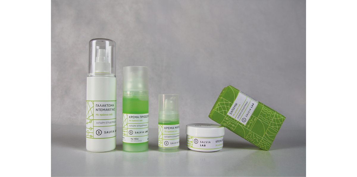
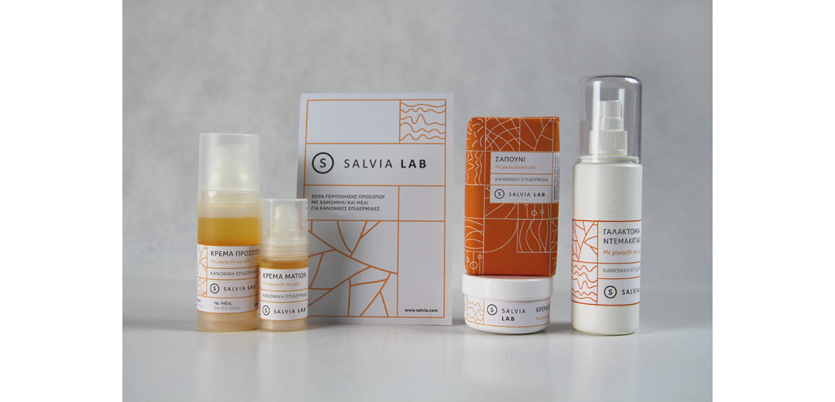
Salvia Pharmacies is a pharmacies' chain. The company is based on the idea that each store
has its own in–house laboratory, specialising in homeopathic products and natural cosmetics.
The goal of my design was to develop an identity concept emphasising on the connection
The goal of my design was to develop an identity concept emphasising on the connection
between nature and science.
––
"Salvia Officinalis" is the botanical name of sage, a plant well known for its healing properties.
Furthermore, the word "salvia" derives from the latin verb "salvere", which means "to save".
Furthermore, the word "salvia" derives from the latin verb "salvere", which means "to save".
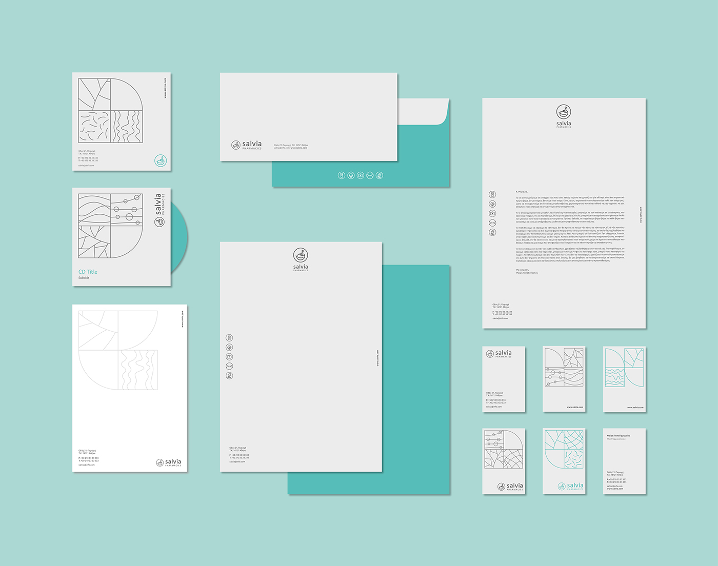
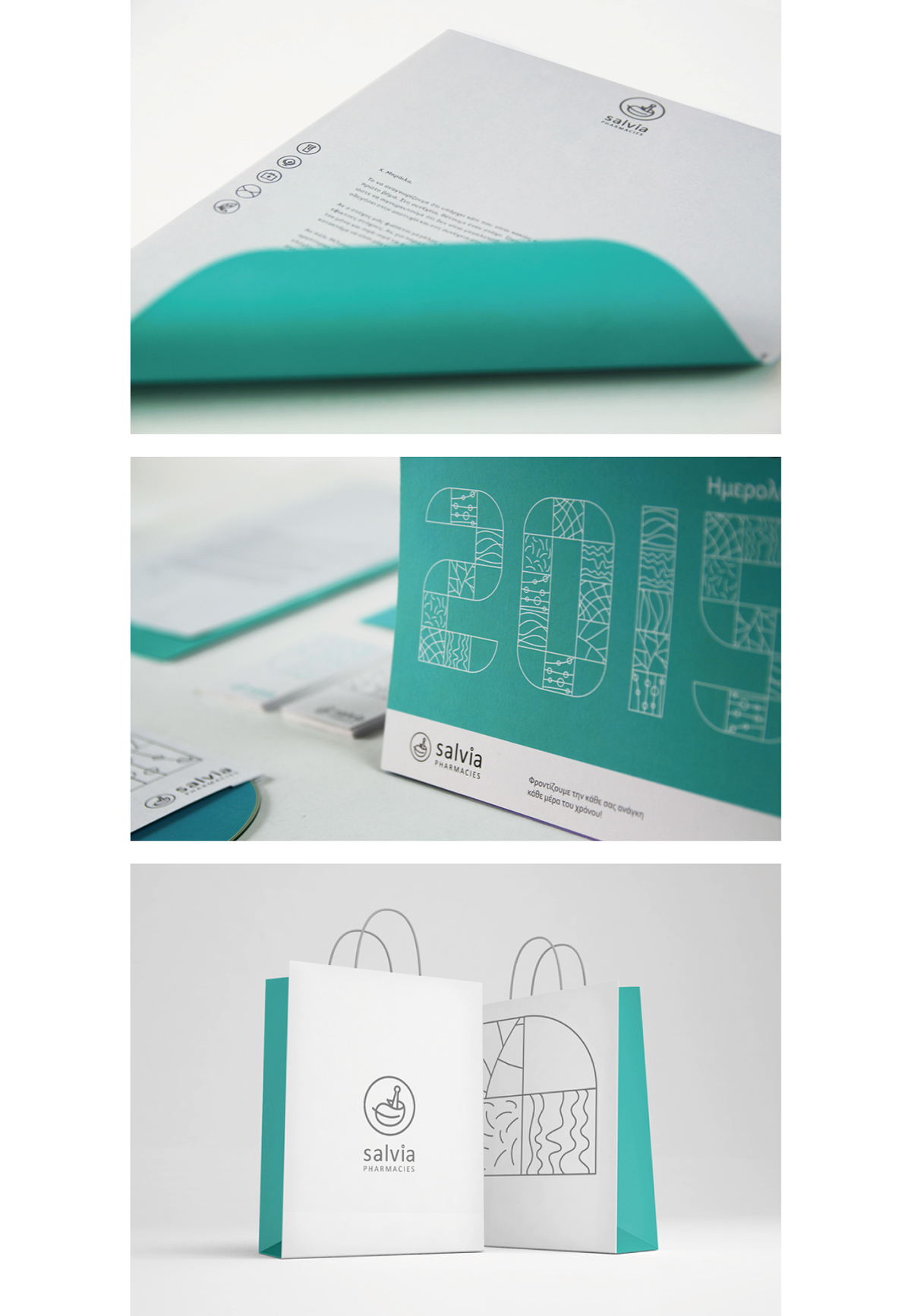
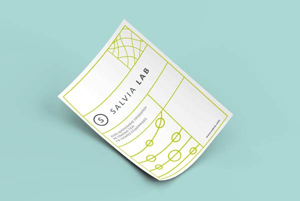
A pattern inspired by the subject of tissues, cells, nerves and organisms under the microscope,
compliments the many aspects of the Salvia brand identity. It can be applied in large or small
compositions or even in typography.
Other identity elements are the icons referring to the categories of products that can be found
Other identity elements are the icons referring to the categories of products that can be found
in the Salvia pharmacies: pharmaceutical, beauty, first aid, orthopaedic and homeopathic products.
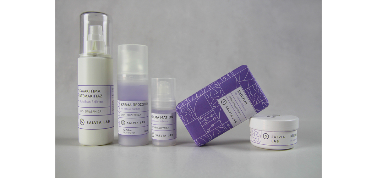
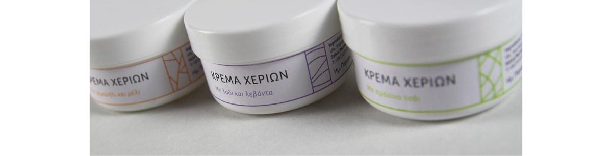
For the packaging of the Salvia Lab products, I developed a flexible grid system, based on
the Salvia pattern, that can easily adjust to the various label sizes.

Logo concept

Horizontal & vertical logo applications

Salvia Lab logo

Brand identity colours

Pattern inspiration

Salvia pattern

Salvia pattern font

Icons