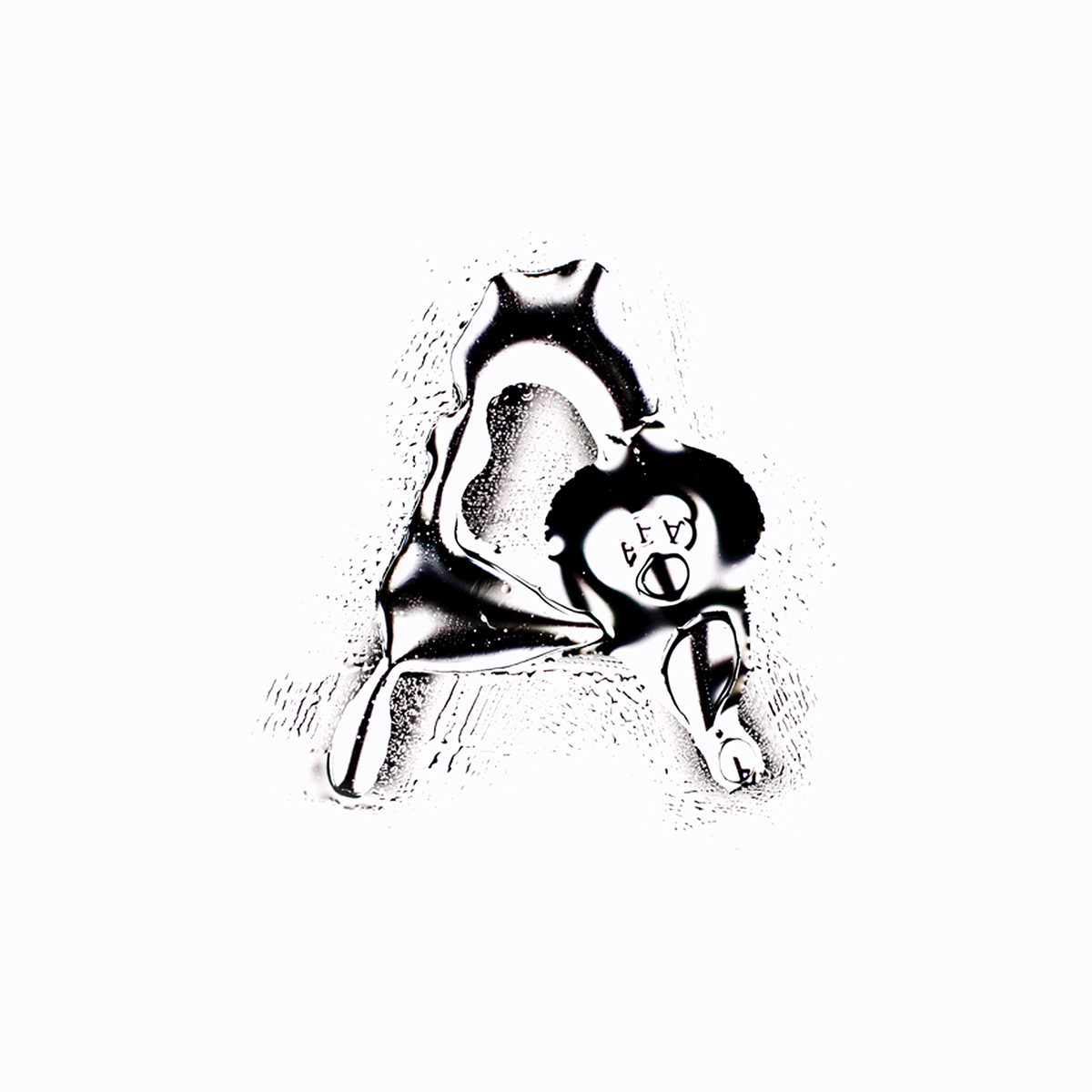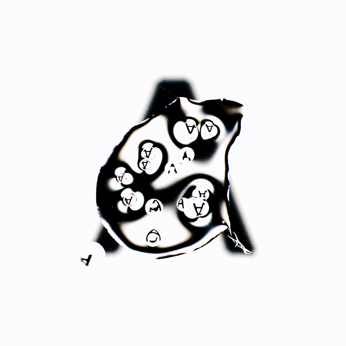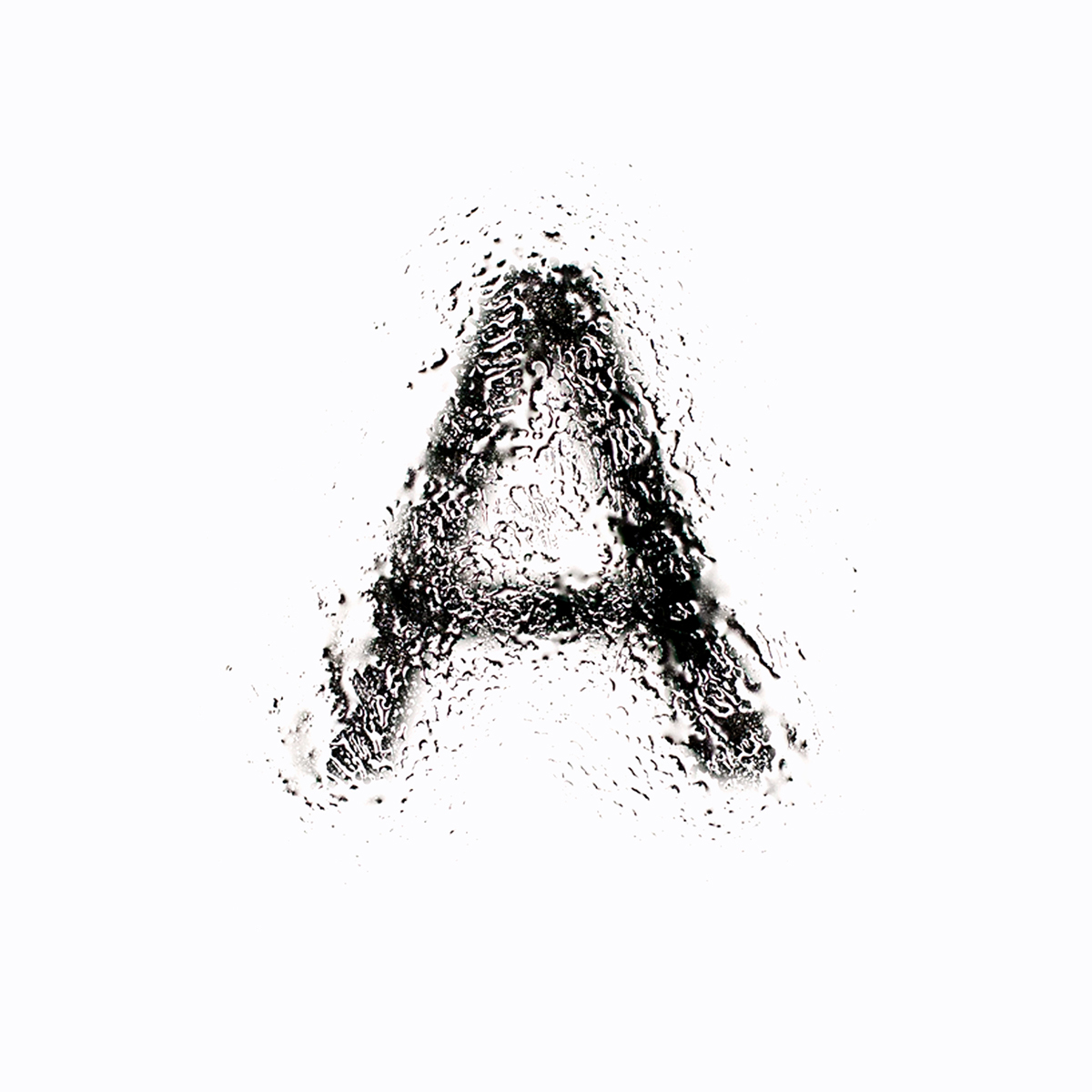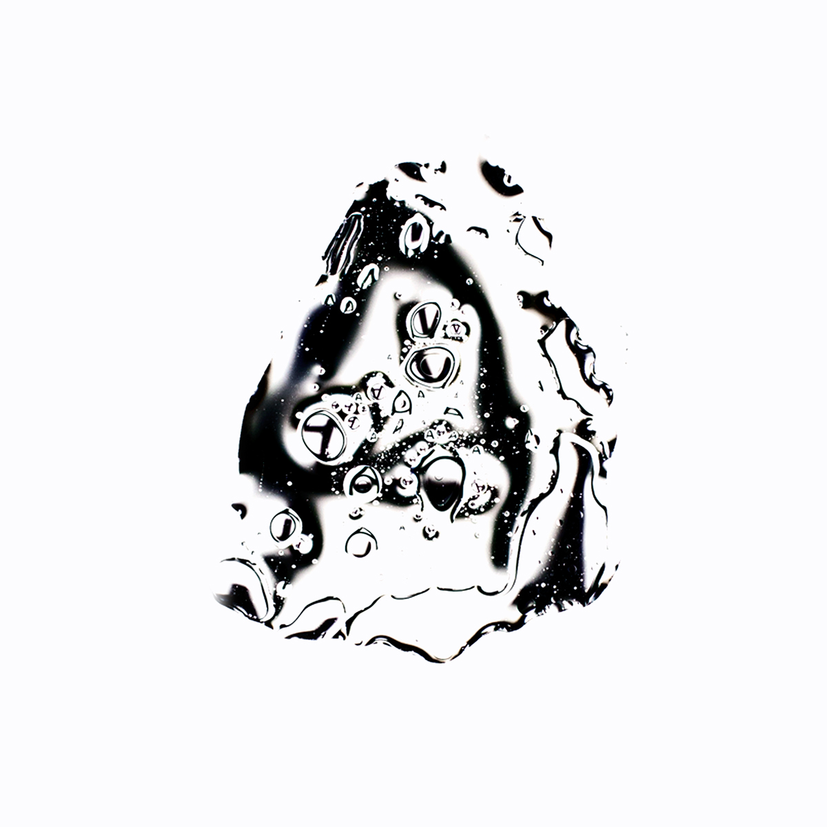
The project Liquid Typography was created in frames of Typoclub course at Hochschule der Künste Bern. In the very beginning it was not clear what it should look like. It developed itself during the experiments. The idea was to find out, what can happen while collaborating liquids and typo.
The difference between mine and many other projects, which connect water and typography is, that the font and the liquids do not come in touch with each other, the printed letter stays like it is and all manipulation is happening on a transparent layer above it. In my case I took glas, put it around 15 cm above the printed typo and created on it more than 50 different effects.
The beauty of it all is that we are working with organic material and the same effect on the same letter will look different every time. Exactly this was the point when I decided to not create a static font out of it, but make a gallery of effects and manuals about how to reproduce it by yourself. It makes it more interactive and leaves a lot of space for more experimentation and finding people’s own way to do it. The basic parameters like which kind of liquids, camera attitudes and techniques were used to each effect can be found on a gallery page.
For promoting the Liquid Typography project, I have created a serie of posters, which represent different effects on different scales of letters and also on a text.


webpage: http://www.liquidtypography.ch


