Annual Report
For Access Fund (School Project)
For Access Fund (School Project)
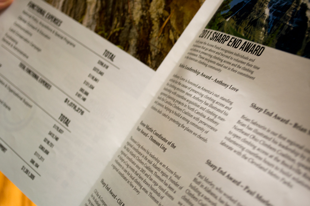
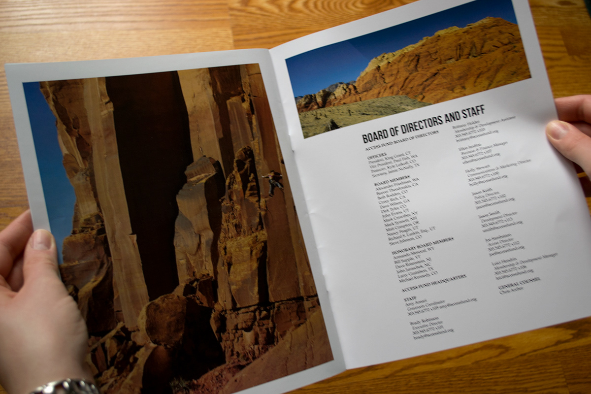
This is an annual report made as a school project for the Access Fund. This project tested my skills in typography. The idea was to have a clean, natural tone with modern layout and typography. The use of negative space allowed the elements to breath and have a greater impact. This breathing space invites an emotional response of fresh air to the viewer.
The typefaces I chose aided with the modern feel of this piece. Bebas Nue was used as my display type and Helvetica Nue was used as a san-serif complement. For the body copy Palatino was used for readability and express a more traditional/natural sense to it all.
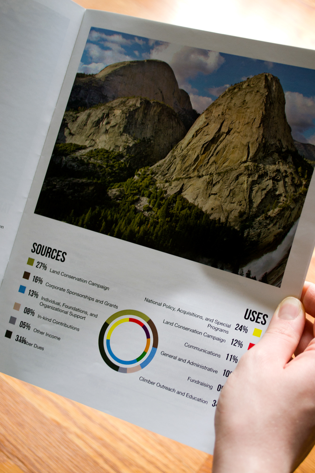
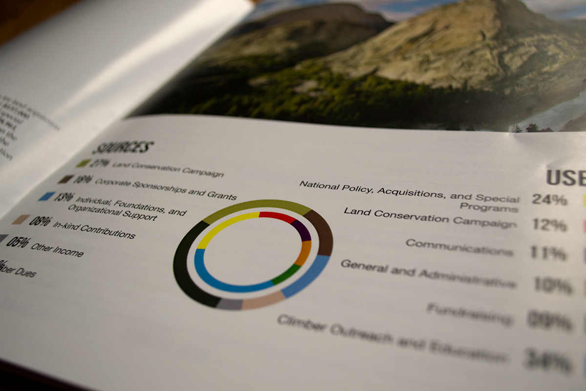
The infographic showing the sources and usages of money is simple, clean and easy to understand. The photo above gives the infographic a sense of place.
The typefaces I chose aided with the modern feel of this piece. Bebas Nue was used as my display type and Helvetica Nue was used as a san-serif complement. For the body copy Palatino was used for readability and express a more traditional/natural sense to it all.
The infographic showing the sources and usages of money is simple, clean and easy to understand. The photo above gives the infographic a sense of place.