
THE REBRANDING
▲
After giving it some good thought we have decided to create a full rebranding for ARTY. The main reason for this refreshing look is that it makes it easier for us to control how his logo will be used from now on so that we can create a consistent look for all design aspects within ARTY’s brand. We believe that having some basic guidelines is essential for this and we expect designers, partners, promoters etcetera to follow these guidelines.
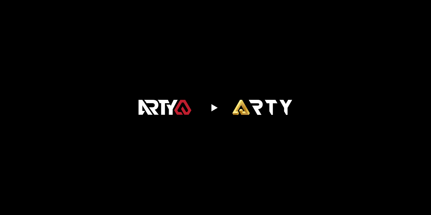
The new look isn’t completely different from his old logo as ARTY has already made quite a name for himself and we want people to quickly adapt to the change. Its a bit simpler, more timeless and more suitable for various applications.
▲
After giving it some good thought we have decided to create a full rebranding for ARTY. The main reason for this refreshing look is that it makes it easier for us to control how his logo will be used from now on so that we can create a consistent look for all design aspects within ARTY’s brand. We believe that having some basic guidelines is essential for this and we expect designers, partners, promoters etcetera to follow these guidelines.
The new look isn’t completely different from his old logo as ARTY has already made quite a name for himself and we want people to quickly adapt to the change. Its a bit simpler, more timeless and more suitable for various applications.
It is very important that people who have seen the old logo will recognize the brand by seeing the new logo. Therefore we kept various design elements but modified them and made them simpler. We believe that a cleaner logo is better as it suits a wider range of applications.
Client: ARTY
Concept: Mart Biemans
Concept: Mart Biemans
Design: Mart Biemans
Management: Mikhail Mazunov
Photography: Giuliano Bekor
Photography: Giuliano Bekor

▲
PROCESS
▲
OLD ► NEW


▲
PRIMARY LOGOS

▲
SPOT COLORS
(Bottom 3 rows were used to create the gradients)
(Bottom 3 rows were used to create the gradients)

▲
INSPIRATION
▲
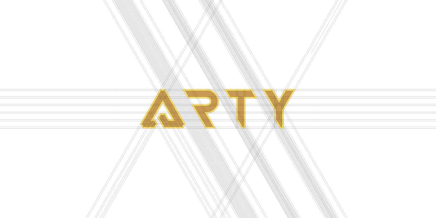
GRID
(Both the thick and thin version can be created from the same grid, initially done so that they could be used for various applications, eventually we decided to drop the thin version)
(Both the thick and thin version can be created from the same grid, initially done so that they could be used for various applications, eventually we decided to drop the thin version)

▲
THICK ► THIN

▲
MINIMUM FREE SPACE
(More space as added between the A and the R to solve the kerning issue)


▲
SYMBOL VARIATIONS

▲
LOGO VARIATIONS

▲
TOGETHER WE ARE REBRANDING
(We applied the same changes to ARTY's radio show entitled 'Together We Are')

▲
TWA GRID
(The two outer triangles are created from the thin version of the original ARTY logo, the middle triangle is created from the thick version of the original ARTY logo)
▼

▲
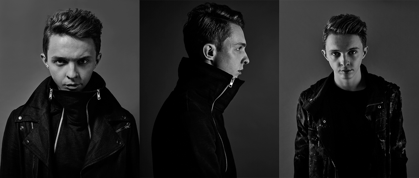
POSTER MOCKUPS & PHOTOGRAPHY
(Photography: Giuliano Bekor)
(Photography: Giuliano Bekor)


