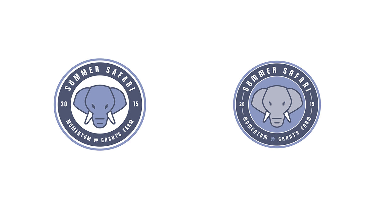
I designed the logo below for my work's annual Summer Picnic which was held at Grant's Farm, here in St. Louis. Our festivities would take us all over the the Anheuser-Busch animal reserve but our home-base was a tent located driectly next to Bud, the 16,000 lb African Elephant that would also become the focal point of our logo mark.


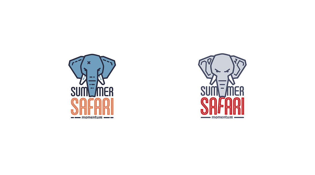
These marks below are more relaxed and whimsical. The one on the left moving to a more traditional African Safari color palette, the one on the right playing with the idea of a drunk elephant. They were eventually cut in favor to the more agressive looking elephant.

This was a quick logo overhaul to show that making the Elephant more realistic looking (not so cartoonish) does not equate to a more mature looking mark.

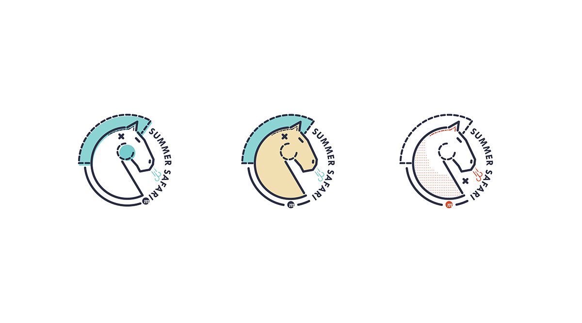
These next few marks are focused on the fact that Grant's Farm is home to the "World Famous Budweiser Clydesdales".
The mark was meant to be extremely simple, with equal line weight throughout (except some versions). I also wanted it to look as if it was designed in the 1980's, possibly for a sport's team. Finally, I wanted to incorporate the "miss-registration" that is seen in screen printing, in that some colors seem to have been placed slightly off there intended mark.
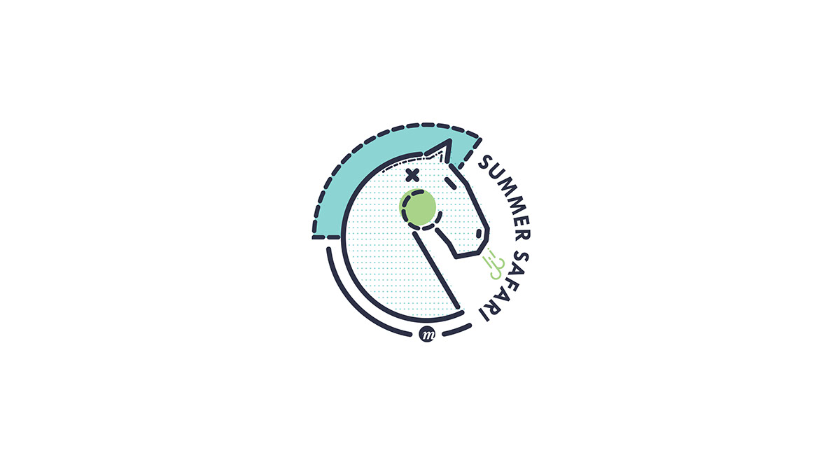

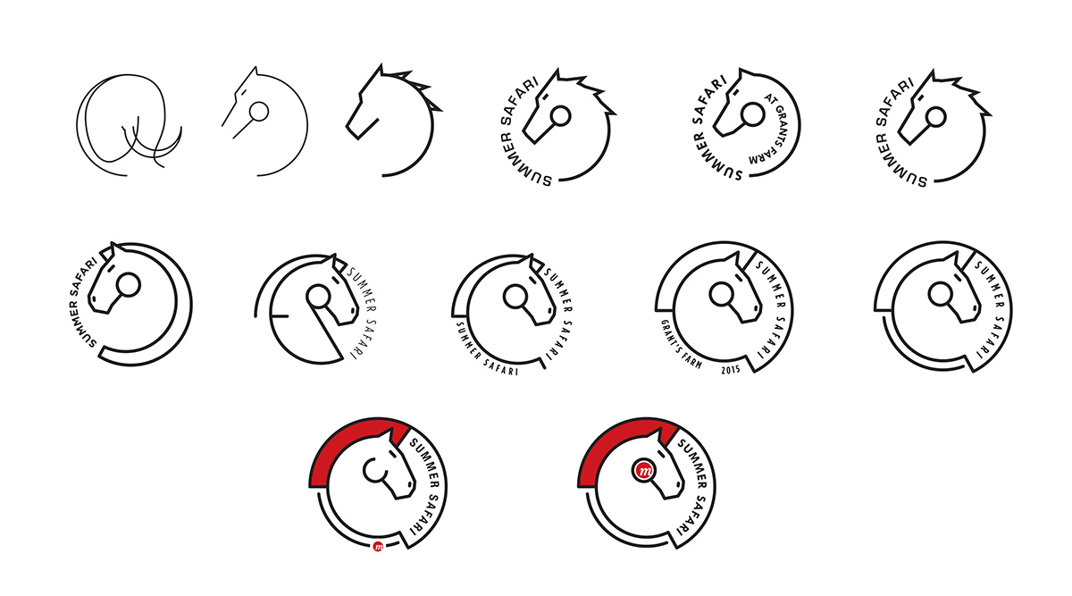
Below is how I evolved the horse illustration.
The remaining designs were cut because they either featured a Lion (which Gran'ts Farm does not have), or becuase the Elephant illustrated was too "childish" for an adult work get-together.