

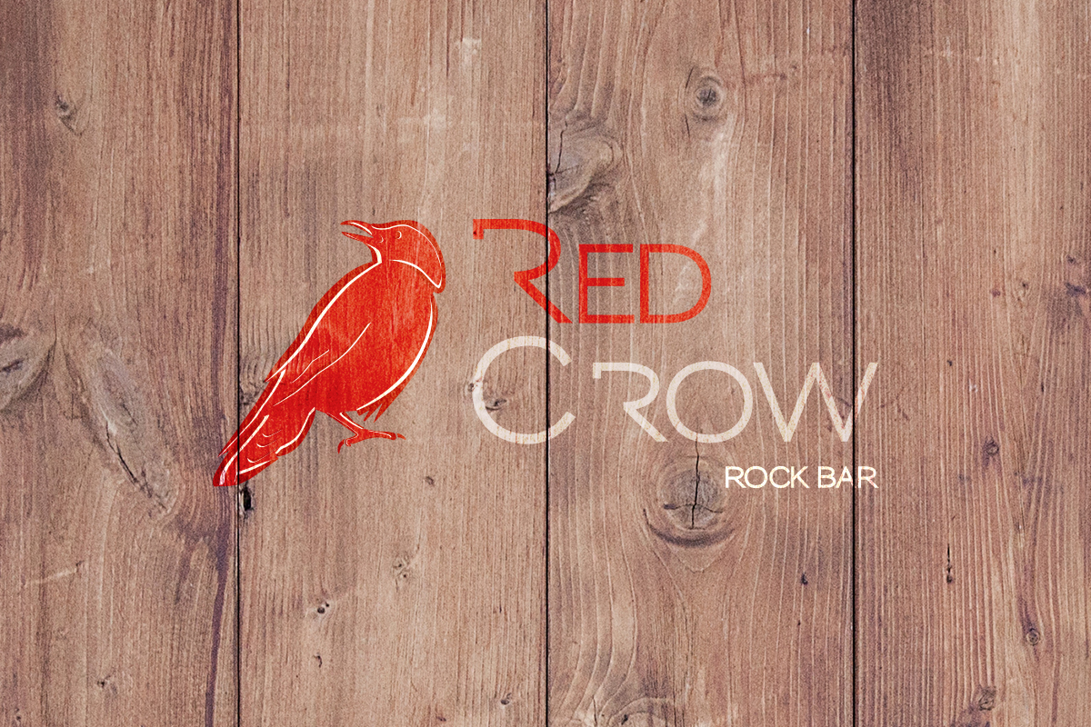
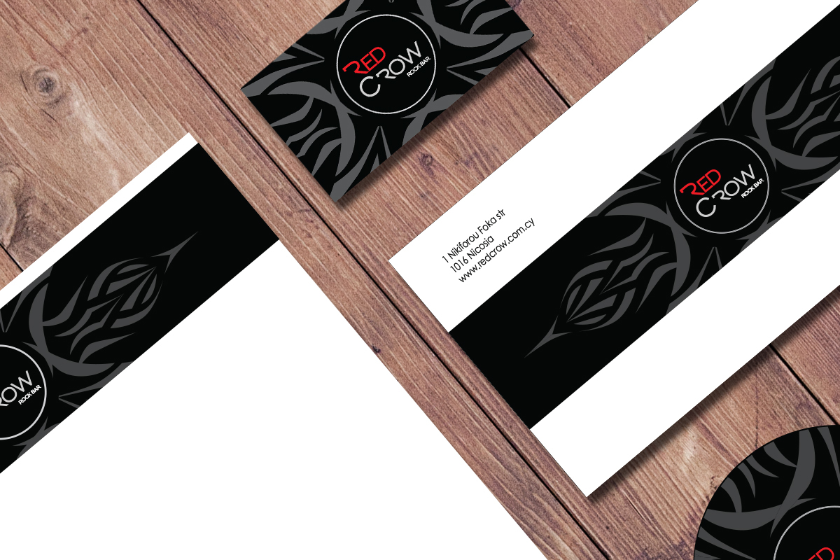
During my dissertation I had the chance to create the corporate identity for Red Crow rock bar. The concept was based on a common idea between me and a friend of mine, years ago. I thought that the dissertation was the perfect chance to bring this idea to life.
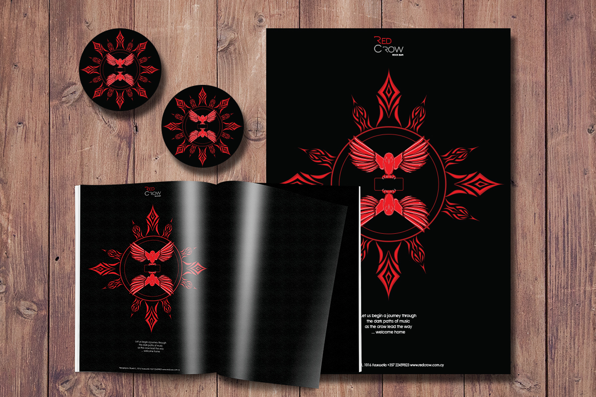
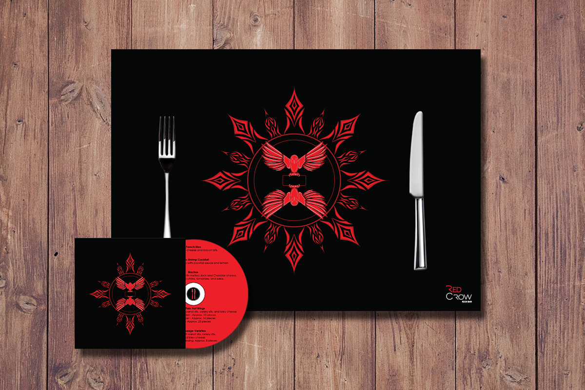
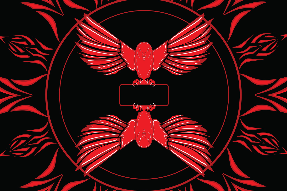
The crow chosen for the name and logo of the rock bar, symbolizes death and bad omen in lyrics of various bands. The chosen colors highlight the aggressiveness of rock music. The background design was inspirited by the crow and barley.


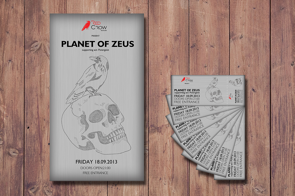
I always imagined the place with a small stage, giving the chance to local bands to perform. For the purpose of the dissertation, I created three different designs for three music nights. Every design was created with different techniques to capture the essence of the band.


Thank you!


