


Chicago is a city of movement; of connection; of muscle. A city that in 1887 reversed the flow of the Chicago river. A city where entire downtown streets and skycrapers have been lifted multiple times to improve water drainage, and for the creation of multi-level streets. A city that commutes along elevated tracks, carving through culturally diverse architecture, signage, and art in a moment's time.
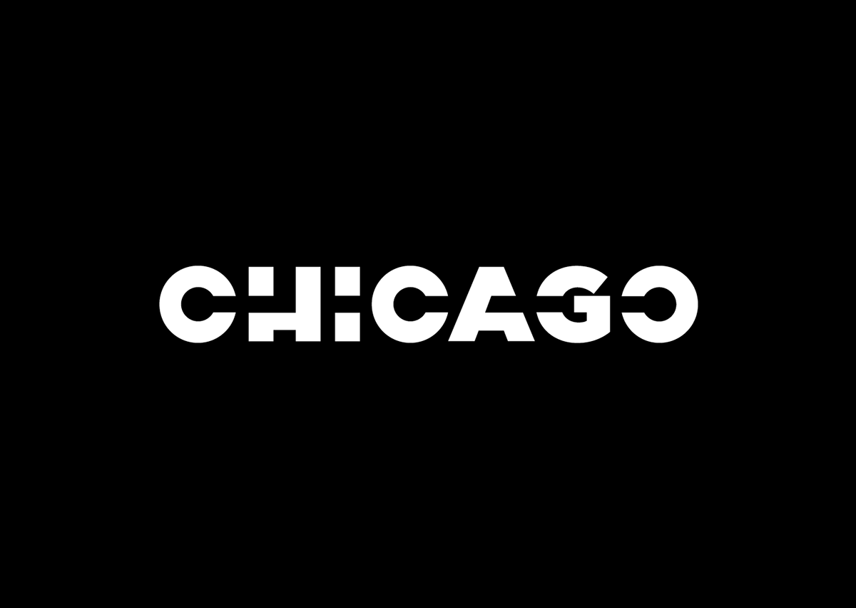
It is this history, and ultimately the experience of living in Chicago that inspired my new identity concept for the city. A sturdy and substantial mark that captures a sense of directional, pointed movement and energy.
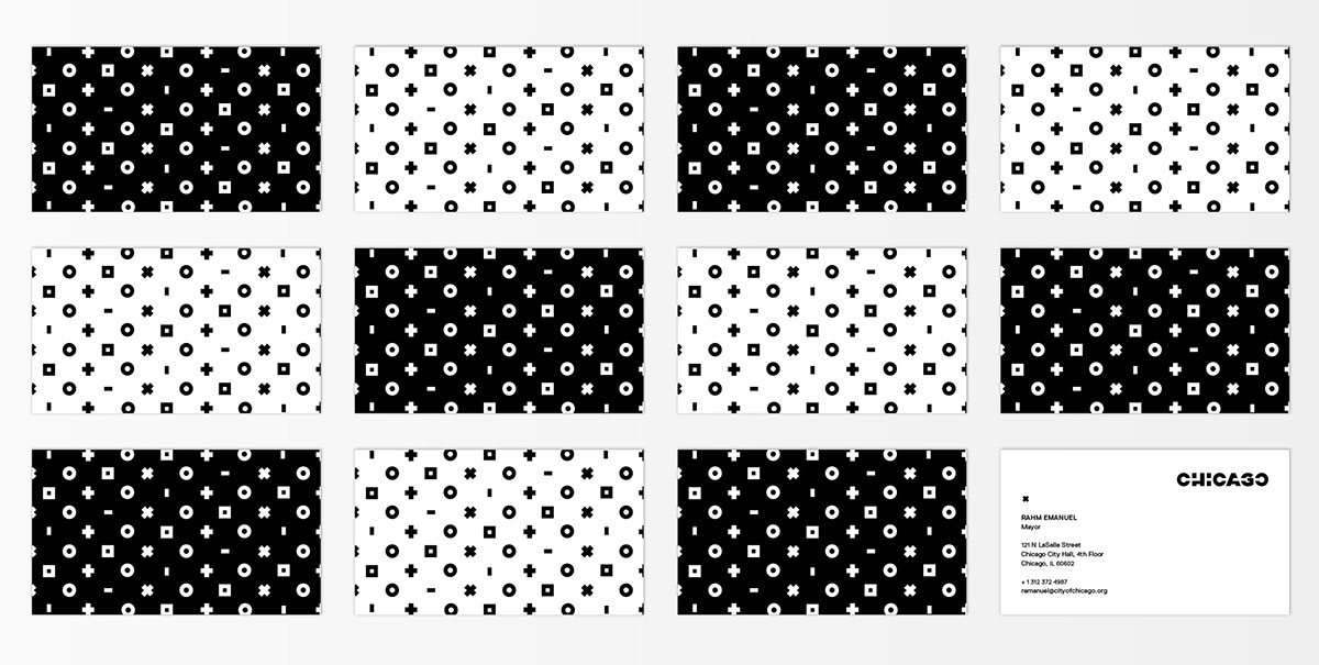
The idea of this project was to develop a full identity system for the city to replace it's existing array of marks. My task was to develop a system that was both consistent and flexible in order to meet the needs of such a dynamic city. Developing departmental logos was an important part of achieving system cohesiveness. Geometric symbol sequences and linear segments were introduced. Parameters for sequence/segment size and department title typography, allow for maximum flexibility within a regimented framework. All segments feature playful geometries and a sense of movement. The system opens up further with the introduction of patterns and icon-style illustrations inspired by the departmental logos.
It is this history, and ultimately the experience of living in Chicago that inspired my new identity concept for the city. A sturdy and substantial mark that captures a sense of directional, pointed movement and energy.
The idea of this project was to develop a full identity system for the city to replace it's existing array of marks. My task was to develop a system that was both consistent and flexible in order to meet the needs of such a dynamic city. Developing departmental logos was an important part of achieving system cohesiveness. Geometric symbol sequences and linear segments were introduced. Parameters for sequence/segment size and department title typography, allow for maximum flexibility within a regimented framework. All segments feature playful geometries and a sense of movement. The system opens up further with the introduction of patterns and icon-style illustrations inspired by the departmental logos.
Identity Systems, Fall 2013
/SAIC


