Culture, but one step further
Centre for the Meeting of Cultures in Lublin (CSK) is a cultural institution located in Eastern Poland with roots dating back to 1960s. The idea behind it was to connect and interpenetrate different types of art and culture in one place.
Due to the finishing construction works then, in 2015 CSK organised a competition for creating the institution’s new visual identity.
The project goal was to develop a strong and consistent brand identity that would reflect CSK’s character and aspirations for a modern world.
Instytucja z misją
Historia Centrum Spotkania Kultur w Lublinie sięga lat 60. XX wieku. Nadrzędną ideą instytucji jest spotkanie
i przenikanie się kultur w postaci różnego rodzaju wydarzeń o charakterze artystycznym.
W związku z kończącymi się pracami budowlanymi, CSK zorganizowało konkurs na opracowanie identyfikacji wizualnej marki. Projekt obejmował stworzenie spójnego wizerunku, który odzwierciedli charakter i aspiracje Centrum
w dzisiejszym świecie.
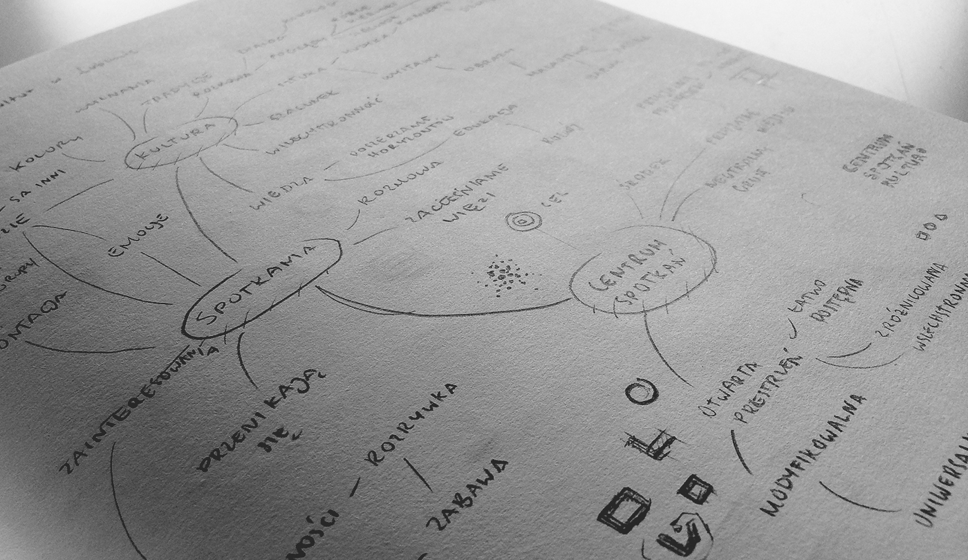
The first step
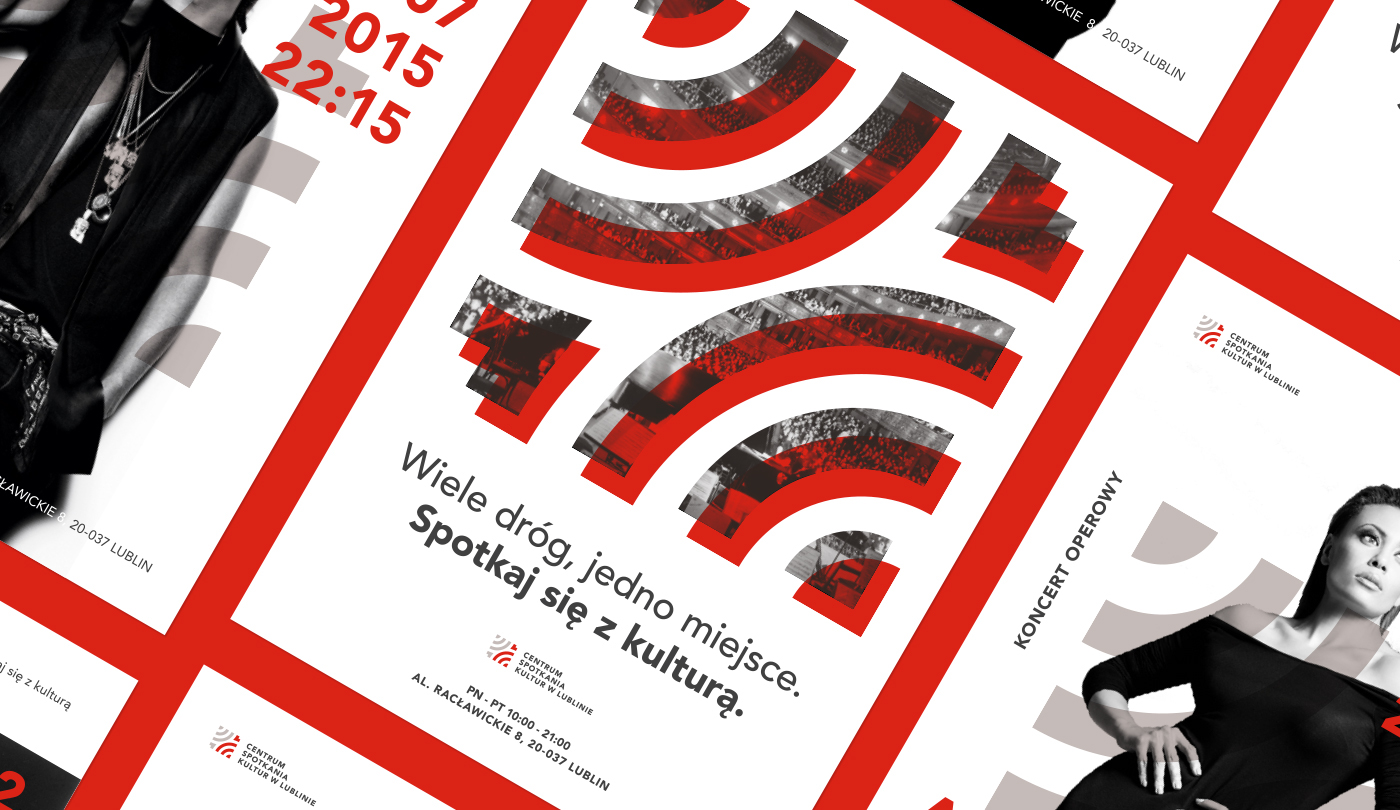
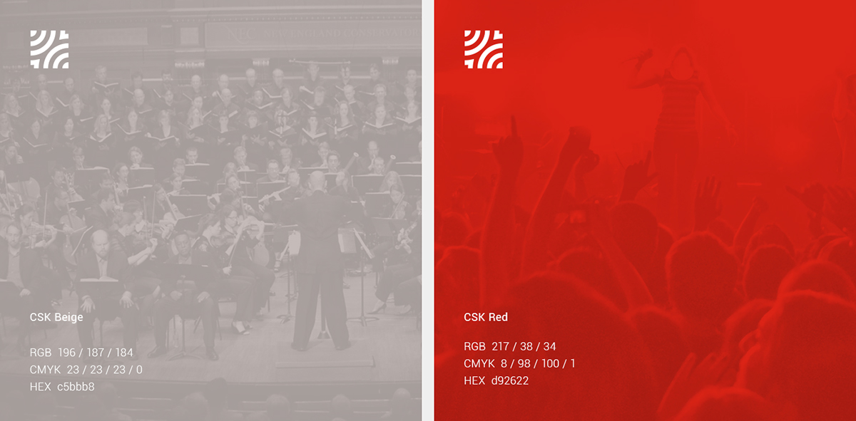
I began with creating a symbol. An icon that would be a trademark - a key element of the identity that would reflect the place strongly. Due to the variety of events organized at CSK, I decided on an abstract symbol that represented the main idea of the institution - a connection and interpenetration of various cultures. To highlight it even more, I developed a contrasty color scheme that could be expanded into visual identity later.
Idea ujęta w znaku
Pierwszym krokiem było stworzenie logo - unikatowego symbolu, który uchwyci wartości instytucji i zidentyfikuje markę w regionie. Z uwagi na różnorodność wydarzeń organizowanych przez CSK, zdecydowałem się na abstrakcyjny kształt reprezentujący ideę “spotkania i przenikania się kultur”. Jej dodatkowym podkreśleniem została kontrastująca kolorystyka, kolejno wykorzystana w komunikacji wizualnej Centrum.


Visualizing the idea
One of many challenges was developing an identity system that, despite a lot of different types of events, would remain unified and attractive across all touchpoints. To achieve that I came up with a unique visual language that, if used methodically, would keep the image of the institution consistent and creative.
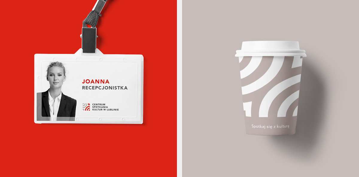
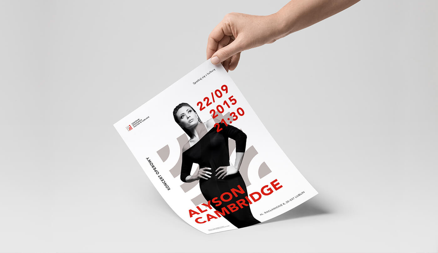
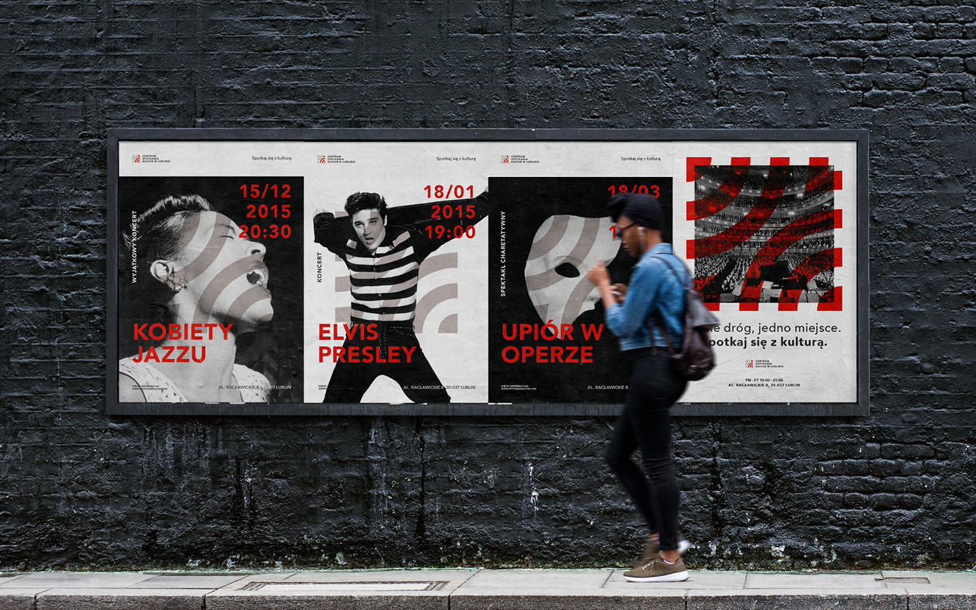
Except the logo design, the project scope included stationery design, identifiers, bands and entry tickets, poster designs as well as wayfinding elements. The project qualified for the second stage of the competition, however it was not chosen as a winning one.
Spójny wizerunek
Jednym z wyzwań było opracowanie identyfikacji, która pomimo zróżnicowania wydarzeń pozostanie zunifikowana, elastyczna i atrakcyjna. Aby to osiągnąć, opracowałem język wizualny pozwalający na utrzymanie spójnego charakteru Centrum na przestrzeni wszystkich punktów styczności marki.
W skład realizacji weszły m.in. materiały biurowe, identyfikatory, opaski i bilety wstępu, plakaty promujące wydarzenia oraz elementy identyfikacji przestrzennej CSK. Projekt został zakwalifikowany się drugiego etapu konkursu, jednak nie został wybrany jako zwycięski.