now.03
We had high hopes for the third edition in the series. No pressure, of course.
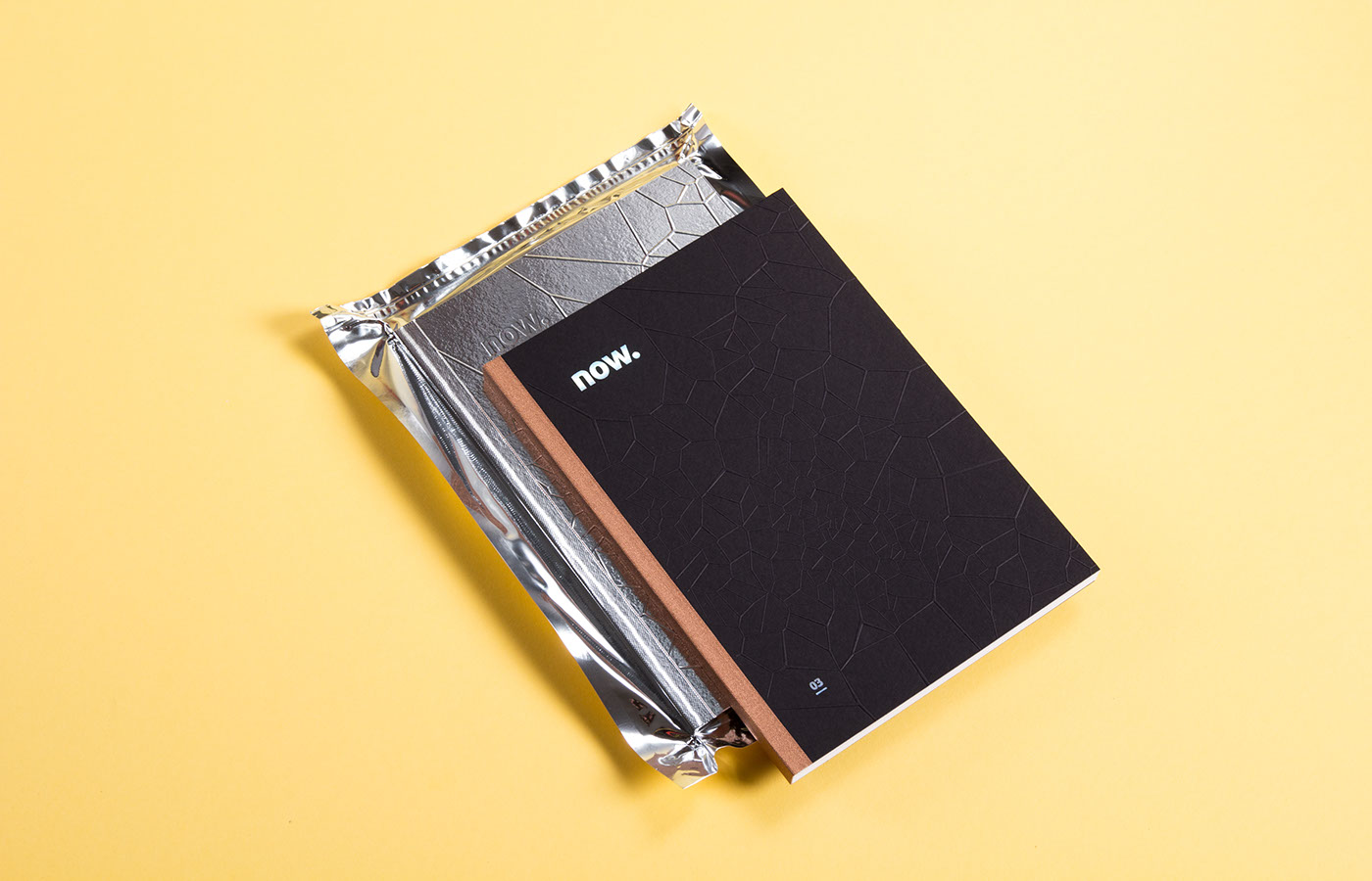
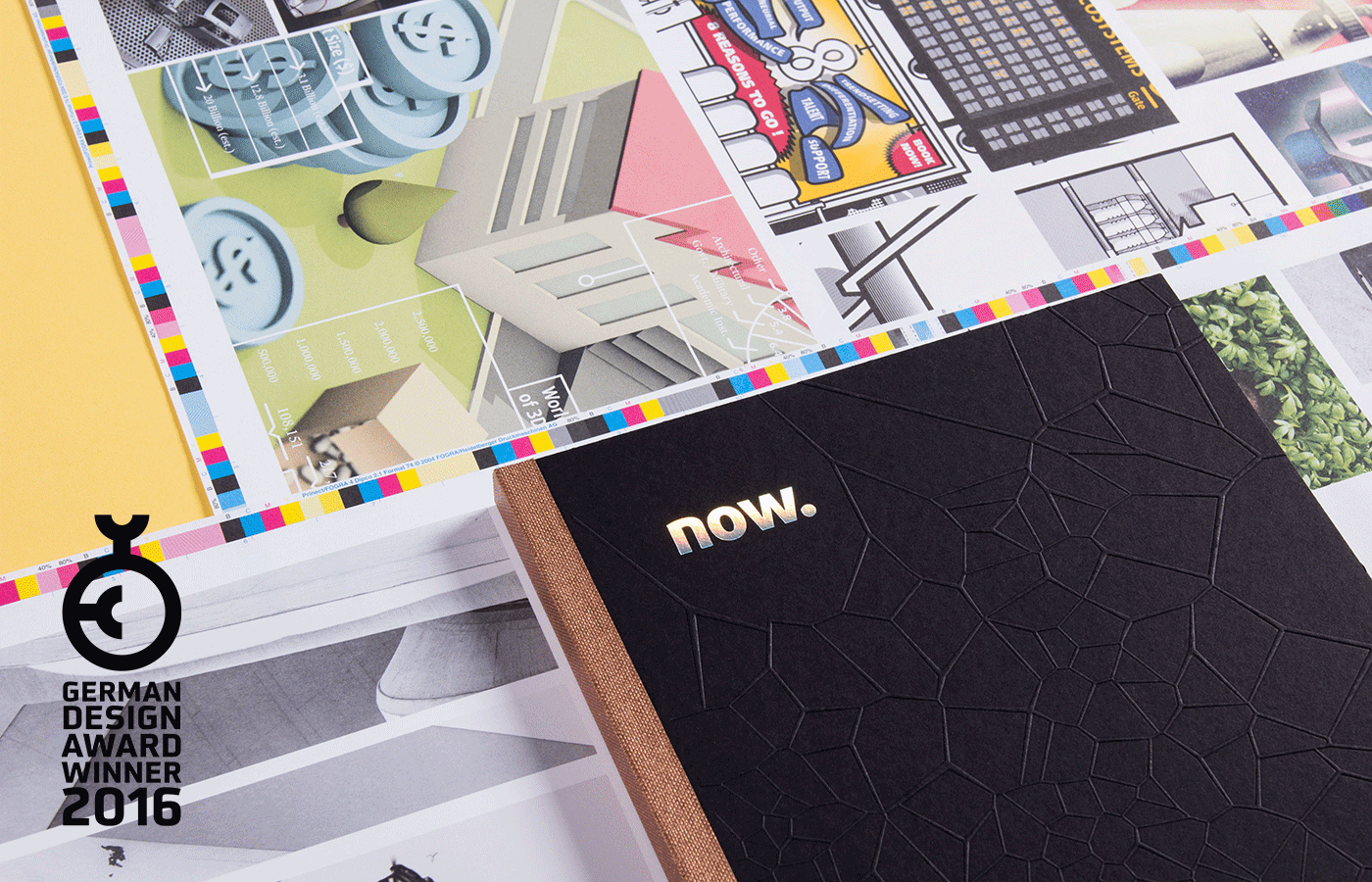
The design idea for the cover was lightweighting. We wanted to achieve a lightness to the book that reflects the endeavors of the car industry to reduce the weight of cars. Lighter objects leave a smaller carbon footprint, and we wanted to use this notion for the design. This book is cool, but it’s also light.
now. 03 introduces a darker page design and a sleeker cover. The lightweighting aspect of the cover also represents the flexibility of our graphic language for the now. project. We want to change the book every time, so that it constantly evolves.
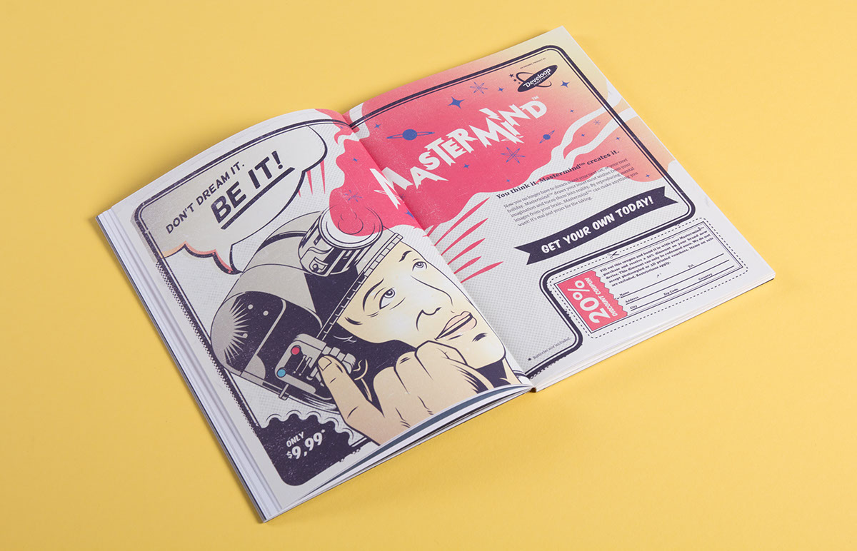
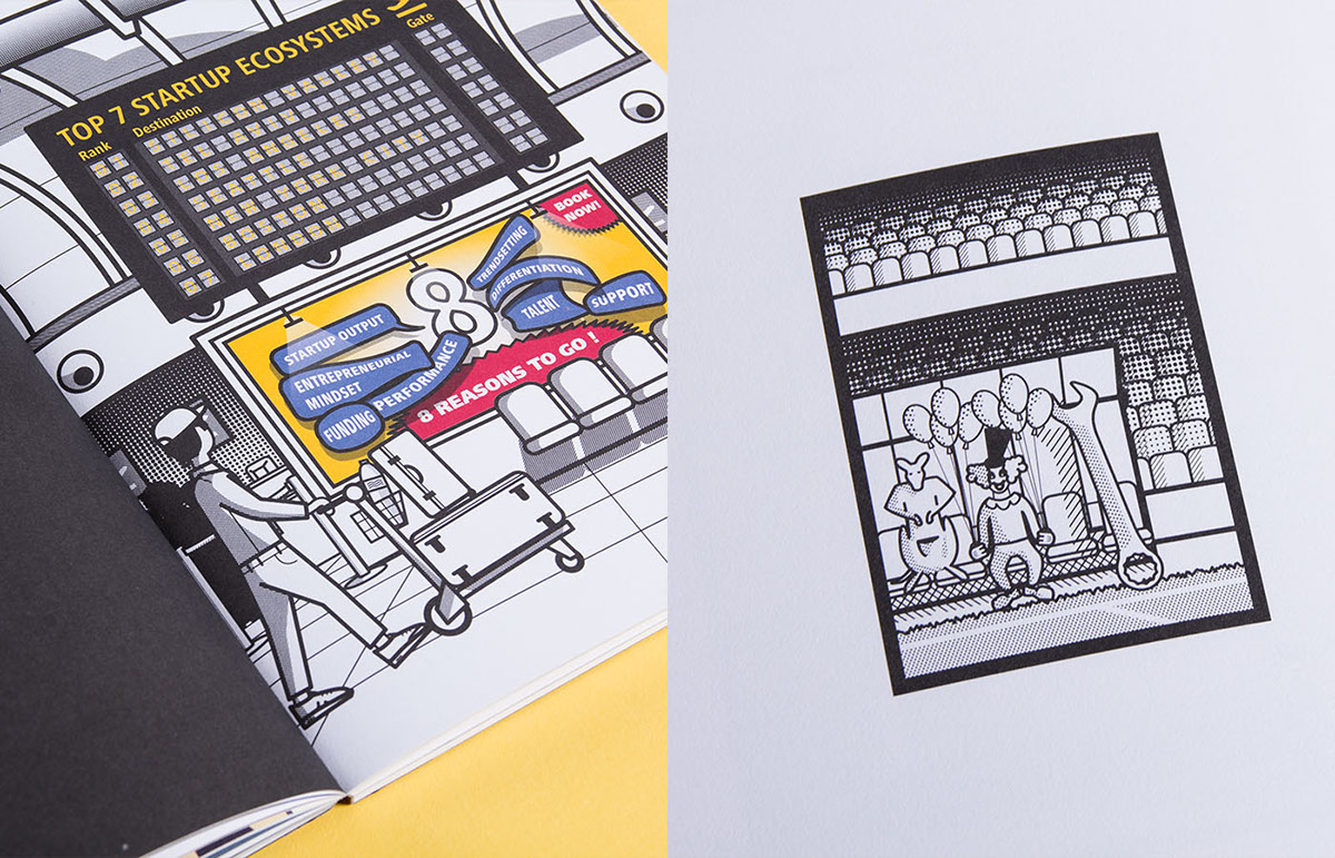
From honest production, nanotechnology, and startups to the essence of storytelling – in now. 03 these issues all make an appearance.
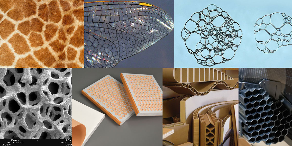
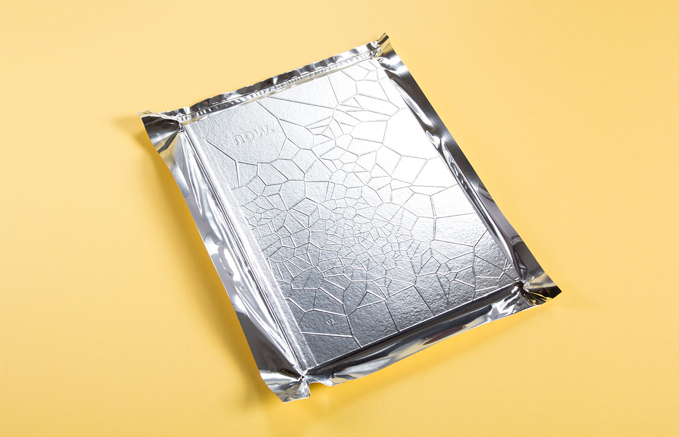
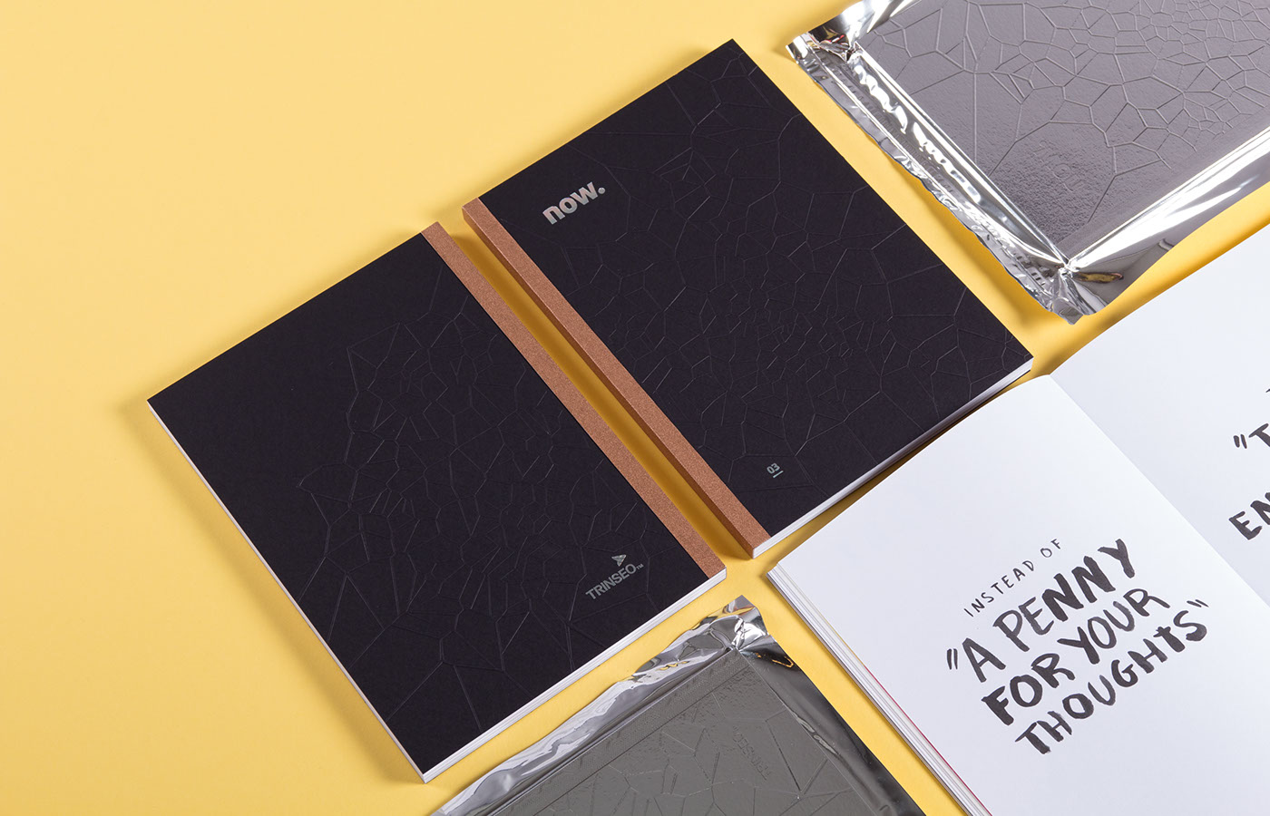
Voronoi patterns occur in nature – you only have to observe the structure of leaves or animal prints. We used a script to generate patterns that were then adapted to fit the book. We embossed our cover with these patterns to give the book a dimensional stability. The now. logo was debossed to reiterate the light – heavy treatment of the cover.
The result is our most aesthetic book cover, yet.
The result is our most aesthetic book cover, yet.


...
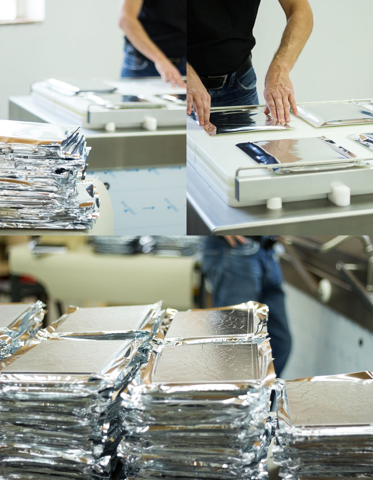
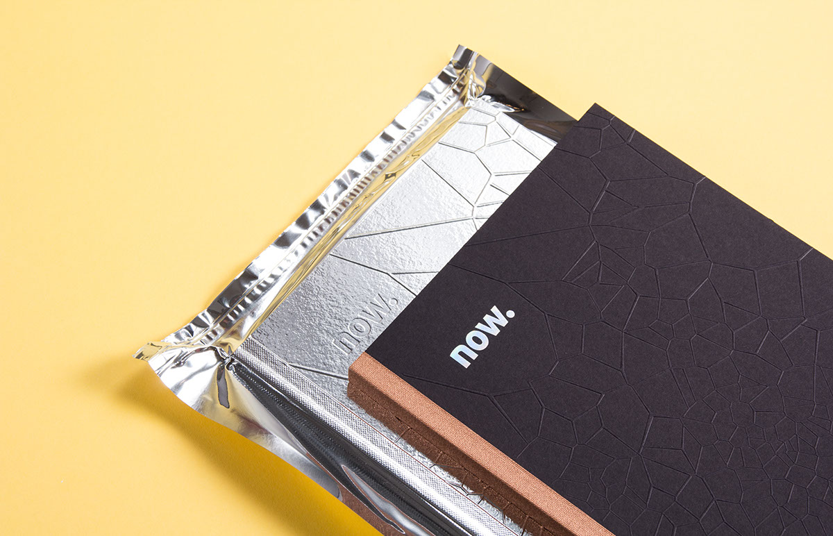
Our team vacuum-packed each book in custom produced silver foil. The idea was to create the experience of tearing open the packaging to receive a fresh, special, edition of now. 03. Furthermore, by extracting the air out of the silver foil, we stabilized the book as such. The Voronoi pattern is also visible through the packaging, hence emphasizing the high quality look of the book.