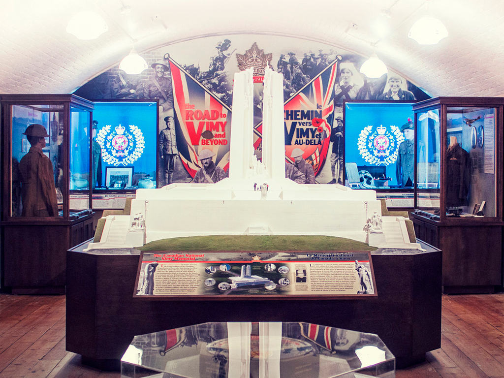
The Road to Vimy and Beyond, 1914–1918
LOGO DESIGN
Client name
Army Museum Halifax Citadel
Brief / Summary of Work
The challenge with this project was to create an identity that paid homage to the Vimy experience in both official languages.
Equal amounts of research and design were invested in this project. Central to the logo’s design was the choice of symbols. For example, the maple leaf, which figures prominently in the background, references the actual leaf in Canadian soldiers’ WW I cap badge. Other symbols include the poppy and helmet.
The main font (Clearface) is the same typeface used in WW I-era “Buy Victory bond” posters. Supporting fonts (Goudy and Franklin Gothic) are from the same period. The colour palette is also derived from WW I propaganda material.
The result is a modern identity that very clearly and eloquently channels the Vimy era in both official languages.
Participating Members and Roles
Creative Direction: Marc Belanger
Lead Design: Yulia Semenova
Graphic Design: Will Hopkins