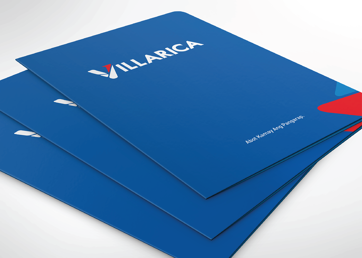
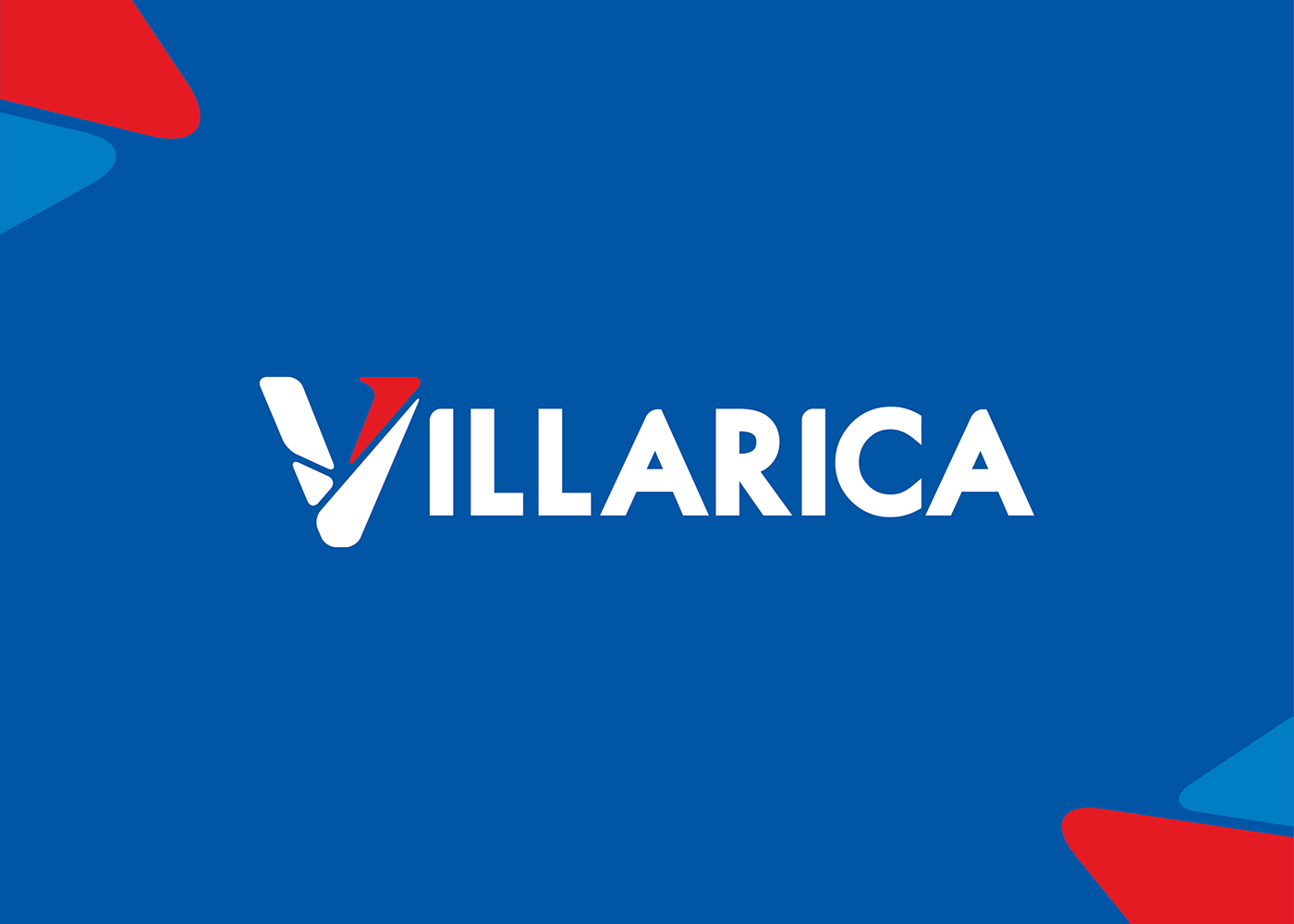
In partnership with Bootleg Innovation Design, TeamManila worked on the rebranding of Villarica Pawnshop, one of the country's longest-running pawnshops, in designing the company's logo and signage. With over 500 outlets located nationwide, Villarica was given a look that is friendly, reliable, and effective over-all. The company's brand colors were kept but used profoundly in highlights and soft details as the iconic letter V stands out. See more of this project below.

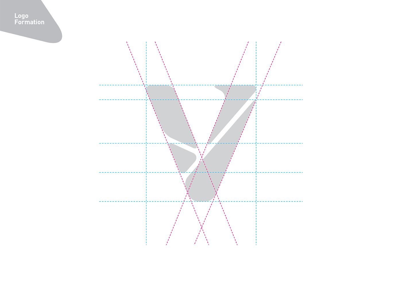

Here are the three elements integrated in Villarica’s current logo. Token, Security, and Transfer complete the brand’s logo as it all
symbolizes Villarica’s image over-all. These three elements make the promise Villarica has as a top-class financial service center in the country.
On this logo for Villarica, a focus on the brand name’s letter V is done as to highlight a certain recall not only for its current market but for its future customers as well. The design’s geometric shapes are varied representations of the brand’s image -- the diamond symbolizes money while the two cuts on the right side of the letter V are checks that symbolize Villarica’s assurance and security when it comes to fund transfer.
The cut on the upper left side signifies a token that shows how much Villarica values their customers.
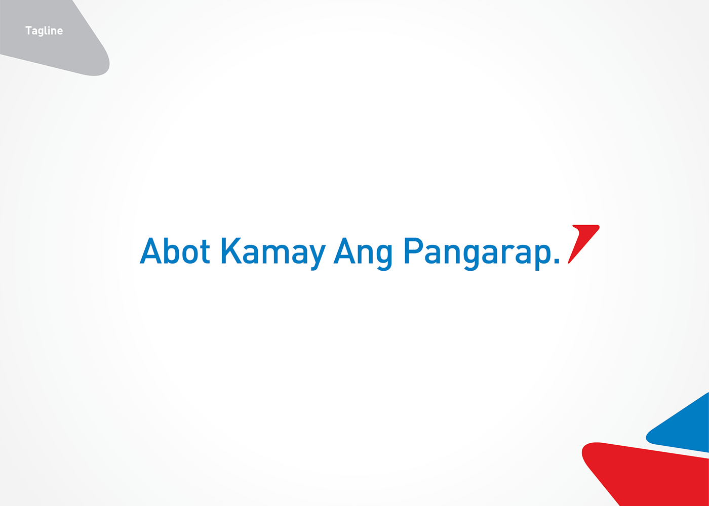
All of these combines and contrasts Villarica’s “Abot Kamay Ang Pangarap” tagline as forward and trusted brand.