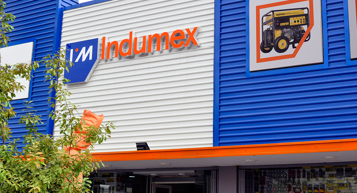
Indumex
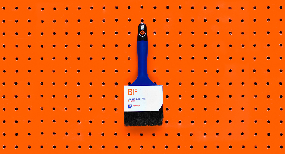
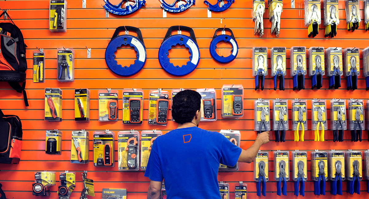
Indumex is not your ordinary hardware store. With the purpose of revolutionising the industry, this establishment is your one stop shop for construction and improvement hardware. Their wide variety of product lines, and the superior customer service they offer make the shopping experience appealing to every handy men in the area.
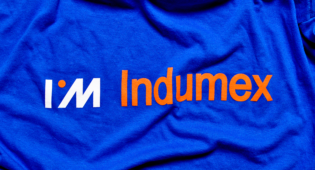
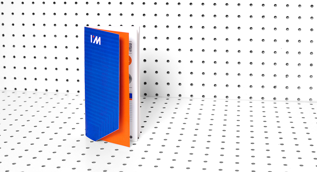
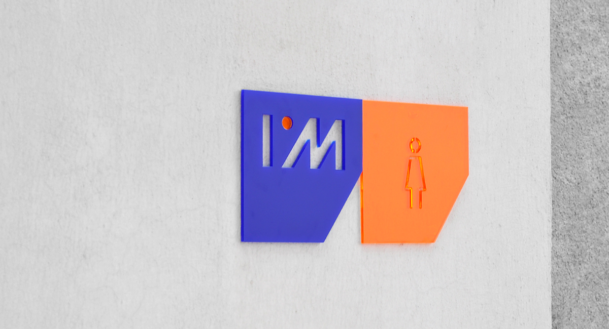
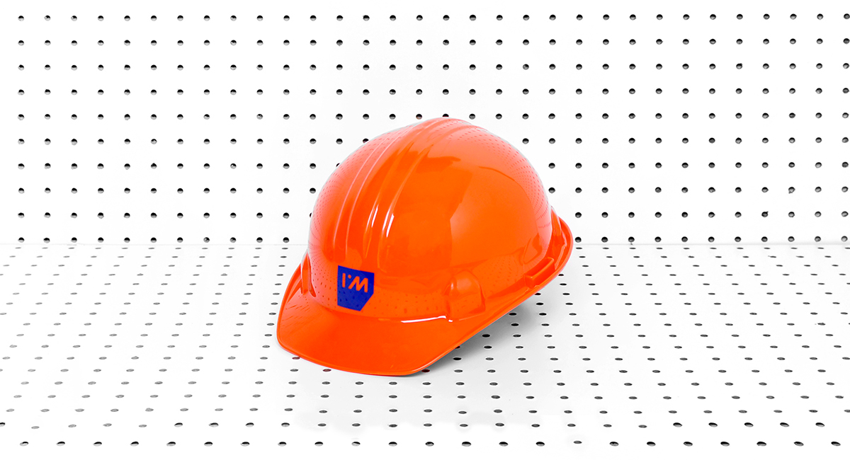
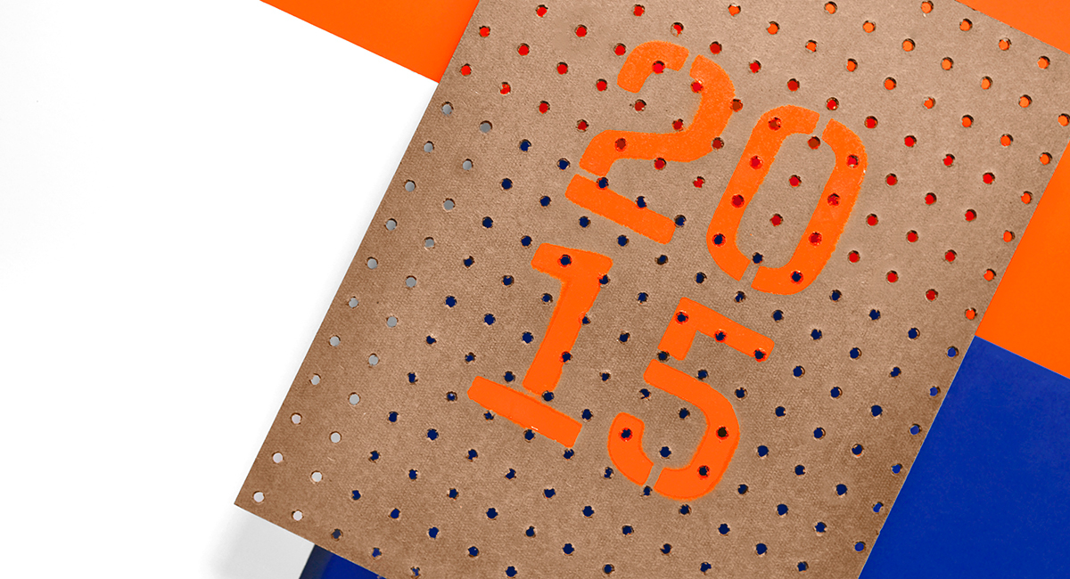
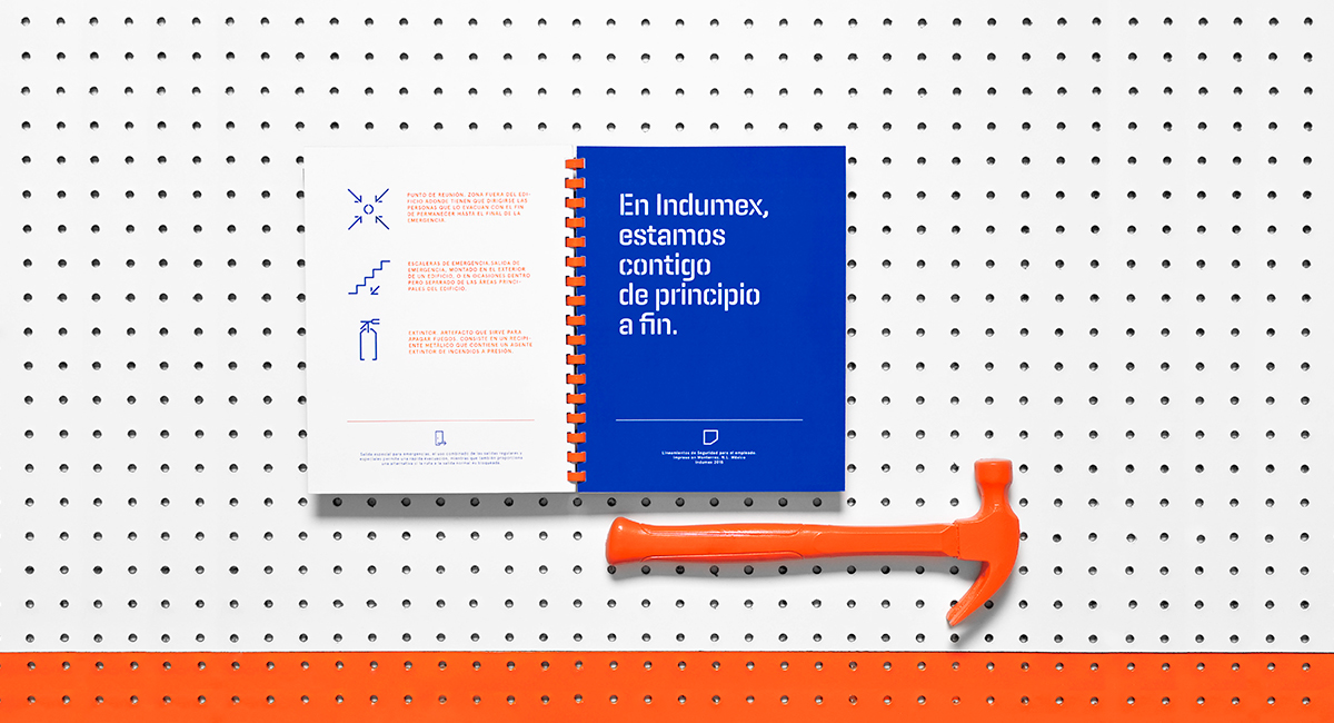
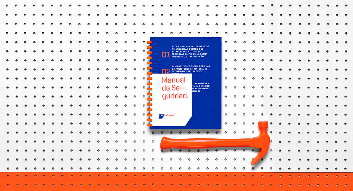
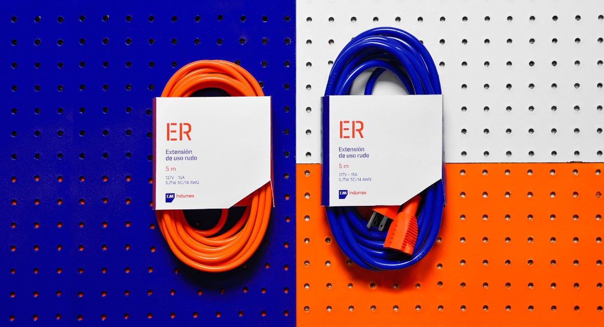
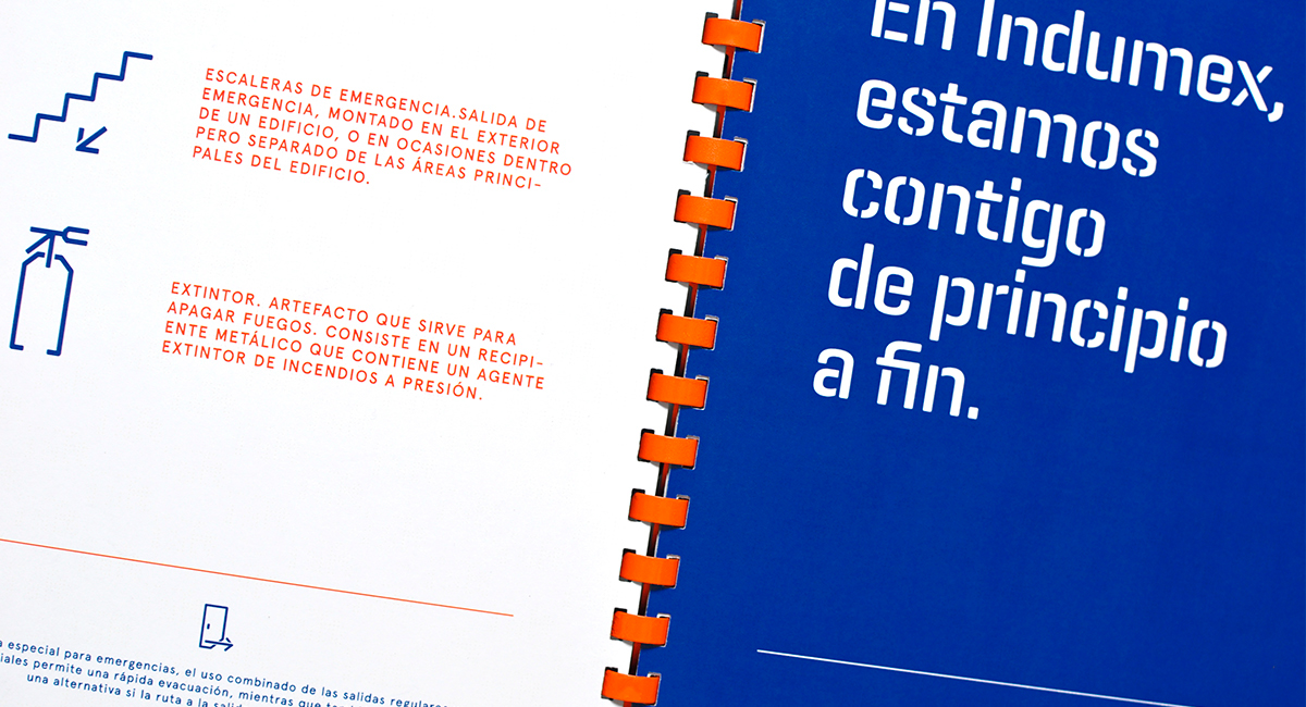
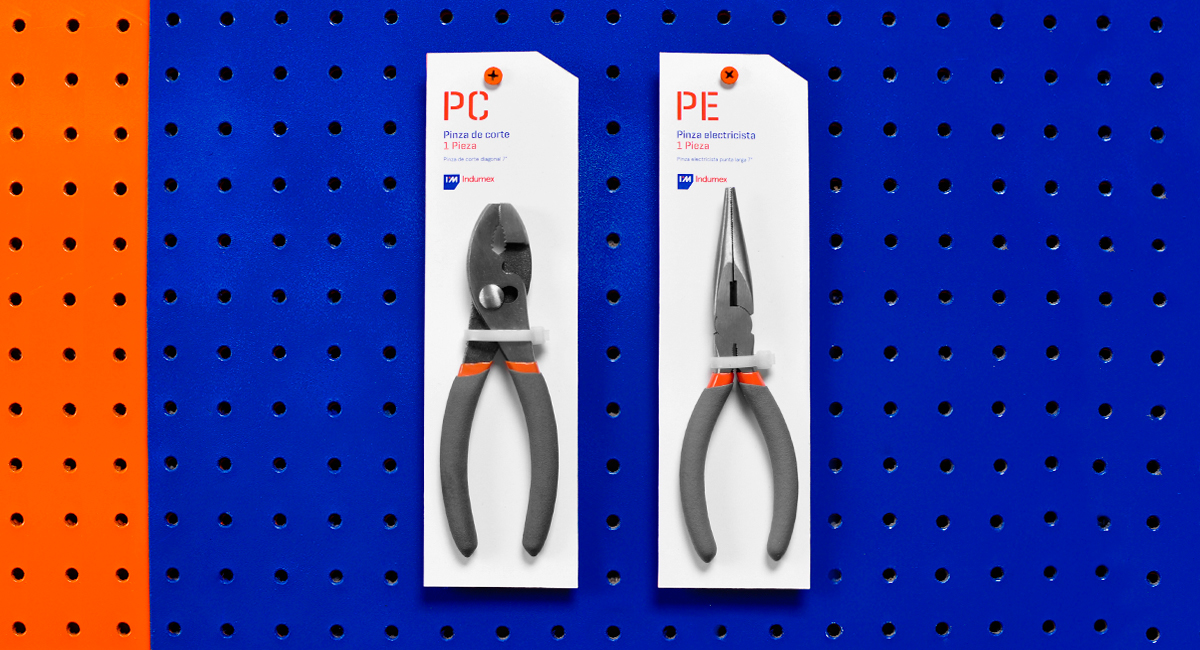
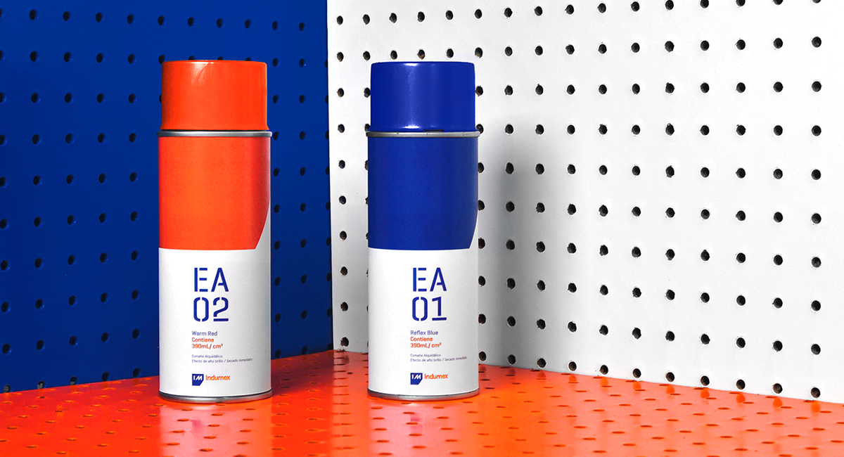
The concept was brought to life intending to portray the brand’s values - professionalism and trust. The idea was to convey expertise, without loosing approachability. The color palette intends to show contrast, emphasizing Indumex innovation in the market. Blue depicts trust, while orange shows boldness. We designed custom typography for the wordmark, and chose a straight forward typeface for other applications to depict the industrial facet of the brand.
We designed an emblem that would make reference to Indumex roots, industrial factories. The I and the M pair well in the portrayal of a factory’s ceiling, and the point in the middle tries to reflect the business ideal to become the hardware center for everything. The frame takes from the emblem and is used as a visual support throughout the collateral and publicity.