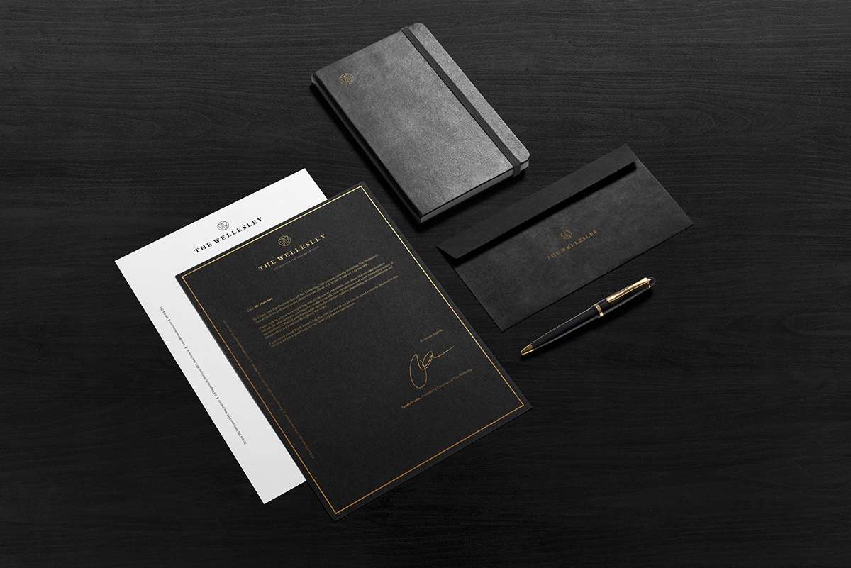
Theme: Rejuvinate not renew: ‘Replenish’
For this rebranding assignment we have focussed on keeping the heritage of the club relevant, reflecting on the importance of its history and heritage. As the club is now over a century old we believe that the design of the club should be a rejuvenation of the existing model rather than a complete renewal. We simply hope to breathe life into the Wellesley Club through a fresh and contemporary aesthetic approach, with relative heritage elements to uphold its authentic properties and maintain the history behind it .
With a 21st Century make-over our objective is to raise the standard and prestige of the club. We want to make it relevant to the wider Wellington business community, extend out to hotel patrons and also younger generations of businessmen who are unaware of its existence. We believe it is important to reconnect all aspects of the building as they could benefit from each other.
As with most major brands we are able to see that ’sim-plicity’ and authenticy has become key to having a successful brand identity in this current time; starting with all relevant elements and slowly deducting the unnecessary to provide the cleanest and most effective brand identity.
To achieve this we want to create an effective andcrisp and uncluttered logo; a logo that is easily recognised and will over time become a symbol thatinsinuates prestige. This will be reflected through a suitable colour choice and the simple elegance of the supporting graphic design elements.