–––––
CLIENT
CVS Pharmacy
STUDIO
Dragon Rouge
–––––
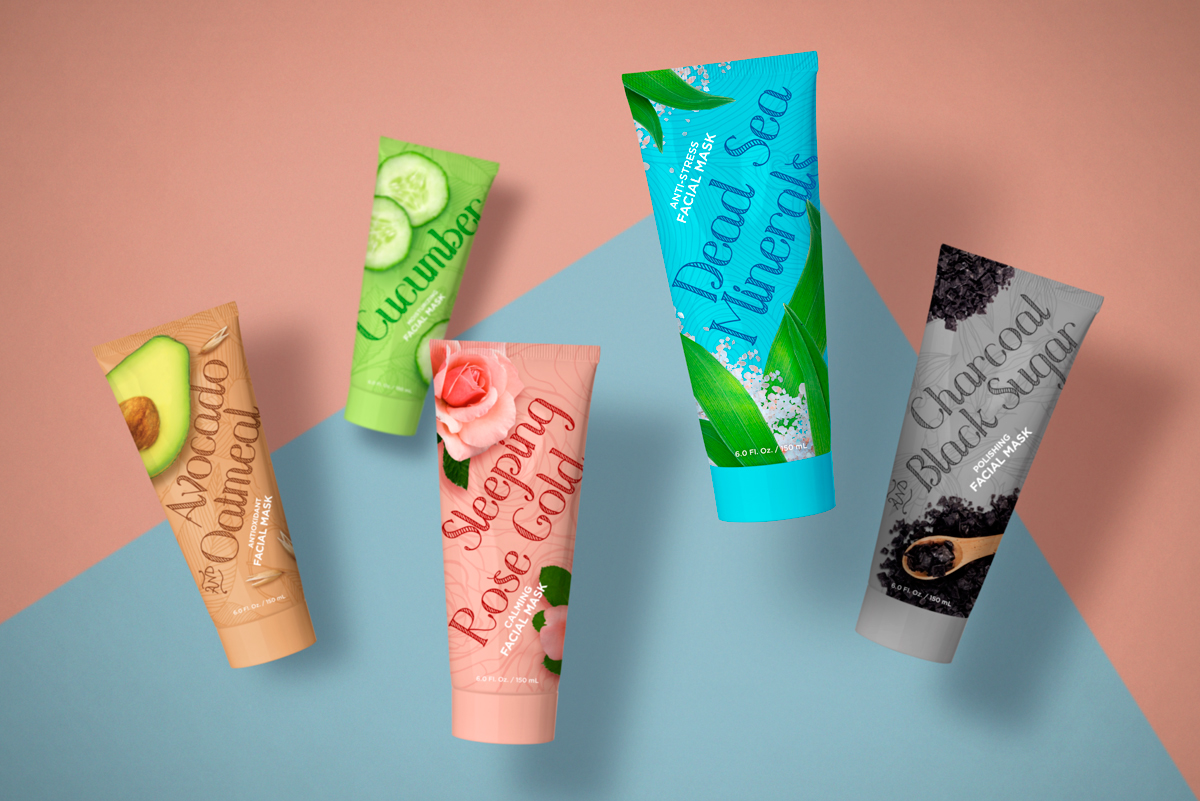
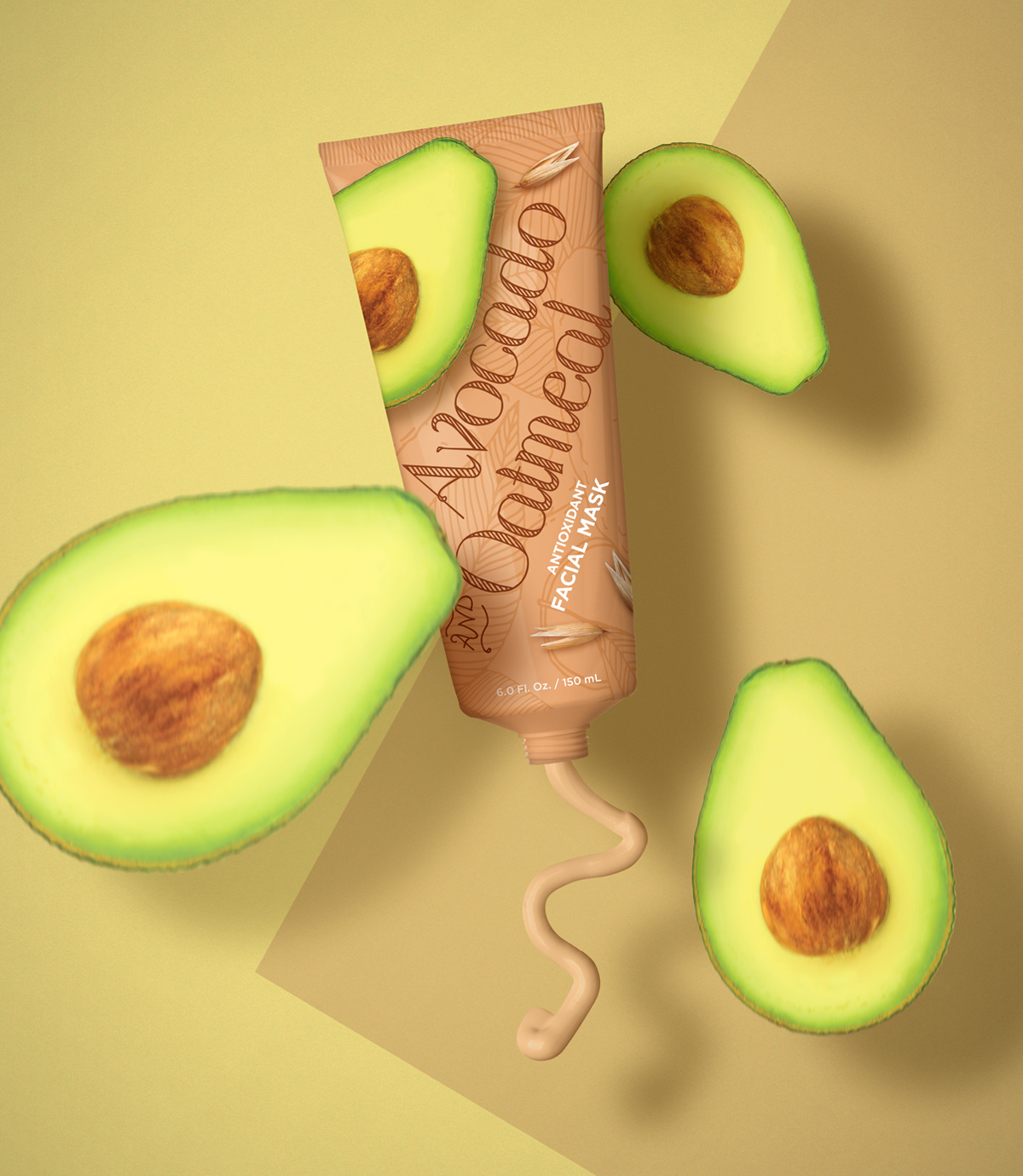
CVS Pharmacy asked Dragon Rouge to develop packaging for a new line of facial
masks. They were looking to create a brand that felt unpretentious and fun with a strong
ingredient and sensorial focus.
A lively color palette gives the line a cheerful quality and helps differentiate the
products by reinforcing their primary ingredients. Large and playful type with a hand-drawn
look adds playfulness and approachability which pairs well with the background patterns
that give a sense of energy and naturality. Ingredient depictions are large and graphic,
bleeding and cropping to create lively layouts that interact with the type
and patterns in dynamic ways.