


Targets
— Increase awareness of the Tunø festival and Tunø in general
— Make more families interested in the island
— Become more co2 neutral
— Using local produce wherever possible
— Create small income opportunities on the island
Strategy
— Synergy with the Tunø associations targets
— Dare to be creative pioneer
— Don’t let traditions limit, but the development must be credible
— Optimization and alternative solutions
— Exploit the island’s resources (Develop resource bank)
Set of values
— Quality over quantity
— Simple and manageable
— Natural and authentic
— Local and sustainable
— A joint project
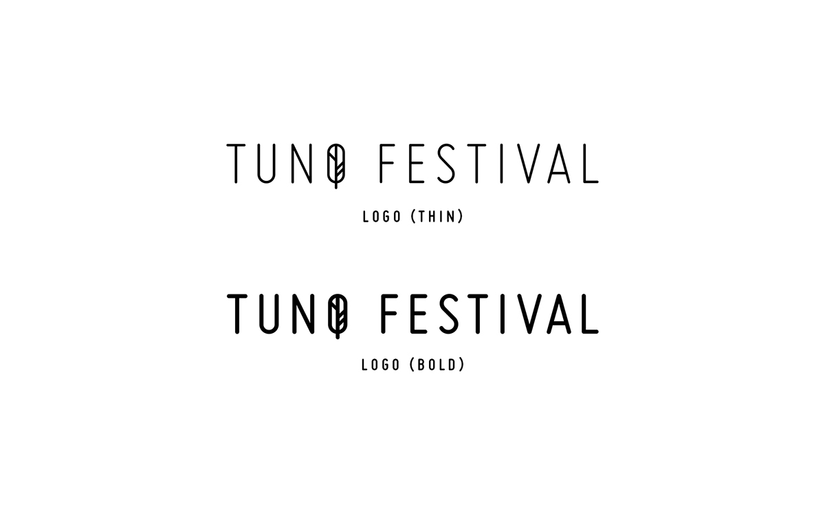
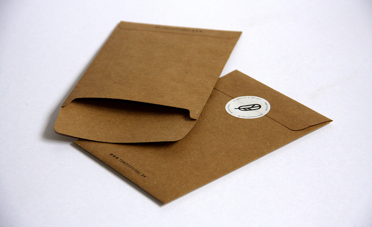
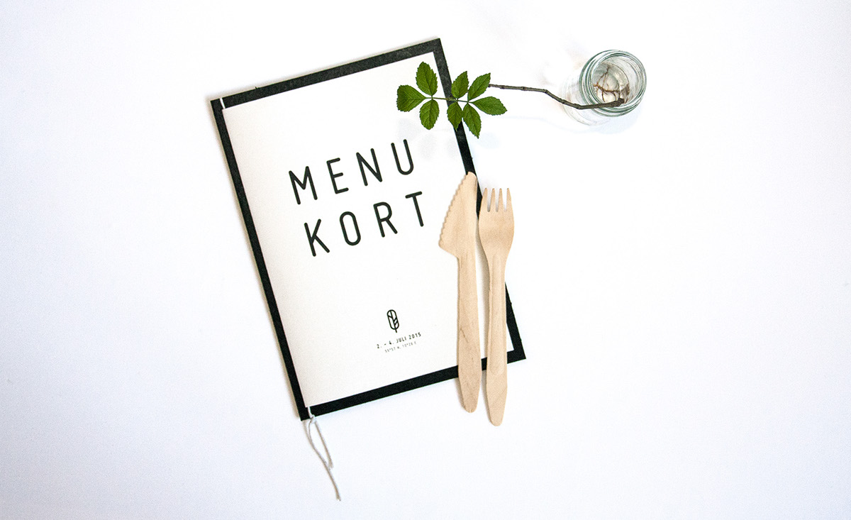
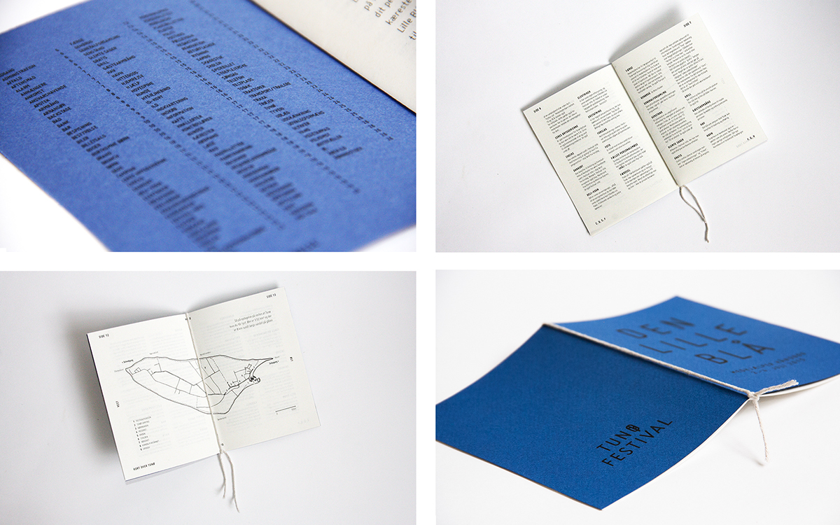
Logo
Simplification of their current seagull logo. This symbol will provide
a greater reference, and refers to the festival’s vision rather than a family festival.
And at the same time retaining the reference to the seagull.
Typography
Miso is Designed by Mårten Nettelbladt in 2006.
It’s a condensed font with a friendly yet sophisticated feel.
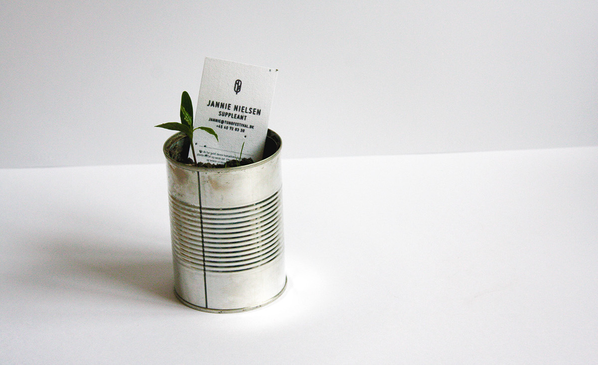
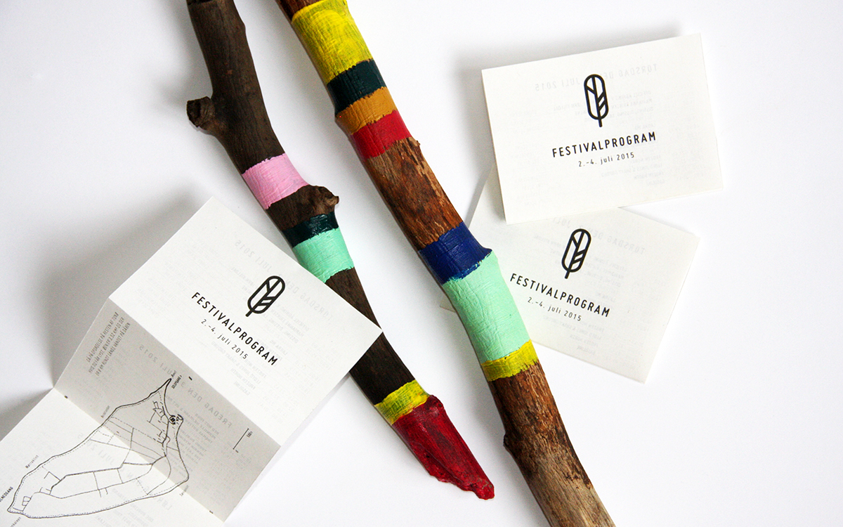
Business cards
The business cards are printed on paper with flower seeds in it.
The paper can be planted and flowers will grow. The business cards
refers to the festival’s green profile, while giving something extra
to the person receiving it.
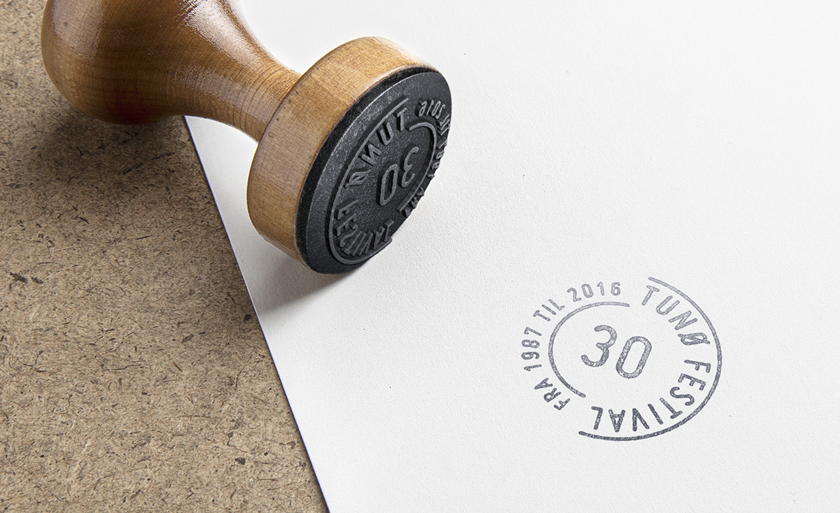
Income opportunities
As much as possible of the festival material should be printed low-practice
on the island’s internet café where the local newspaper is produced,
to create income opportunities on the island.
...


