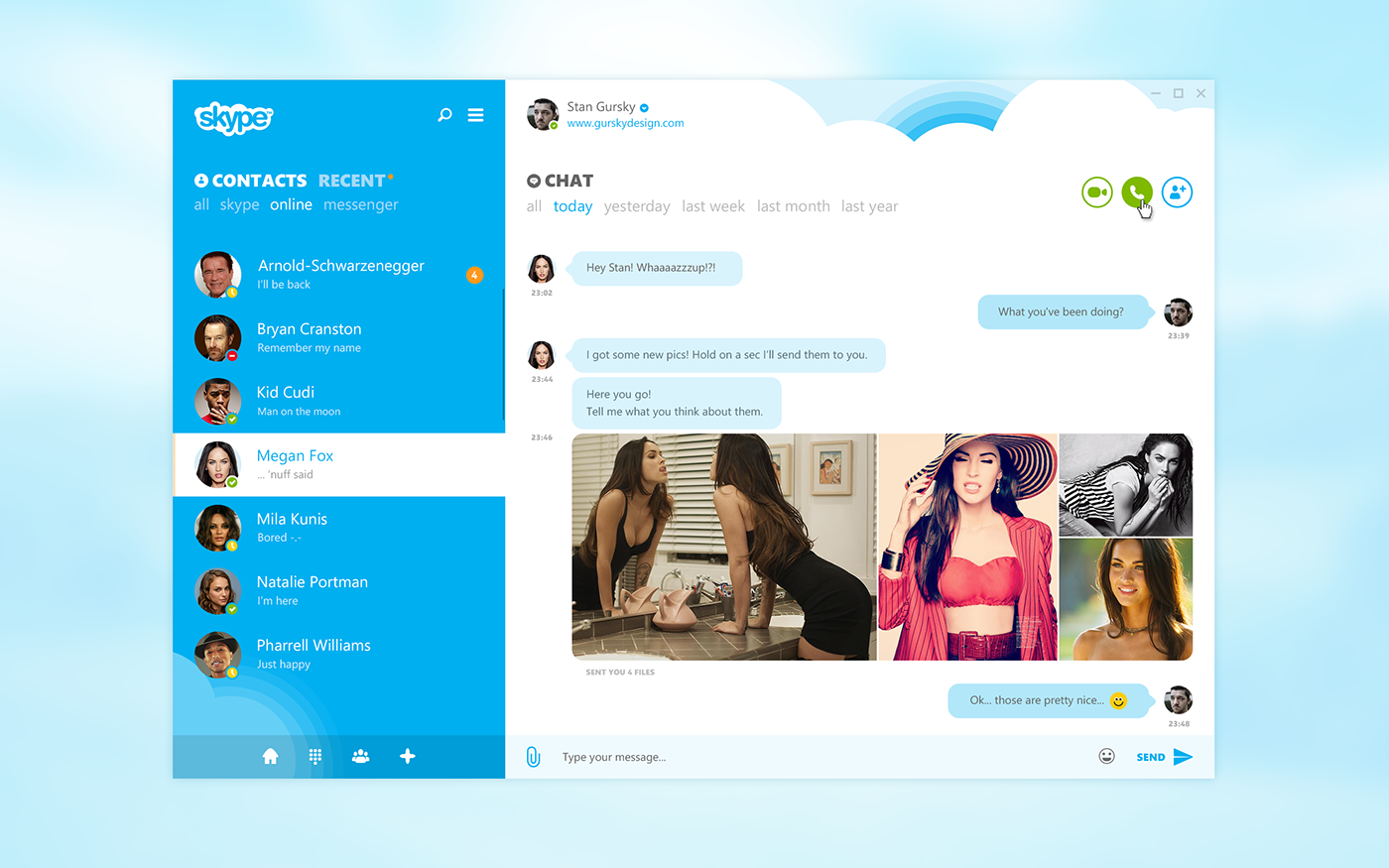
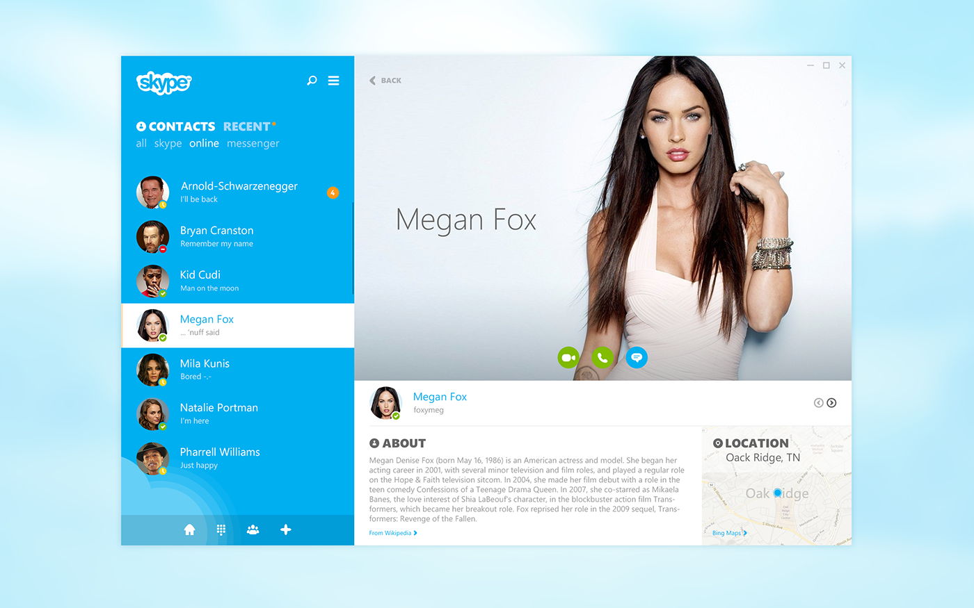
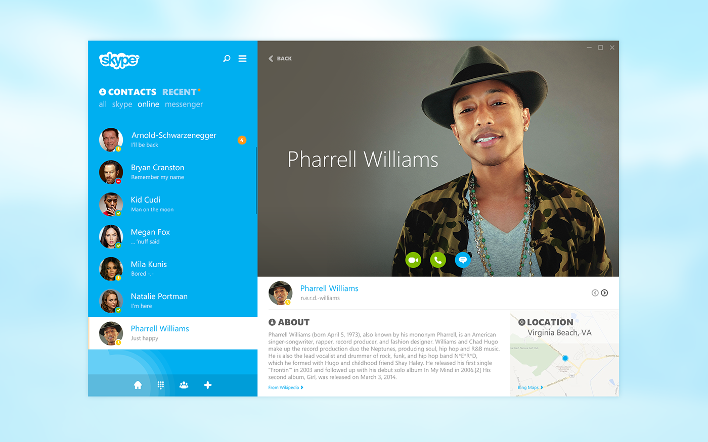
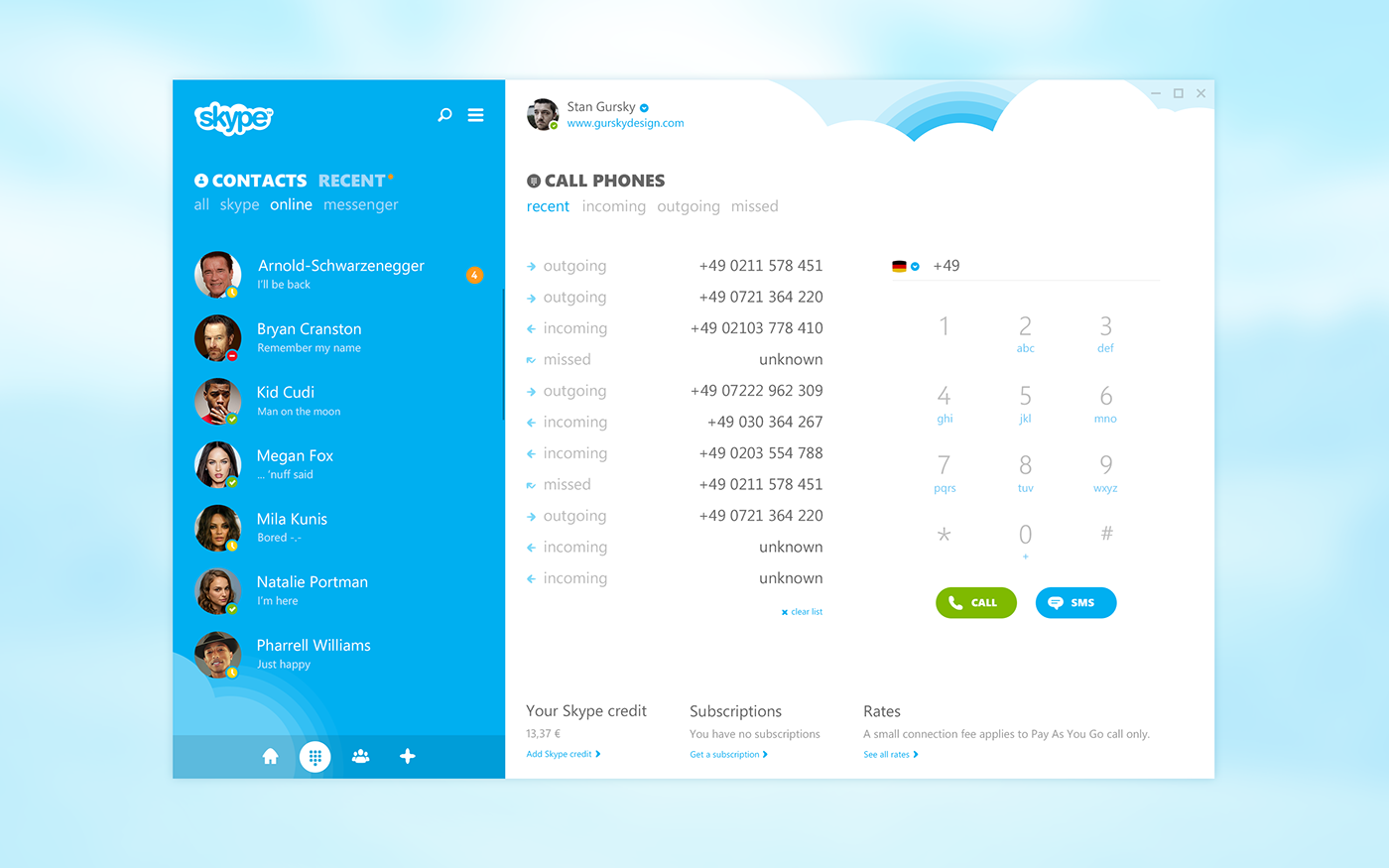
It's been a little bit over two years since I posted my Skype concept. So as I got a few free hours this week, I thought to revisit the redesign and put on some fresh 2015 paint on it. I was also pretty curious to see and explore how my design preferences changed and how I would make some things different this time around.
As much as I like Skype, I think that the app (at least on Windows) still doesn't reach its full potential and misses the opportunity to really stand out in the crowded messaging market. The new and updated design is rather nice but still pretty bleak and washed out (colors-wise). So I made a version with bold colors, less clutter, better contrast and just an altogether fresher and modern version.