Custom typeface design is the crowning distinction in brand identity design. Unique typography, designed and set aside for a specific brand name, is a clear and emotive way to create brand awareness and connection. Whether it is a tailored logotype designed (with care) or a complete alphabet to typeset a headline, custom typography is invaluable for brand recognition and customer relation.
Here is a selection of unique and custom typeface design.
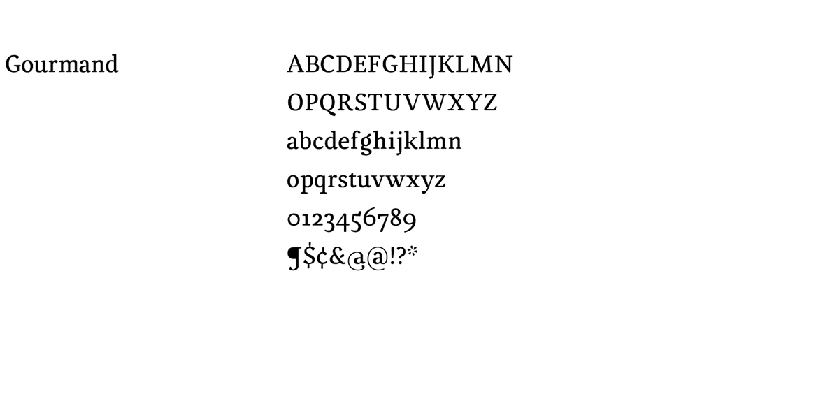
Gourmand was commissioned as a text face for a high-end food and beverage platform. With rounded corners and strokes that swell, Gourmand carries a certain savory quality that communicates connoisseurship and good taste.
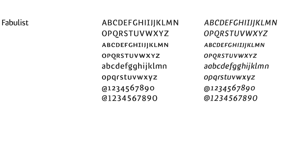
Fabulist is a spurless sans designed for corporate typography. The letterforms and simple and understated while still carrying personality and uniqueness. Its open apertures and low contrast allow for simple typesetting across print and web media while a robust character set enables professional typesetting using OpenType features when possible.
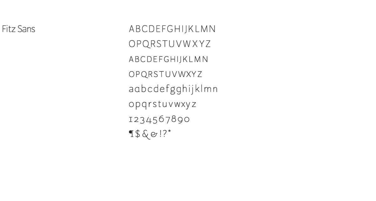
Fitz Sans is a sans serif font with a single stroke weight, generous x-height and a wide character base. Fitz was designed with multiple OpenType features: standard and discretionary ligatures, contextual alternates, stylistic alternates, and an array of figure positions.
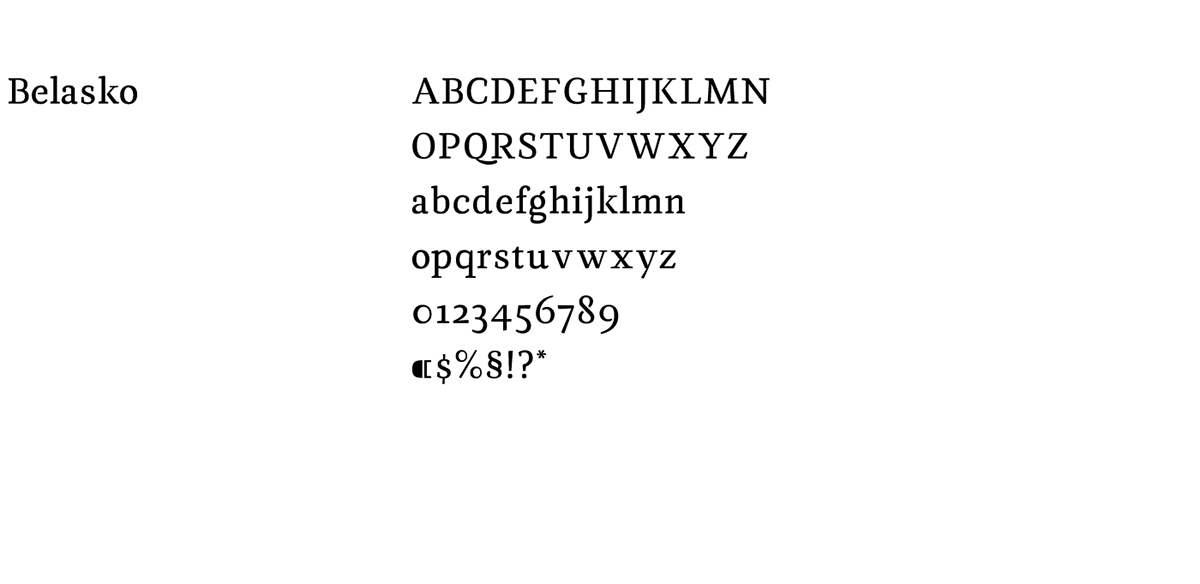
Belasko is a typeface optimised for continuous texts printed on paper, preferably book settings. Belasko is intended for 9–12 points.
The name is derived from the Spanish Baroque painter, Diego Velázquez. Velasco (also Belasko) is a Spanish family name. The typographic style is influenced by Velázquez’s tenebrism and Spanish Baroque oil paintings.
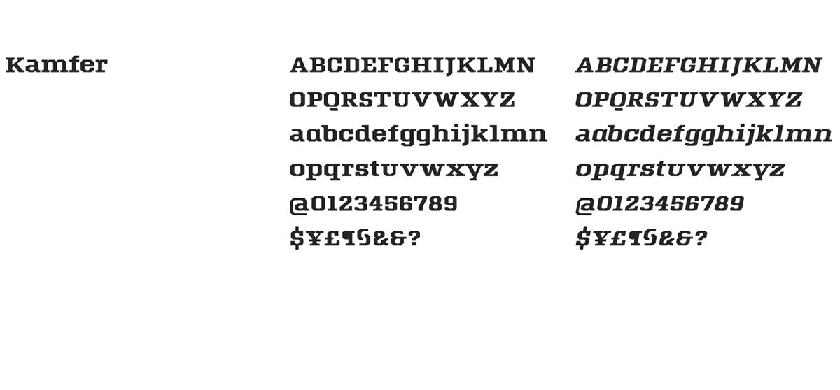
Kamfer is a chiseled face built for headlines. The letterforms are based on industrial-era rigidity and beveled edges. Kamfer is confident but not too formal with its easygoing contrast and relaxed proportions.
Kamfer was designed in two families: slab and sans; with two styles each: roman and oblique.

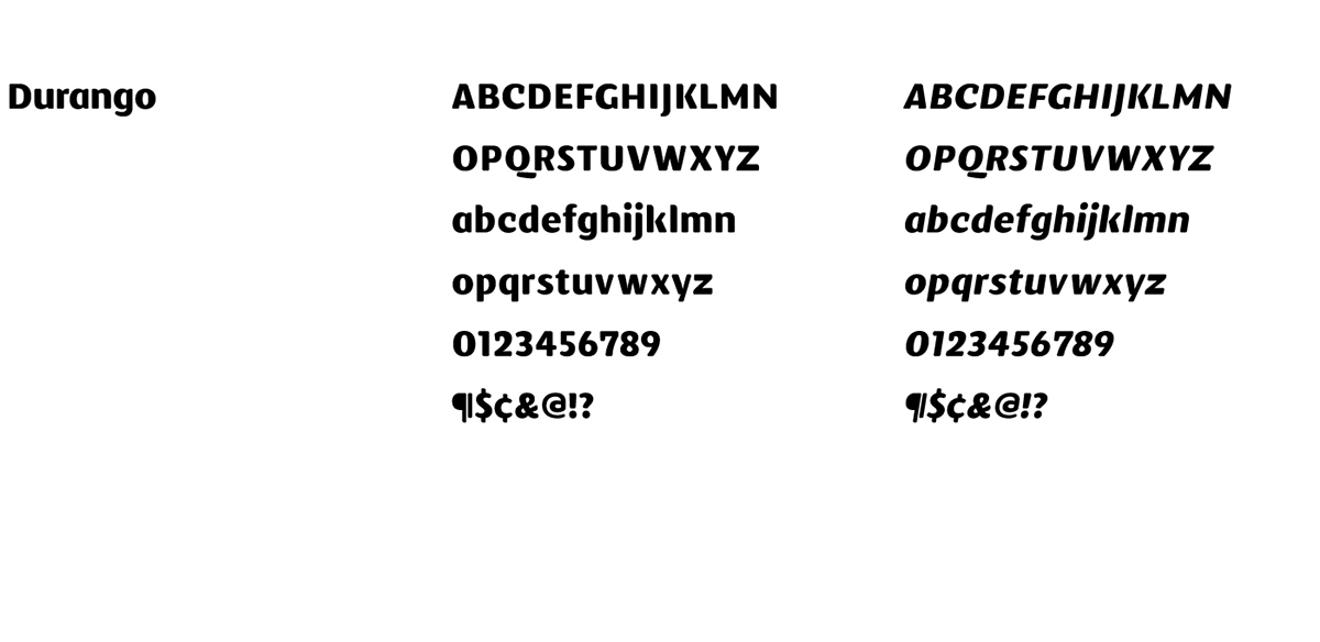
Durango is a humanist face, with geometric roots, designed for headlines. With medium contrast it calls attention to itself with a warm tone. Its uncommon but familiar letterforms are subtle and simple.
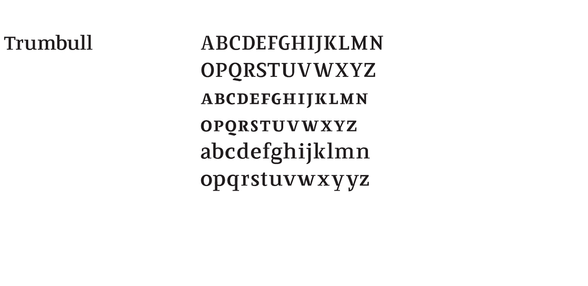
Trumbull is a contemporary American Didone. Its medium-high contrast pulls influence from Didot and Bodoni. However it is named after John Trumbull, an American historical painter, responsible for the iconic Declaration of Independence (1817), used on the backside of the two-dollar bill.