@36daysoftype
—
Is a project that invites designers, illustrators and
graphic artists to give their particular view on
the signs from our alphabet.
—
Is a project that invites designers, illustrators and
graphic artists to give their particular view on
the signs from our alphabet.
My personal approach was to challenge myself
and show to everybody that in lettering and
typography as image everythig is possible.
and show to everybody that in lettering and
typography as image everythig is possible.
This 2015, in the second edition of #36daysoftype
I decided to participate creating the complete
alphabet and the endless possibilities of creation,
using different materials and tools and letterforms.
I decided to participate creating the complete
alphabet and the endless possibilities of creation,
using different materials and tools and letterforms.
—
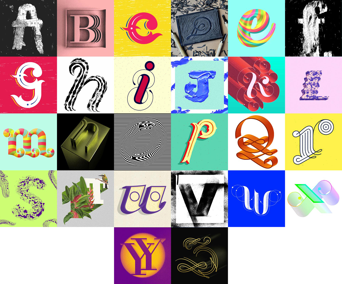
Alphabet
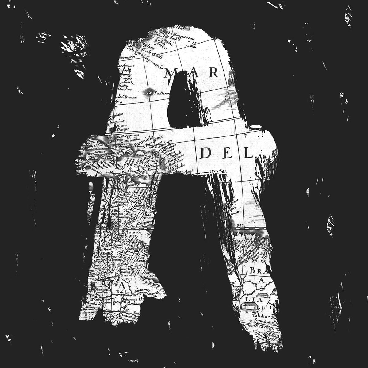
"A" Inspired by the America's conquering
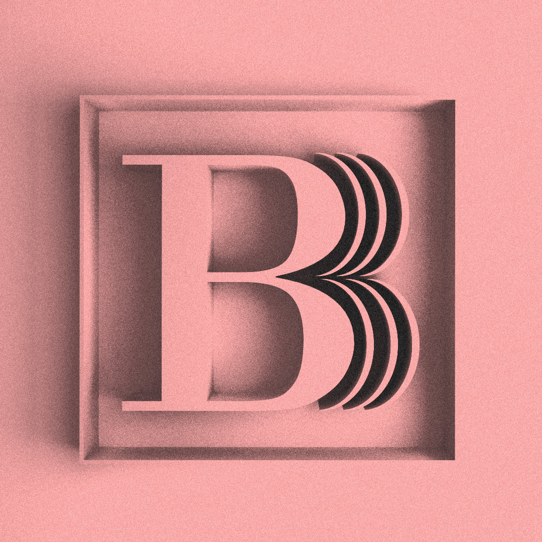
"B" Monogram for playwright Bertolt Brecht
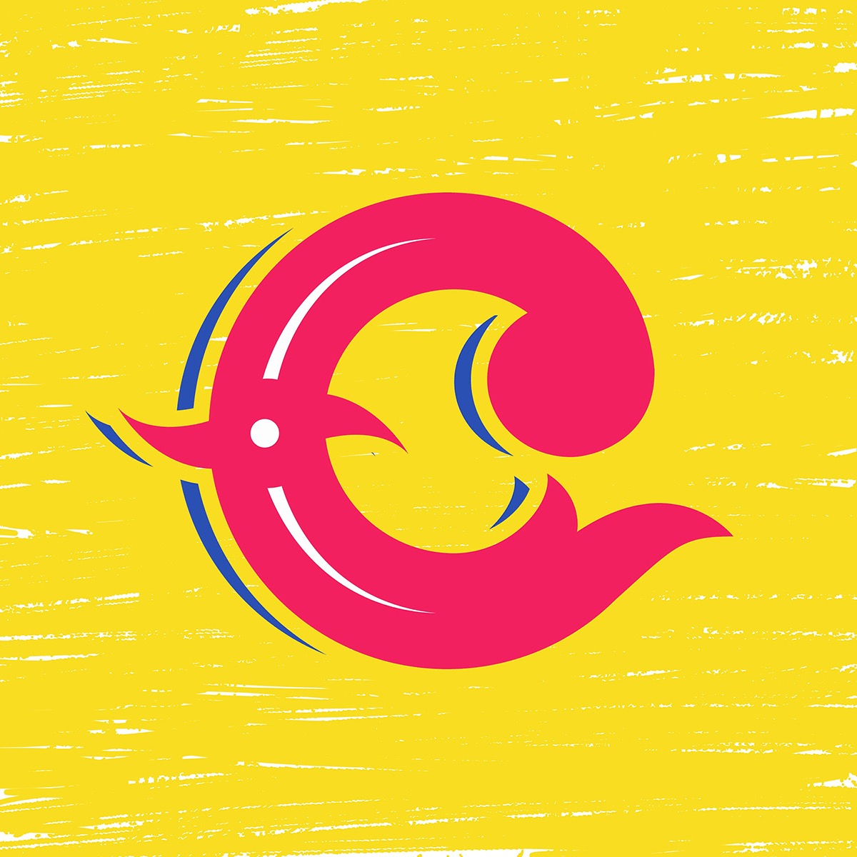
"C" Un corazón for Lantinoamérica (A heart for Latin America)
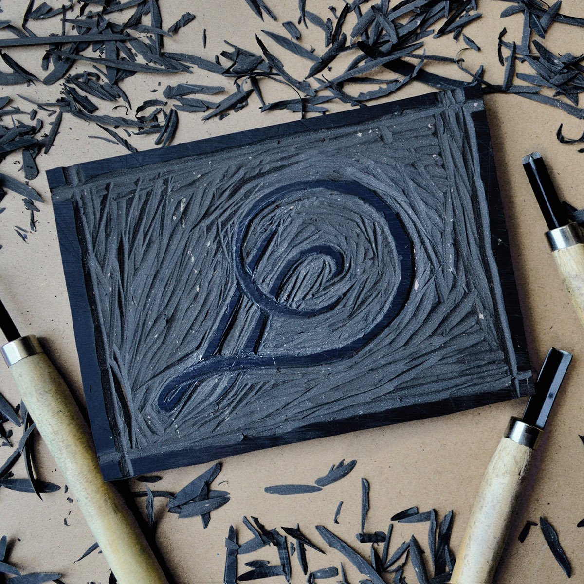
"D" Linocut
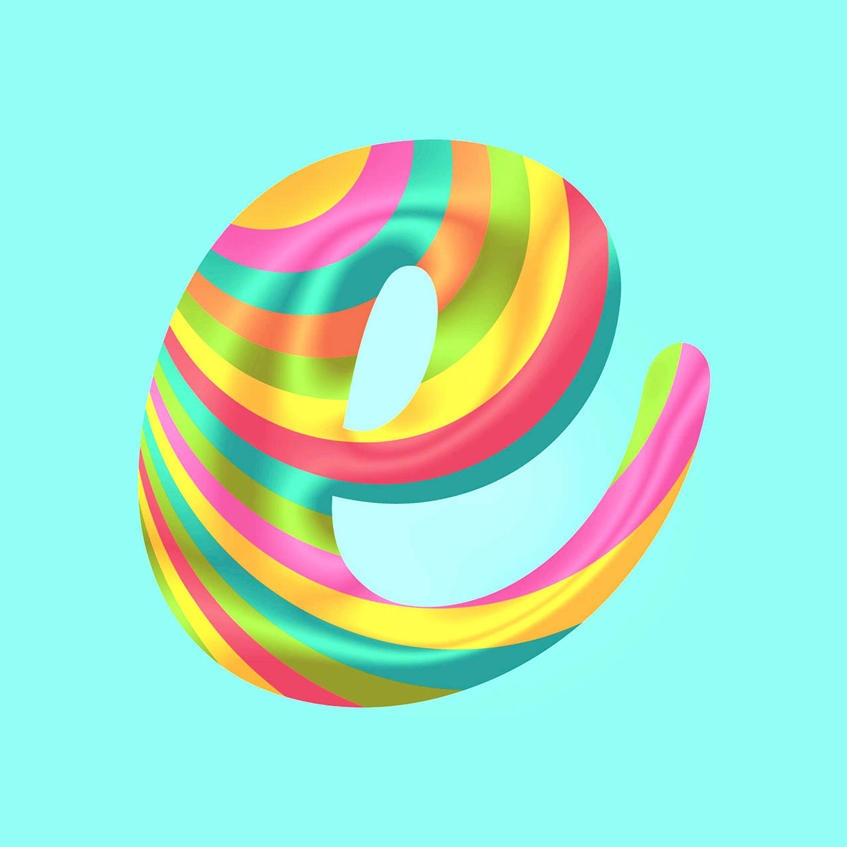
"E" Psycho Candy
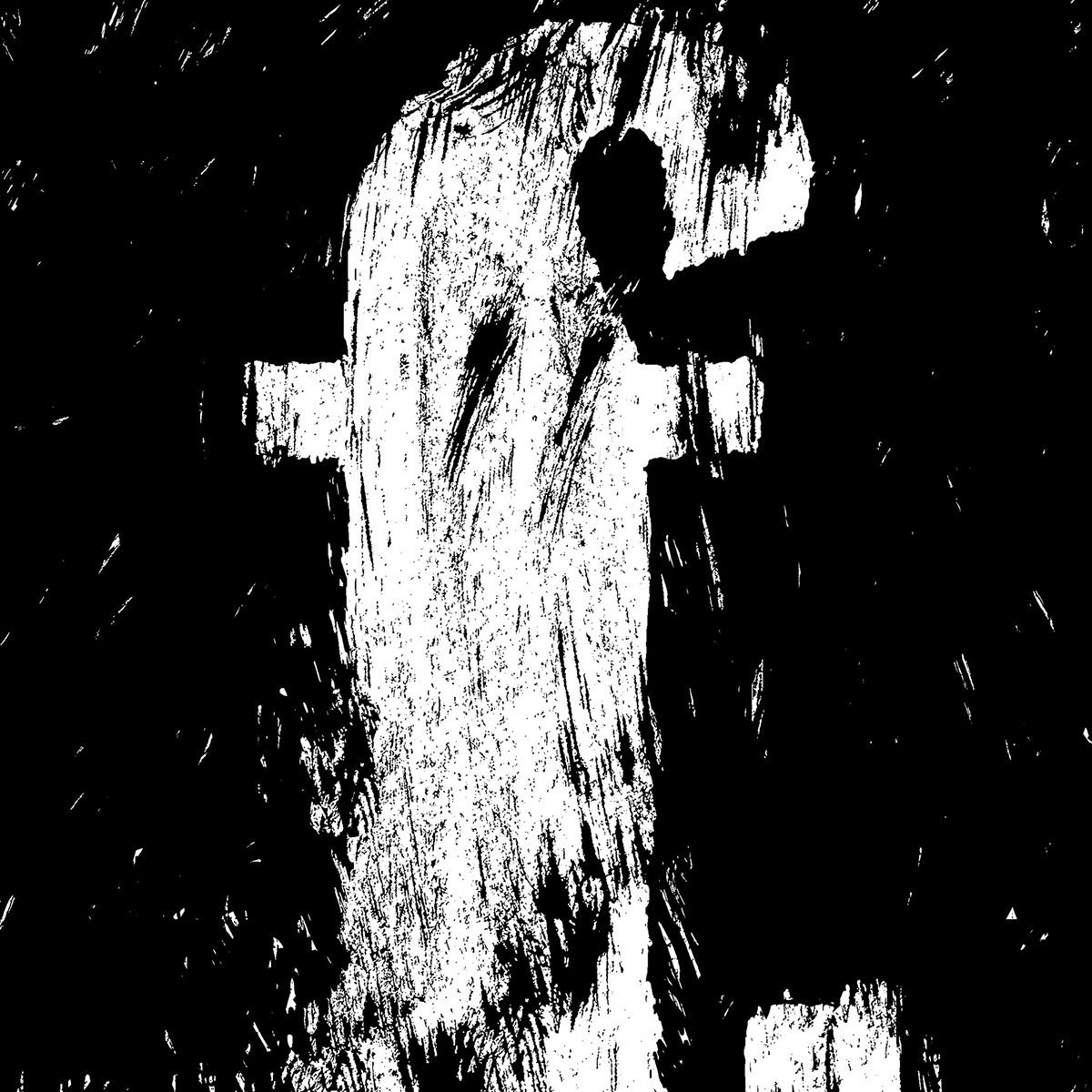
"F" Violent and Raw
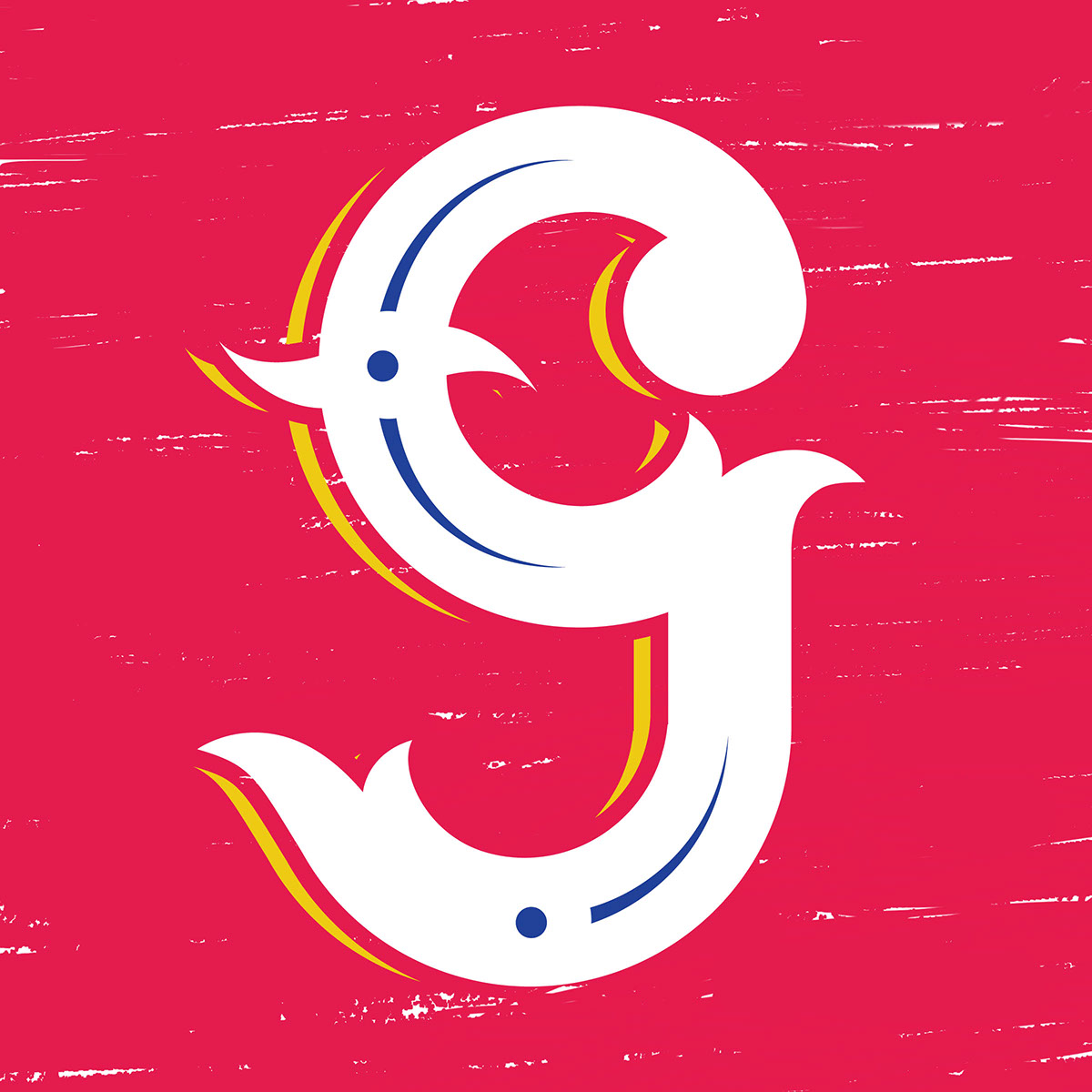
"G" for "gráfica popular" of Latin America
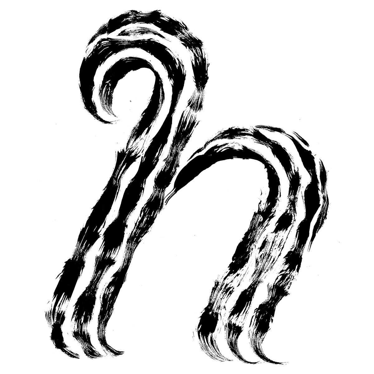
"H" Hairy tied

"I" Monogram for myself
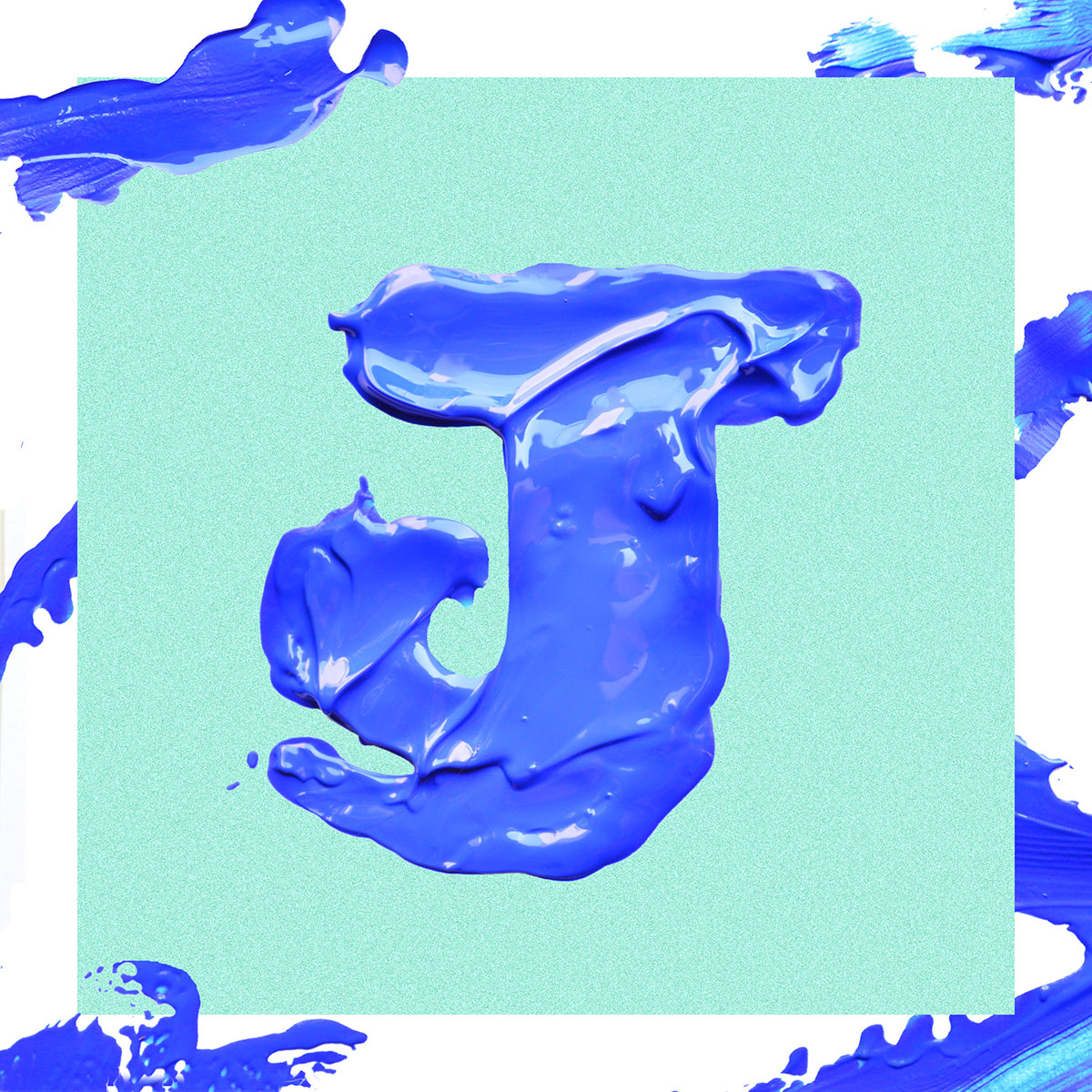
"J" for Javiera Mena's music
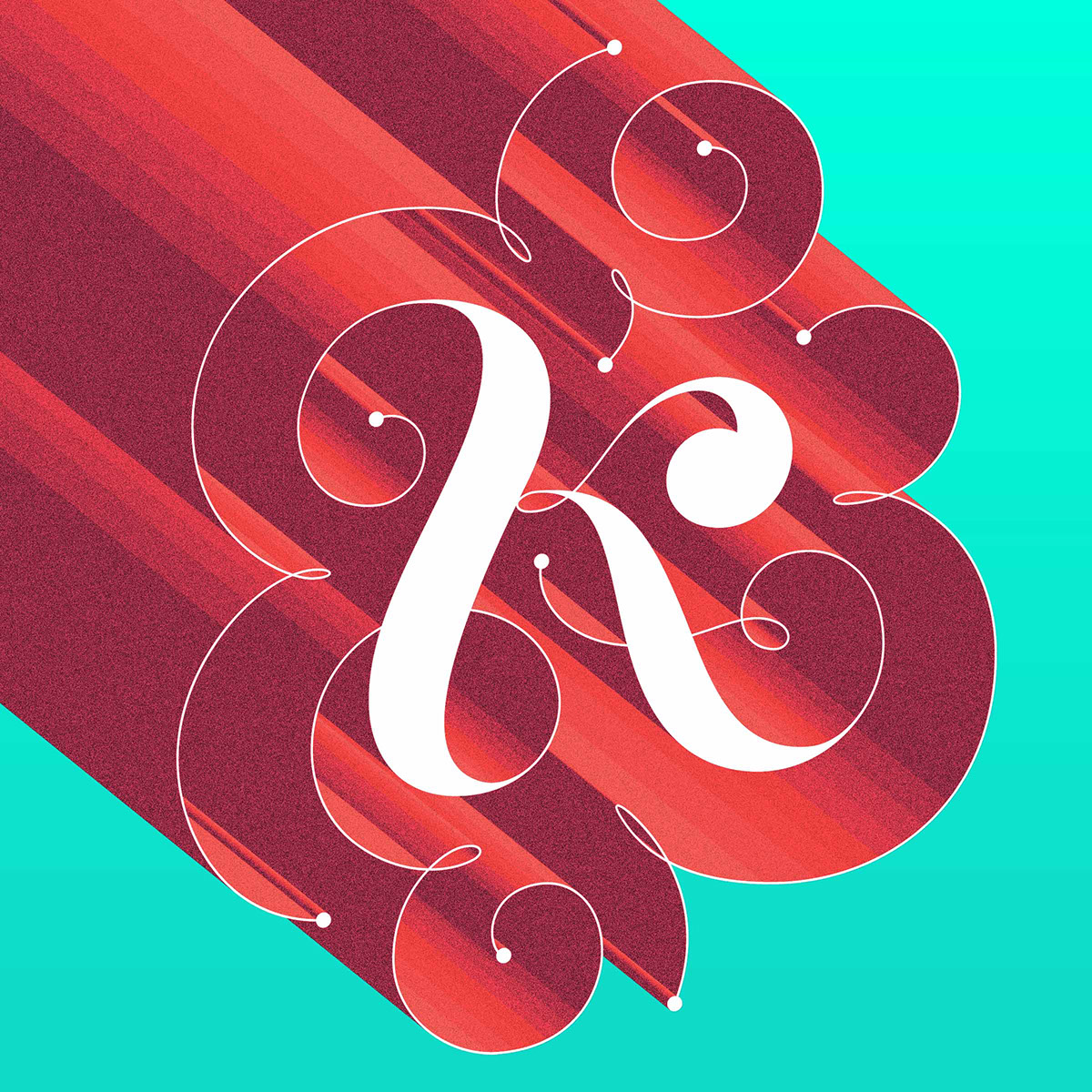
"K" as a woman
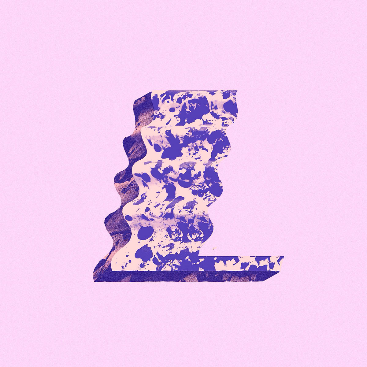
"L" Inspiration, music and magic.

"M" Psycho candy #2
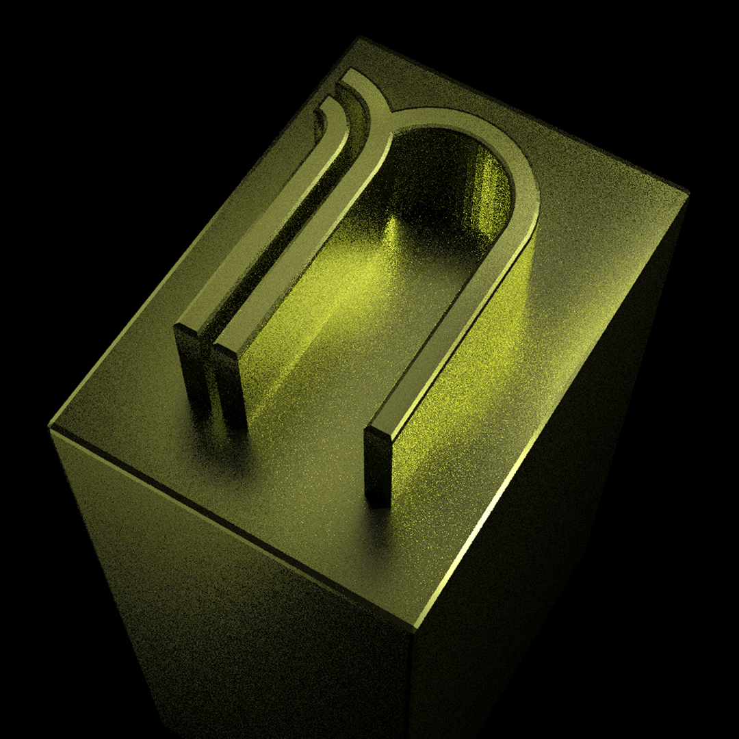
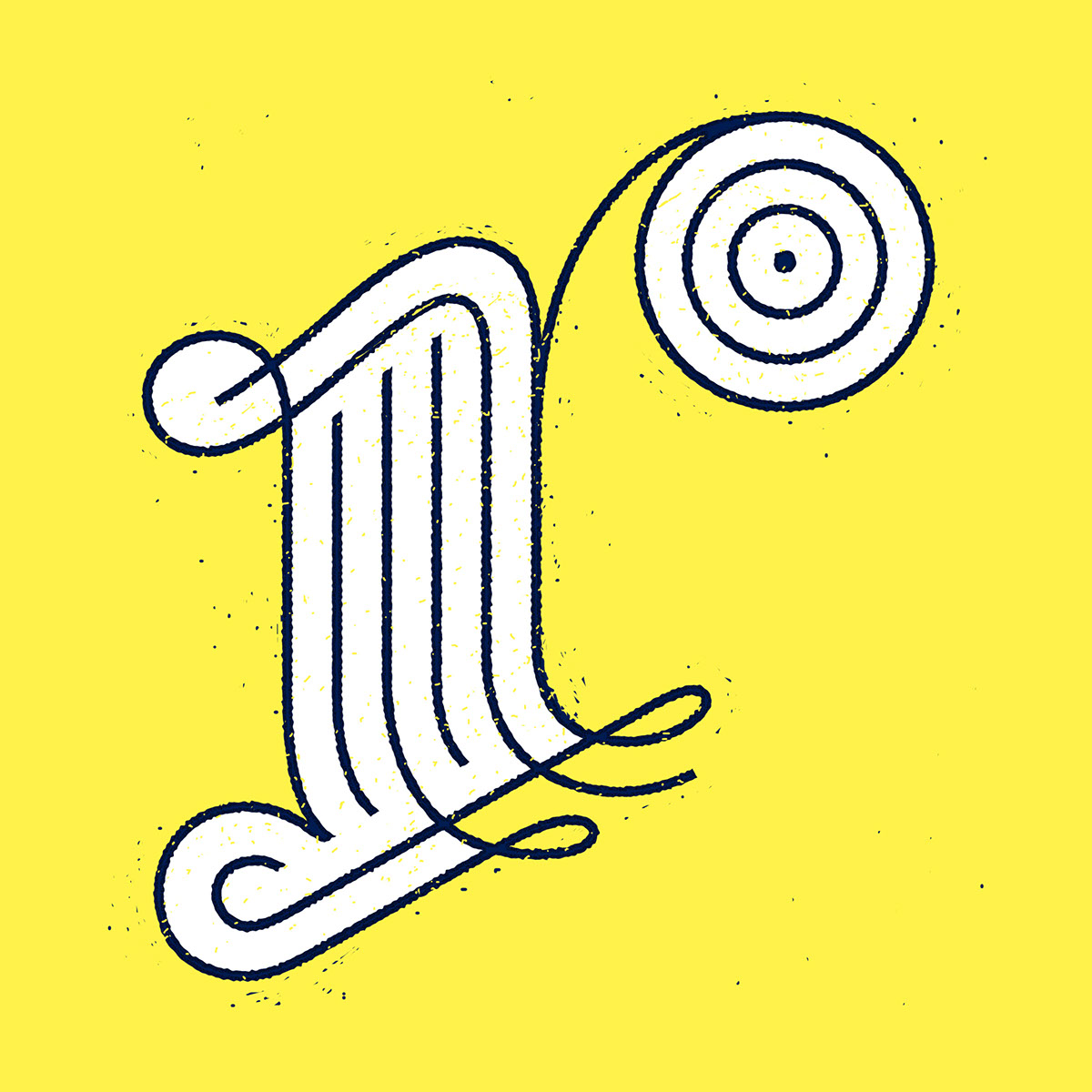
"N" for a typeface I designed: Neo 20
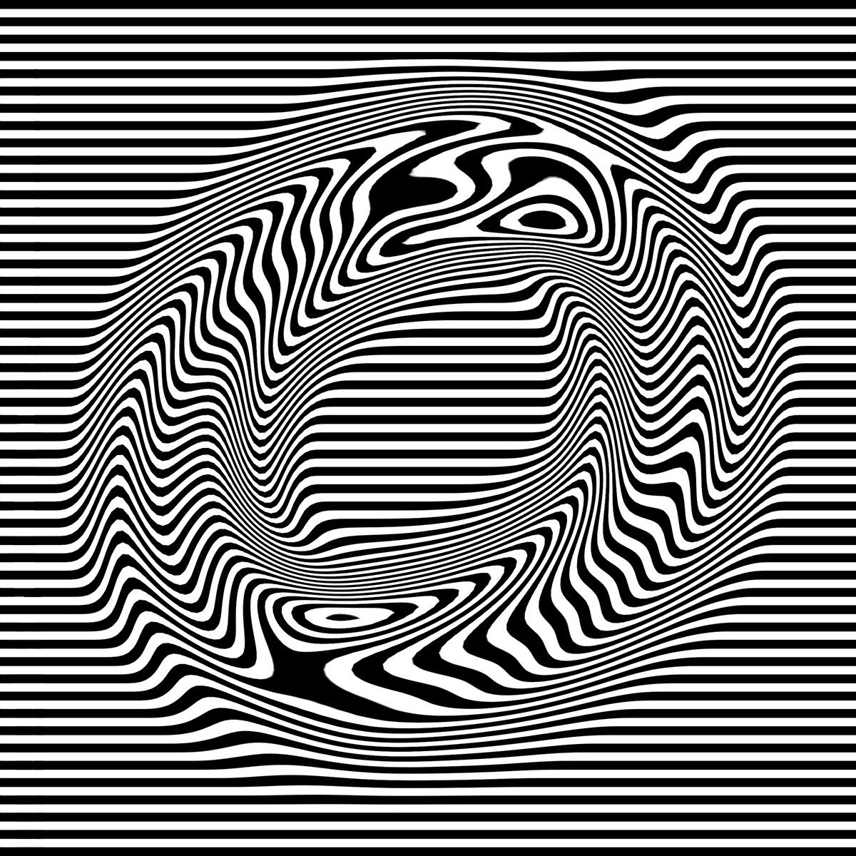
"O" Optical illusion

"P" Popular as the "gráfica popular"
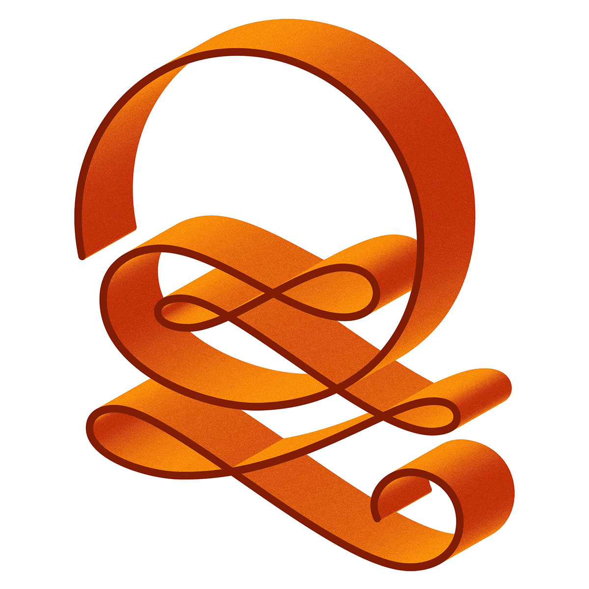
"Q" ribbons
"R" remember the history

"S" Virus

"T" Torogoz (National bird of El Salvador)

"U" Grapes and cream

"V" Graffiti vandals
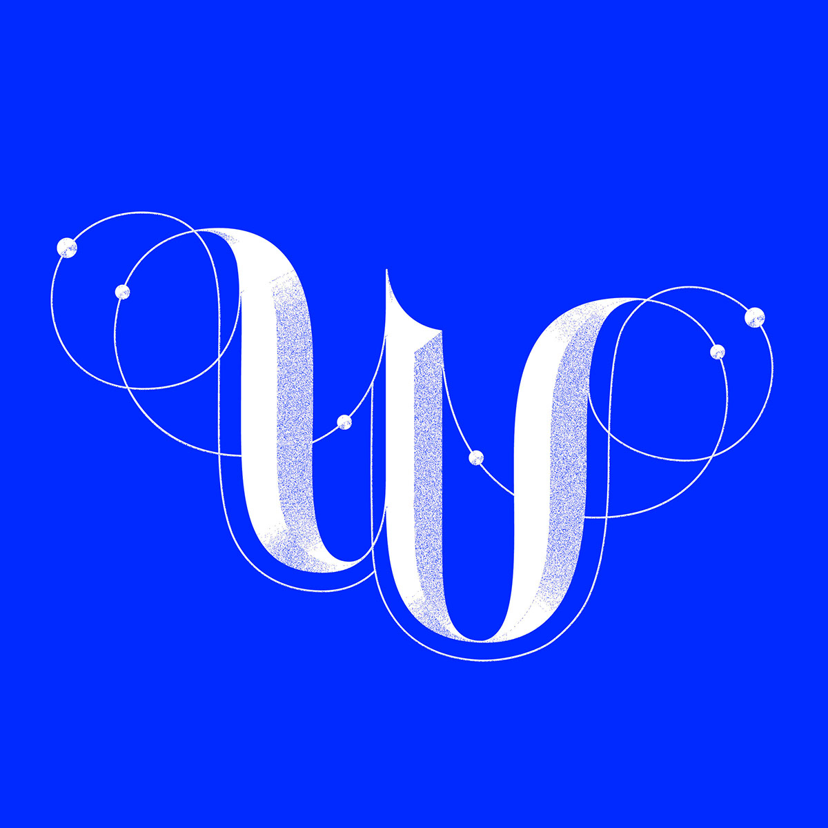
"W" Crystal blue
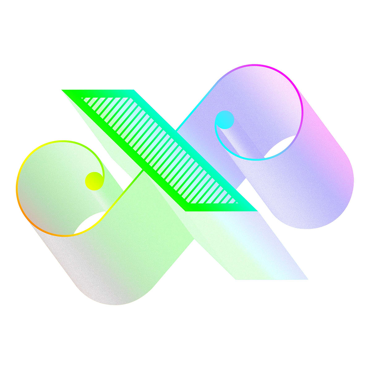
"X" X-pectrum

"Y" Monogram for playwirght Ben Yeoh
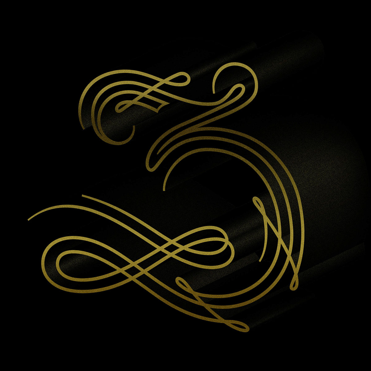
"Z" Three-lined
"Stay close to detail, but don't forget the everything"
Instagram: @ivan7castro
Special thanks to @36daysoftype for being an awesome project that motivates, inspires and pushes a lot of people in the design world, and for all the people that supported me through this challenge. It was awesome!
thanks for watching!