Wings.
Charity fund
Charity fund «Wings» carries out educations and game projects, modelling real life situations and helping residents of orphanages to socially adapt after the graduation. Over 200 kids from 8 orphanages-boarding schools of Moscow and Tver regions participate in fund’s projects. The agency had a task to create a modern charity brand and its design identity to support and strengthen the image of the Fund and communication with outer and inner audience.


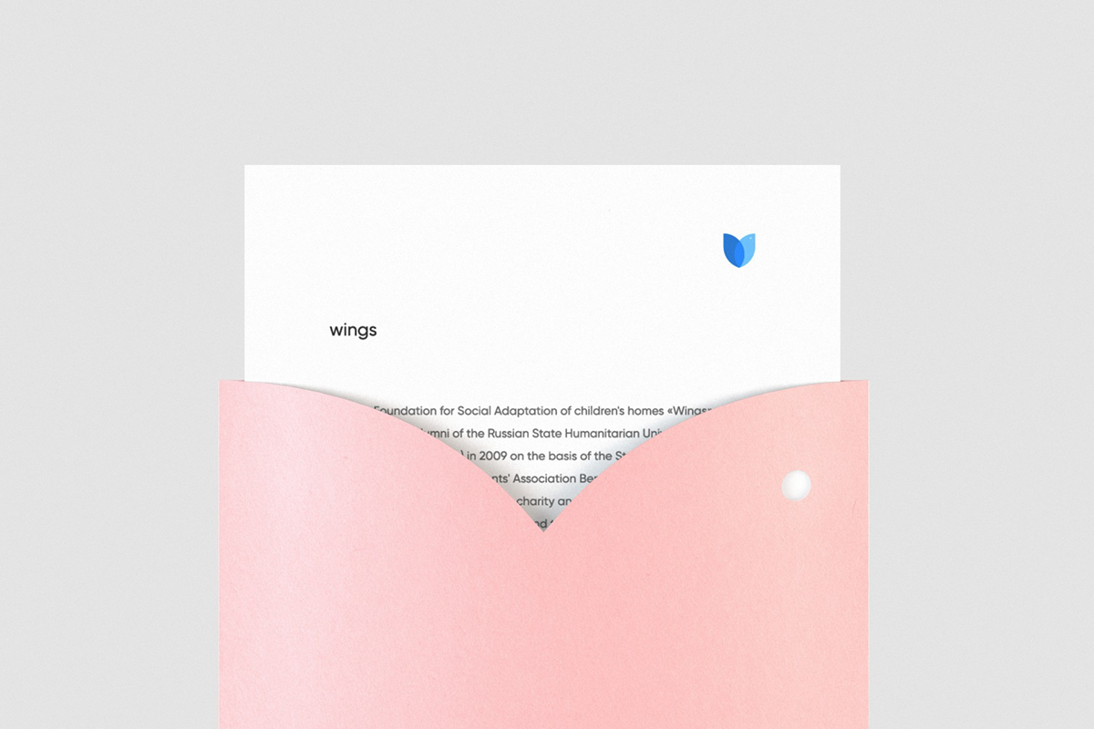
The team was faced with a difficult task of creating a symbol, clear and understandable for several generations. The meaning of symbols was also an important issue. After all, the sign turned out to be abstract, but managed to reflect main values of the Fund: a bird became a symbol for freedom, a flower embodies the process of growing up, a heart — love and care, and a shield — support and protection.


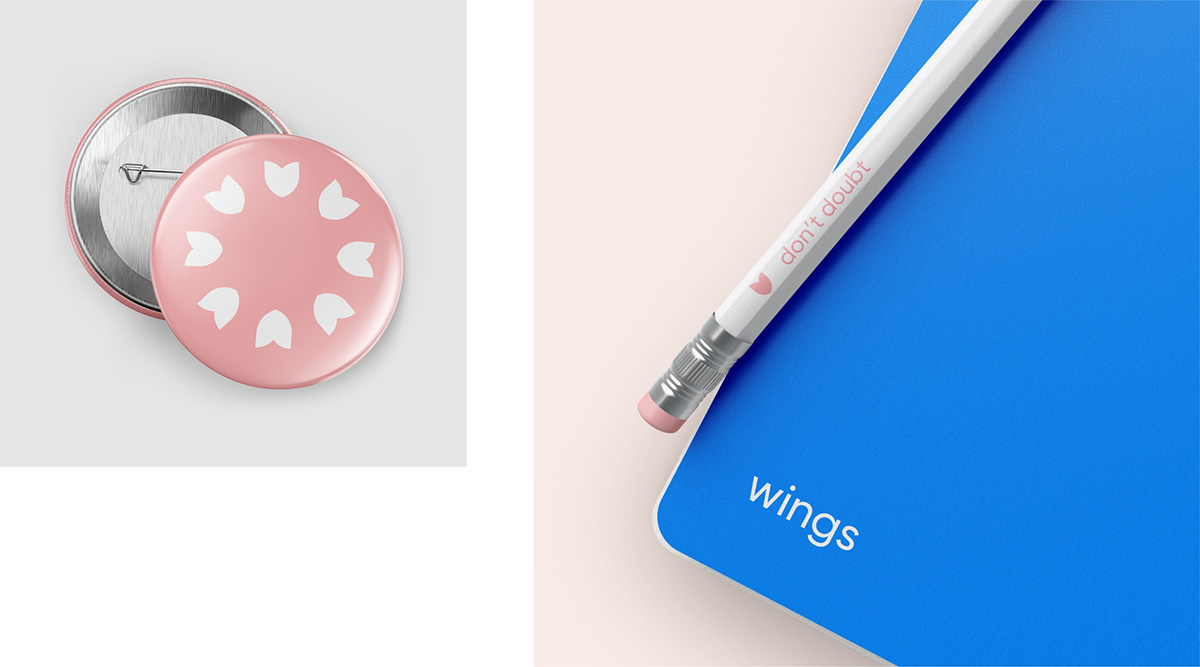
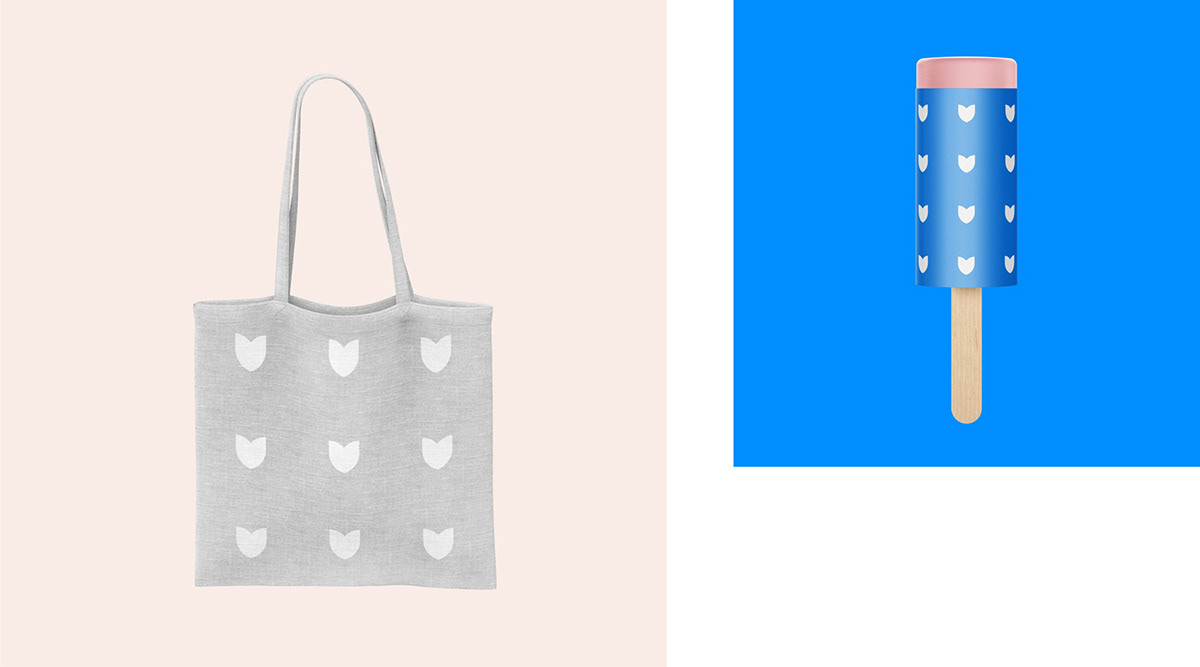
A pattern that reminds of a flock of birds or a flower field, was designed specially for souvenir and advertising items. The renewed symbolics brought lightness and openness to the Fund’s brand image, which is important when working with kids.


—
Creative Director Vitaly Afanasiev
Design Director Vladimir Isaev
Art Director Evgenia Abramova