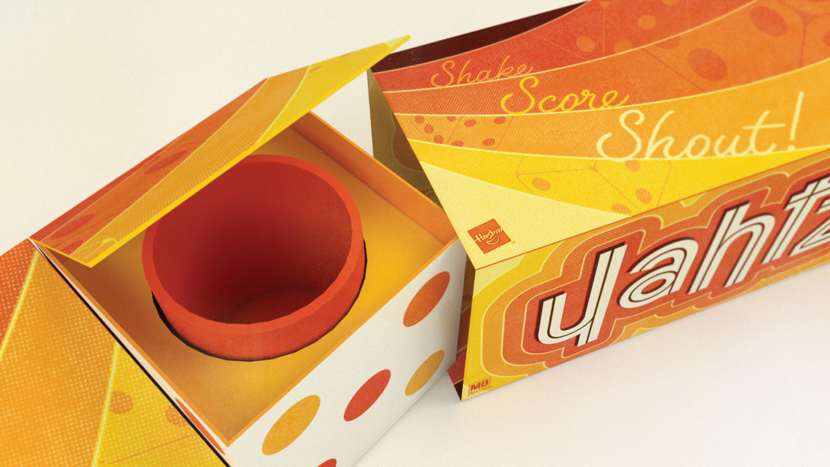
Shake. Shout. SCORE!
One of my most distinct childhood memories is sitting Indian-style on my grandparents' living room carpet, knees nudged up against a game board the morning after Thanksgiving or Christmas. However, our faces that once played and joked together are now hypnotized by the Almighty Screen, robbed blind of life-giving human interactions such as these.
The aim of this Hasbro re-brands is to pay homage to these family past times while enriching the tactile experience. Bold, flat color was paired with simple yet engaging graphical elements to create a retro vibe that stands out among a sea of gradient-laden modern game packaging. In addition, the unique interior tray concepts for both games make for a fun un-boxing experience as well as all but annihilate organizational headaches.
The aim of this Hasbro re-brands is to pay homage to these family past times while enriching the tactile experience. Bold, flat color was paired with simple yet engaging graphical elements to create a retro vibe that stands out among a sea of gradient-laden modern game packaging. In addition, the unique interior tray concepts for both games make for a fun un-boxing experience as well as all but annihilate organizational headaches.


Thanks for playing!