[EN] Last December we were commissioned to work on the new visual identity of the Saint-Étienne Opera House. After nearly six months of work, we are tremendously proud to unveil this project today.
With more than 150 curtain lifts for around 60 performances throughout the 2014-2015 season, the Saint-Étienne Opera House is a landmark of great cultural importance, a predominant player in the cultural life of the city.
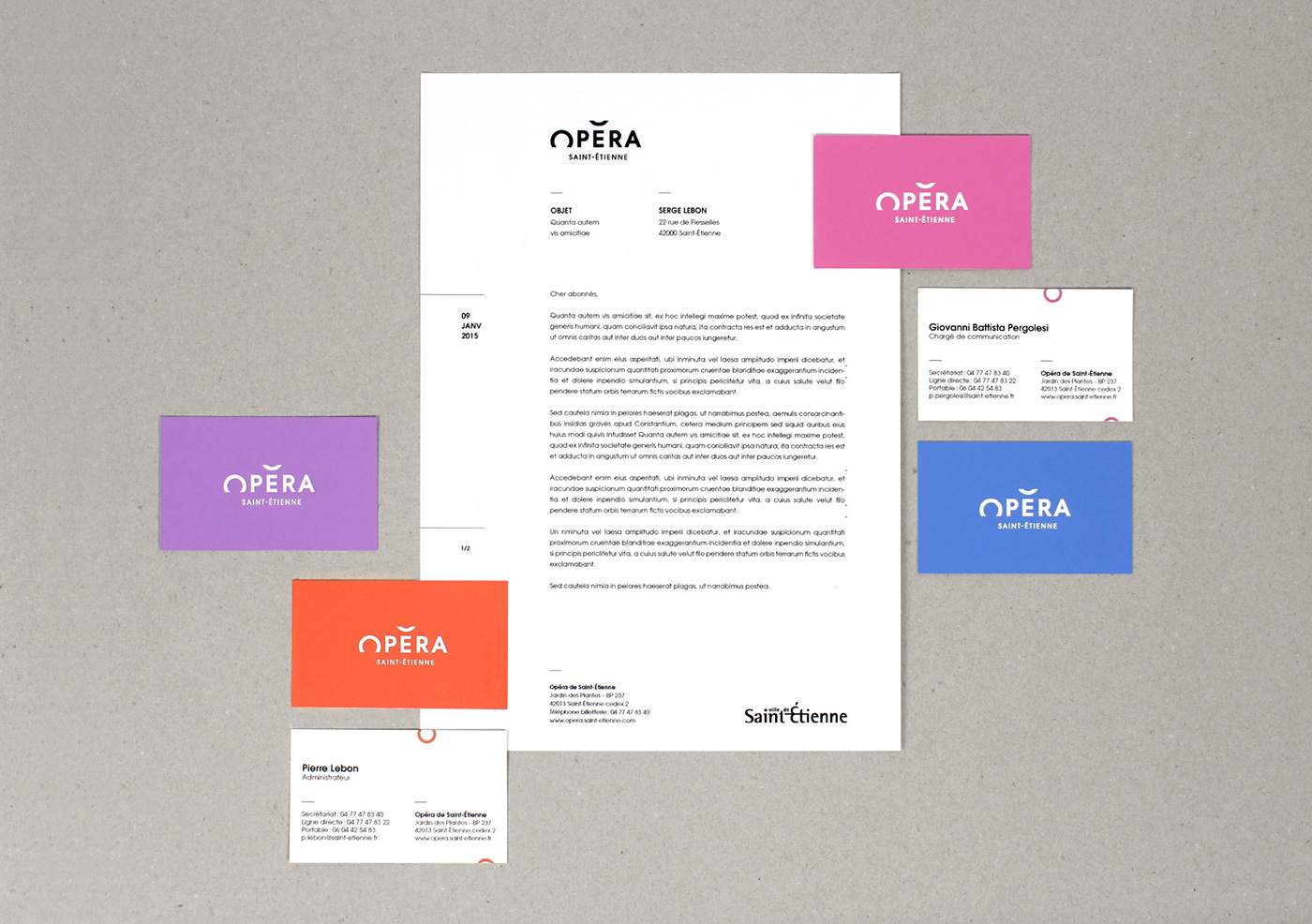
The objective laid out in this commission was to re-establish a sense of closeness with the people of Saint-Étienne through simple and down-to-earth communication. The main change was forgoing the “Opera-Theatre” name in favour of “Saint-Étienne Opera” to reflect an image of a traditional Opera House for its aficionados, but also to draw in potential opera-goers. As for the theatre programme, it has been put in the hands of the recently reopened “Comédie de Saint-Étienne”.
[FR] En décembre dernier, nous étions consultés pour travailler sur la nouvelle identité visuelle de l’Opéra de Saint-Étienne. Après presque 6 mois de travail, nous sommes extrêmement fiers de vous présenter aujourd’hui ce projet.
Avec plus de 150 levers de rideau pour près de 60 spectacles durant la saison 14-15, l’Opéra de Saint-Étienne est une structure culturelle d’importance, l’un des acteurs principaux de la vie culturelle stéphanoise.
L’objectif indiqué par le commanditaire était de rétablir un sentiment de proximité avec les Stéphanois, à travers une communication simple et populaire. La principale nouveauté était l’abandon du nom « Opéra Théâtre » au profit de « Opéra de Saint-Étienne » afin de refléter une image de maison d’Opéra auprès de son public historique, mais aussi des publics potentiels. La programmation théâtrale étant confiée à la « Comédie de Saint-Étienne » nouvellement ré-ouverte.
[EN]
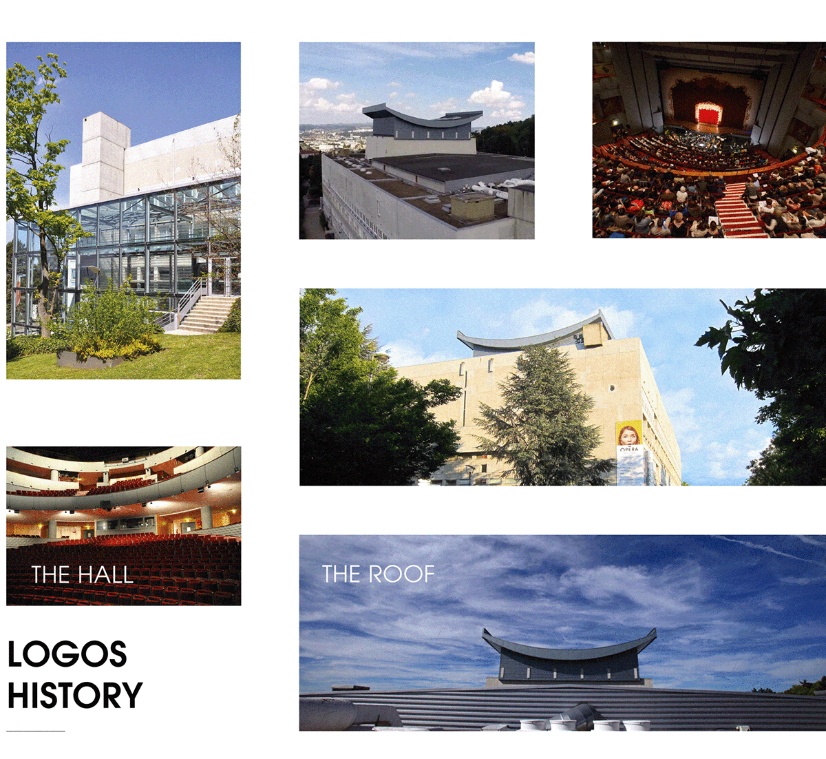
1969 : Inauguration of the Maison de la Culture et des Loisirs cultural centre by André Malraux. It is named L’Esplanade.
1998 : An arson attack destroys the Massenet Theatre. An open-air programme is organised over two seasons. In 2001, the Massenet Theatre re-opens to the public. In 2006, L’Esplanade becomes the Opera-Theatre of Saint-Étienne.
2015 : A new page is written: Opera Theatre of Saint-Étienne becomes the Opera of Saint-Étienne, and now offers a program refocused on his opera production, giving a privileged place at the Orchestre Symphonique Saint-Étienne Loire and the Lyric Choir in Saint-Étienne.
[FR]
1969 : Inauguration de la Maison de la Culture et des Loisirs de Saint-Étienne par André Malraux. Elle s’appelle alors l’Esplanade.
1998 : Un incendie criminel détruit le Grand Théâtre Massenet ; une programmation hors les murs est organisée durant deux saisons. En 2001, le Grand Théâtre Massenet rouvre au public. En 2006, L’Esplanade devient l’Opéra Théâtre de Saint-Étienne.
2015 : Une nouvelle page s’écrit: l’Opéra Théâtre de Saint-Étienne devient l’Opéra de Saint-Étienne, et propose aujourd’hui une programmation recentrée sur sa production lyrique, donnant une place privilégiée à l’Orchestre Symphonique Saint-Étienne Loire et au Choeur Lyrique Saint-Étienne Loire.

[EN]
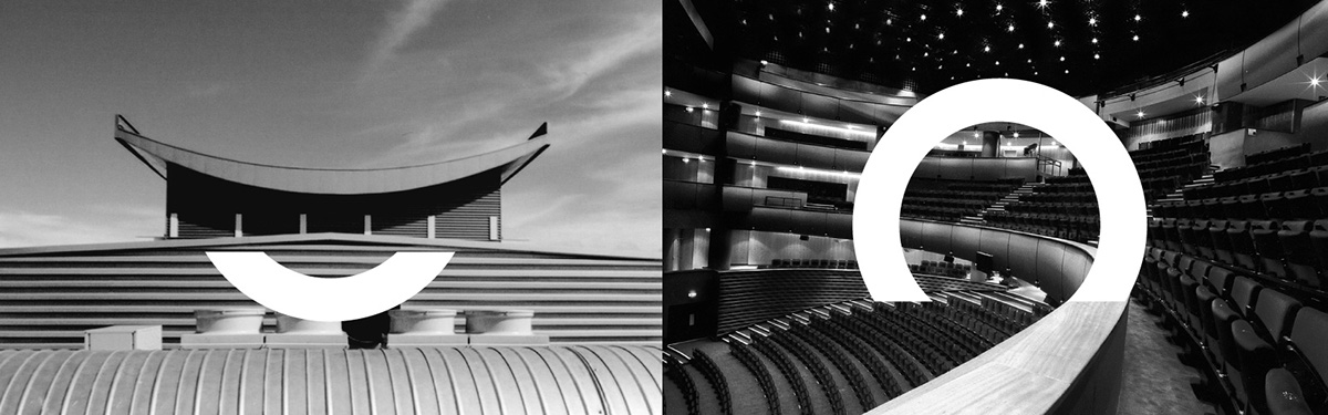
The Rooftop: An unmissable architectural feature, the roof of the building looks as if it is giving a sign. With its location from the heights of the Jardin des Plantes park, the sign looks over the city. For Saint-Étienne’s inhabitants it has become part of their landscape.
The hall: Perfectly circular, the hall offers exceptional comfort and acoustics.
[FR]
Le toit: Élément architectural incontournable, le toit du bâtiment fait «signe». Par la géographie de son l’emplacement, sur le hauteur du Jardin des Plantes, ce signe surplombe la ville, et s’impose à la vue de tous les Stéphanois.
La salle: La salle, parfaitement circulaire, offre un confort et une acoustique exceptionnels.
[EN]
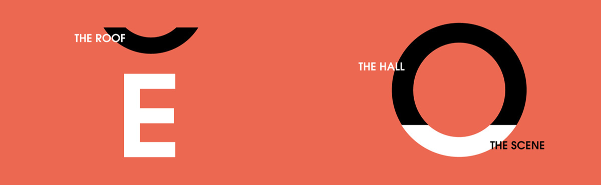
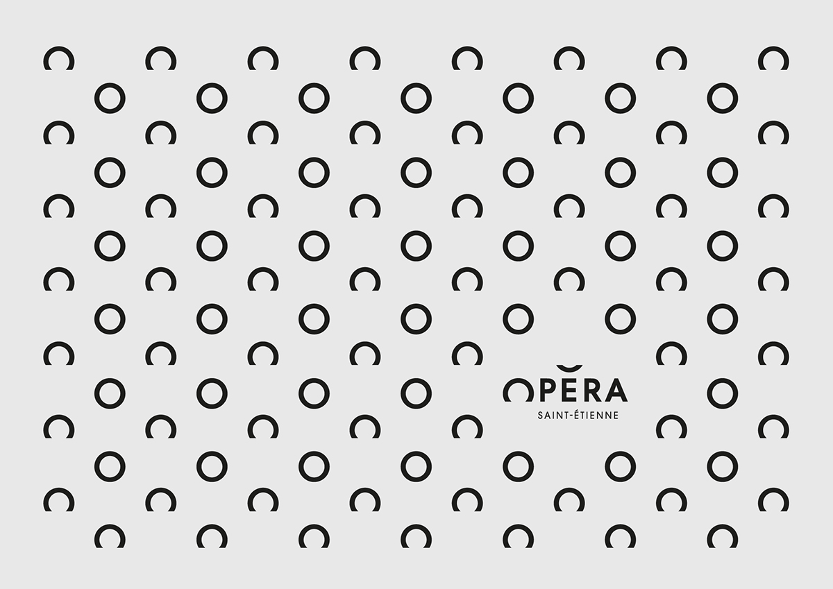
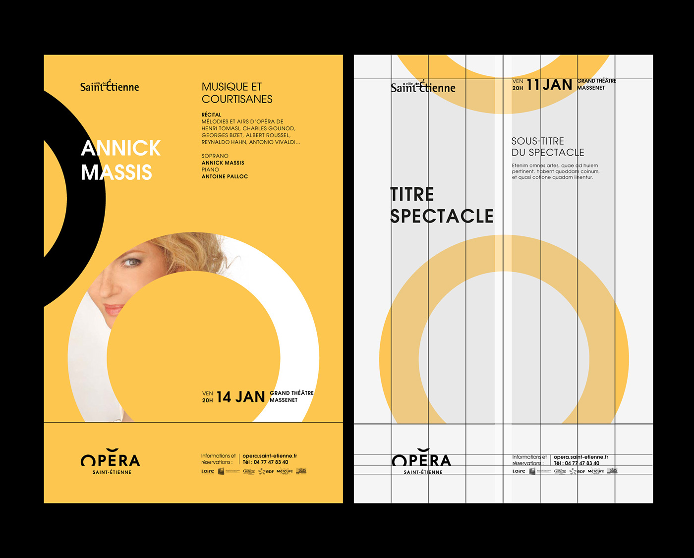
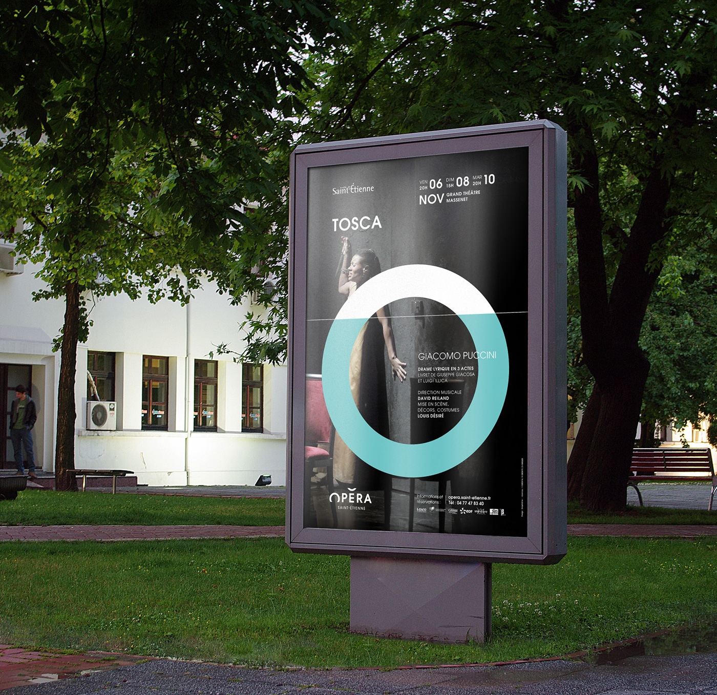
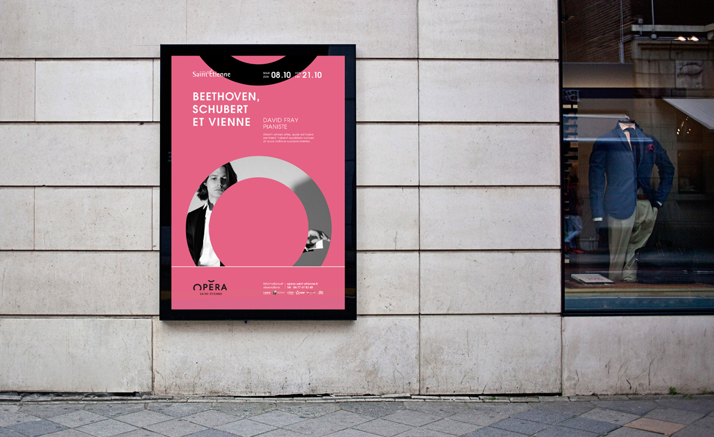
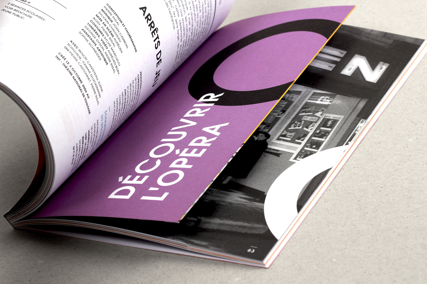
An accent on the top: On the top of the “E”, the accent stresses the syllable by increasing the intensity of the voice. It decks the word “opéra” with the image of the building’s pagoda.
Opera with a capital “O”: The shape of the “O” brings to mind an open mouth singing an operatic aria. The “O” is used to show a strong emotion such as surprise, admiration, joy, etc.
[FR]
Un accent sur le toit : Sur le toit du «E», l’accent met en relief la syllabe en augmentant l’intensité de la voix. Il coiffe le mot opéra à l’image de la pagode du bâtiment.
L'opéra avec un grand “Ô" : La forme du «O» évoque directement une bouche ouverte vocalisant un air d’opéra. Le «Ô» est utilisé pour marquer une émotion forte comme la surprise, l’admiration, la joie, etc.
[EN] Rhythm is life
In opera, music and dance are intimately linked through “movement”. This could be the movement of a body, of musical notes or simply the emotions* triggered by these two art forms. (*The word “emotions” literally means “to make movement” of feelings). The emotion behind this logo comes from the optical framing trick between an “O” and the “accent”. The “O” looks as if it’s disappearing at the same time as the accent appears. That’s Opera’s magic!
[FR] Rhythm is life
Dans l’opéra, musique et danse sont intimement liées par le «mouvement». Que ce soit par celui des corps, par celui des notes ou simplement par l’émotion* suscitée par ces deux arts. ( *Le terme émotions veut littéralement dire » mettre en mouvement » les sentiments.) L’émotion que cherche à susciter ce logo vient du jeu de cadrage entre le « O » et « l’accent ». Le « O » semble disparaitre tandis que l’accent apparait au même moment. C’est la magie de l’Opéra !
.


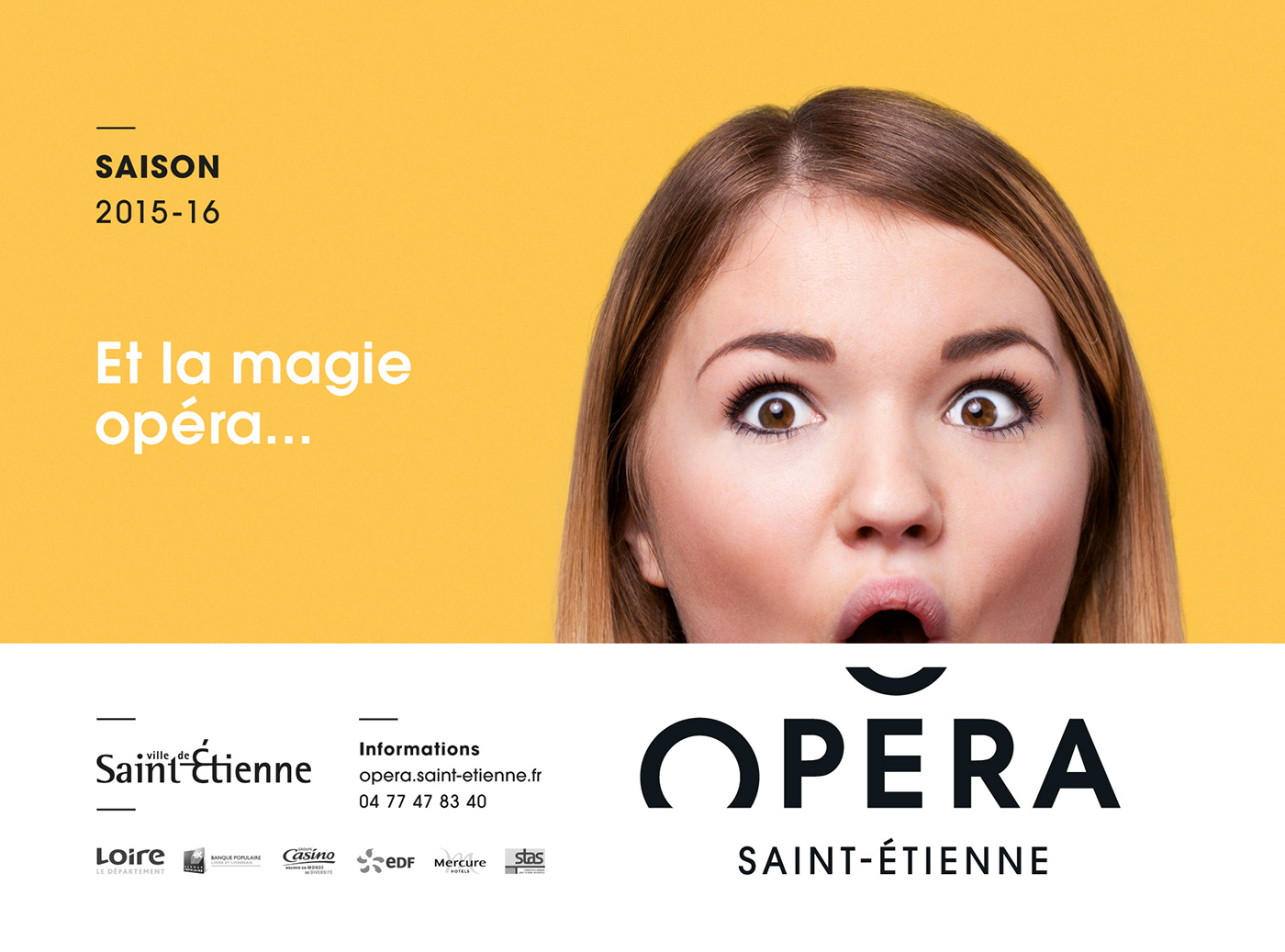
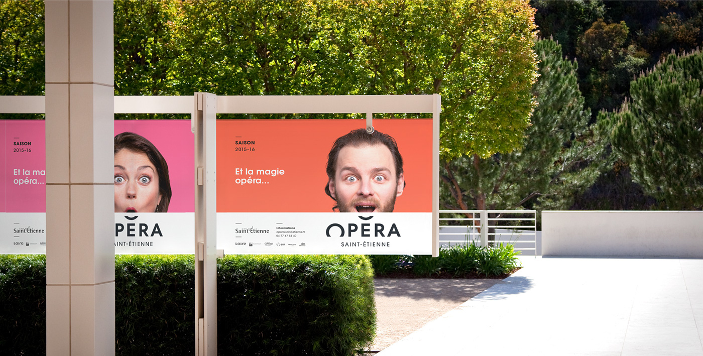
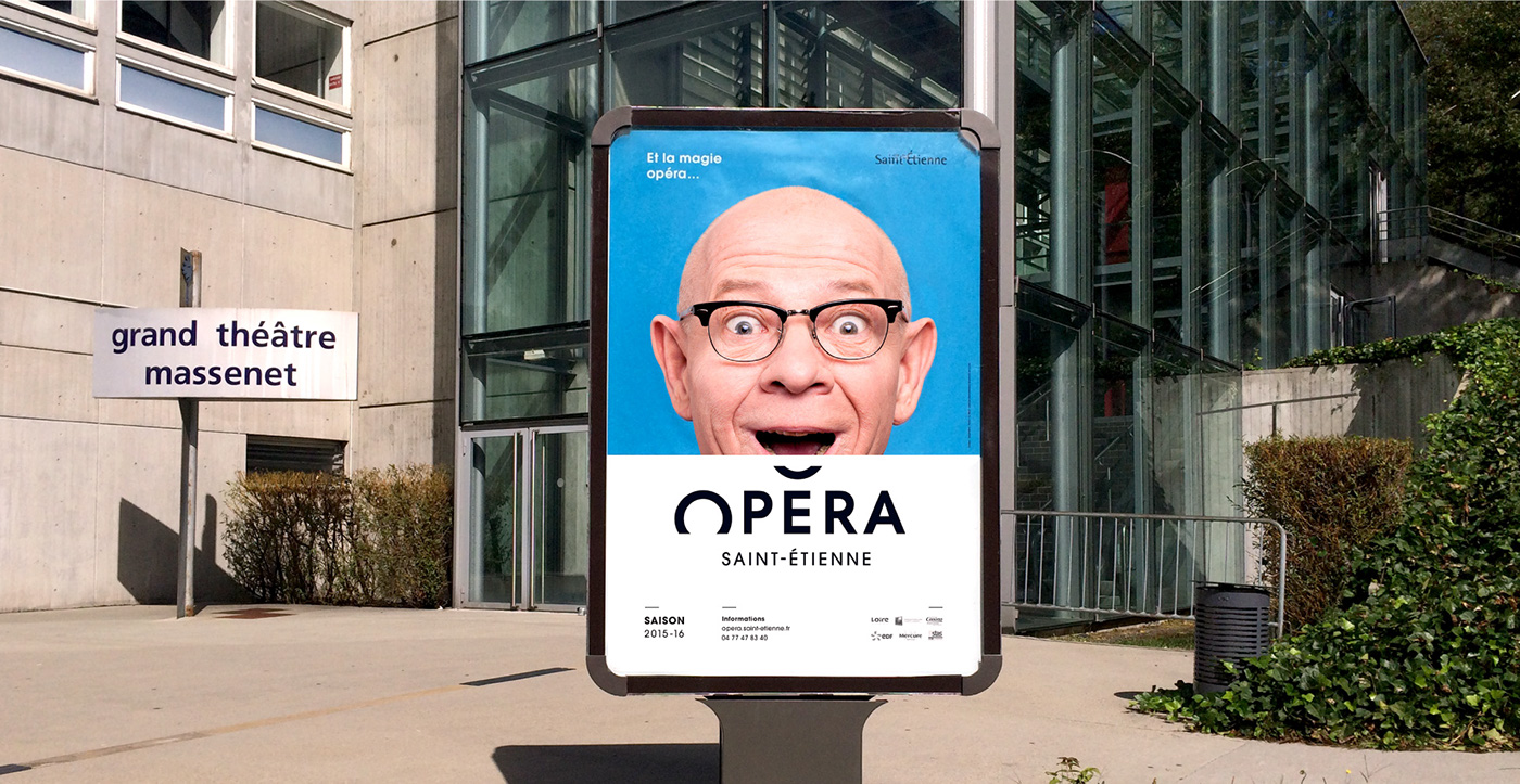
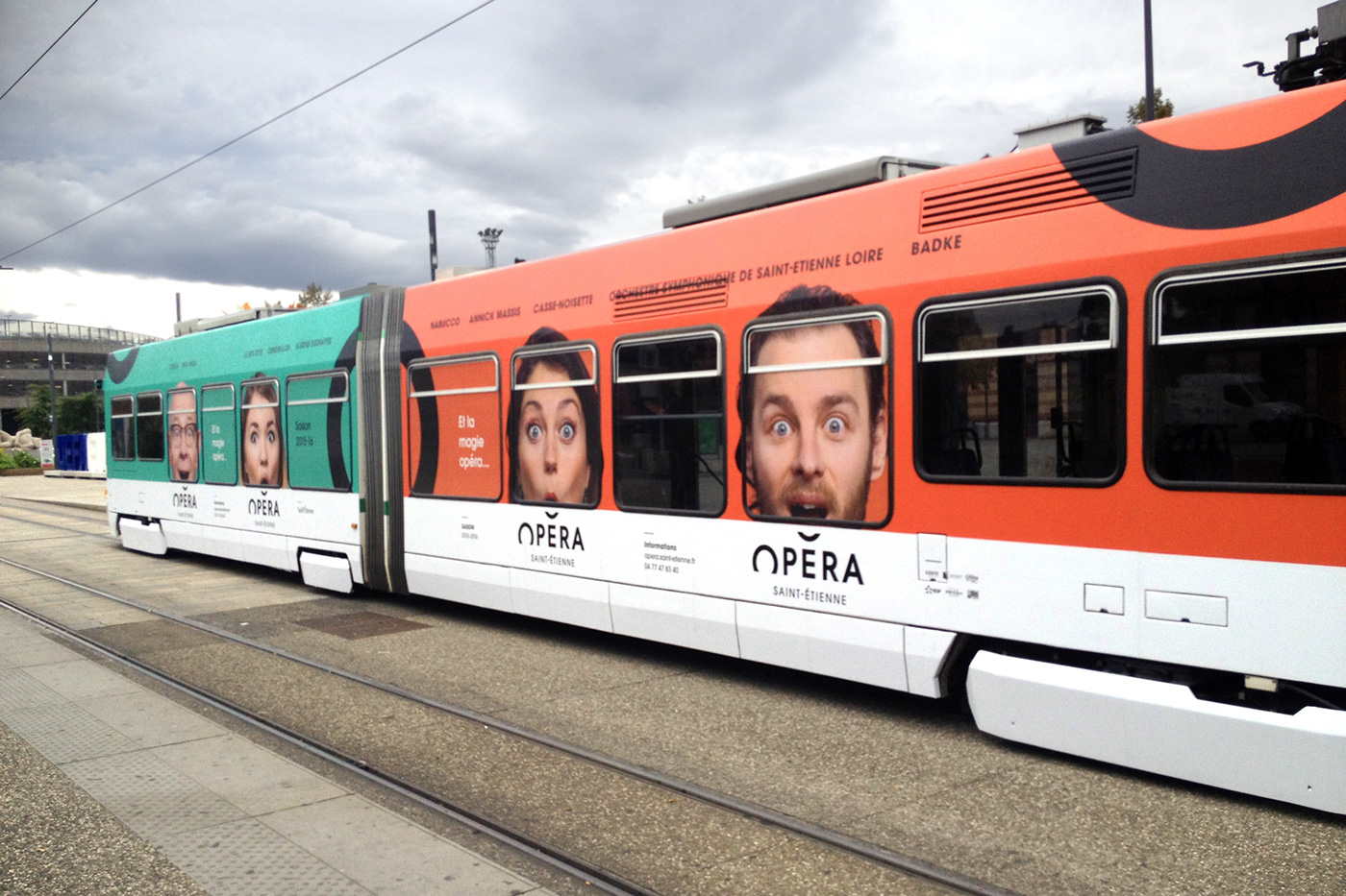
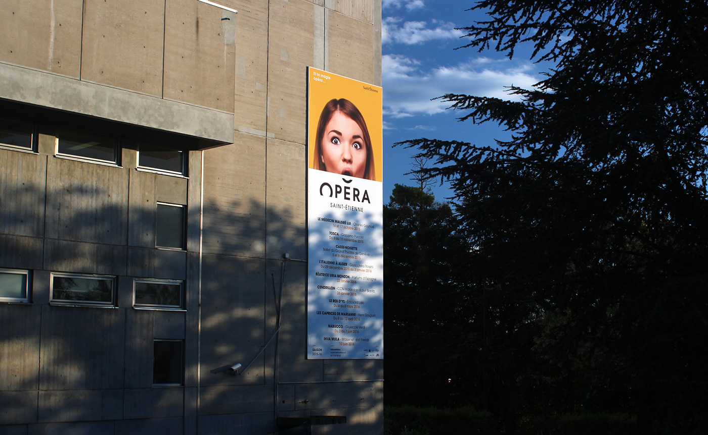
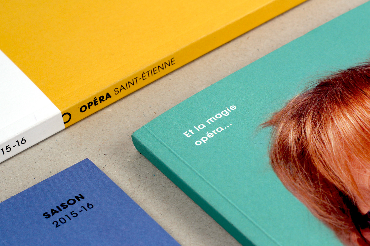
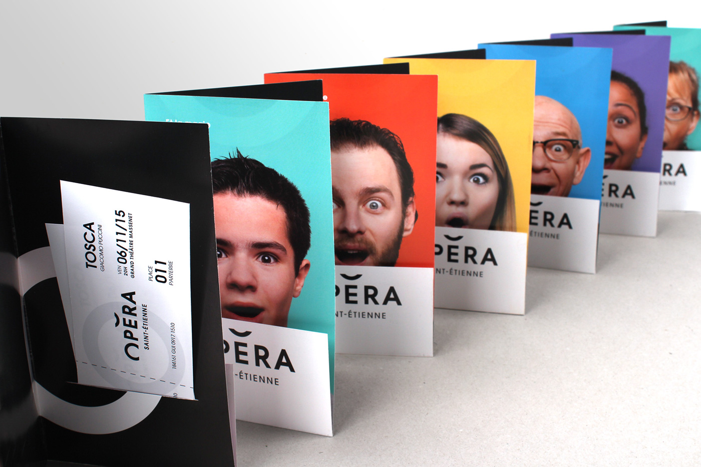
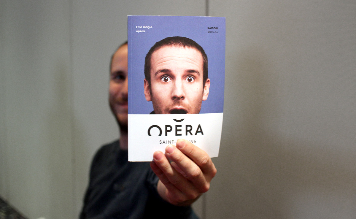
[EN] And the magic opera(te)...
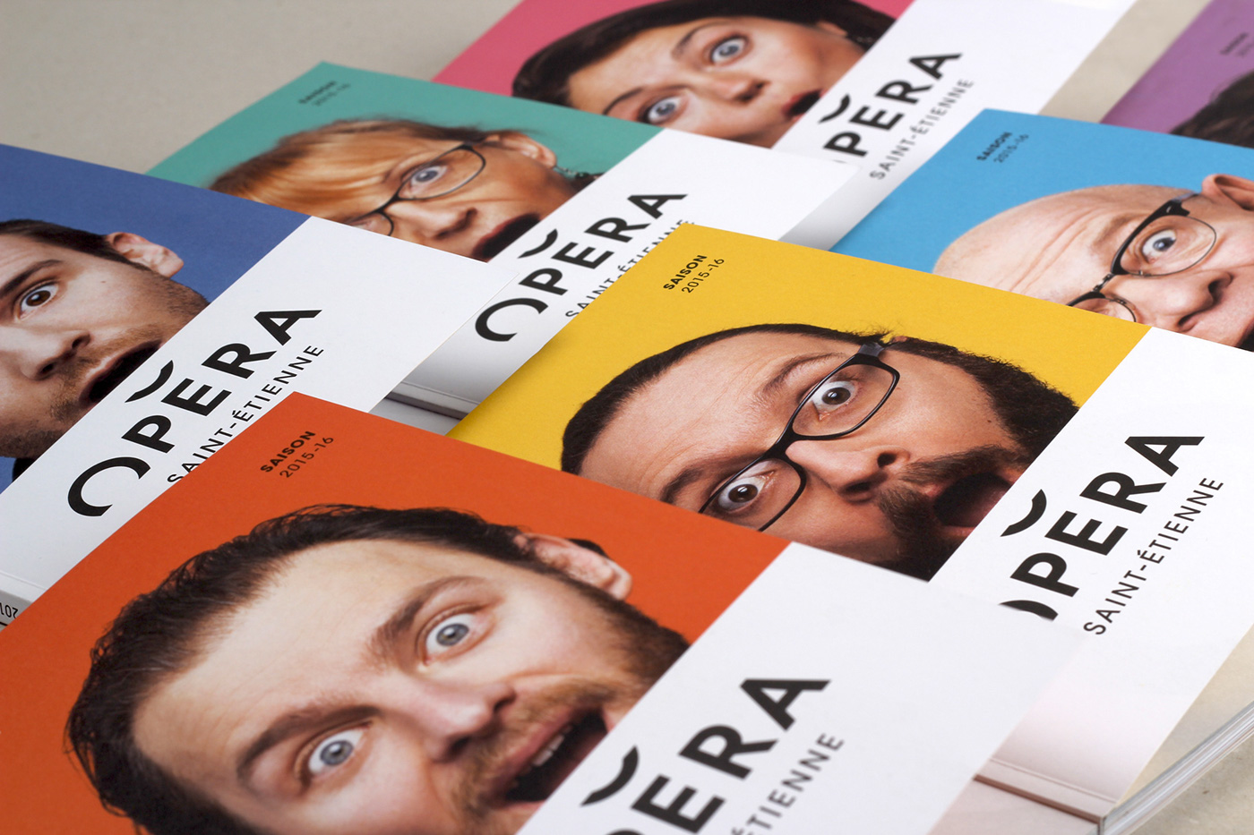
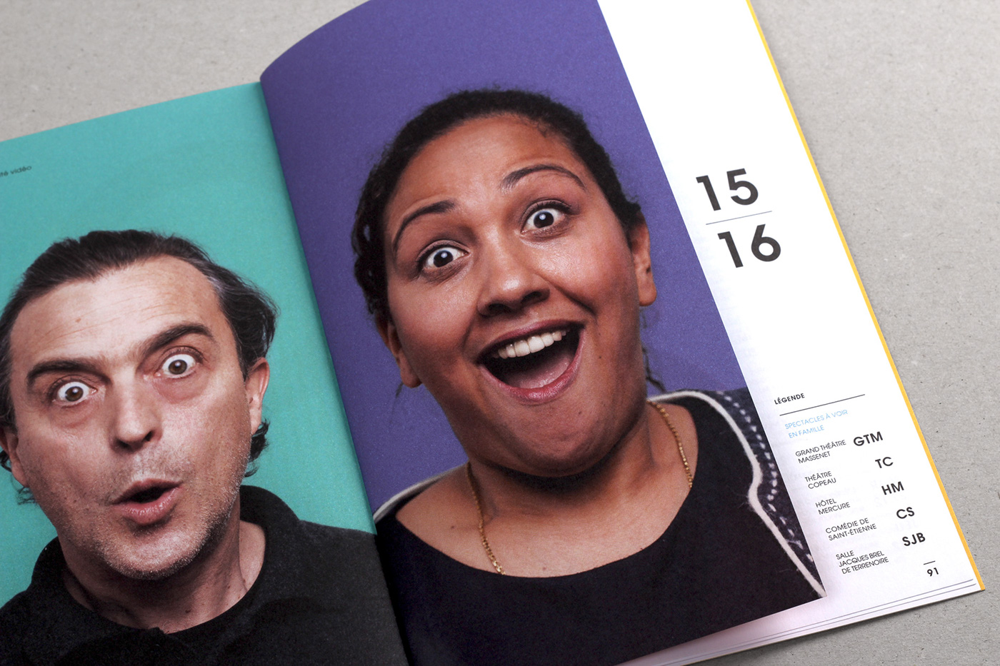
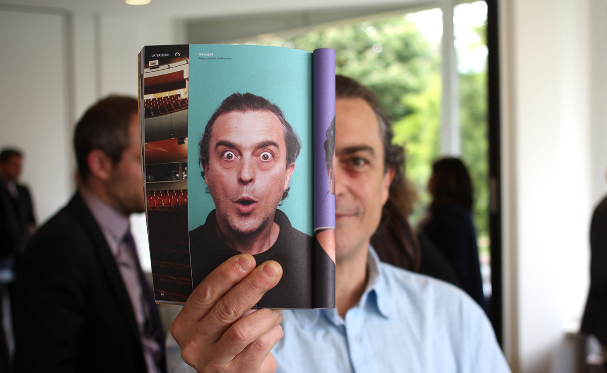
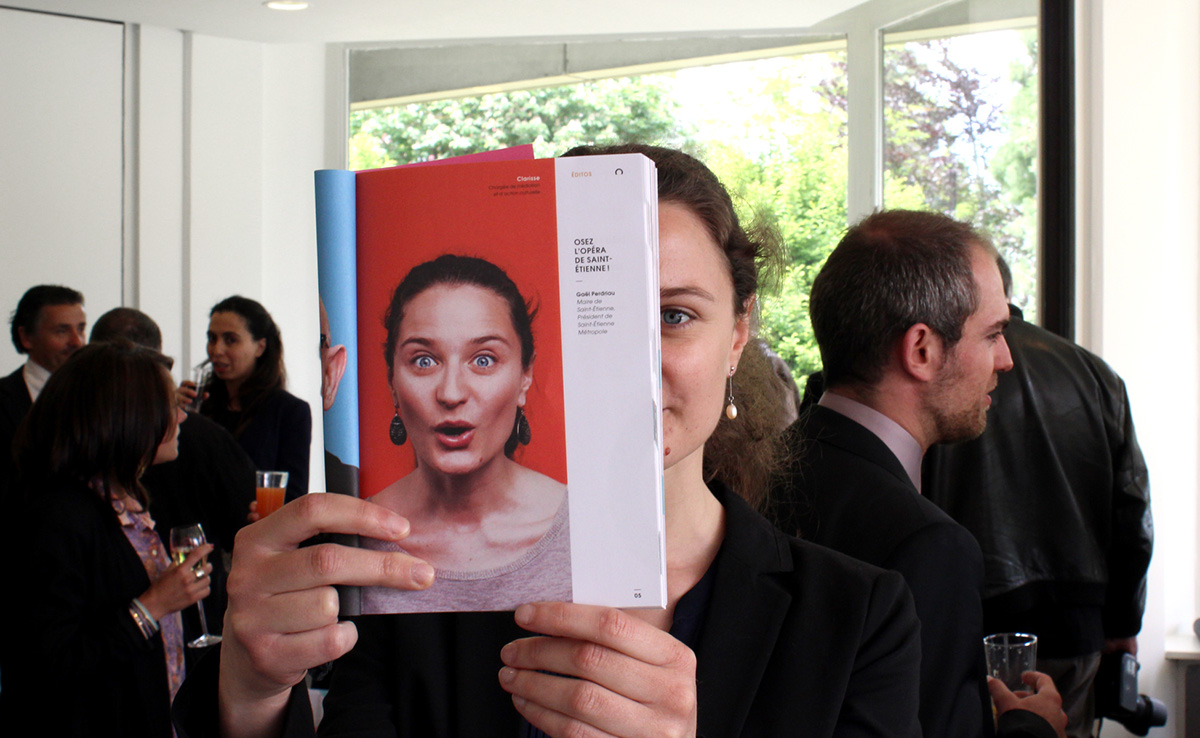
To inaugurate the new logo’s first season, we have come up with a simple and accessible communication campaign which features, in photos, all the staff members who work at the Opera. The logo is there to finish off the smile of the person being photographed, as if a curious spectator had come to peek through the Opera doors, wide-eyed at what they saw. So it’s about re-establishing a feeling of closeness between the people of Saint-Étienne and a popular cultural venue. The campaign comes with the slogan “And the magic opera(te)…”, is a pun in France between the word “operate” and the word “opera”.
[FR] Et la magie opéra...
Pour inaugurer la première saison de ce nouveau logo, nous avons proposé un dispositif de communication extrêmement simple et populaire, mettant en scène le personnel de l’Opéra. Le logo venant compléter le sourire du personnage, un peu comme si un spectateur curieux venait regarder par dessus la porte de l’Opéra pour sa plus grande surprise. Il s’agissait ainsi de rétablir un sentiment de proximité entre les Stéphanois et ce lieu de culture populaire. La campagne est accompagnée du slogan « Et la magie opéra… ».


[EN]
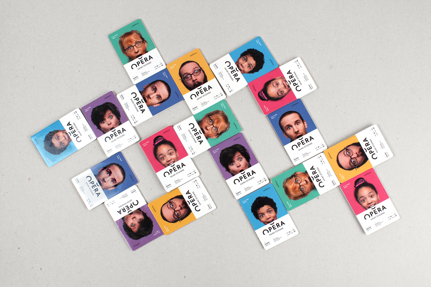
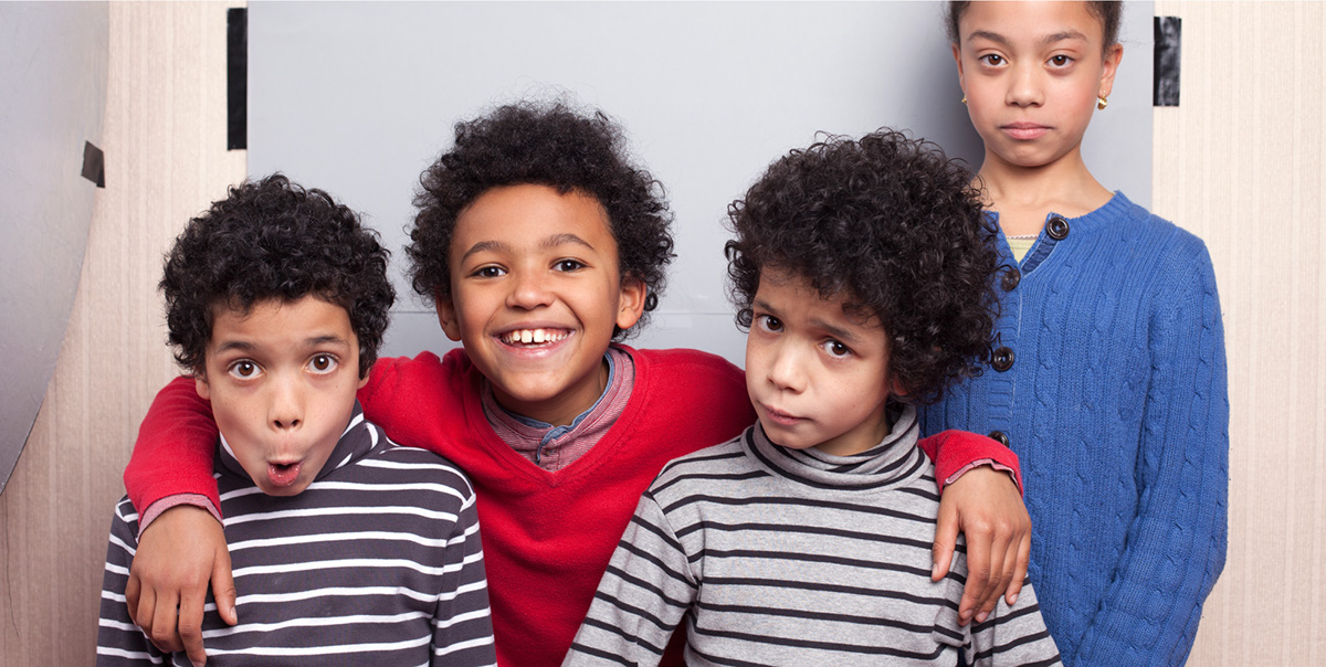
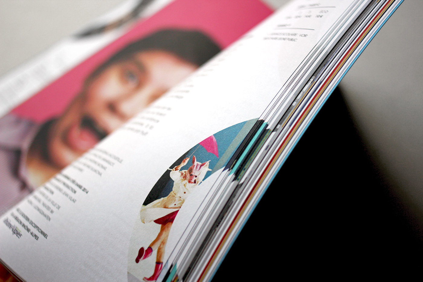
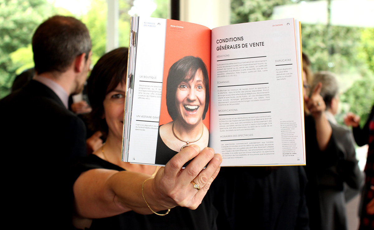
Right from the bid-for-tender phase, we put forward the idea of photographing real people from Saint-Étienne (the “Stéphanois” as they are known) for the new season’s communication campaign. We wanted to avoid the bank of images effect – the kind of stereotyped portraits of people with fake smiles. Alongside the opera’s communications team and our favourite photographer from Lyon, Ghislain Mirat. we organised a photo shoot inside the Opera. On a voluntary basis, all staff members were invited to have their portrait taken. The day was highly rewarding and motivating. Three quarters of staff members entered into the spirit, from the people who work at reception to the Director, not forgetting the faces hidden behind the curtain, the smiles of the dressmakers, happy children and a few drifters walking by!
They had no idea at that point what the project was going to look like. So they were both surprised and proud to discover they had become icons of their own Opera House. It might need to be reminded that the Opera had been through some tricky months of political and administrative upheaval and team morale was pretty low. We hope this very unique campaign put a smile back on people’s faces when they went to work. That was our objective in any case!
[FR] Dès la phase d’appel d’offres, nous avions proposé de mettre en scène de vrais Stéphanois pour la campagne de communication de la nouvelle saison. Il s’agissait d’éviter l’effet banque d’images, vous savez ces portraits stéréotypés avec un sourire d’américain. Nous avons organisé avec l’équipe du service communication de l’opéra et notre photographe lyonnais préféré Ghislain Mirat une séance photo dans les locaux de l’Opéra. Sur la base du volontariat, tout le personnel était invité à venir se faire tirer le portrait. Ce fut une journée extrêmement réjouissante et motivante. Les 3/4 du personnel se sont prêtés au jeu, de l’agent d’accueil au directeur en passant par tous les visages cachés derrière les machineries, les sourires des couturières, les enfants joyeux et quelques pièces rapportées !
Ils ne savaient rien de précis du projet final à cette époque-là. Quelle ne fut pas leur surprise et leur fierté de se découvrir en égérie de leur propre maison d’Opéra. Il faut dire que l’Opéra venait de traverser quelques mois d’intenses complications politico-administratives, et le moral des équipes n’était pas au beau fixe. Cette opération, unique en son genre, aura on l’espère permis à toutes ses personnes de retrouver un beau et grand sourire en venant travailler. En tous cas, tel était notre objectif !


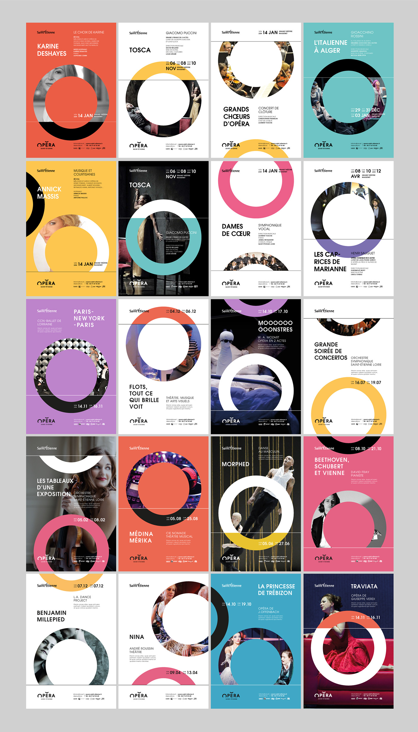

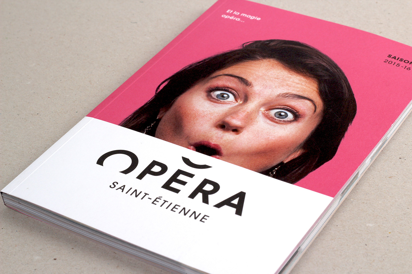
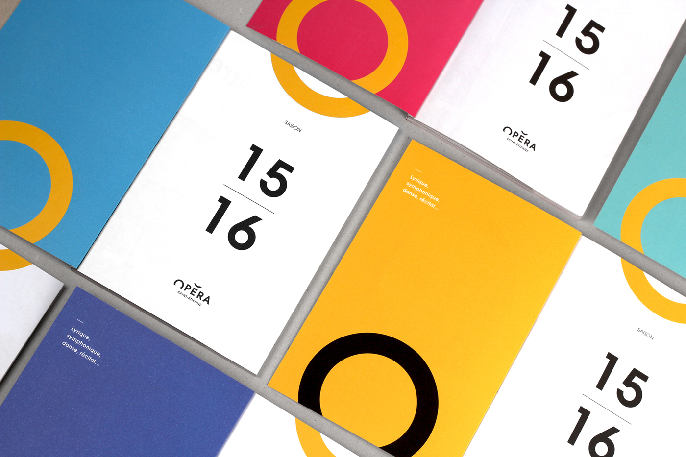
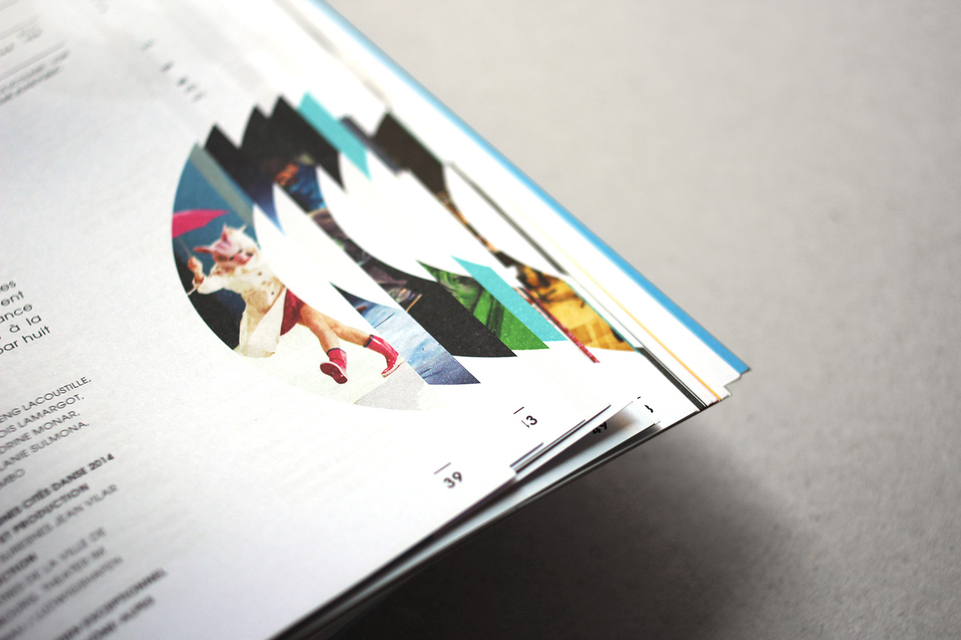
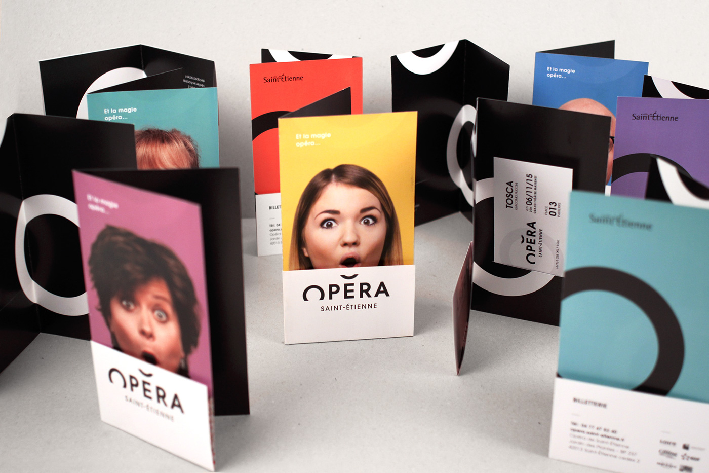
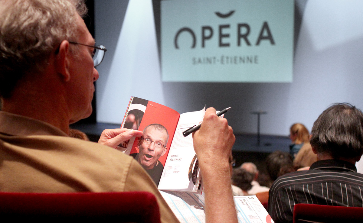
[EN] With 8 different covers, the seasonal programme also puts the portraits in pride of place. A definite collector’s item… the 15,000 printed issues have almost all gone!
[FR] Avec 8 couvertures différentes, le programme de saison fait également la part belle aux portraits. Effet collector garanti… les 15 000 exemplaires imprimés sont déjà quasiment épuisés !
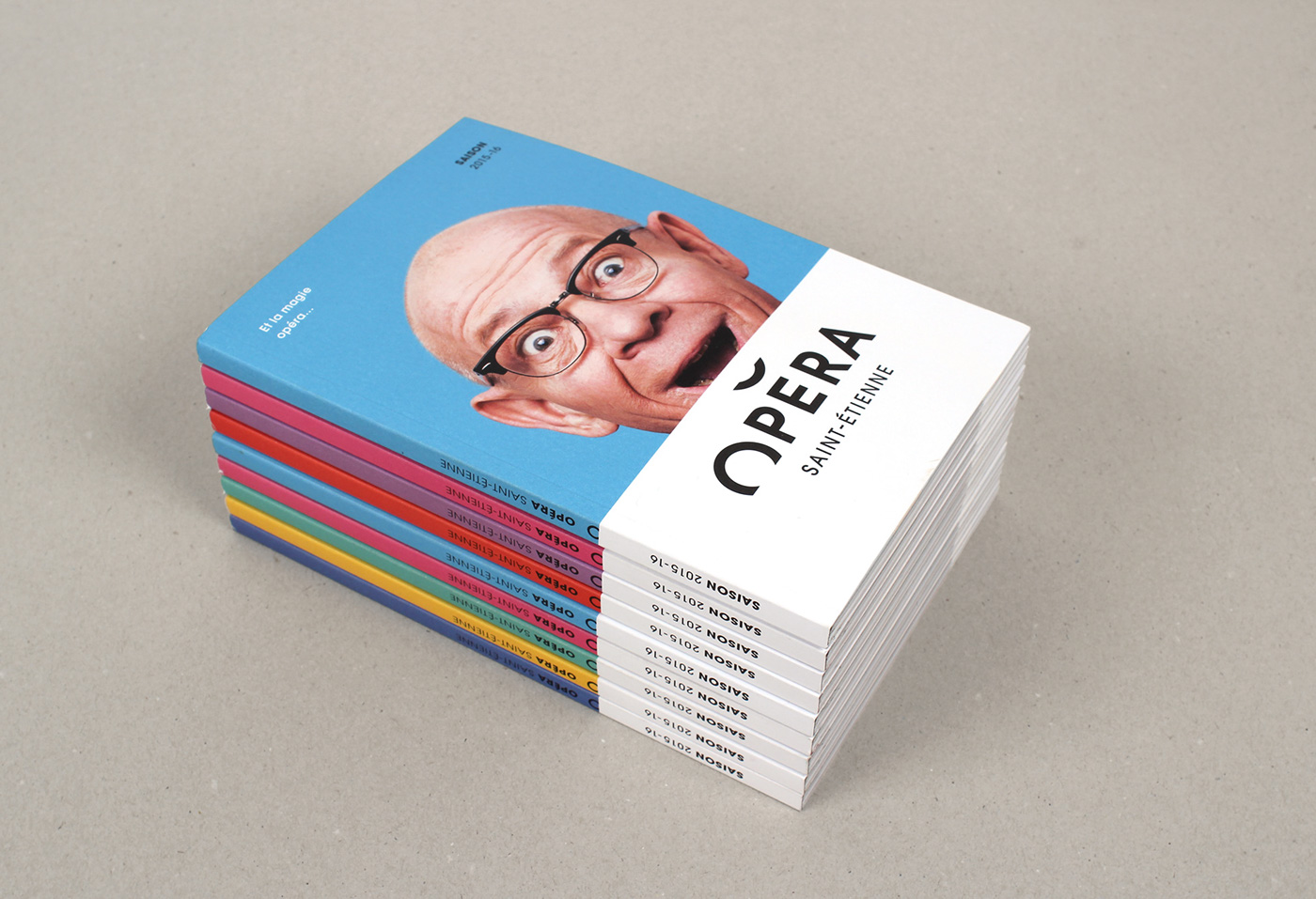
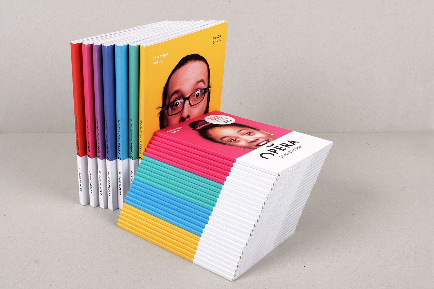
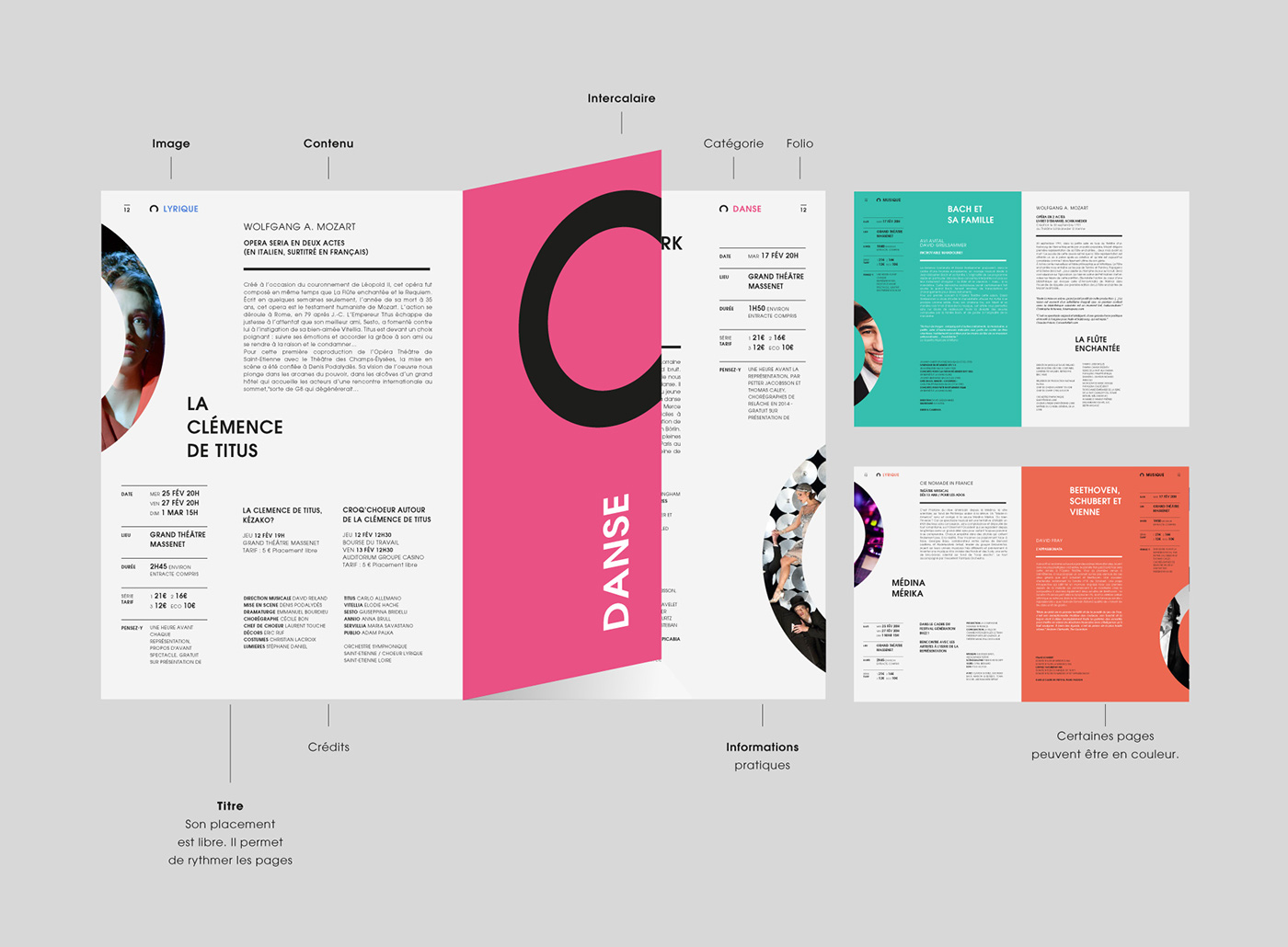
[EN] What is special about this programme too is that the start of each chapter serves as a divider. What we have are small booklets less that 4cm wide with a series of portraits inside. Because they are narrower, they make for easy reading as people can find programme chapters more swiftly. The idea may look straightforward on paper, but we have to admit that our favourite printer (Ferréol) tore his hair out a fair few times to put out a programme for less that a euro! Well done to him and his team! Thanks also to Céline (from Graphéine) who fought like a warrior to make printing possible. The result is there for all to see!
[FR] L’autre spécificité de ce programme, c’est que chaque entrée de chapitre fait office d’intercalaire. Il s’agit simplement de petits livrets moins larges de 4 cm, comprenant une série de portraits. Du fait de leur largeur raccourcie, ils facilitent la lecture du programme en permettant d’accéder plus facilement au chapitre souhaité.
Si l’idée était simple sur le papier, il faut bien avouer que notre imprimeur préféré ( Imprimerie Ferréol ) s’est bien cassé la tête pour sortir un programme à moins d’un euro l’unité ! Bravo à lui et à ses équipes ! Merci aussi au passage à Céline ( de Graphéine ! ) qui a bien bataillé sur ce dossier d’impression. Le résultat est là !

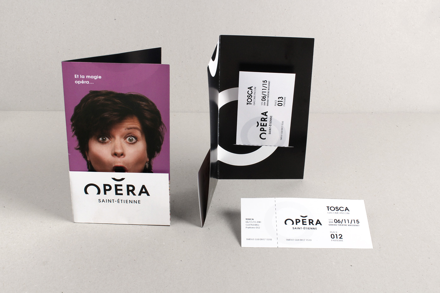
[EN] A final cheeky addition - the ticket holder. A simple piece of card folded in 4 with a slit to slip the ticket into. Turning the fold over stops the ticket from sliding out. A very stylish idea which ends up cutting costs too, as it avoids the traditional plastic pouch.
[FR] Dernière petite coquetterie, les pochettes à billets, une simple feuille pliée en 4, avec une fente pour glisser le billet de spectacle. Le retour du pli, empêchant le billet de glisser. Une astuce très design qui s’avère être par la même occasion une économie, en évitant la traditionnelle pochette collée.

[EN] Here are a few photos from the season launch. The same smiles as the ones in the brochure were to be found on the faces of each of the Opera’s collaborators!
[FR] Voici quelques photos du lancement de saison. On pouvait retrouver sur le visage de chacun des collaborateurs de l’opéra, le même sourire que dans la brochure !


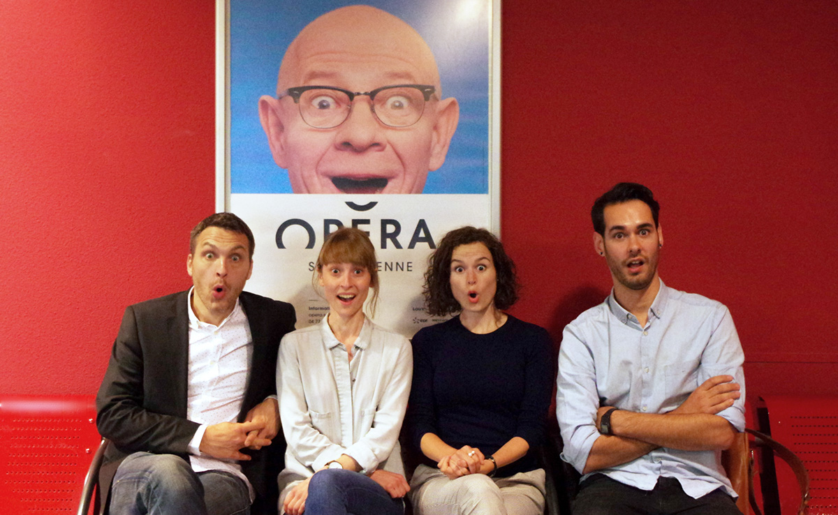
[EN] Above: the Graphéine team in Lyon, from left to right, Mathias (Creative Director), Céline (Project Manager/Office Manager), Adrienn (Artistic Director) and Jonas (Graphic Designer and Layout Artist)
[FR] Ci-dessus : l’équipe de Graphéine Lyon, avec de gauche à droite, Mathias (Directeur de Création), Céline (Chef de projet-Office Manager), Adrienn (Directrice artistique) et Jonas (Graphiste-Maquettiste).


