

Universal Design
After an elaborate list of products, we decided to do a thorough study on the medicine bottles for syrups. For our research we decided to look into several medicine bottles catering to different illnesses and consumers. We approached physicians, pharmacists and users to understand the process in which the medicine bottles come to be used. This was followed by a series of simulations to place the product, in this case the medicine bottle was tested in the hands of a visually impaired, a user with tremor, a physically challenged person, single handed users, people without a thumb or fused fingers and other anomalies.
The medicine bottle works as a container for the storage of liquid medicine. We have listed below in points the various aspects of the current design of the bottle, the measuring cap and the label. The cap size of all medicine bottles are standardized. The body of the bottles is made of plastic or glass depending on the reactions of the drug to sunlight.They are usually of a transparent white or transparent amber color. The bottles have a thread mechanism for opening and closing of the bottle. The caps are made of metal and have a 5ml capacity. In case of medicine for children where the dosage is often less than the others a measurement cap is provided with a capacity of 10ml. Labels covering the bottle display the name, brand, dosage, expiry details, chemical composition and warnings.
The medicine bottle works as a container for the storage of liquid medicine. We have listed below in points the various aspects of the current design of the bottle, the measuring cap and the label. The cap size of all medicine bottles are standardized. The body of the bottles is made of plastic or glass depending on the reactions of the drug to sunlight.They are usually of a transparent white or transparent amber color. The bottles have a thread mechanism for opening and closing of the bottle. The caps are made of metal and have a 5ml capacity. In case of medicine for children where the dosage is often less than the others a measurement cap is provided with a capacity of 10ml. Labels covering the bottle display the name, brand, dosage, expiry details, chemical composition and warnings.
Drawbacks of the current design
The seal around the cap poses problems for all users particularly those who are physically challenged, aged and those with tremor. The opening of the cap has also been found to be difficult for a number of left handed users. When the seal is broken, it is often found to leave sharp edges in the cap which can be dangerous taking into consideration the fact that the cap is used for the consumption of the medicine in most cases. The cap though standardized does not appeal to the visually impaired.In the case of a single handed user, the problems start right from opening of the bottle to the filling and closing of the bottle. Considering that the dosage of the medicine is usually after the meal, wet or oily hands need to be attended to before easy opening of the bottle. Users face problems when there is leakage of the medicine while consumption of medicine. As a result of the leakage, the label is corroded with crucial information (mostly expiry date and warning) often getting lost. The possibility of ants and other insects around the leakage is also to be considered. Crystallization of the medicine on the bottle neck further increases efforts required to open and close the bottle. Labels around the bottle are not standardized in layout and design.Information provided on the labels is most often very difficult to read due to the type size being very small. The problem with the display is also the language (English is not read by a large population who still fall under the category of consumers). Labels too do not cater to the mass of visually impaired.


The aim of this idea was to regulate the dosage and easen the process of cunsumption. A haxagonal cap with a chamber would be filled when the bottle is invertedand turned back with a fixed quantity which then could be consumed directly.
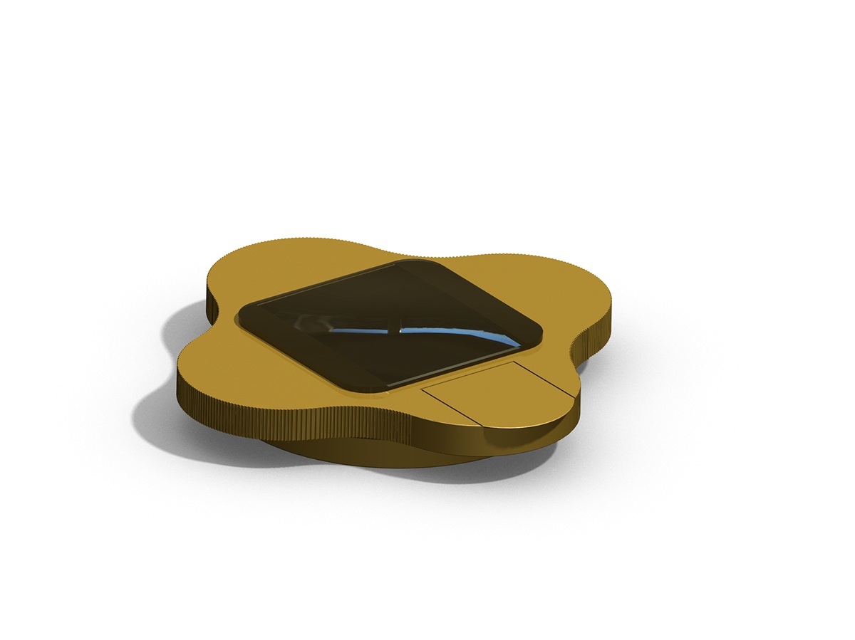
With the issue of readability persisting in most of the existing bottle designs, we decided to look into what could be done and how we could best do it. We looked into the information that the user or patient needed and wanted to know in order to frame a hierarchy of the display itself. To ensure that there is minimum or no confusion between family members who all have a differnet prescription, the caps would be made available in six different colors. Like the color coding done in toothbrushes, each member of the family could choose a color of cap and avoid clashes with the others. Keeping the visually impaired in mind in such a case where there might be a possibility that there are more than one visually impaired person at home, the caps can be distinguished by a braille symbol. The caps have a provision on the top to slide in the prescription which would include the name of the patient, the medicine, it’s intended purpose and the dosage. This provision is sealed with a convex lens also acting as a magnifying glass to those who have problems deciphering small size text.
Labels would be printed in two langauges. It would not be wrapped around. Instead it will be placed on either side of the bottle. Details in the label would include:brand,name of the medicine, quantity, purpose, M.R.P.batch number, expiry date and warnings.
Labels would be printed in two langauges. It would not be wrapped around. Instead it will be placed on either side of the bottle. Details in the label would include:brand,name of the medicine, quantity, purpose, M.R.P.batch number, expiry date and warnings.


Keeping the visually impaired in mind, color coding of the the caps is not a solution one can offer. Here the caps would be determined as a male or female user by inscribing the braille symbol for the same where the lid is located acting also as the indication to where the cap is to open. The requirement for a convex lens is absent and hence the cap will have the name of the syrup and it’s purpose written in braille.


