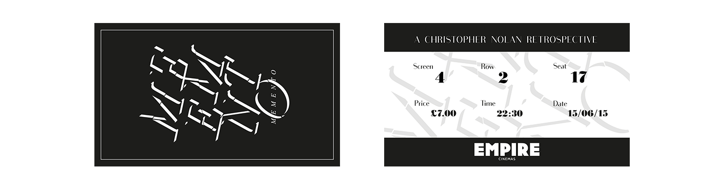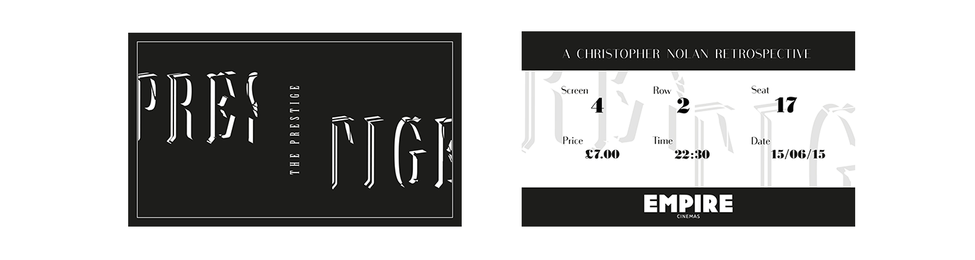
A Christopher Nolan Retrospective Screening
I'm a self confessed film nerd so my goal with these posters was to create original designs that did not spoil the film with unnecessary imagery. I wanted to illustrate the mystery of these films in a subtle graphic style to reflect the intelligence and style of the director Christopher Nolan. The use of partially visible type and a black and white colour palette creates a shadow of abstract shapes which harks back to film noir.
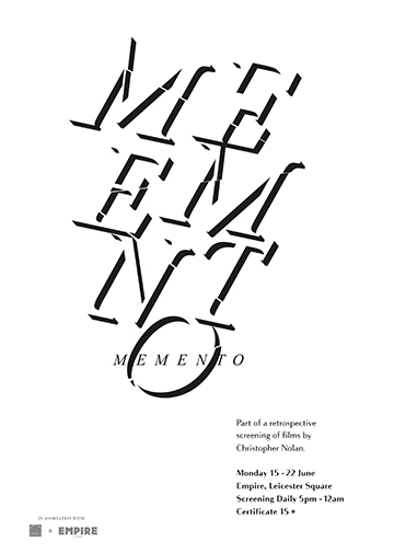
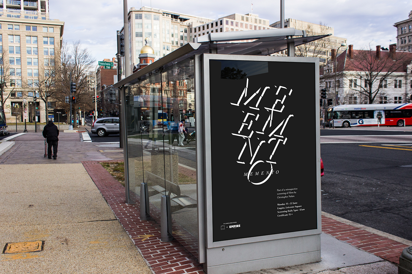
MEMENTO
Fractured letters are stacked and offset to illustrate the broken mind of the protagonist. The fracture lines lead to the solitary O which highlights the film title like some newly discovered clue.
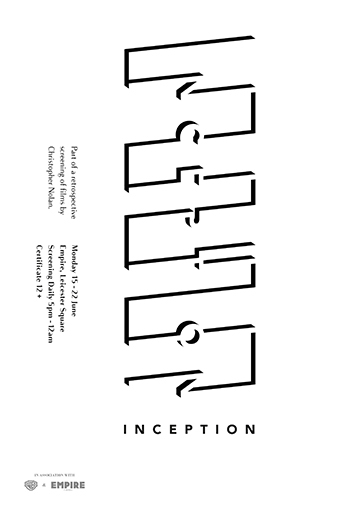
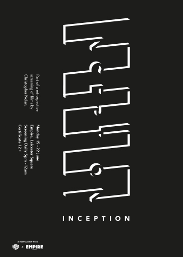
INCEPTION
Each letter is individually constructed into one of nine linked 'levels' to form a dissected view of a dream. The orientation of the poster can be rotated to slightly change the perspective of the typography, transforming it into a maze structure.
Each letter is individually constructed into one of nine linked 'levels' to form a dissected view of a dream. The orientation of the poster can be rotated to slightly change the perspective of the typography, transforming it into a maze structure.
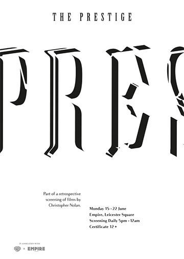
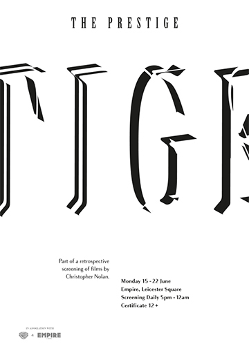
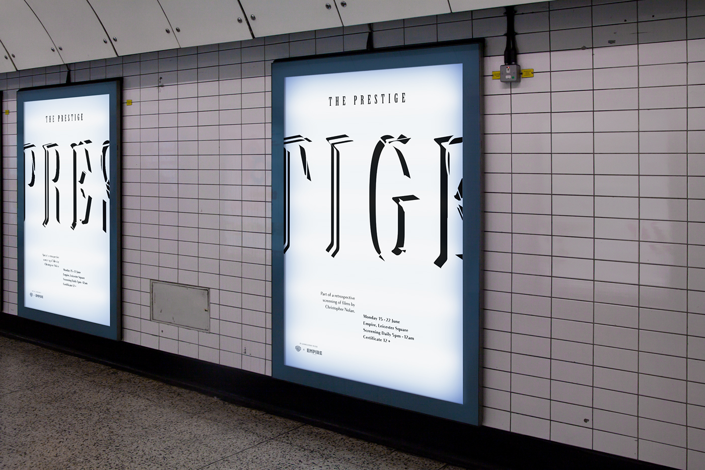
THE PRESTIGE
This design is split between two separate canvases to create a reenactment of the teleportation trick. The missing halves of each poster are overlaid in white to create the broken appearances, evoking the two leads vandalising eachother's act.
This design is split between two separate canvases to create a reenactment of the teleportation trick. The missing halves of each poster are overlaid in white to create the broken appearances, evoking the two leads vandalising eachother's act.
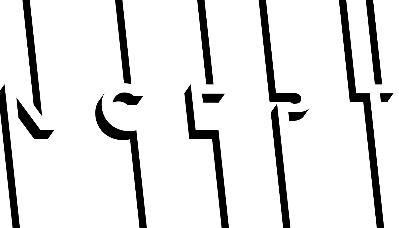
Reversed Designs
The following reversed black editions could be used as limited edition screen prints to accompany the event and also form the basis for the ticket designs.


Ticket Designs