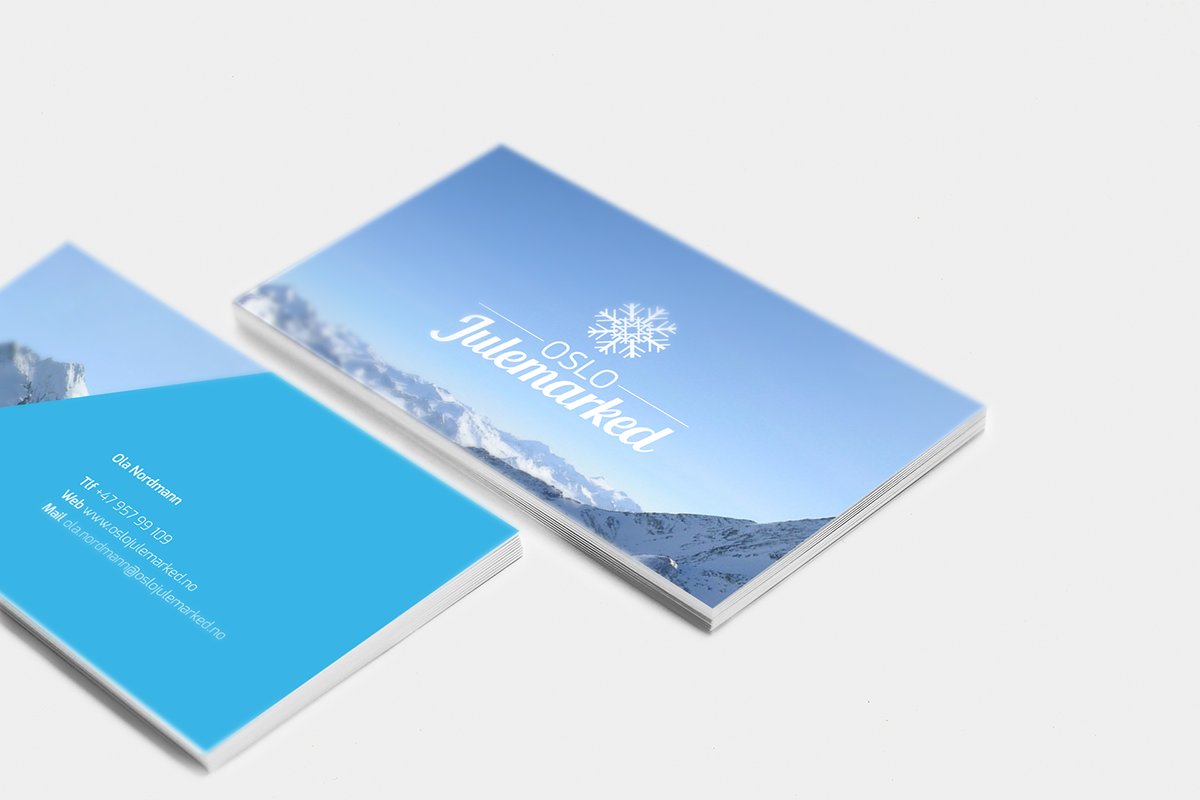
Oslo Christmas Market
This is a branding project from my second year of the Norwegian School of Creative Studies. A well known Christmas market in Oslo wanted to take the visual part of their brand to a new level and requested a complete makeover.
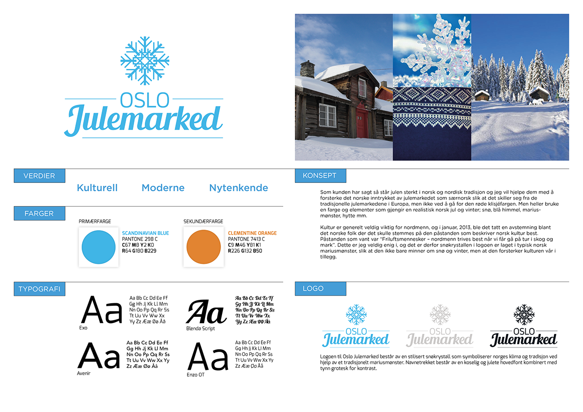
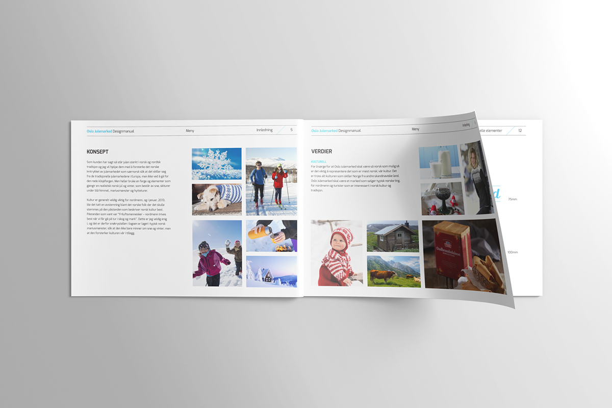
Culture is really important to norwegians, and we are known to be out and about in the woods and mountains.
Culture is really important to norwegians, and we are known to be out and about in the woods and mountains.
Therefore, my design for the Christmas market revolved around the concept of Norway's traditions and winter climate.
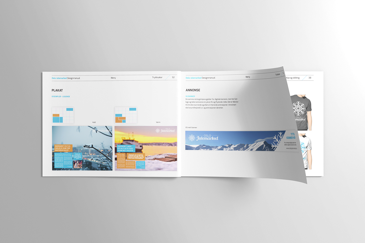
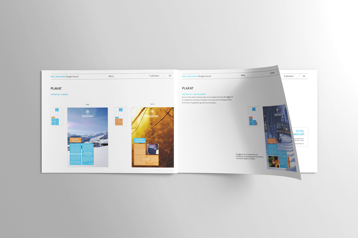
Here are two posters to get a quick overview of what the new identity looks like as a whole.
The new identity has a cold side and a warm side.
Here are some mood boards to express the feeling of the market's identity.
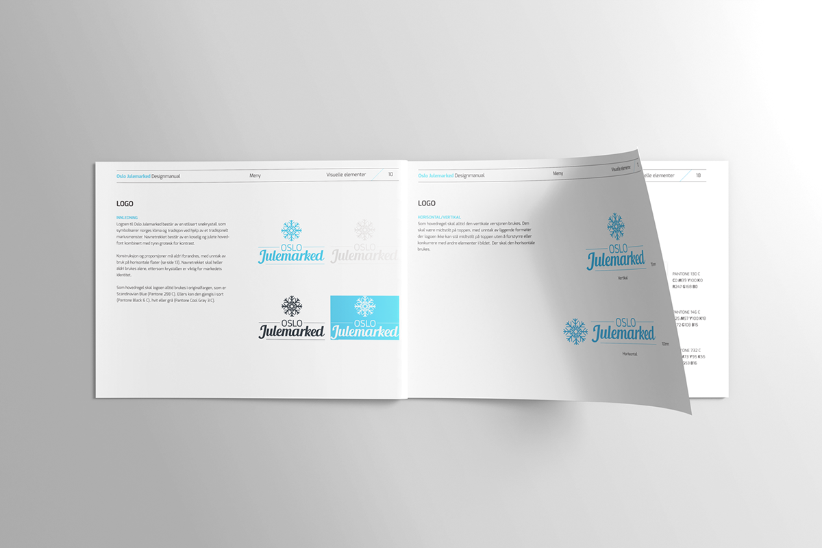
The logo has a snowflake handcrafted by myself to represent the traditional Norwegian "marius" knitting pattern,
as well as the scandinavian/Norwegian climate.
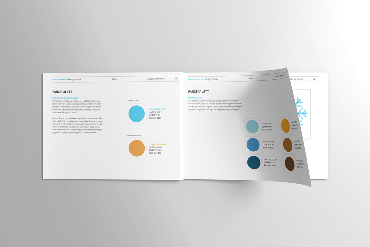
I used a cold, blue color as the main color to represent Scandinavia, and a warm orange as a complementary contrast. To widen the spectrum of colors and get some variety I added two darker shades of the primary and secondary color.
I created a simple 6 column grid and a box system. Which means you can place and stack however many boxes you need to suit your text and picture requirements. This grid and box system makes it easy to design posters, flyers etc.
Here's the horizontal edition of the grid and box system.