


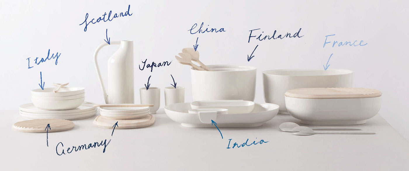
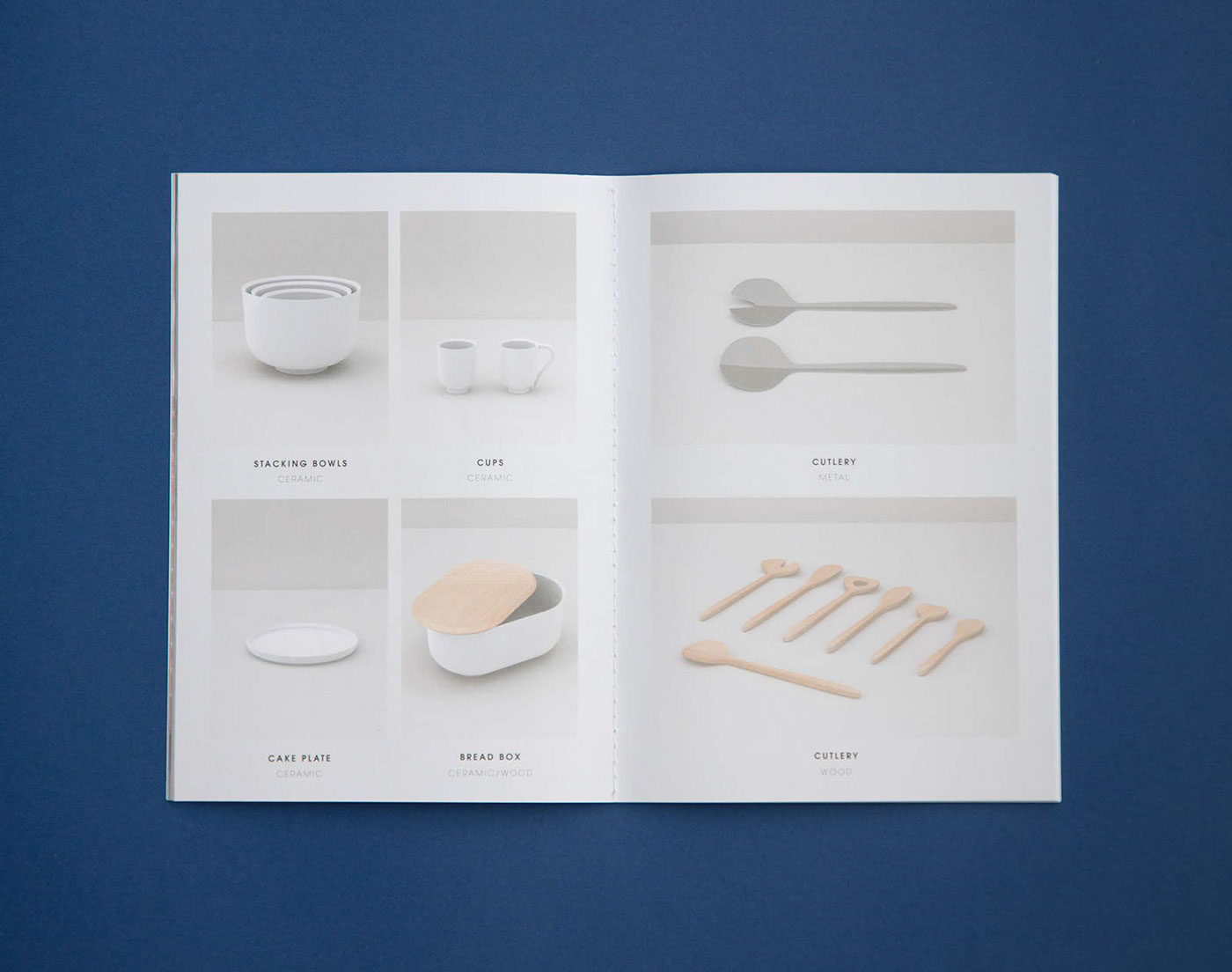
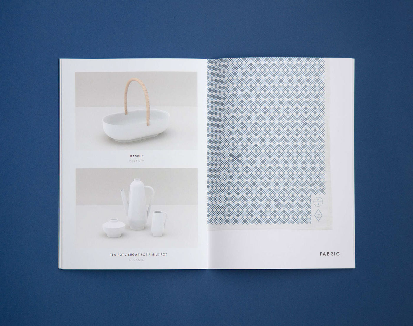
Born to celebrate multi-ethnic culinary experiences at the current
table, Fabrica presented À Table, a tableware collection for
Atipico in which each shape refers to a different country’s craft.
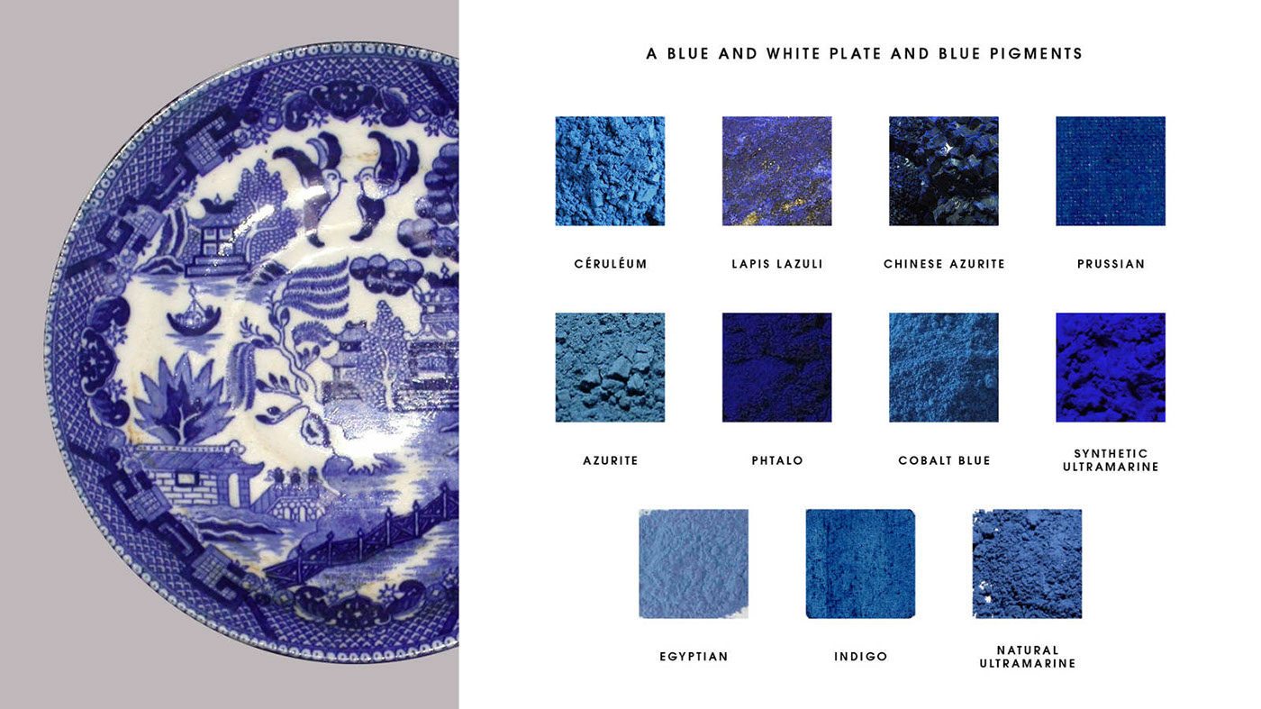
The graphic identity highlights the reinterpretation of cultures
The graphic identity highlights the reinterpretation of cultures
using the story of blue and white pottery. Developed in China,
a style of blue and white pottery was widely exported all over the
world. Imitative wares were created in many countries using local
blue pigments, which caused different blue colours of decoration.
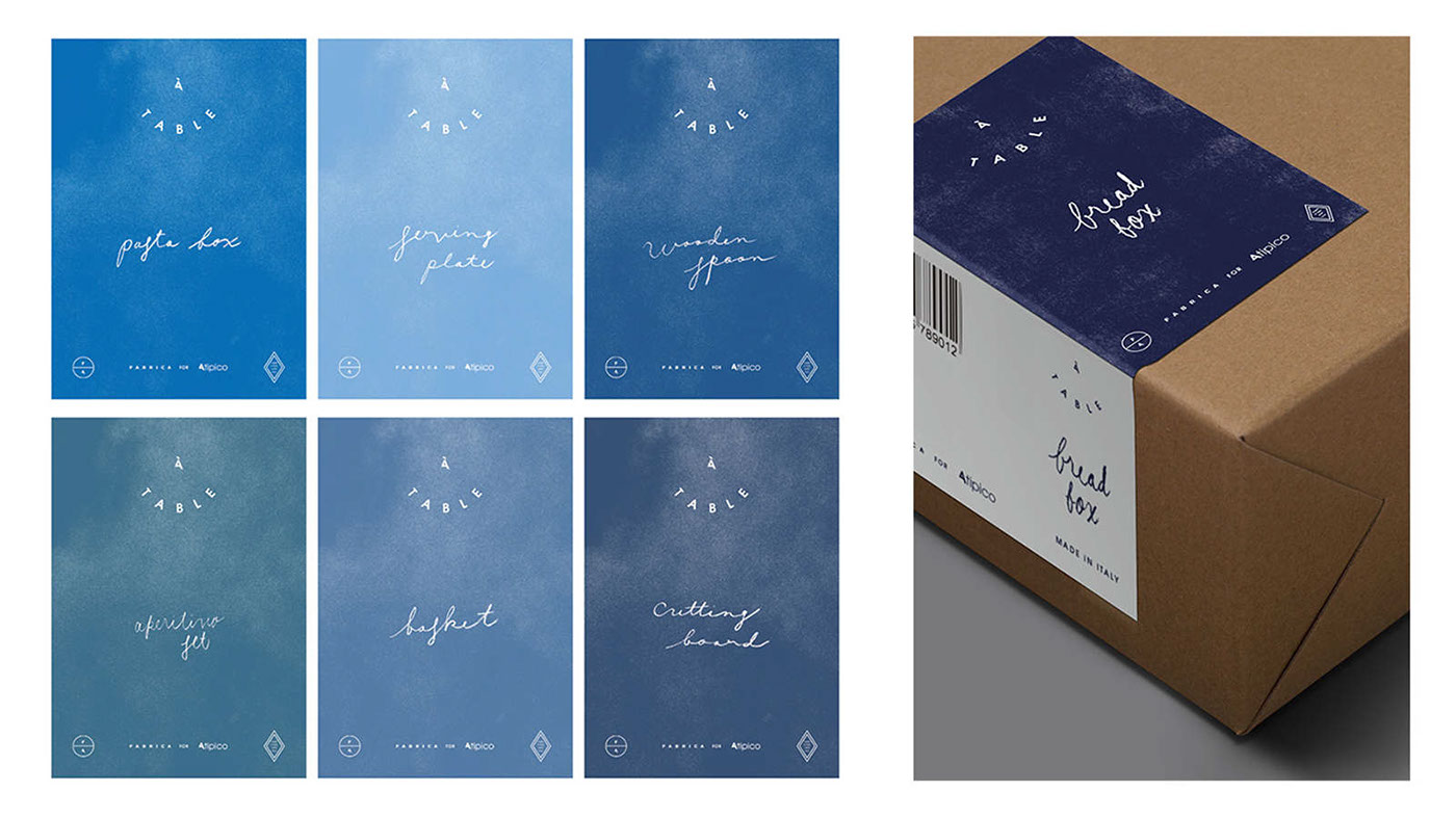
Representing each country, eleven blue colour variations are
used in graphic ornaments to liven up the multicultural-ness
of the collection, while they function as an identification of each
Representing each country, eleven blue colour variations are
used in graphic ornaments to liven up the multicultural-ness
of the collection, while they function as an identification of each
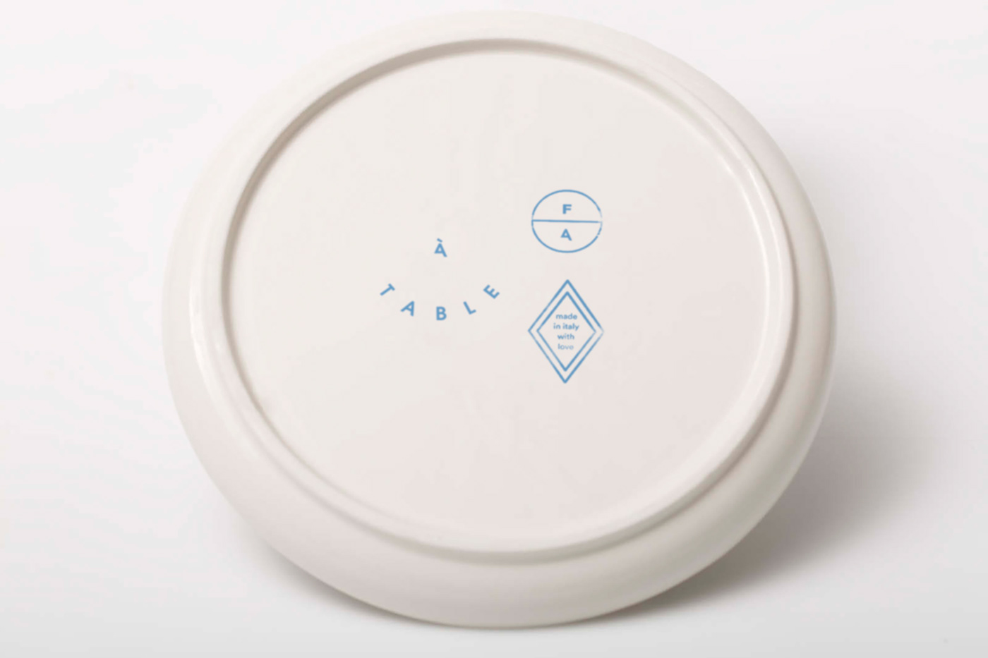
country on the packaging. The logo and the handwritten ornaments
allude to people gathering at a table where the items are set up.
allude to people gathering at a table where the items are set up.


Credits
Creative Direction: Sam Baron
Art Direction: Catarina Carreiras
Graphic Design: Tomomi Maezawa
Photography: Marco Zanin
Images of a blue and white and blue pigments:
A blue and white - CC BY-SA 3.0, Link
Lapis Lazuli - By Hannes Grobe - Own work, CC BY-SA 2.5, Link
Azurite - By Eric Hunt - Own work, CC BY-SA 2.5, Link
Natural ultramarine - Public Domain, Link
Egyptian blue - By FK1954 - Own work, Public Domain, Link
Ground azurite - Public Domain, Link
Cerulean - By Stephhzz - Own work, CC BY-SA 3.0, Link
Indigo - By prepared by Palladian - Own work, Public Domain, Link
Synthetic ultramarine - Public Domain, Link
Phthalo - By Stephhzz - Own work, CC BY-SA 3.0, Link


