Redesign J2O to become more appealing to adults.
As it stands, 40% of J2O consumption is by those aged 16 and under, but we’re wanting to change that. The current artwork design is not seen as ‘adult’ by many; the colours are viewed as bright and childish, and some consumers have even described it as cheap and ‘chavvy’. We’d therefore like you to redesign J2O to appeal to a target audience of 25-35-year-old men and women. The design should make them proud to be seen holding J2O in bars, restaurants and at home, and should bring through J2O’s expressive, unpretentious and playful personality.
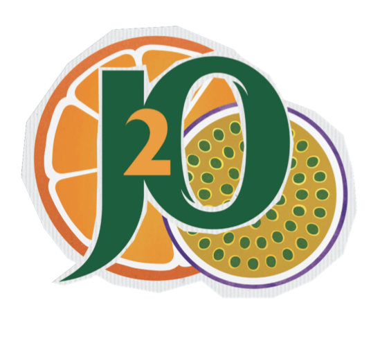
J2O Orange and Passionfruit Logo Design

J2O Mango and Apple Logo Design
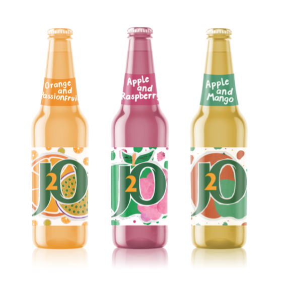
Bottle Packaging Design


