The logotype is designed for annual event. It takes place in a small town called Luhačovice. The place has become more valuable not only by the beneficial and medical effects of mineral water, but also by specific architecture with beautiful natural surroundings. Besides the sanative springs, which occur in that parks, there are a great variety of birds. Therefore the feast has been organised every year accompanied by different exhibitions with the intention of keeping birds safe and protected.
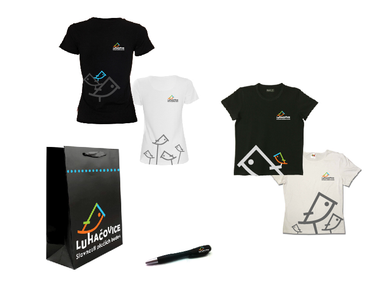
The logotype presents the name of the town and also silhouette of bird, which slightly emphasizes the surrounding architecture. Colour and the whole logotype indicate the freshness, playfulness and the atmosphere of the event. The most interesting detail is in the connection between the letter and silhouette and in the jumping font, which creates the mutual concord.
The logotype presents the name of the town and also silhouette of bird, which slightly emphasizes the surrounding architecture. Colour and the whole logotype indicate the freshness, playfulness and the atmosphere of the event. The most interesting detail is in the connection between the letter and silhouette and in the jumping font, which creates the mutual concord.