The main problem with these salt and pepper shakers is that the user does not know which is salt, and which is pepper. The salt and pepper shakers are a unique, fun, and a very cool design. We want to keep the “cool” factor, but allow our users the chance to know what they are picking up.

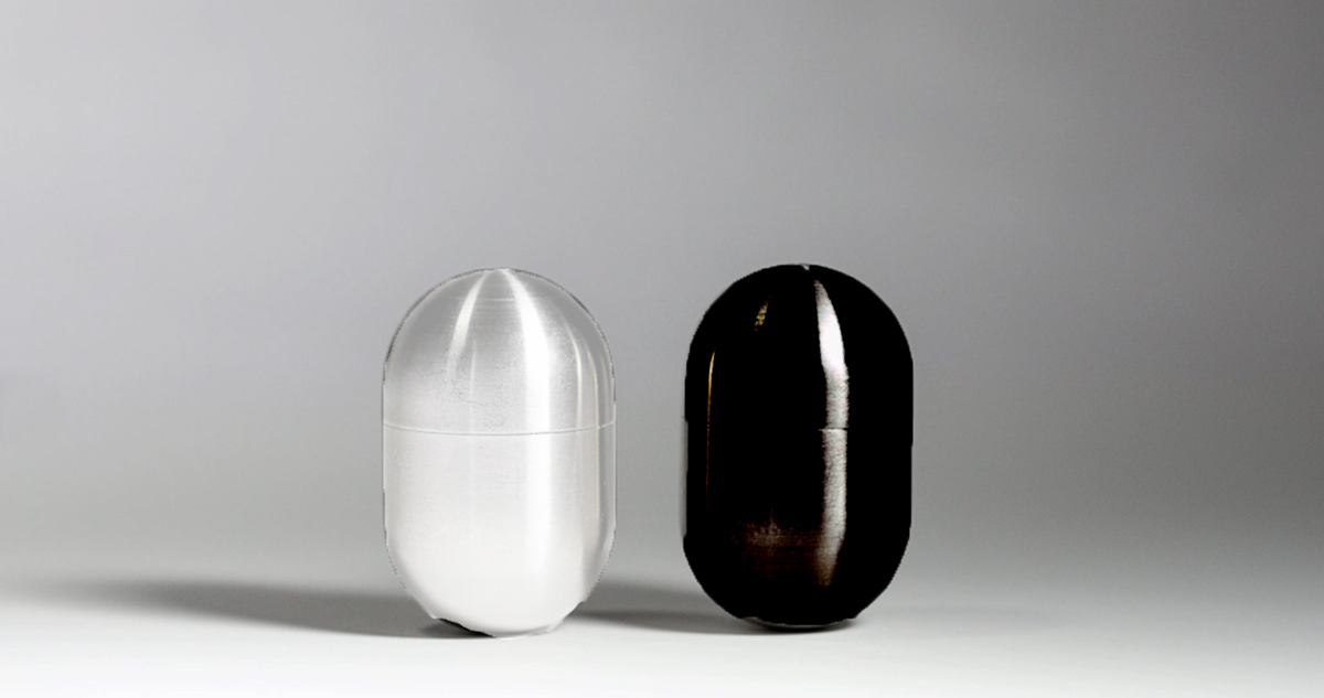
he most common symbol or signifier of salt and pepper are the colors black to represent pepper, and white to represent salt, This signifies to the user, at a quick glance, the contents within. The final solution is simply glass capsules, in the same design.

The next option is to have an “s” and a “p” on the top where it comes out. This idea would work on it’s own, but the constraint is that it would take the user a bit more time to look at the top of the capsule to see what is within.


Salt and Pepper are written on the capsules. The affordance in this design is that these capsules are capable of holding salt and pepper, and best of all it is created from stainless steel, therefore is extremely sturdy. The problem with the material they are made from though, is that they do not allow for users to see the contents inside. We can let them know what is inside, by placing the word describing the contents within.

