This project was made my last year of Uni.
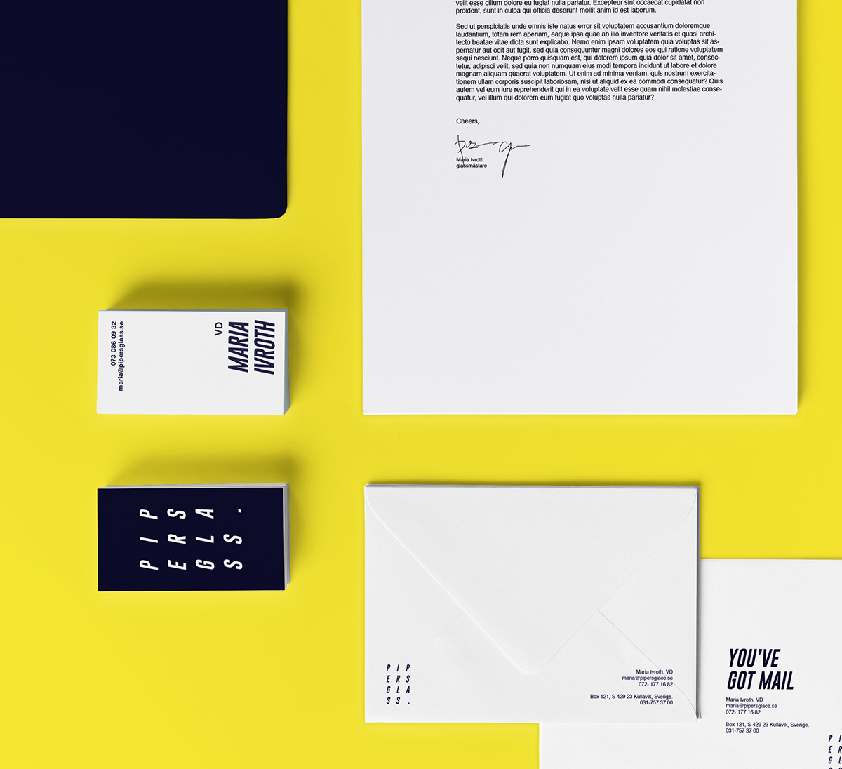
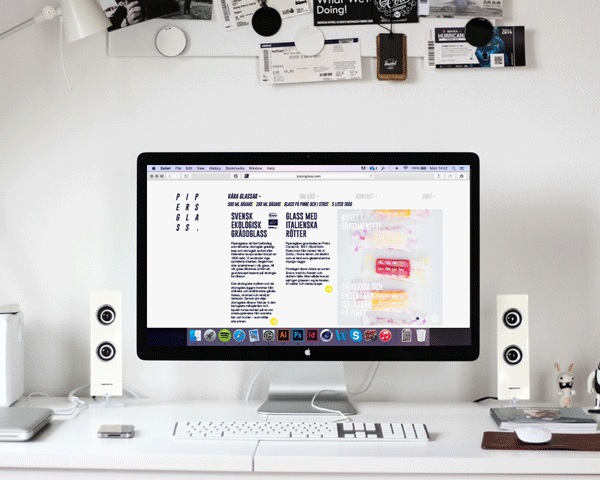
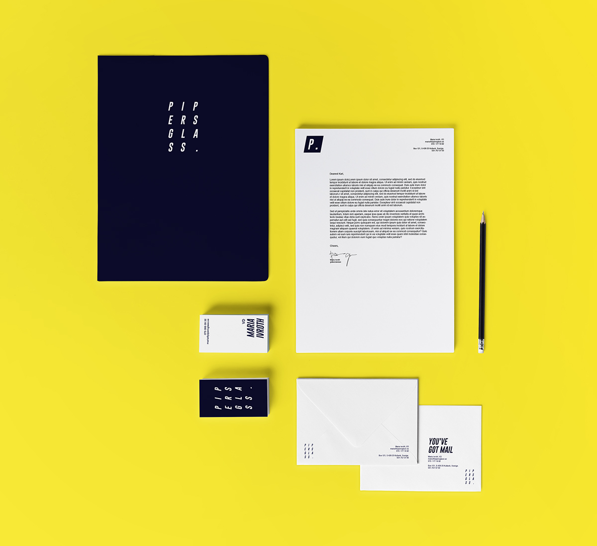
It's a fictional rebranding of an ice-cream company.
It's a fictional rebranding of an ice-cream company.
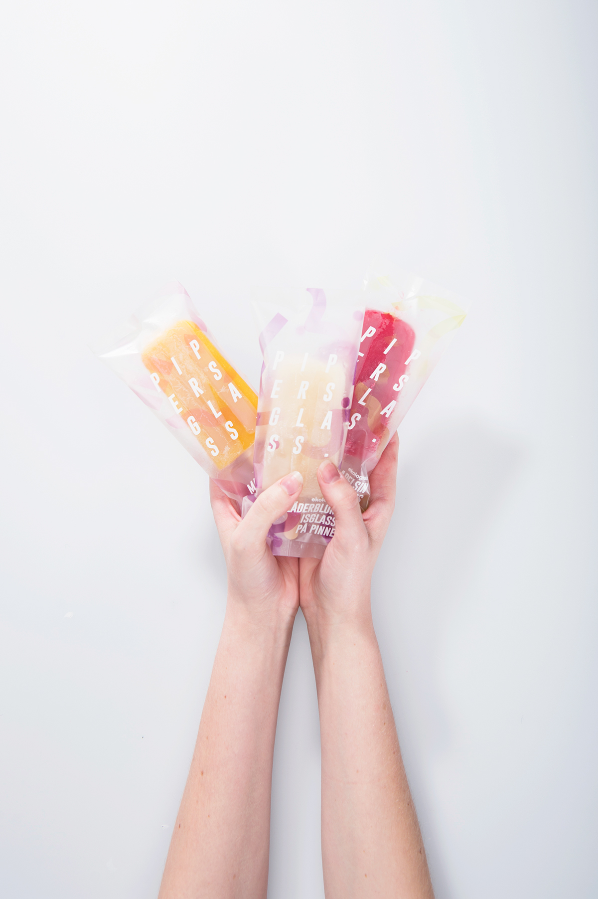
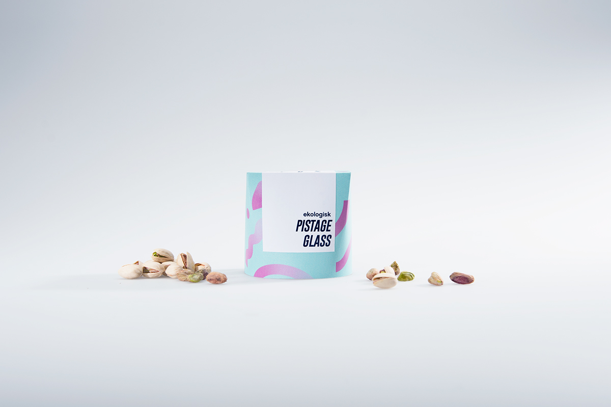
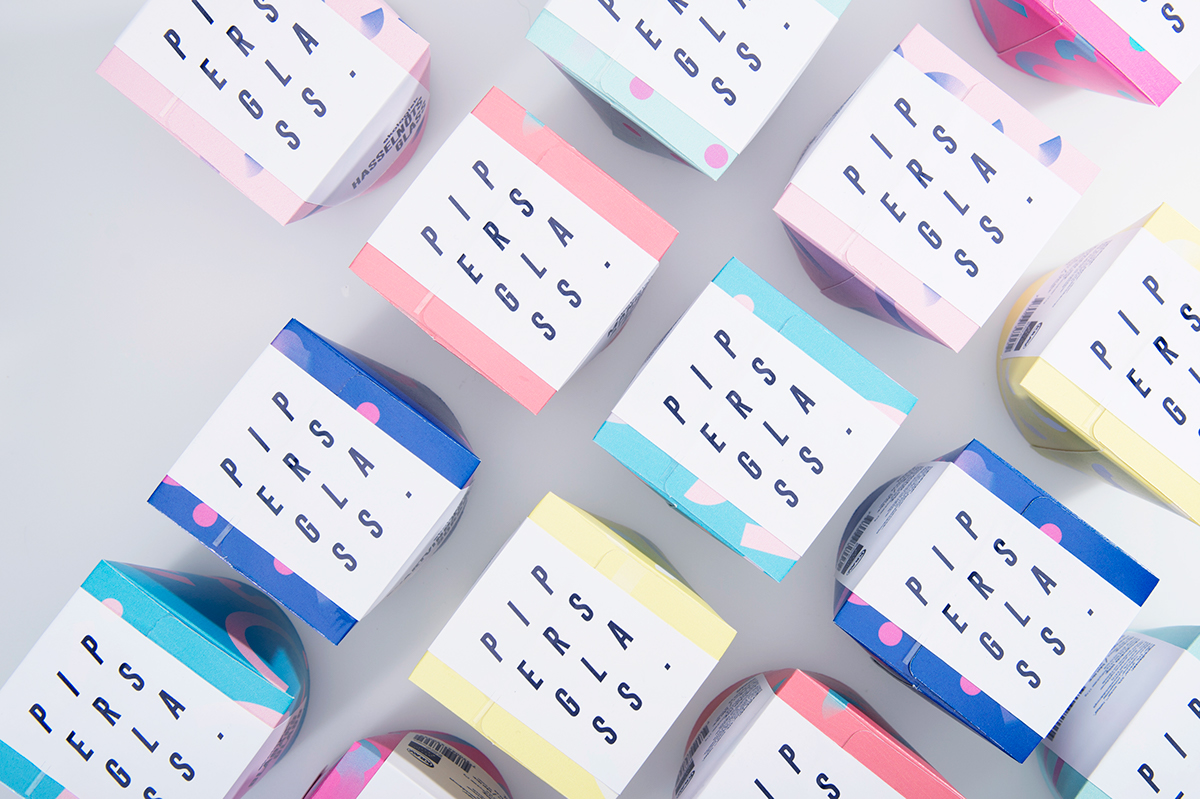
I wanted the graphic design of the packaging to be as striking as possible and really catch ones eye without being too in your face and disturbing. So, I worked with simple shapes and instead with vibrant and fun colours to express the goodness that is inside.
The shapes are all actually illustrations I made of the main ingredient in each ice cream, that I later deconstructed and made into a confetti-looking pattern. The reason I did this was to not make it too obvious and I found it hard to make the shapes all on their own and not make it too boring and repetitive. This gave them even more life and wonder.
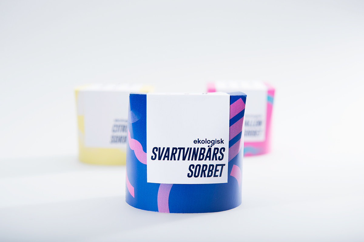

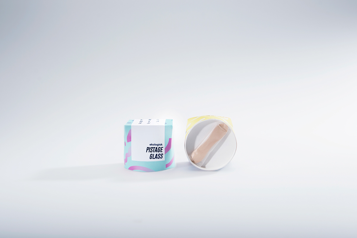
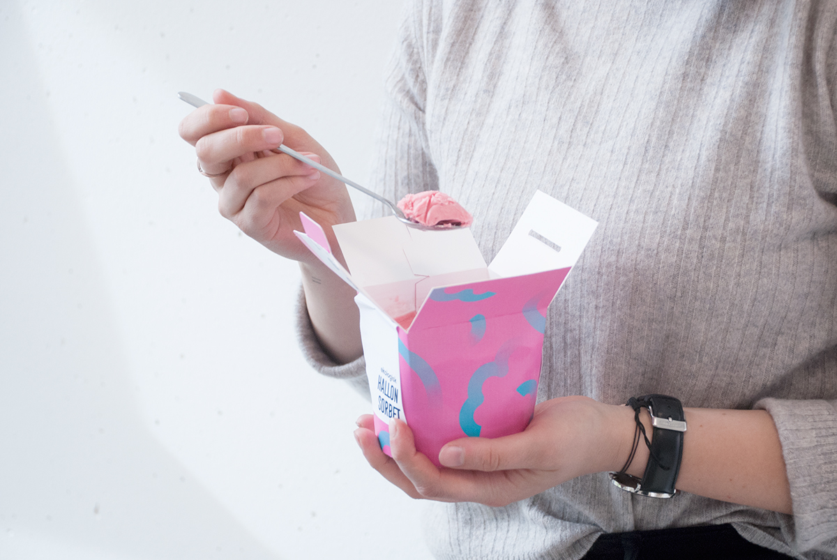
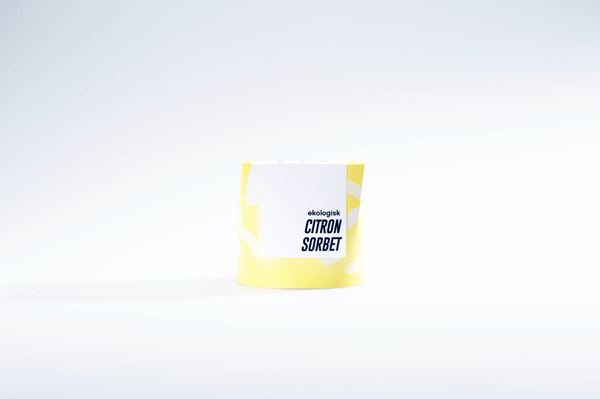
The containers come in two sizes, the larger one is to share (or consume by yourself when you're having a bad day, for instance) and the smaller one is for people on the go – hence the little wooden spoon underneath.
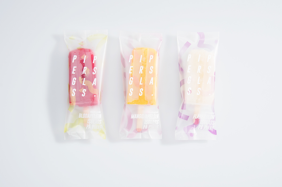
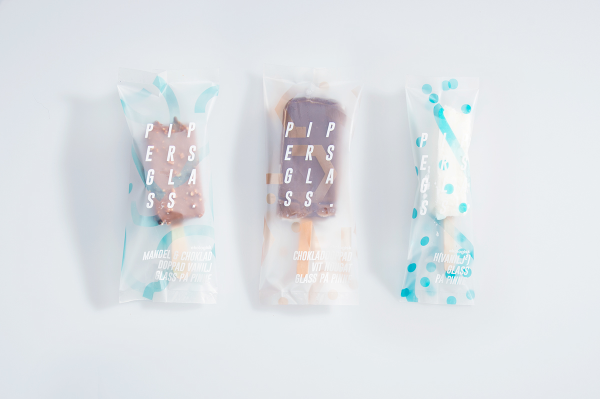
I wanted the ice lollies and other ice creams to be in an icy, see-through plastic so that one would know what they would get and to truly celebrate what's on the inside.