Like many designers, I was managing my online portfolio as a Behance Prosite. However, Prosite layouts do not (as yet) offer a responsive option.
After trying a brute-force approach in the Prosite back-end, customizing html and css, and not getting exactly what I wanted, it was time to take charge.
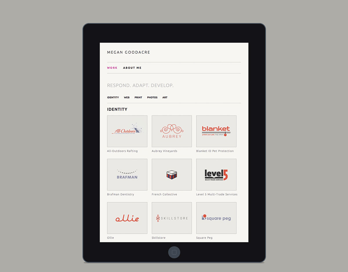
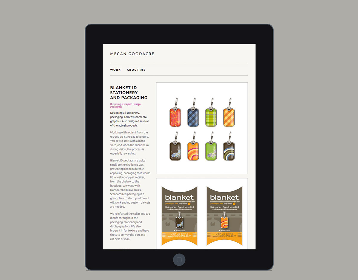
The goal was a mobile-first, adaptive, responsive layout, with a fresh, simple design and straightforward nav.
The site uses php, css, a tiny bit of javascript, and the Behance API.
You can see it in action at www.megangoodacre.com


