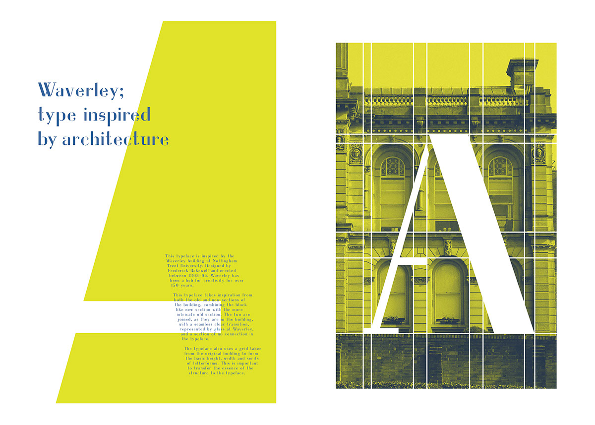
I chose to base my typeface on Waverley building, Nottingham. The main element of the building I chose to form my typeface was the combination of old and new, I therefore created a half serif, half sans-serif typeface. The two sections of each letter form are connected by the same seem less glass partition that we see on the building.


The base shape for my typeface came from a grid created by the lines of Waverley building. This ensured that my typeface kept the structure of the building.
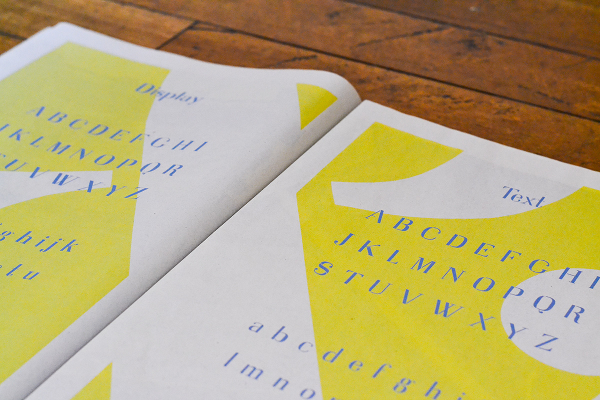
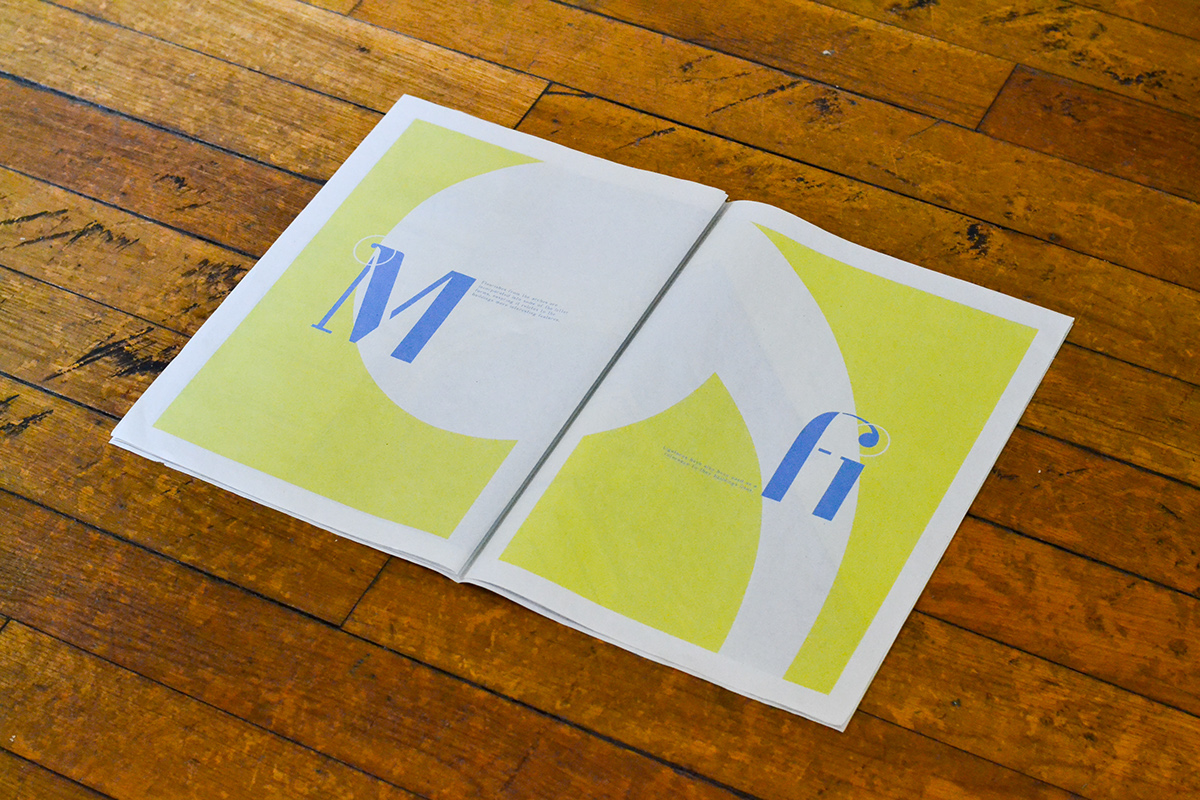
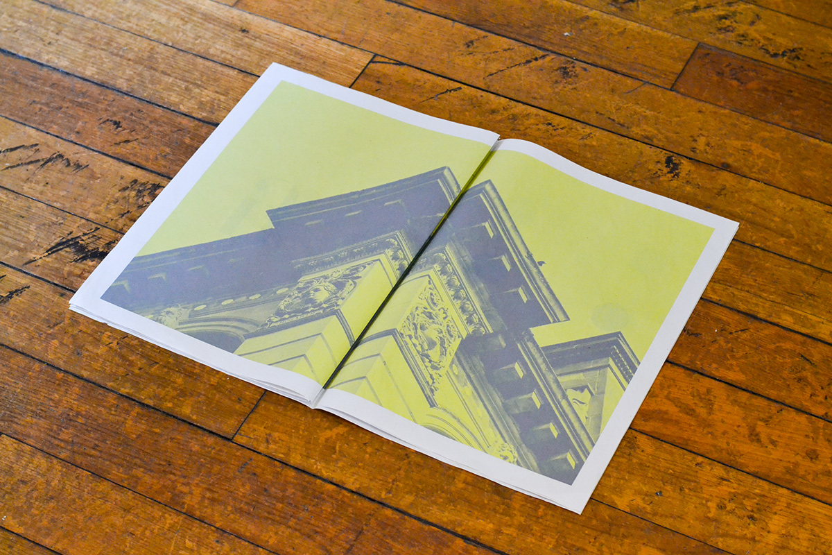
This is the type specimen book for 'Waverley'. I chose a traditional newsprint format to relate to the age of the building, and the colour scheme was taken from elements within the walls.
This is the type specimen book for 'Waverley'. I chose a traditional newsprint format to relate to the age of the building, and the colour scheme was taken from elements within the walls.


Thanks for looking!
I will be making a version of this typeface available, please email me if you're interested.
I will be making a version of this typeface available, please email me if you're interested.

