

I worked on a personal project were I created album covers for artists spanning various genres of music. I wanted my design to be as detailed as possible so I had to invent a label to use on the promotional materials.
I decided to base its name on the phrase 'sight and sound' but that changed to 'Sound&Sight' when I realized the music was pivotal in the developing of the style and content of the covers.
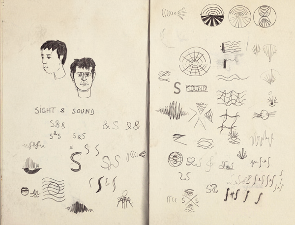
I started sketching things out on paper, playing around with various visual metaphors for the name and the relationship between the two senses. I was more concerned with form and space than with accurate rendering and I already knew I wanted something synthetic and understated, almost scientific.
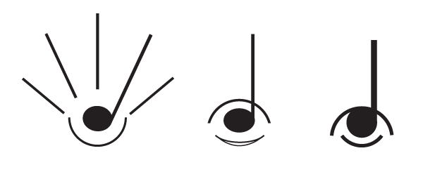
Eventually I settled on the sketch that combined symbols of both senses and created different versions in which I balanced visual cues and simplicity, searching for the most effective and coherent pairing.
Below you can see a few mockups I used in order to test the final result.

This is the back view from one of the covers I created, featuring the logo for the Sound&Sight Production Company.

Thank you for viewing my projects!


