


Brief Summery
This was my last student brief in university. I was asked to write a brief for myself that is based on my dissertation. My brief was to rebrand Holland and Barrett to appeal more with it's current audience, the rebrand must use research complied within my dissertation to show how the rebrand will improve sales within the current market.


Brief Outcome
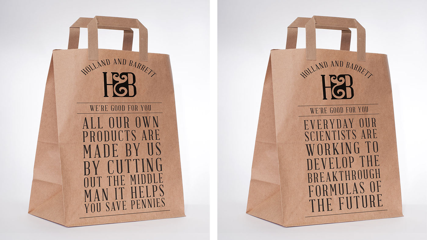
Holland and Barretts products are very high quality and they have a price to match, unfortunatley the packaging and design throughout the whole of the company is inconsitant and this makes the company look over priced.
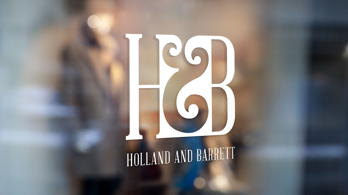
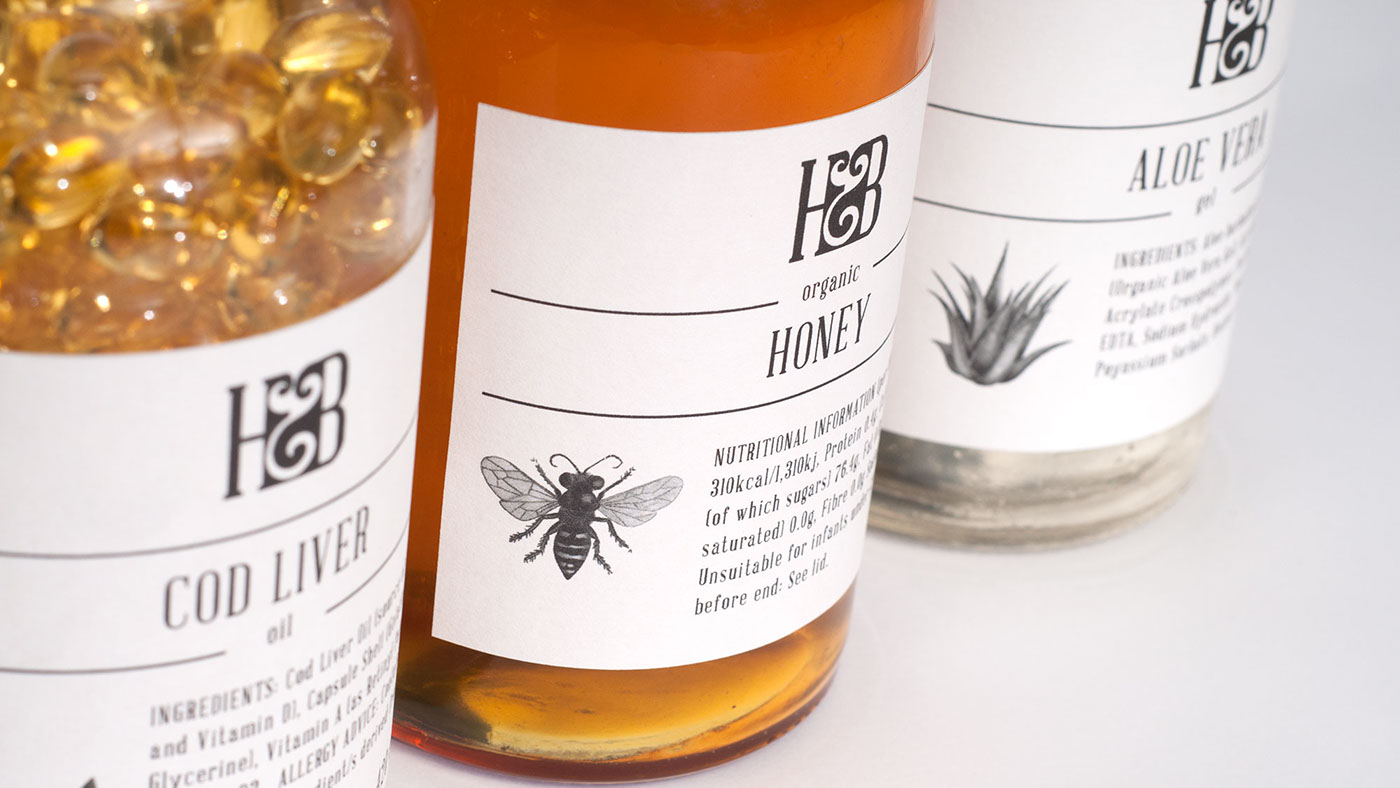
My rebrand needed to inject premium quality into the brand. I researched heavily into the company background and found that it was started by two partners in the late Victorian Era orginally as a chemist. I used images and styles from this era to heavily influence the branding, using glass containers so customers can see the true quality of the products that they are buying. I created a striking monogram logo that can well stand alone and work well with the packaging that I designed.
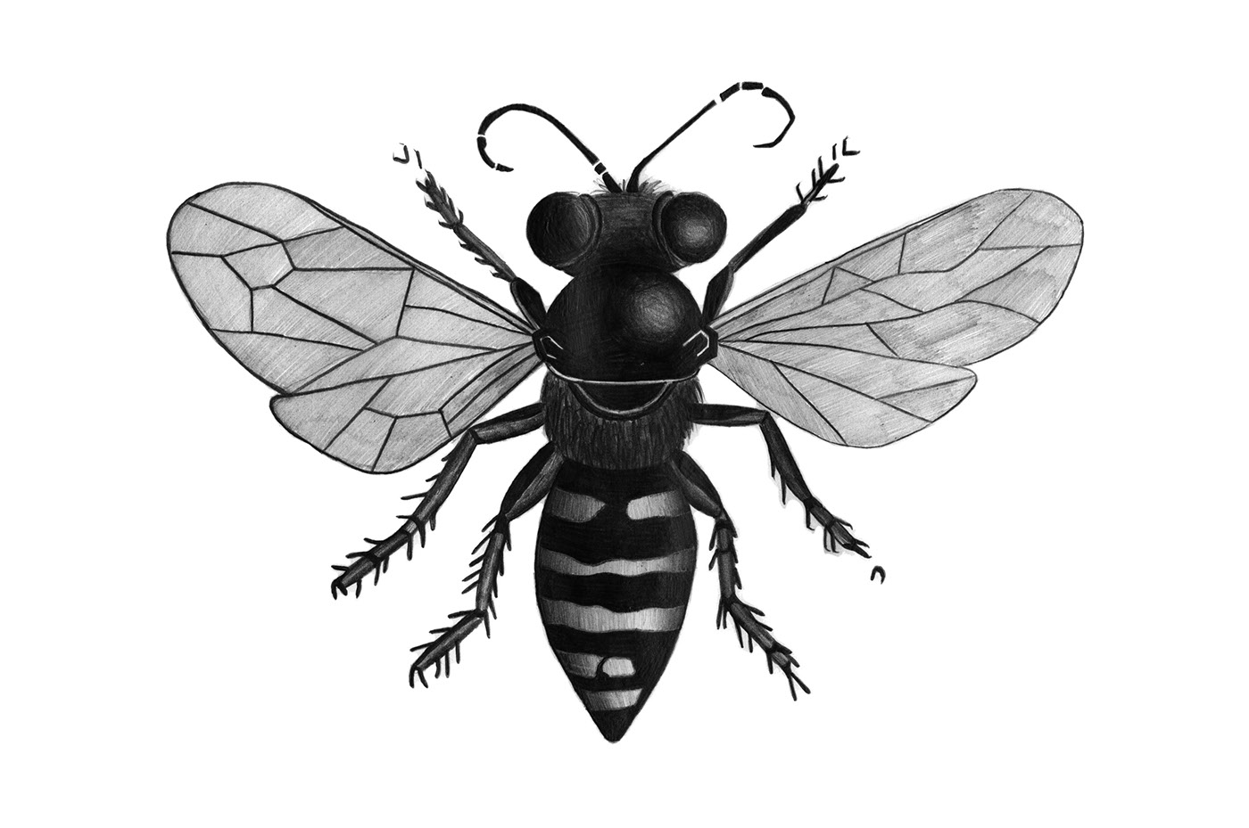
I produced a vector monogram logo for the brand, three victorian styled illustrations and I designed and made the labels myself. I also designed the front of the bags and created a brand guidelines so that people could see how the brand could work in various ways. I worked with a studio photographer to take the pictures but I edited all of them myself.


