


Aberaeron, Wales.
My chosen town is one that holds many memories for me. The Welsh coastal town of Aberaeron is where I spent many a childhood holiday. With its rows of painted houses it was the first place to come to mind when considering a project based around colour.
I have created a typeface inspired by the colour and architectural features of these houses, embodying the pride that these people hold for their town. With the typeface came the visual style, it needed a function.
I have created a typeface inspired by the colour and architectural features of these houses, embodying the pride that these people hold for their town. With the typeface came the visual style, it needed a function.

Inspiration.
After visiting Aberaeron again and collecting many photographs of the area I was able to build a strong visual language based on the architecture of the buildings. Particularly the bright colours and contrasting windows and door frames.
After visiting Aberaeron again and collecting many photographs of the area I was able to build a strong visual language based on the architecture of the buildings. Particularly the bright colours and contrasting windows and door frames.
These were the starting point of this project and really influenced the typeface.

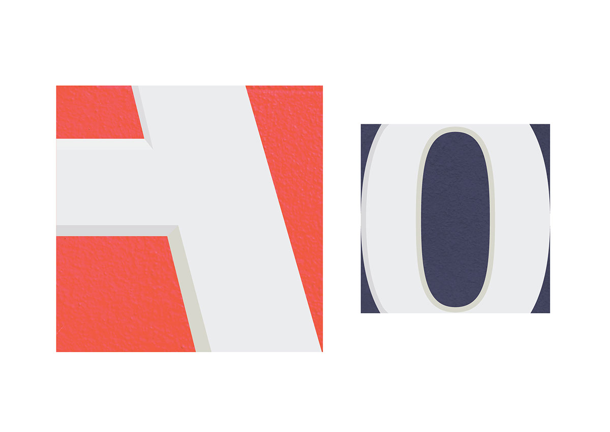
The Typeface.

Soon after the typeface was designed I experimented with some 4 layer screenprints of my personal favourite letterform. thanks to this process it has a very interesting texture, almost replicating that of the walls in Aberaeron.

Wayfinding.
The typeface needed a function so I decided to create a guided route around the town to its historic and beautiful features such as the Harbourmaster Hotel and the River Aeron. This route is marked out by square tiles featuring letterforms from the typeface, each one loosely relates to the subject it is attached to, e.g. The Harbourmaster has a “H” tile. These letterform tiles are accompanied by an “information tile”.

The tiles are accompanied by a bi-fold card for visitors to the town. These are designed with each individual letter of the typeface on the front so that users can choose their own initial etc. I chose to design them this way so that they act as a keep-sake. If there is a personal touch to the experience the visitor is more likely to keep it; almost like taking part of the town with them.
The card acts as the map for the route and includes the information from the “information tiles”.

There are 12 wayfinding tile pairs in total. Each with a piece of information about the town. I believe they fit into situation well, subtle enough to ensure that the overall beauty of the town is not lost.
The floor directional tiles are also shown here. these are to ensure that people know which direction they need to be going to find the tiles. These use the same colours from the typeface and the same bevel effect to ensure a consistent visual language.


Website.
A new online presence for the town designed to be coherent with the wayfinding route. I have adopted the square format and transformed it into a grid for the website and used the colours from the typeface.

Accompanying promotional materials such as posters, signage and postage stamps. The lamp posters could be positioned along the road towards Aberaeron, acting as welcome signage, or along areas of the town, for example, The Harbour.
The promotional posters could be used in magazines or as web adverts. I consciously decided to avoid using any photographs in these posters as I feel that is very generic. The bright colours demand attention and the minimal amount of information builds intrigue.


