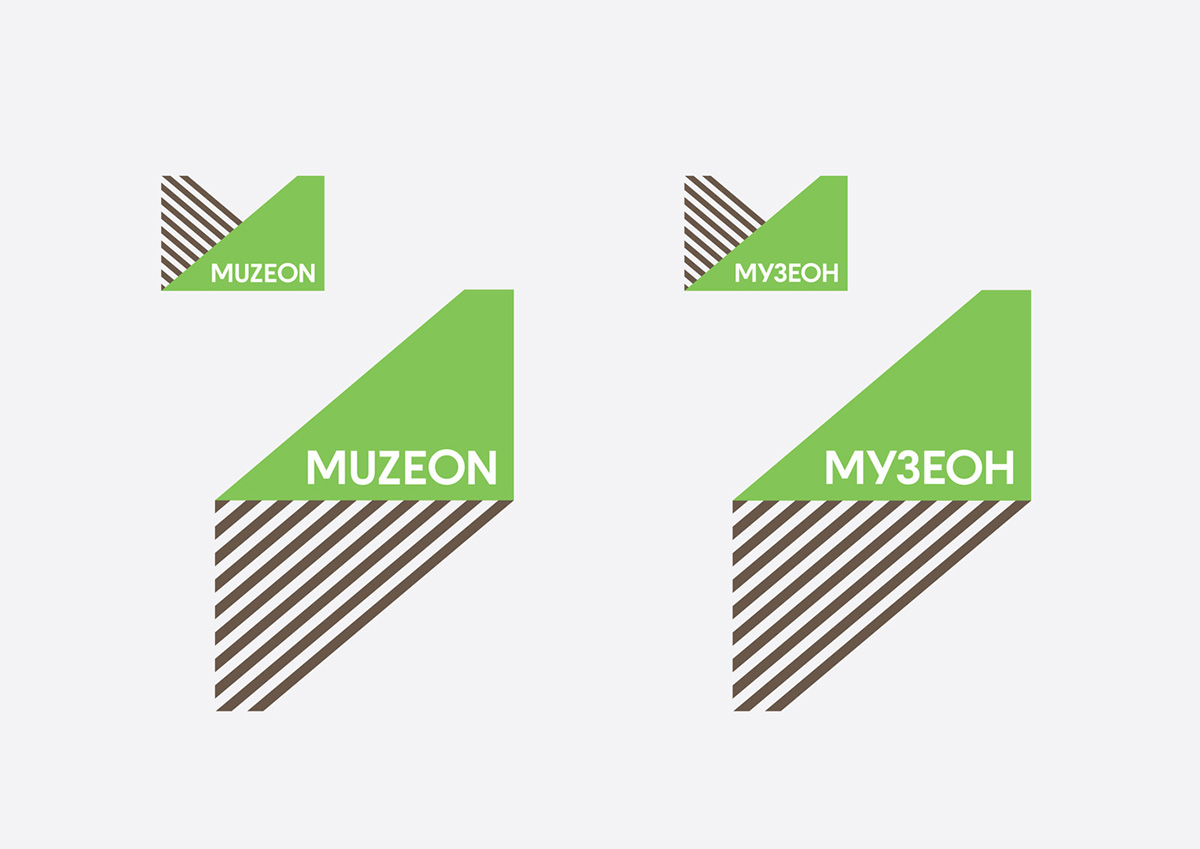
Muzeon museum park is a unique place. Sunlight plays an important role in the environment: the park's exhibition constantly changes, dependent on the time of day and season. The sculptures here are sunlit and, in contrast to sculptures that are evenly lit inside museum rooms, they have their antipode - a shade. Muzeon's new logo symbolises this duality: light and shade are both antipodes and integral parts of one entity. In painting, light and shade play a special role. Thus, the logo refers to Muzeon's public image as a communication vehicle of Moscow's artists and cultural activists while stressing its proximity to the city's major art galleries. The contrast motif is the basis of the park's brand identity. In every element the duality theme is visible: light and shade, cultural and natural. Modern materials are mixed with wood, bright accents, with neutral ones. For print and advertisement materials ecology-riented approach was chosen: one/two color printing and using recycled paper. Also, the park's navigation system, both visitor-friendly and in line with the general architectural concept, was developed. The typography and black-and-white illustrations emphasize Muzeon Park's connection with the 20th century art and its unique role in Moscow's cultural life.