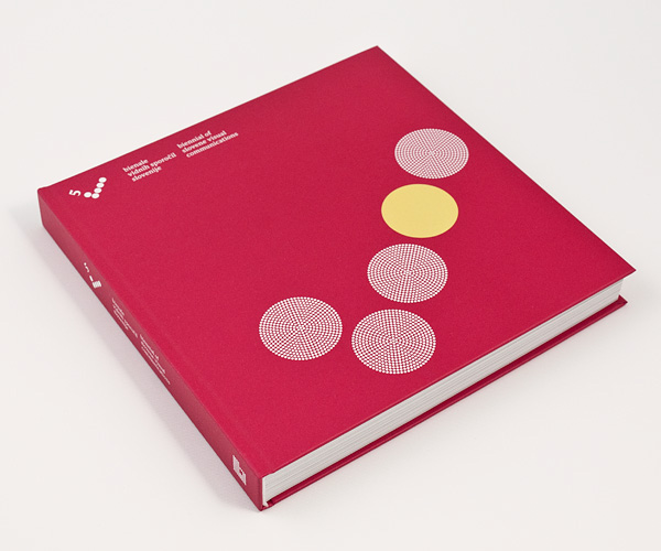
every dot has a meaning
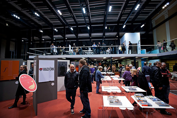
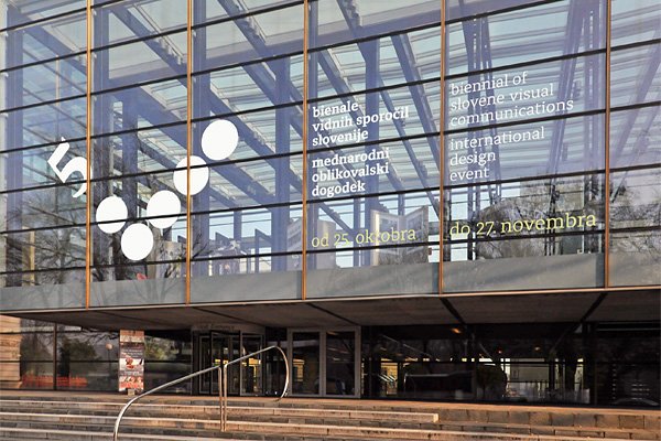
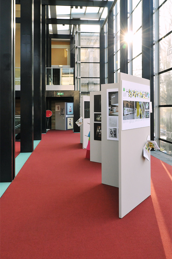
Every second year the Brumen Foundation has been organising the most prominent event in the field of graphic design in Slovenia, the Biennial of Slovene Visual Communications. The best designed works by Slovene graphic designers have been selected and put on display in the National Gallery of Slovenia along with the exhibition of works by members of the international jury.
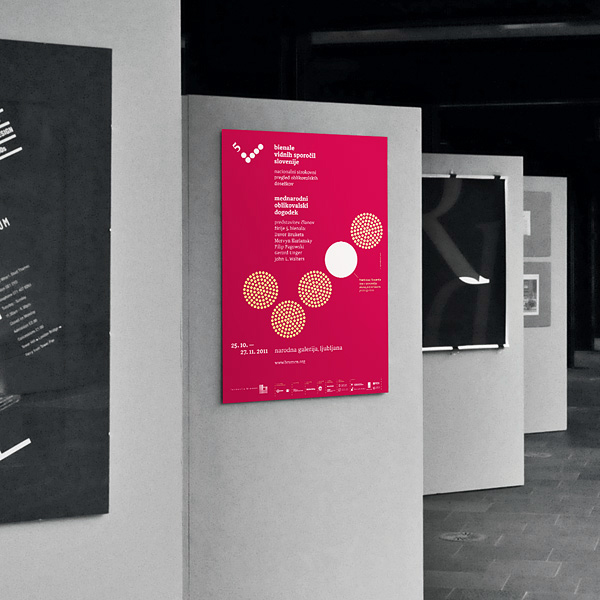
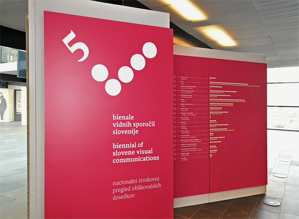
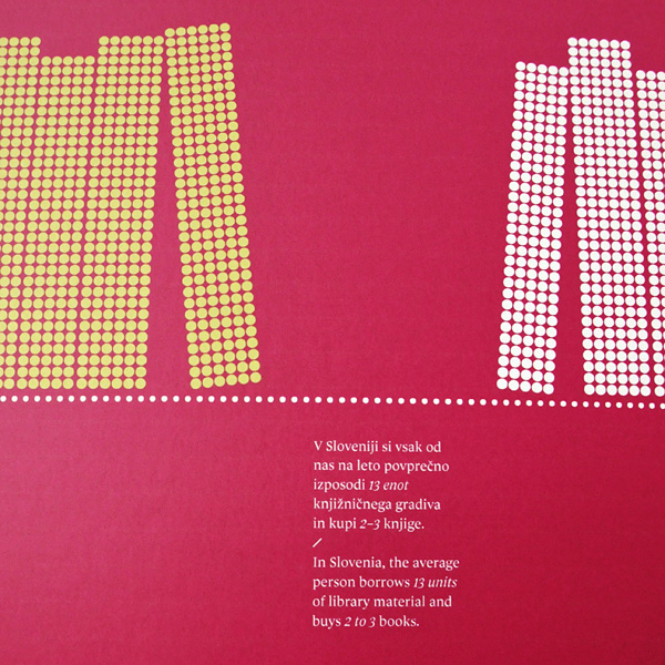
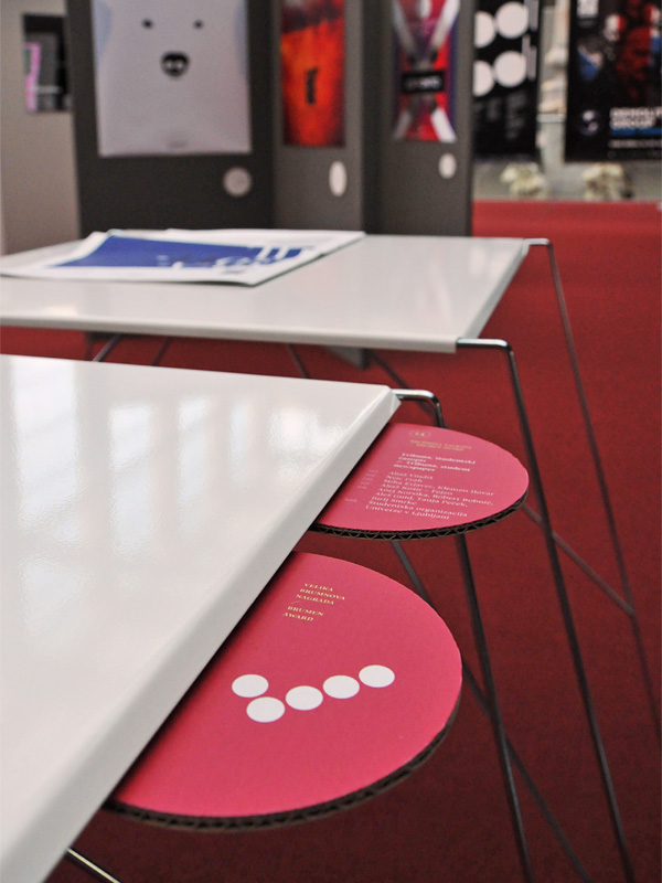
Traditionally, the basic element of all Biennials' visual identities has been a dot, derived from the Brumen foundation logo. Five dots are arranged to form a check mark, a symbol for quality and accuracy.
Traditionally, the basic element of all Biennials' visual identities has been a dot, derived from the Brumen foundation logo. Five dots are arranged to form a check mark, a symbol for quality and accuracy.
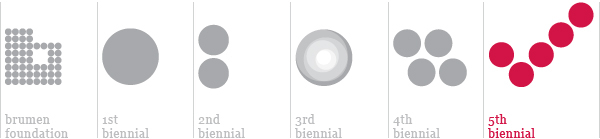
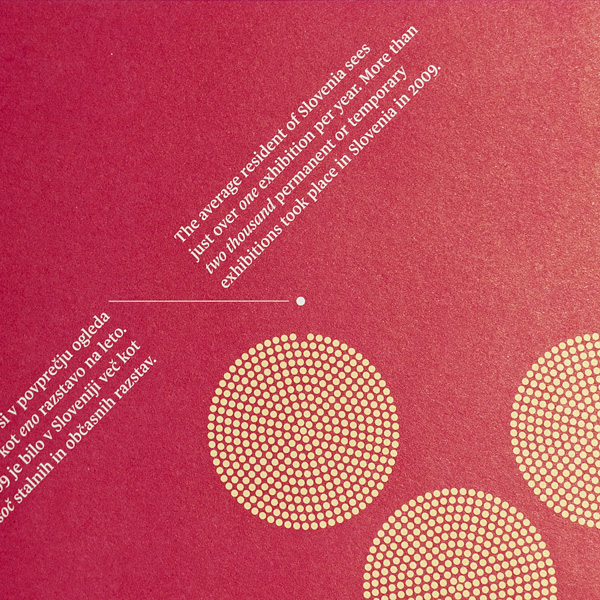
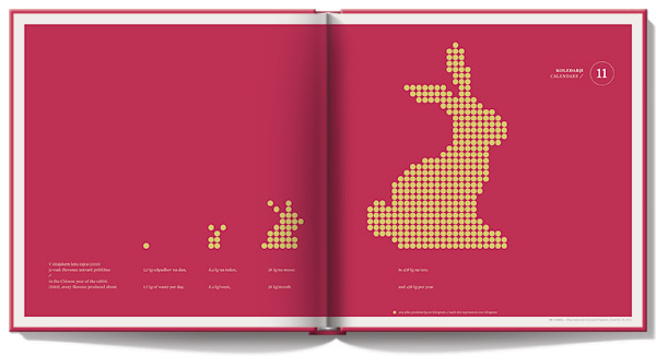
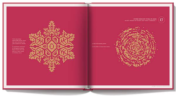
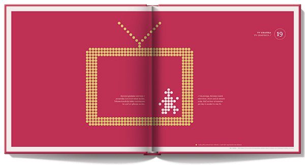
For this year's visual identity we set a goal – to give each dot a function by pointing out some important and thought-provoking facts that affect or are affected by graphic design, such as a high level of functional illiteracy among Slovenes or a very low amount of money they spend on books. Each dot represents one part of the whole.
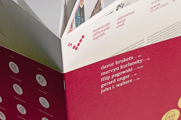
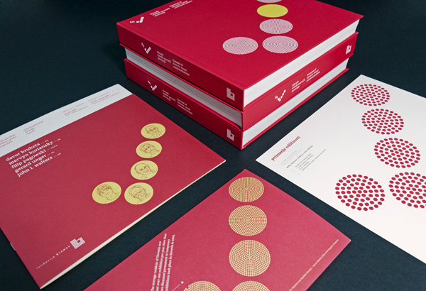
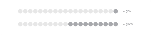
Each of the selected statistics (more than 30) has been presented on every promotional material (posters, ads, invitations, leaflets, t-shirts etc.) as well as on introductory panels at the exhibition and category dividers in the exhibition catalogue.
Each of the selected statistics (more than 30) has been presented on every promotional material (posters, ads, invitations, leaflets, t-shirts etc.) as well as on introductory panels at the exhibition and category dividers in the exhibition catalogue.
Concept and design by Matjaz Cuk.
Information graphics by Katarina Mrvar, Luka Mancini (Lukatarina) and Matjaz Cuk.
Exhibition design by Matjaz Cuk and Lukatarina.
Type family BadNews by Samo Acko.
Information graphics by Katarina Mrvar, Luka Mancini (Lukatarina) and Matjaz Cuk.
Exhibition design by Matjaz Cuk and Lukatarina.
Type family BadNews by Samo Acko.
© nada zgank / memento
call for entries poster
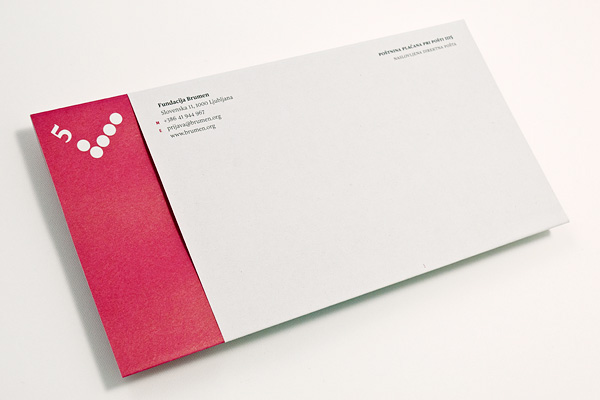
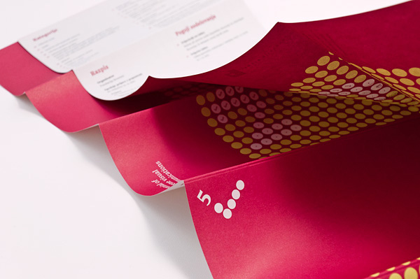
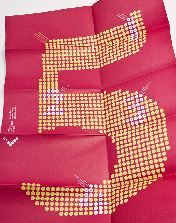
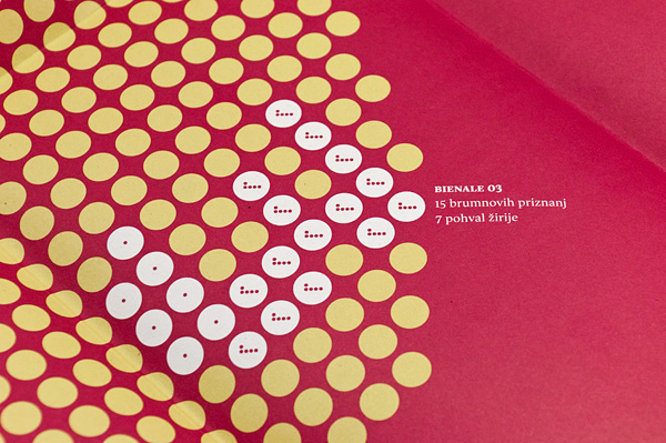
The call for entries leaflet features the statistics of the past Biennials. The big number 5 represents all exhibited works (880) compared to awarded works on each of the four Biennials (numbers 1 to 4). Each dot represents one work.
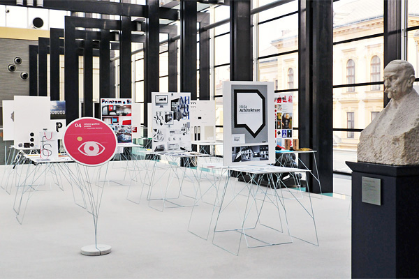
exhibition design
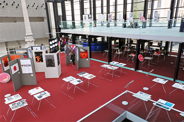
230 works have been presented in 19 categories, such as type design, corporate identities, books, packaging as well as digital media.

Information panels have were printed directly onto the special corrugated paperboard.
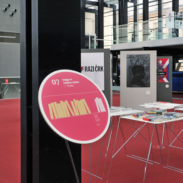
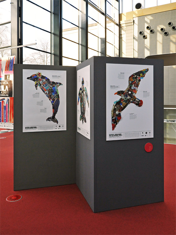
Information panels have been cut out from the recycled corrugated paperboard.
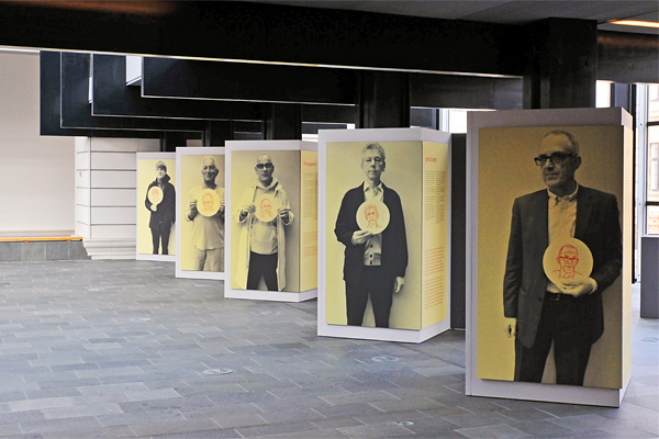
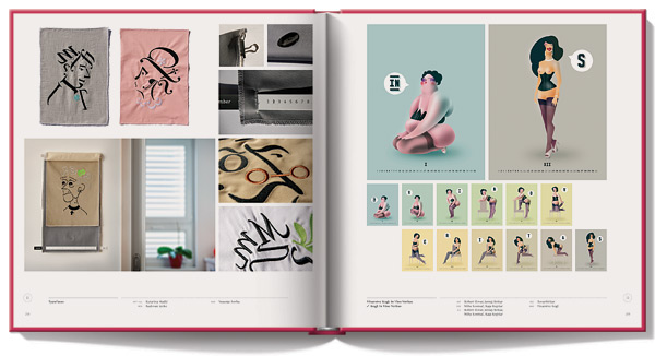
Members of the international jury have been presented in a separate exhibition in the gallery space. — Portraits illustrated by Robert Ilovar (IlovarStritar), photographed by Milan Pajk.
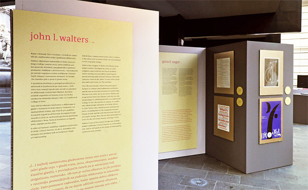
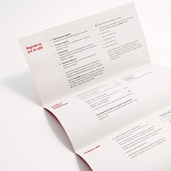
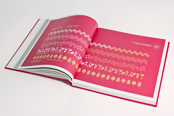
catalogue of entries

The facts on promotional materials and cover pages are presented in the form of the logo (the check mark) in order to enhance recognisability. However, every infographic is different.
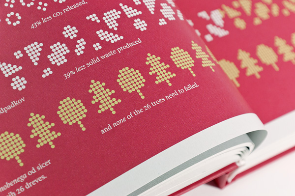
Recycled paper has been used for all printed materials of the Biennial, including the exhibition catalogue. One of the facts is showing the benefits of using this more sustainable option for graphic print production.
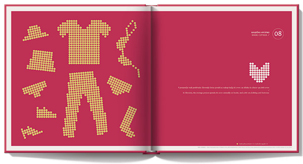


promotional materials