


Visit the site at Harrisburglaw.widener.edu
Awarded silver in the 2015 EDU Digital Marketing Awards
This is a website redesign I worked on for Widener Law Harrisburg University. I worked on this project as part of a team at Greatest Creative Factor. I was involved in almost every step and aspect of the process. We started with sketches, wireframes, and client meetings. I went onto campus with the photographer to art-direct the photos featured on the site. I illustrated a campus map, and several icons. I turned the wireframes into Photoshop flats and worked with the developers to get the functionality that the school was looking for. Designed the various breakpoints and how the content re-flows at various screen sizes. Right before the site went live I combed through it one last time for style consistently and to find any last minute bugs. Developed a style guide that the school can refer to as they continue to update the site.
This project wouldn't be anywhere near the level it is without the help from:
My team at Greatest Creative Factor
Developer - Ignition72
My team at Greatest Creative Factor
Developer - Ignition72
Photographers - Bill Denison & Chris Hartlove
This project was done in conjunction with the Widener Univeristy Delaware Law website. These are two sister law schools with the same parent university. Part of our challenge was to give each school their own voice while remaining in the Widener University brand. We tried to reuse as much of the code and structure as possible across both sites to reduce costs. If you haven't seen that project I recommend checking it out as well. View the project here.
A quick tour of some interaction from the site.
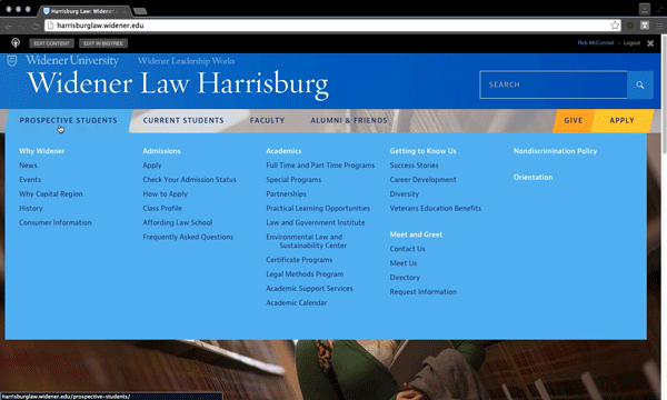
Drop down menu.
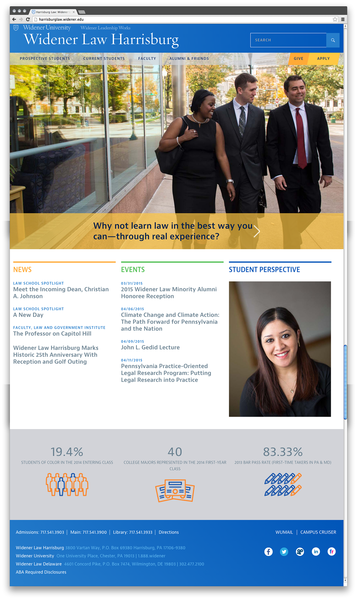
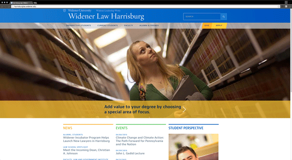
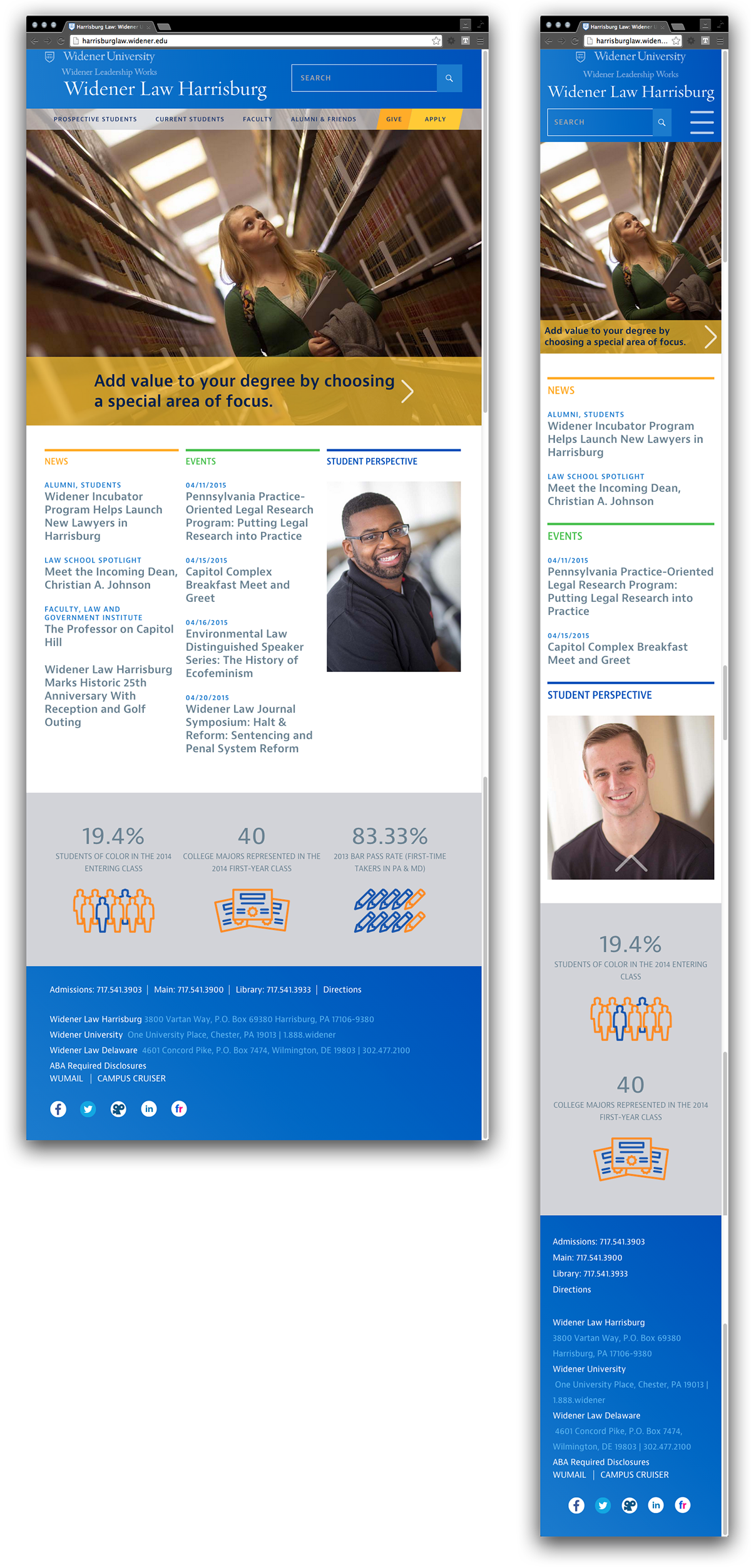
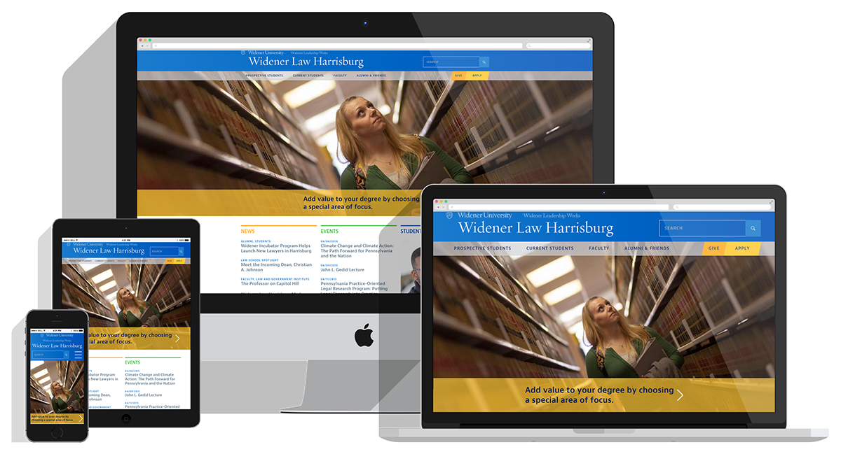
The home page. This page opens with a slider feature, it highlights upcoming news & events, a student perspective, and closes with some stats and figures of the school.
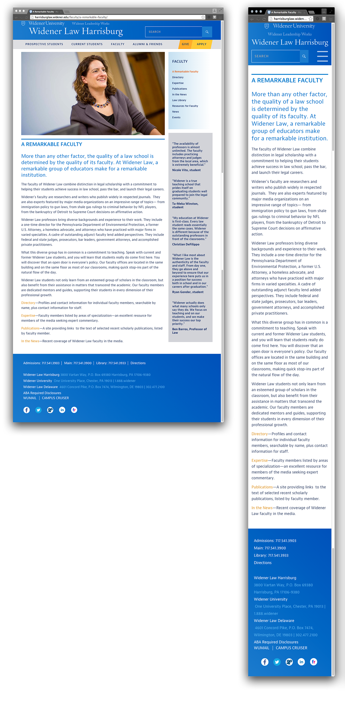
An interior page.
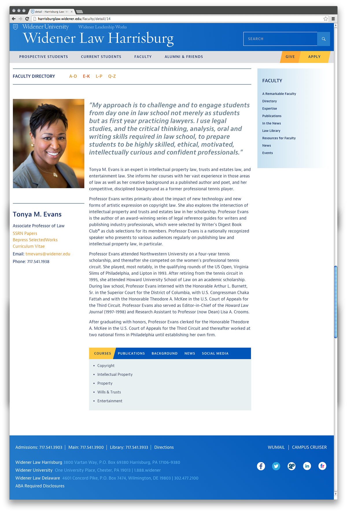
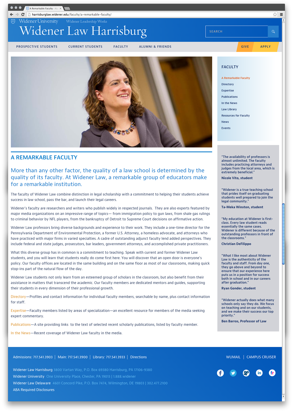
Faculty page.
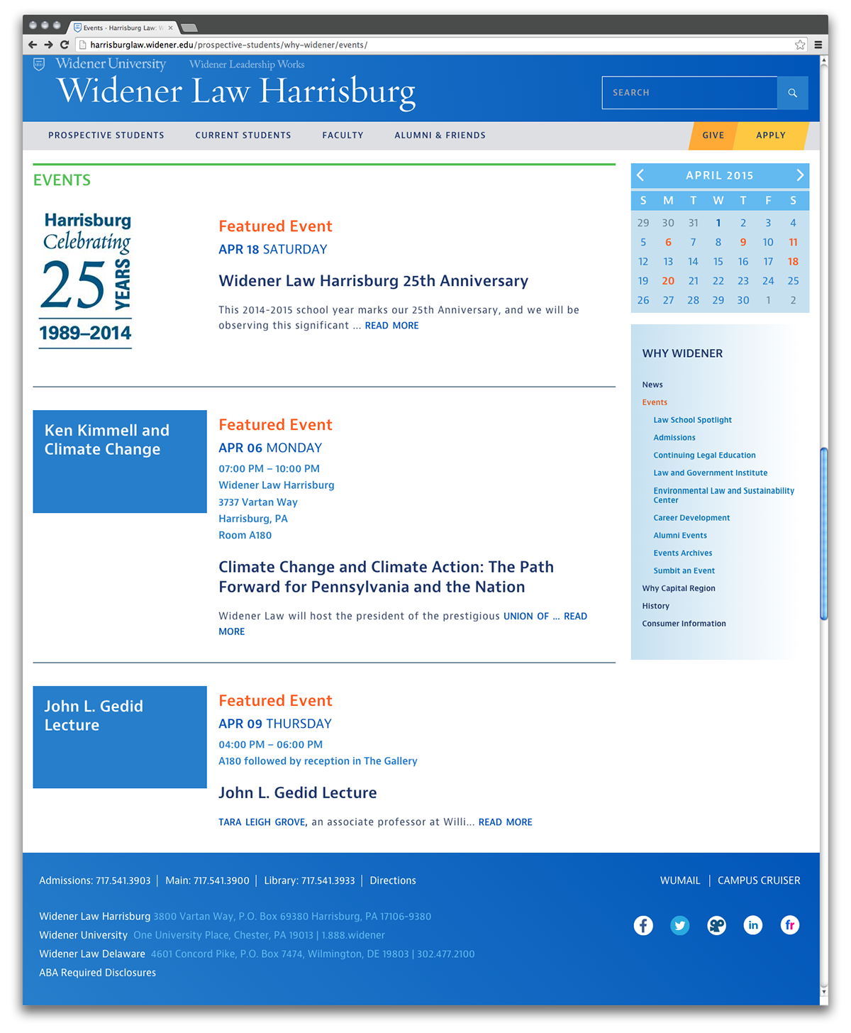
Events page.
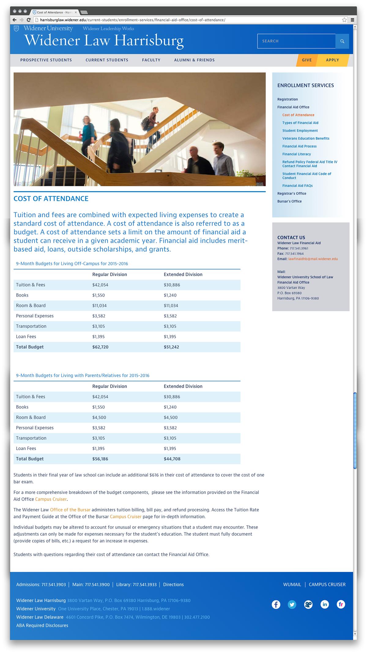
Interior page with tables.
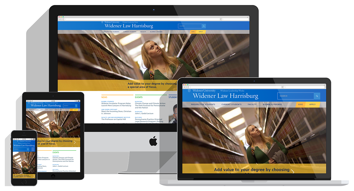
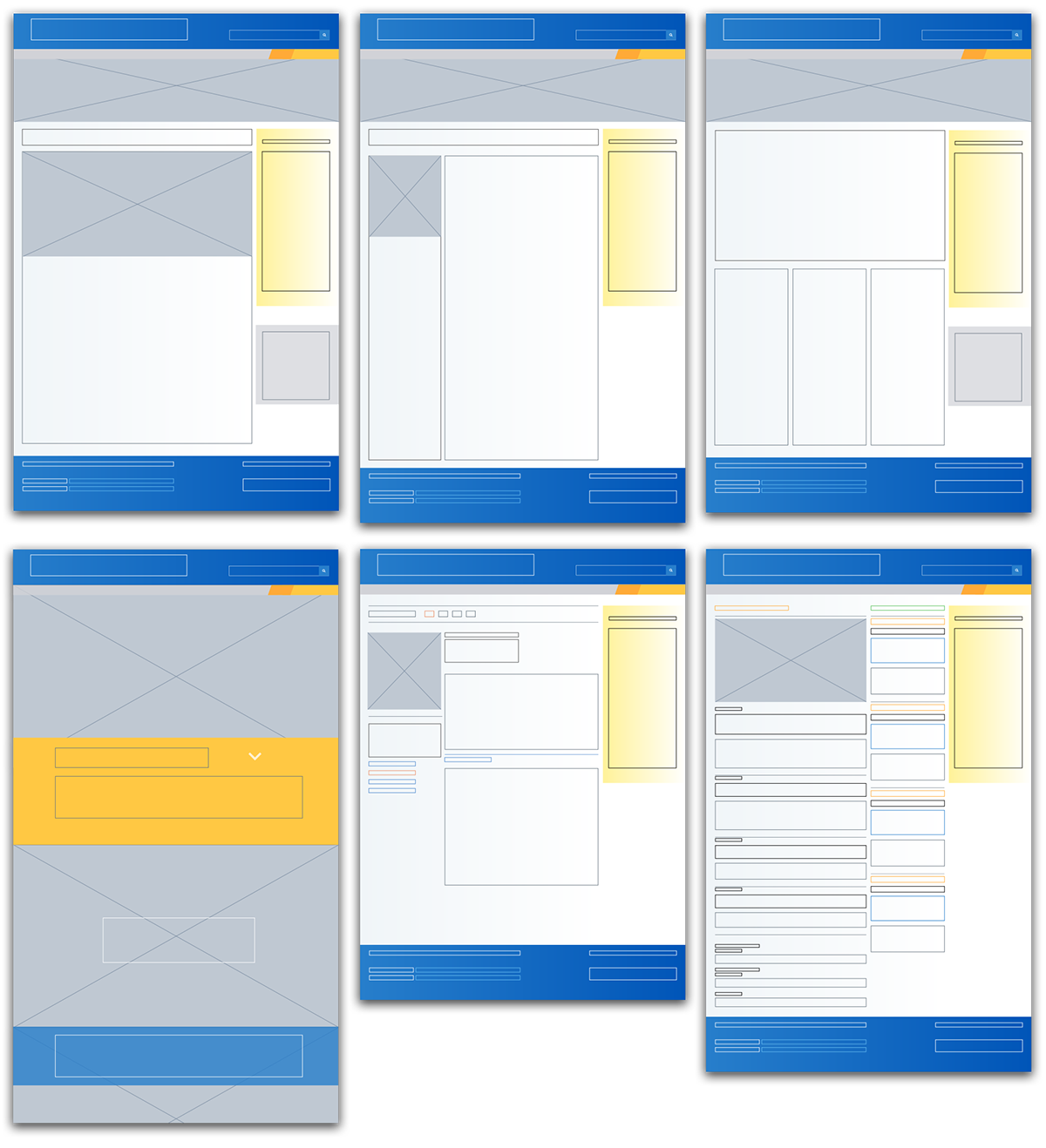
Responsive Design
We reflowed and, in some cases, trimmed the content that shows up on a tablet and mobile screen. You can see a sampling of pages below to compare how the content reshapes for a smaller screen sizes.
The four main responsive breakpoints: extra-wide, regular, tablet, & mobile.
Mobile tour of the site. This video highlights a handful of pages on the site showing how content and interaction have been reflowed and refined for a better mobile experience. It includes: the home page, mobile navigation, interior page, search feature, and faculty directory.
Process & Extras
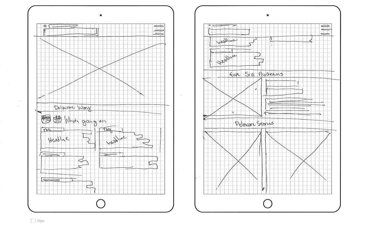
Before I spend time mocking up the site in Photoshop, I would do some quick pixel sketches.
This allowed me to power out a ton of ideas very quickly before I worked with any digital files. After sketches, I made wireframes for several pages to work out the colors and layout across various templates.
This allowed me to power out a ton of ideas very quickly before I worked with any digital files. After sketches, I made wireframes for several pages to work out the colors and layout across various templates.
Tablet sized home page sketch.
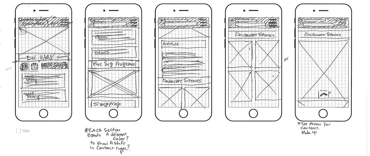
Mobile sized homepage sketch.
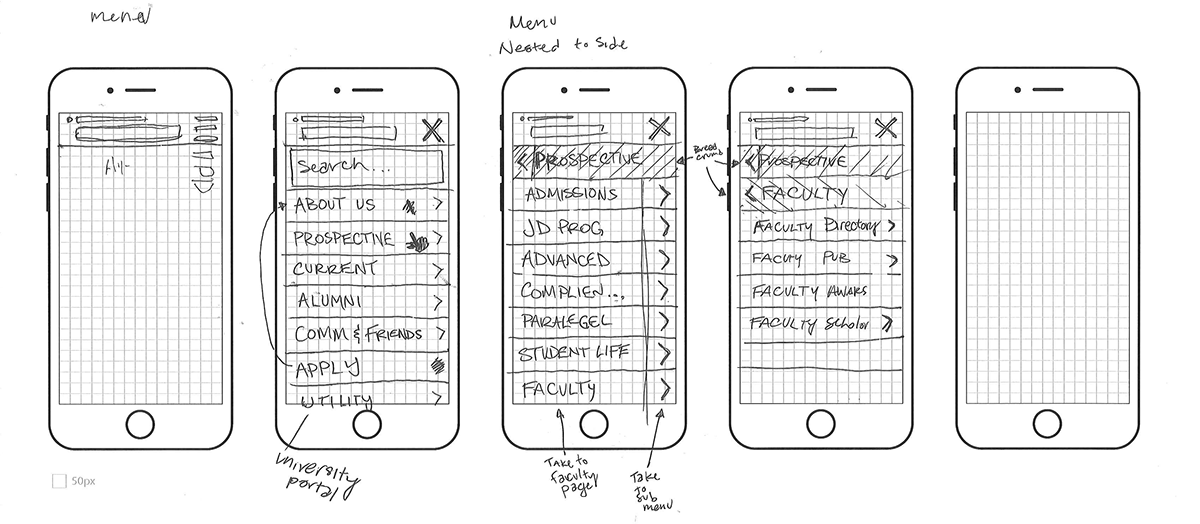
Sketch for how I envisioned the menu working on mobile.
Several wireframes showing the layout of various pages.
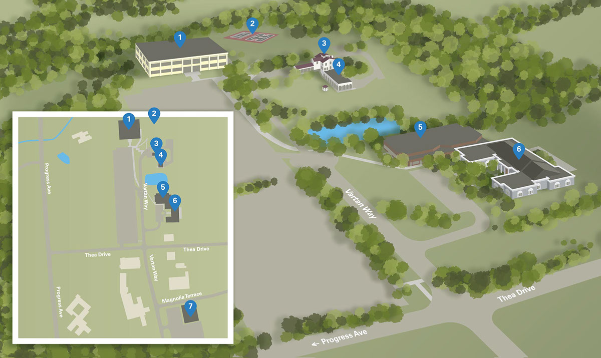
The school didn't have a current map that they could use. So I made one for them in Illustrator.

All the separate layers for the map.
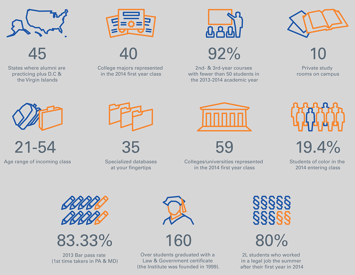
The full set of icons and statistics that will be featured on the homepage.
Because the site is built on a CMS, the schools have the ability to update, edit, and add new content and pages to the site. I designed and wrote a style guide to help them keep the site looking just as good as the day it launched.
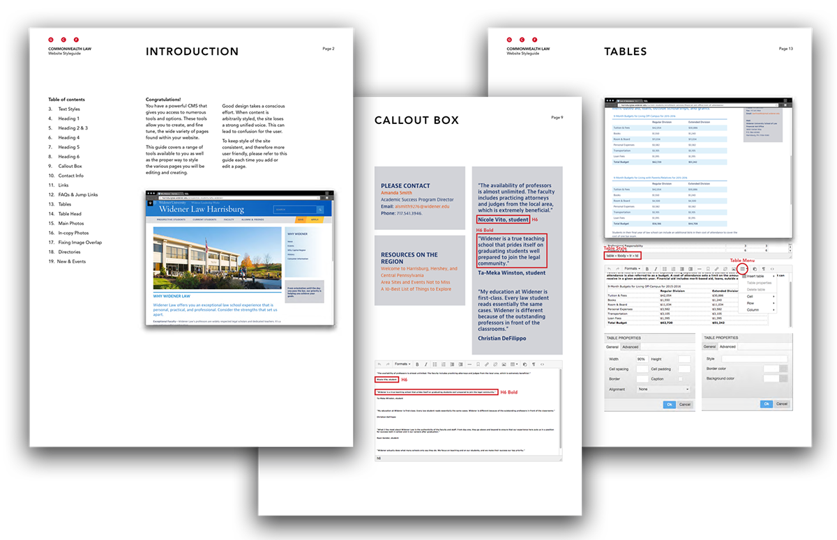
Three pages from the styleguide.
I hope you enjoyed looking through the process we went through to make this site possible. Make sure to visit live site as well. There are plenty of surprises left to find that we didn’t share here. If you haven't already seen the work we did for Widener University Delaware Law, you should check it out too. View the project here.
Visit the site at
Harrisburglaw.widener.edu
Harrisburglaw.widener.edu


