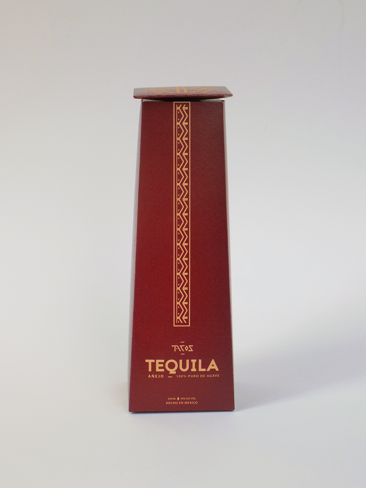
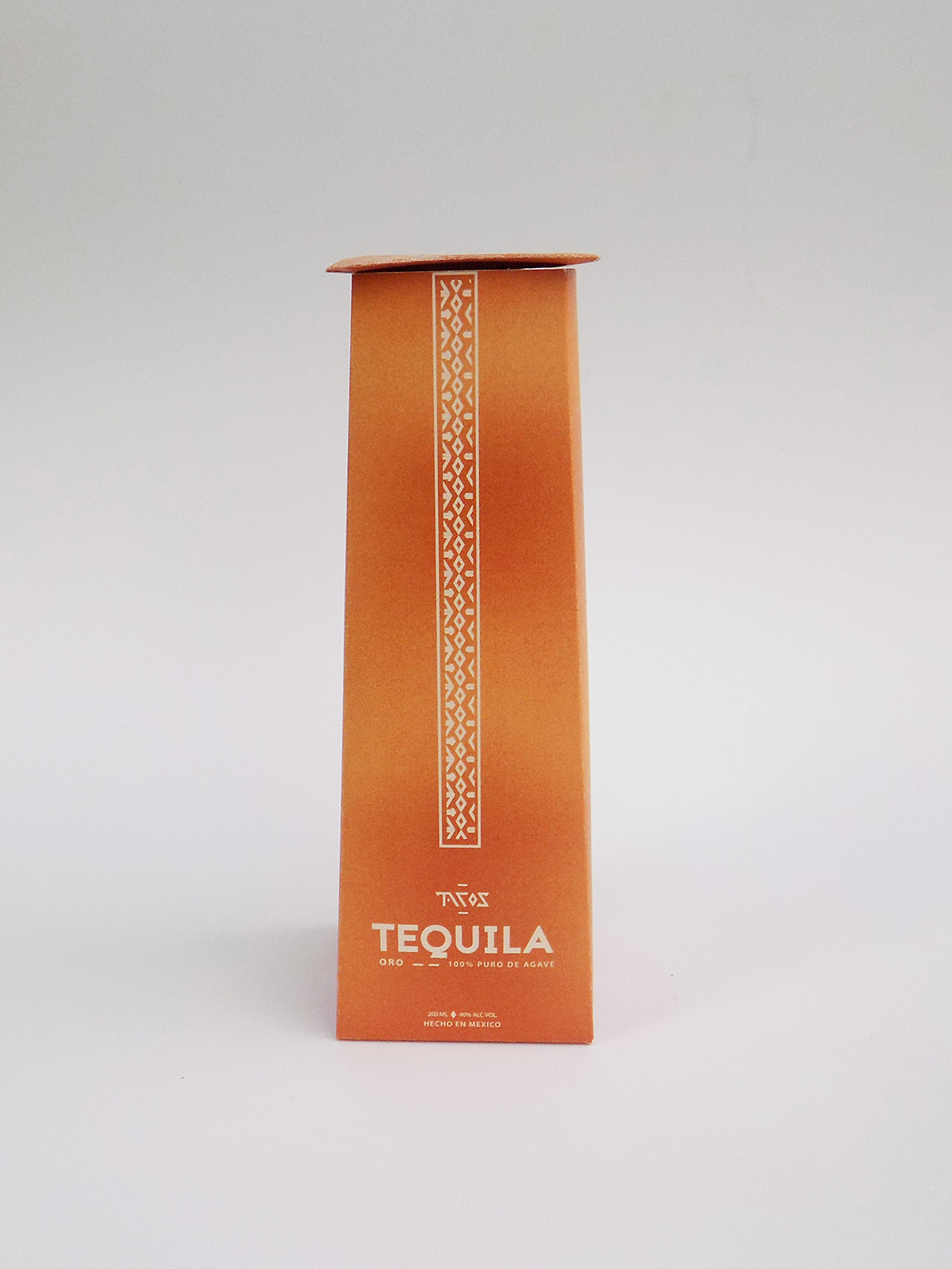
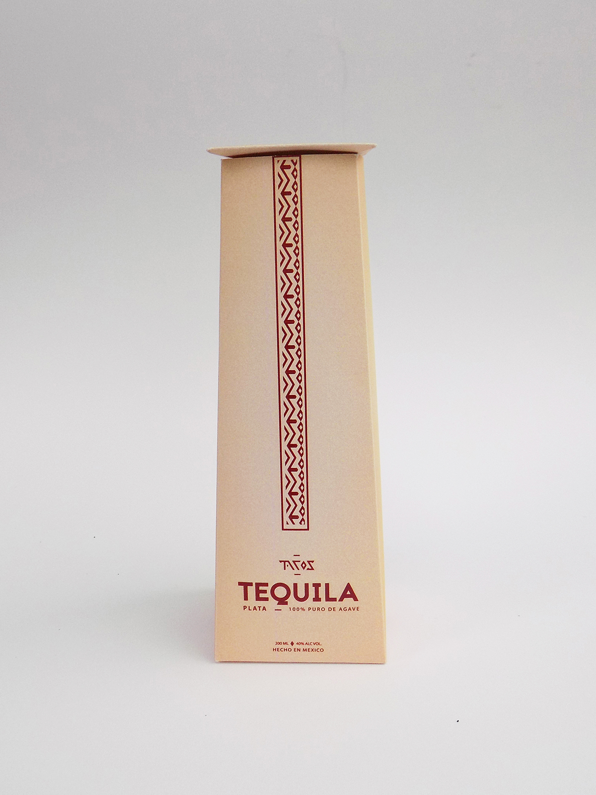
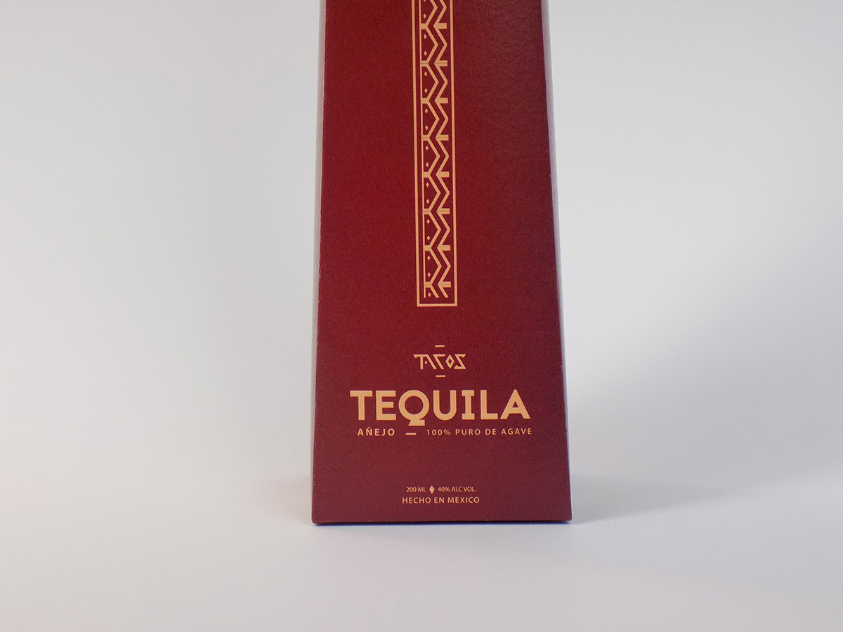
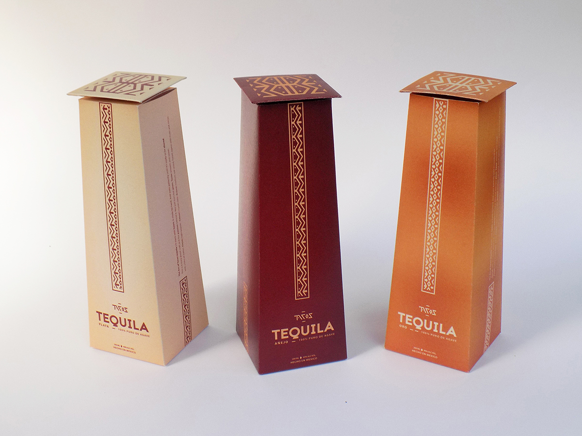
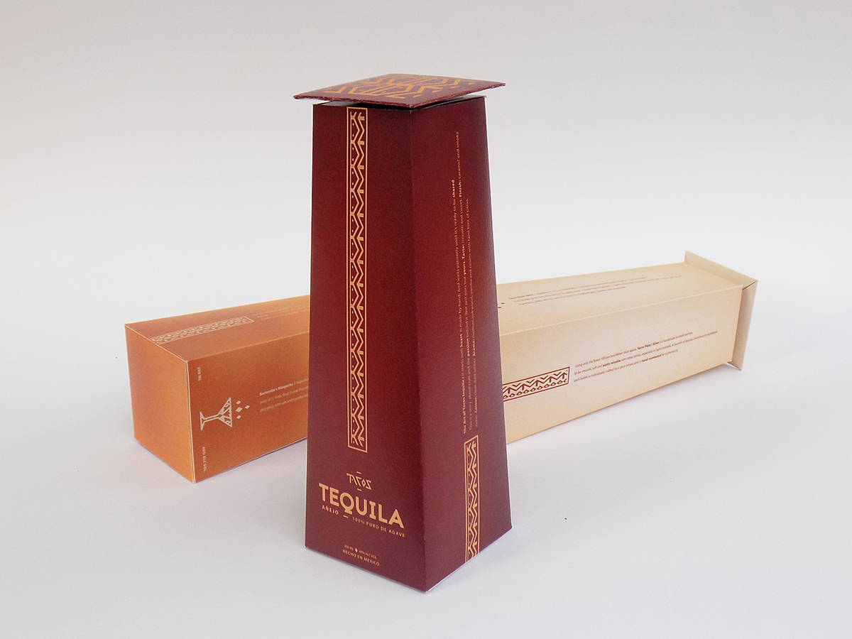
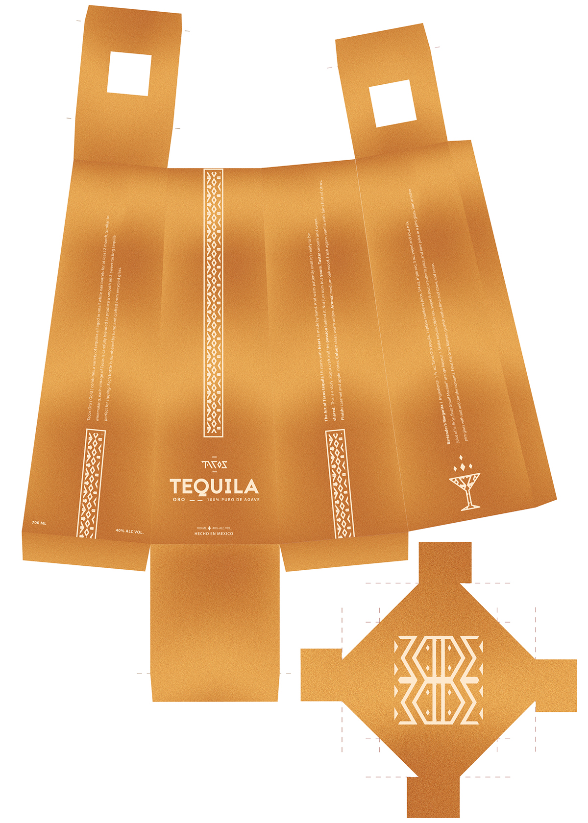
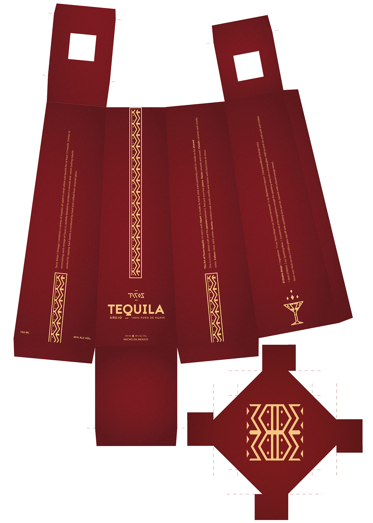
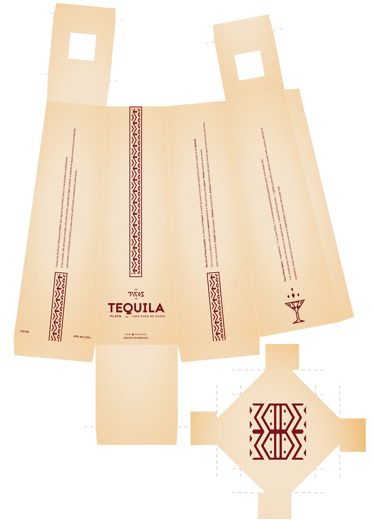
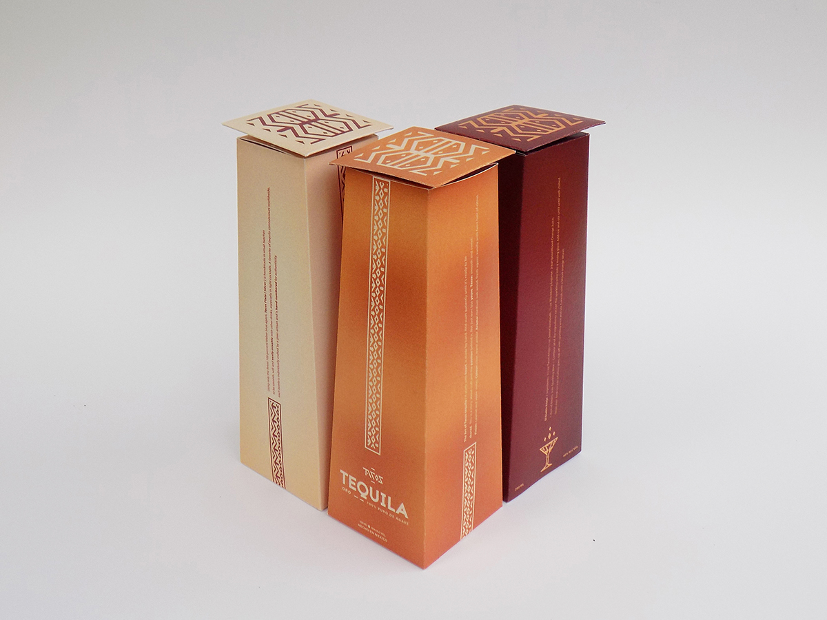
The packaging was created for a fictive tequila brand, which is supposed to be sold exclusively at the luxury “Tacos” restaurant, fictive too. :-)
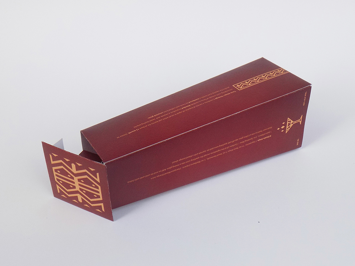
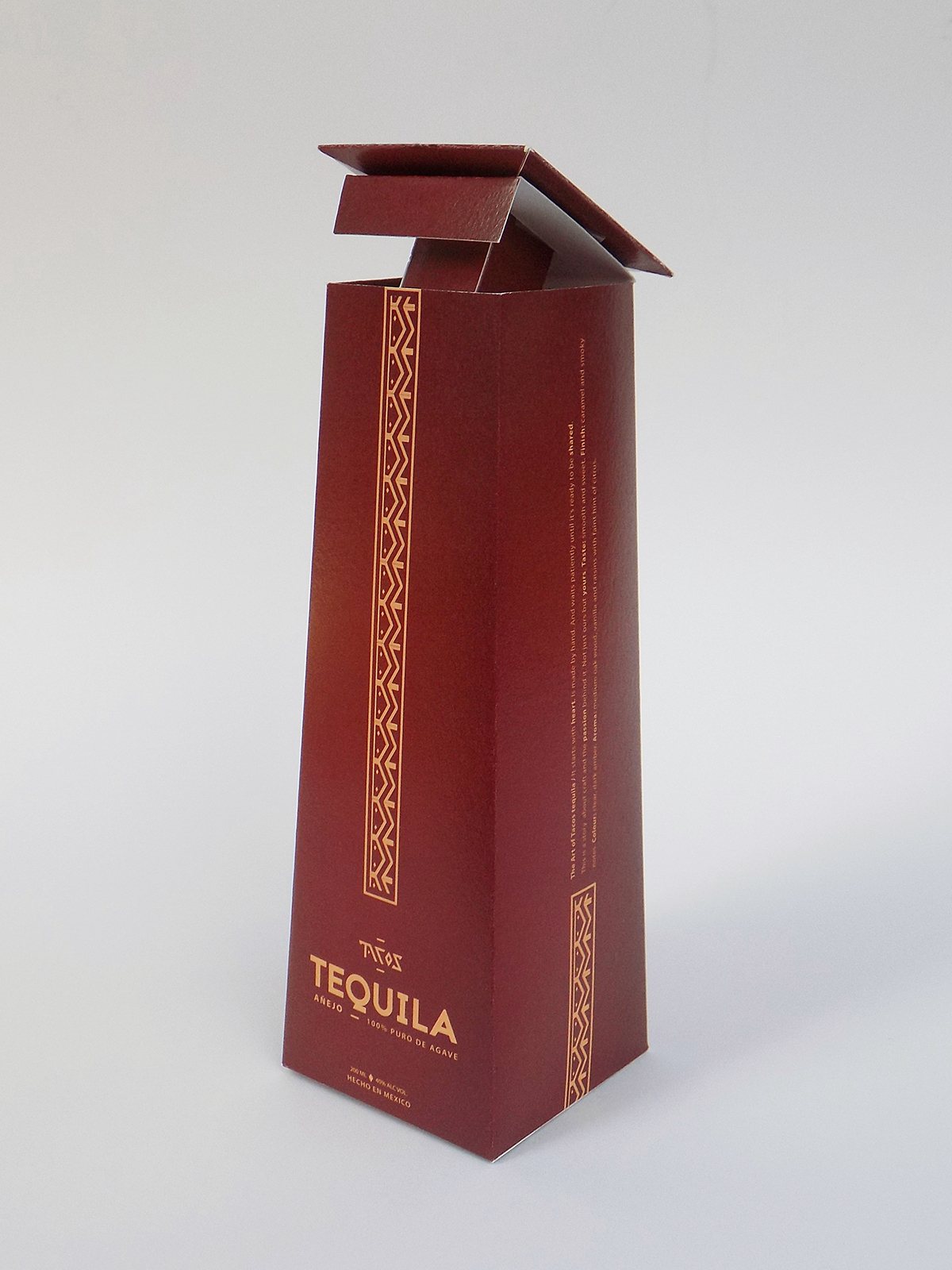
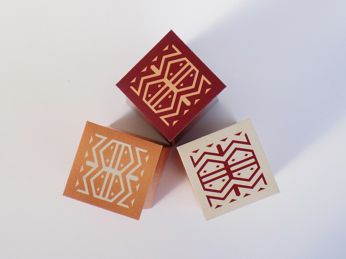
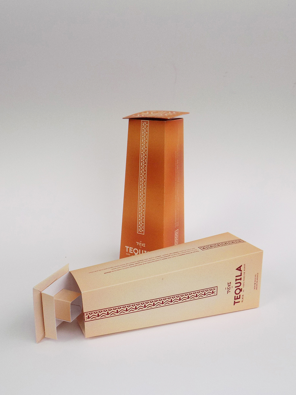
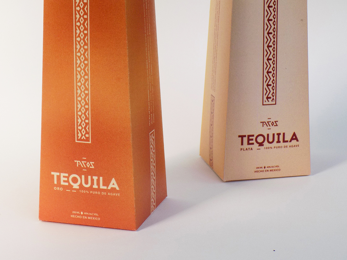
The whole project ( including the visual identity, which can be seen on my Behance profile, too ) revolves around a luxury restaurant. Also, my intention was to create a box that would be unusual and thus show the uniqueness of both the product and the place. The “cap” indirectly refers to the Mexican sombrero. The whole packaging is about luxury, elegance, simplicity but there are some interesting details and elements such as the pattern “stripes” and the typography that mimics them.
It's a student project.
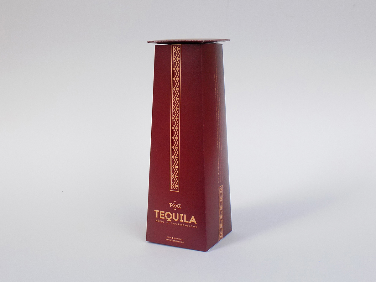
Featured on Packaging of the World