Reptilia Magazine Rebrand- Class Project
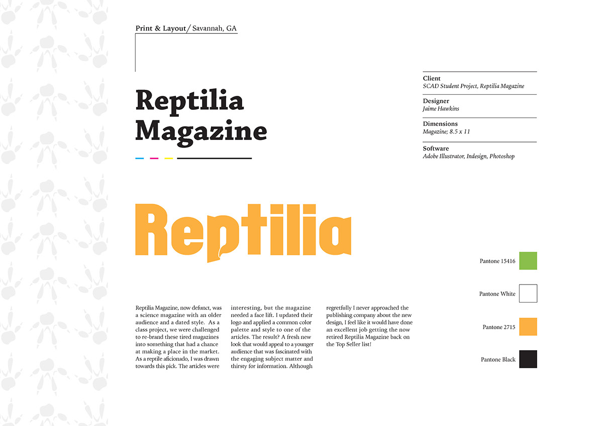
Tasked to redesign a magazine that was going out of style, I chose Reptilia, which focused on reptile education and knowledge. Before, the colors were gaudy and clashed horribly, with pixelated images and a very "90's" design.
I wanted to market to a younger, fresher audience and attract more readers with bright eye catching images, bold contrast, and a sleek design.
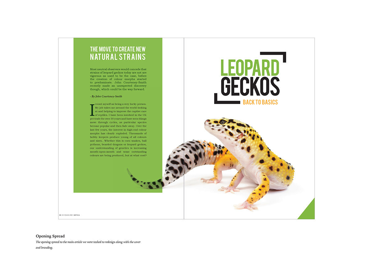
Taking an article that was previously featured in Reptilia Magazine, I redid it to better reflect the demographic I was catering to.

Above is the final rendition of the magazine cover and spreads. The feature article "Back to Basics with Leopard Geckos" is represented on the front with a high contrast image of a leo. The green accent color is also a call in to the feature, and would ideally change per issue to reflect the article within.
The spreads themselves show my tendancy torwards high imagery design- I feel that visual interest is the key to drawing in potential readers, and quickly expressing the subject matter of a given page at a glance. I used the green accent color from the front to bring together the entire article, and used pops of orange from the front for the pull quotes.