Lush Cosmetics
Branding
The Brief: Redesign a Famous Brand
I chose Lush Cosmetics as I feel their current brand doesn't reflect any of their company values:
- Handmade
- Organic
- Green Credentials
- Luxurious
I wanted to make the brand more feminine as their targed audience is mainly females between 18 and 45. I also wanted the logo to have meaning, as there is no story behind their current logo.

Mood Board
I researched into the style of current Lush shops and noticed their aim was to appear like delicatessens. This encourages the idea that their products are good enough to eat.
In my research I also discovered that they use real Jasmine in their cosmetics. Jasmine flowers open at night revealing their scent so I tried to portray this in my logo design.
Looking into Lush Spa's as well as their stores allowed me to discover that they use bird songs throughout as a form of relaxation; I felt this would be ideal to show in my rebrand as their key selling point is relaxation.
Many of their products are 'naked' -don't use packaging- as they are very keen on reducing their carbon footprint. For their creams, where packaging is unavoidable I thought of introducing refill stations throughout their stores. Rather than purchasing countless amounts of containers, consumers would reuse the same one refilling as often as they like. After refilling 5 containers, customers would recieve a free refill; encouraging them to recycle.
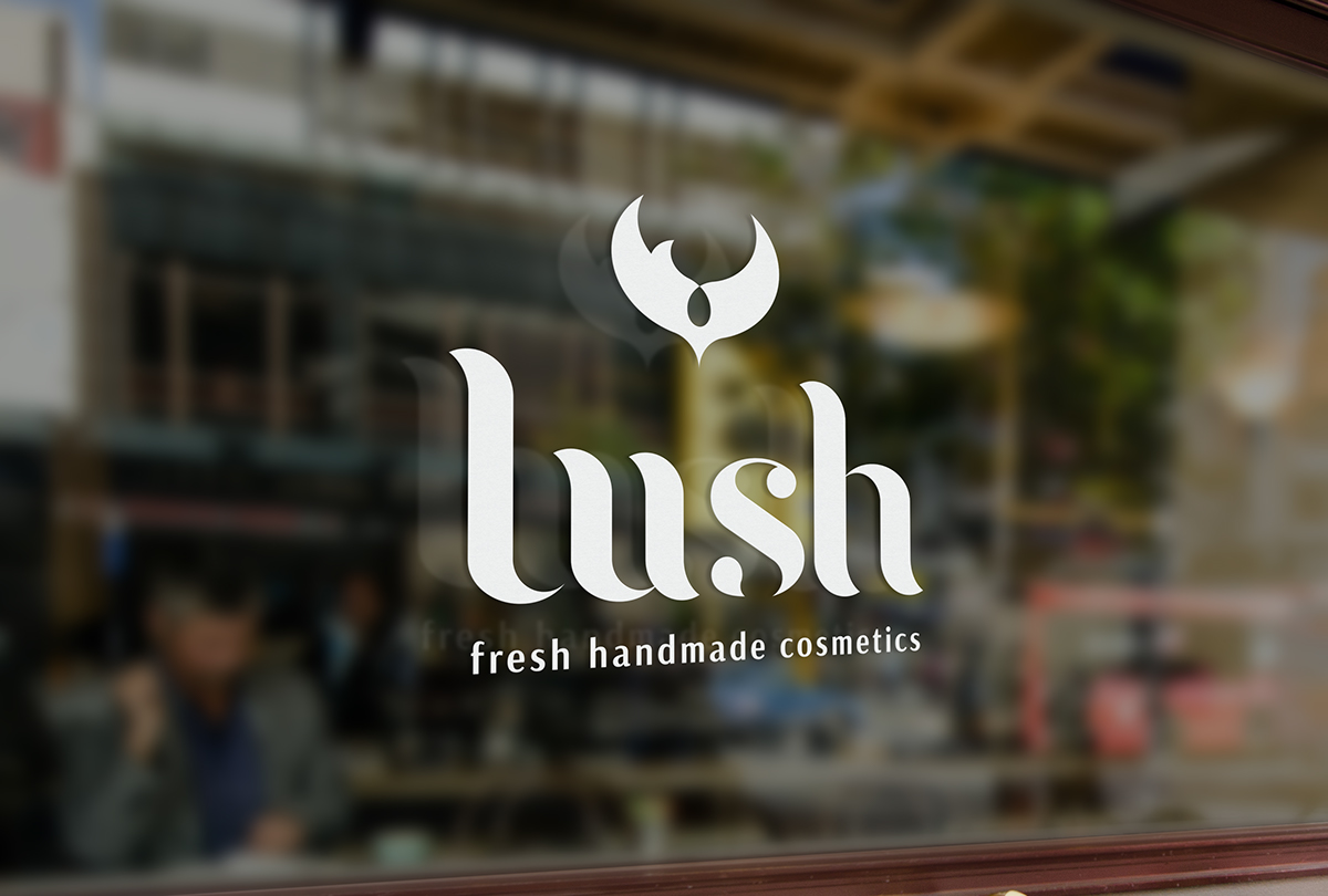


For the device of my logo I wanted to capture the company brand values. It represents an opening Jasmine flower, a bird in mid-flight and open hands caring for each product and the world around them. I highlighted the area where the birds heart would be to represent Lush's caring qualities; especially for animals as they are against animal testing. This area also resembles a necklace portraying their elegance and royal traits.

