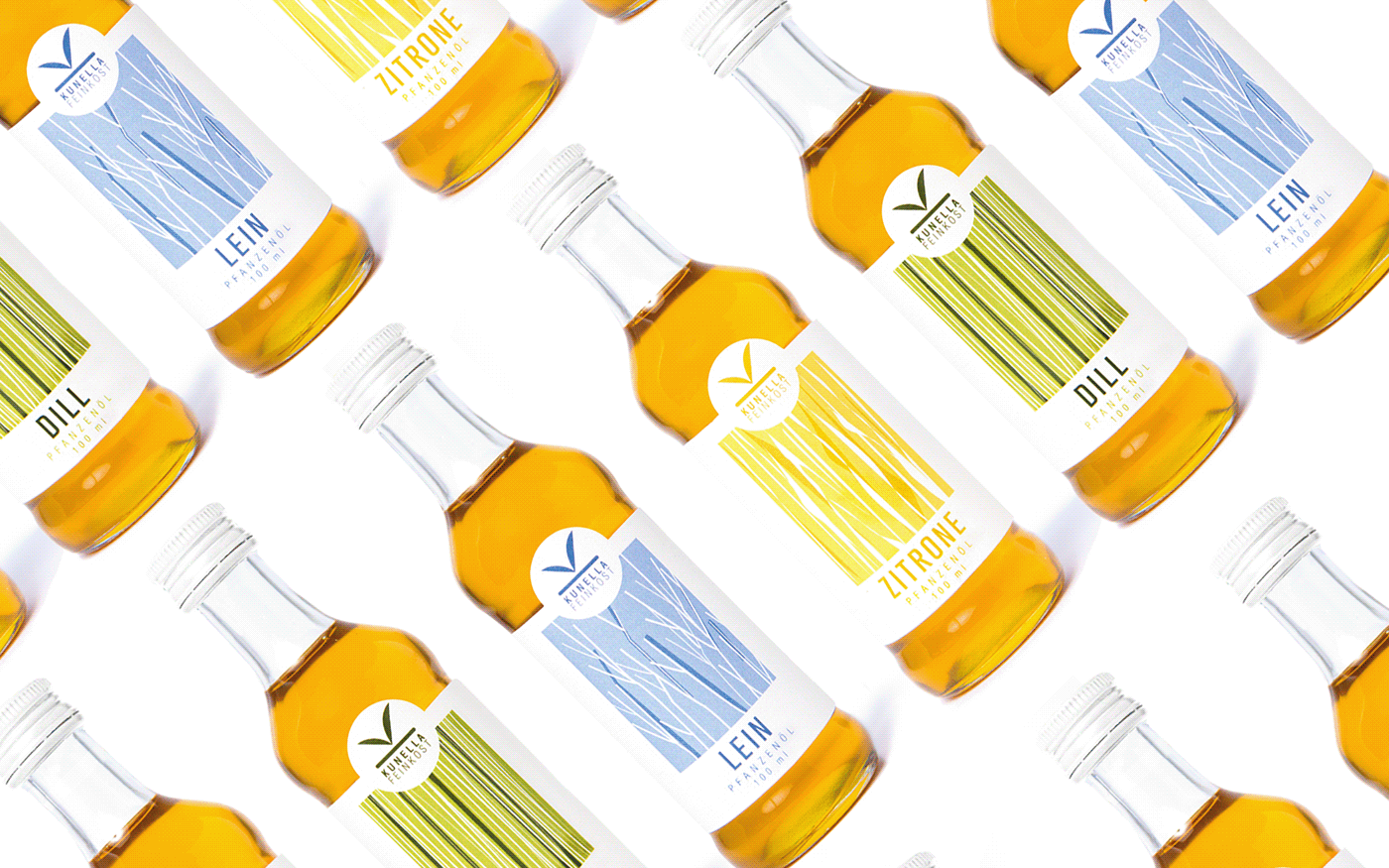
Kunella Feinkost
is a condiments and oil producer in Germany. The brand has a strong connection with the nature, which has been highlighted in the logo design.
The K of Kunella stands for a simple plant, which bridges the connection between nature and the product, communicating the simple and organic ingredients used to curate the products.
featured on: http://www.packagingoftheworld.com/2015/03/kunella-feinkost-rebranding-concept.html


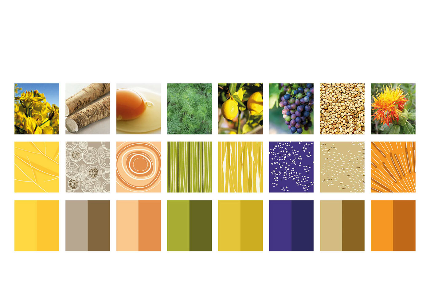
Colors and illustrations:
The goal for each product is to communicate the main ingredient.
The illustrations are an abstract representation of the natural ingredients,
which are highlighted by the use of color as well.
Final illustrations:


