

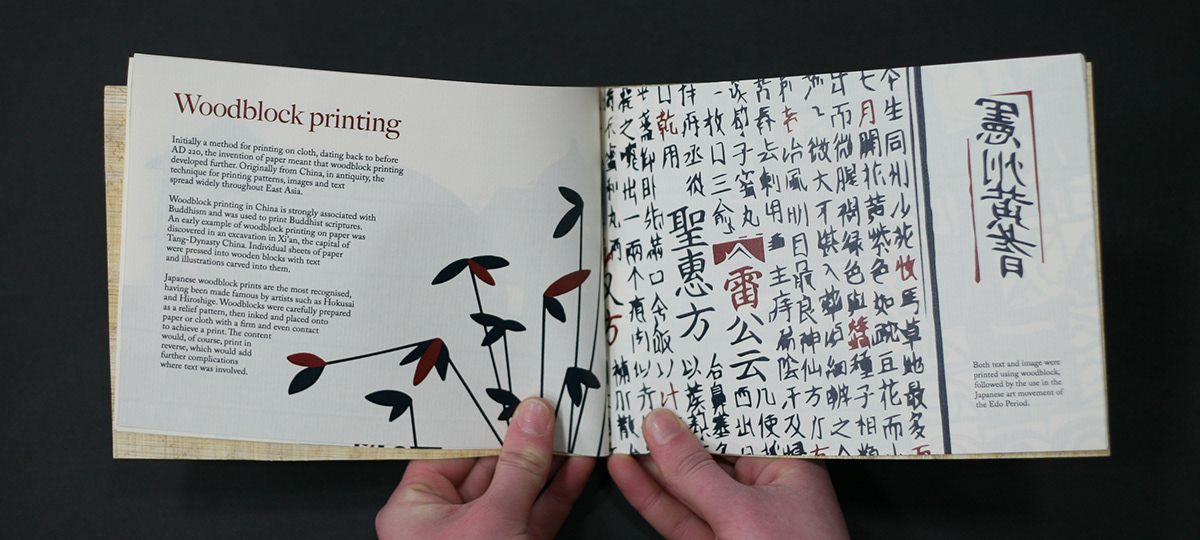
A publication designed around typographic connections. Starting off with papyrus and how heiroglyphics were used, continuing through the origins of paper and movable type, ending on Gutenburg and his 42 line bible.

Front book cover and binding.

Using my own handmade paper, I then screen printed the title onto the paper. Although the texture of the paper has made the screen print not quite perfect; I feel that this represents the subject of the publication much more.

The end pages are made out of papyrus, the beginning of paper as we know it.


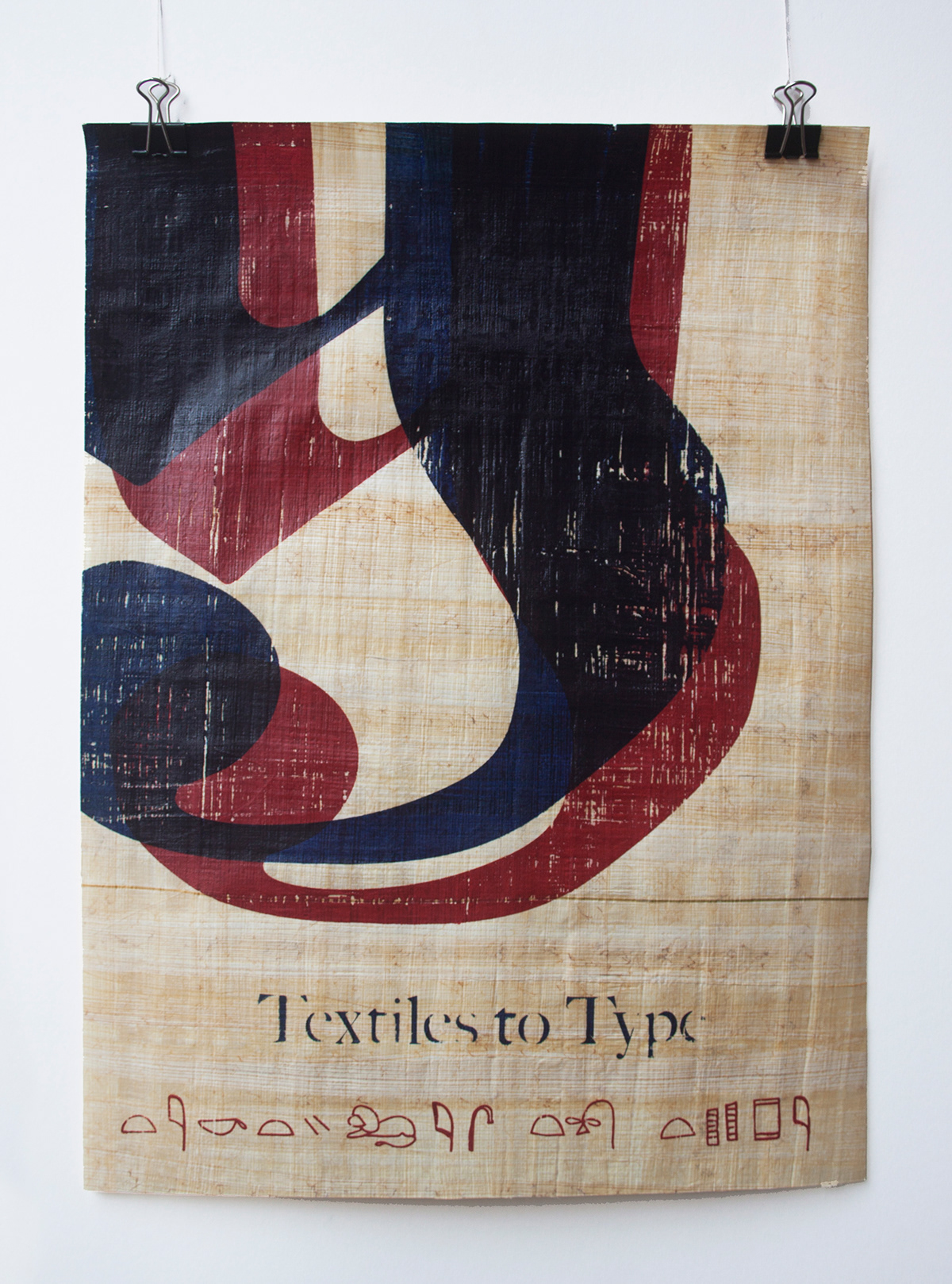
We also had to design a poster for the publication. I chose to print the illustration I designed for my page on Gutenburg, onto papyrus; signifying the start of paper to to the beginning of type.


