

Beauty in Aging | for your (obsession)
Packaging designed for Visual Communication IV class
Project 1: Obsessions/Collections
School of Art, Design & Media
Supervised by Nanci Takeyama
Project 1: Obsessions/Collections
School of Art, Design & Media
Supervised by Nanci Takeyama

The concept behind Beauty in Aging | for your (obsession) is derived from the society's obsessive pursuit of flawless, age-defying beauty. The idea exploration began with the designer's personal obsession with facial pore sizes (also known as porexia), which with research uncovered other beauty-related obsessions and problems existing in the current society. Consciously or sub-consciously, as the target audience of beauty brands and advertising companies, the general public, especially women's opinion of beauty has been influenced and changed throughout the years as technology advances. New beauty products and treatments are being developed and introduced, promising "age-defying" results while consumers are unhappy with their looks and hooked on the thought that they are able to turn back the clock or take a ride in the time machine to look young once again, despite the fact that aging is still a continuous, on-going process. Beauty isn't all about smooth, perfect and flawless skin or looking young; Beauty is being at ease with your own skin and self, with your imperfections and to accept aging as it is. It is mandatory to know that aging is inevitable and there is no miracle or time machine to turn back time. Only with self-acceptance one is able to feel happy about themselves and think they look beautiful, beauty is more of a feeling of self-satisfaction.


Parts of the images used in the sequence:
Left (Eyes) | Center (Nose) | Right (Lips)
Left (Eyes) | Center (Nose) | Right (Lips)
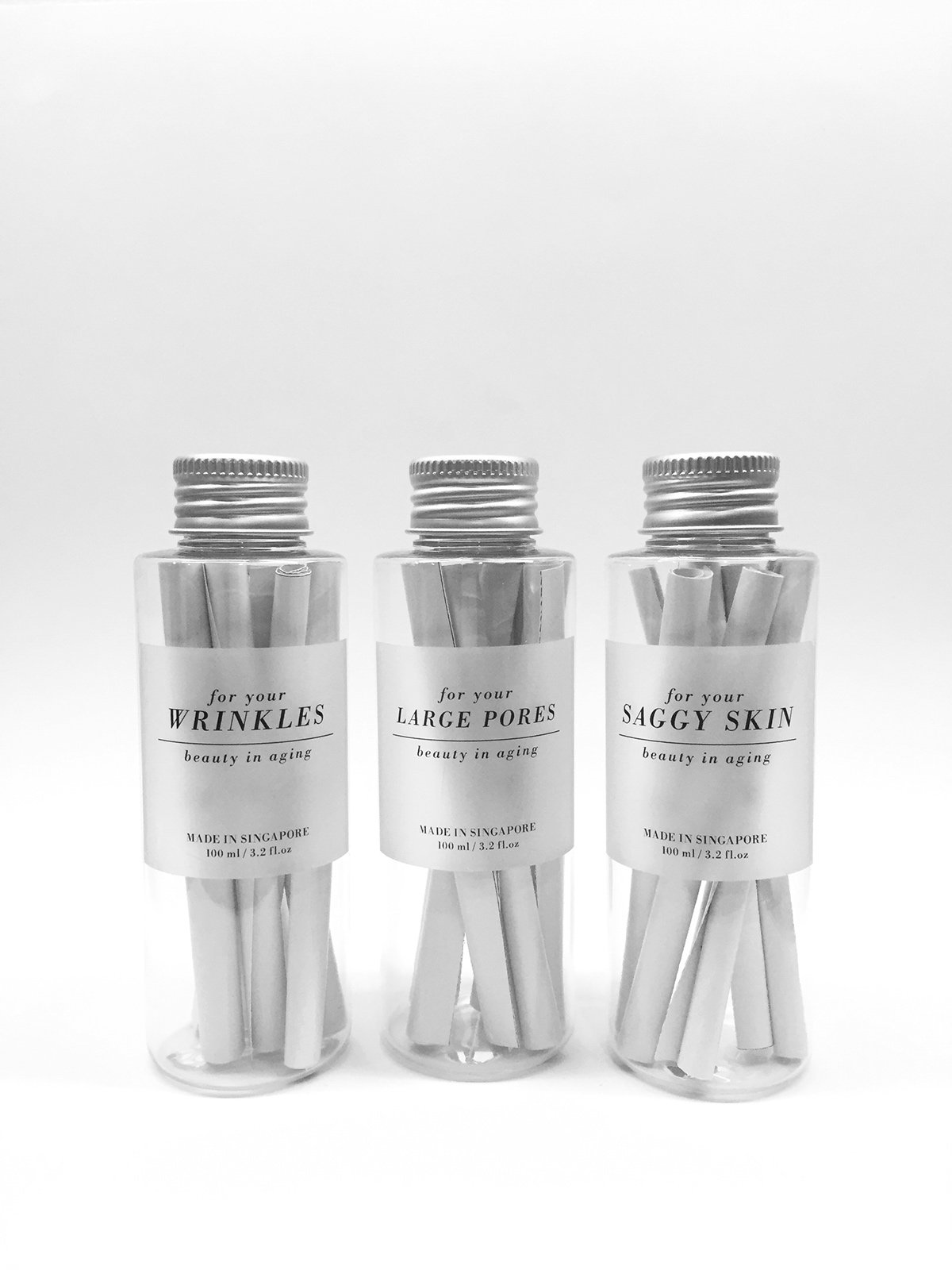
Seeing the need to redefine beauty and what beauty looks like, Beauty in Aging | for your (obsession) is a beauty line targeted for consumers concerned and obsessed with their perceived imperfections and the fear of looking old. Beauty products are usually bought to solve the perceived imperfections consumers think they have and thus packaging was chosen to be the medium to fight most of the pre-conceived ideas for why we buy beauty products to begin with. It comes in a set of three, each box containing the "secret formula" for the targeted area, namely wrinkles, large pores and saggy skin. The packaging is designed in a way to convey the idea that aging can be beautiful. Selected facial parts of 3 aging female individuals are printed on each box so that when they are put together, it forms a generic woman's face. Despite having different types of facial features, the generic look of an aging woman radiates confidence, contentment, happiness and vigour. The designer hopes to set the audiences thinking about the mentality and attitude one should bear on the topic of aging looks. Unlike the usual skincare/beauty products, this beauty line emphasises on the essentials when dealing with beauty issues: the type of ingredients used in the product, personal lifestyle and attitude towards the pursuit of beauty and idea of aging. Explanations of the key ingredients to look out for when buying beauty products and selected quotes relating to the designer's thought on the issue are rolled up as a "secret formula" as the contents of the beauty product. Choice of typeface used in the packaging is Bodoni (a font commonly associated with fashion) as beauty and fashion are two themes heavily-focused on looks.


