


KO
-
디자이너라면 그만의 독창성있는 브랜드가 필요하다고 생각합니다.
특히나 현재와 같이 온라인에서 많은걸 공유할 수 있는 환경이라면, 공통된 방향의 상징성 있는 로고의 활용은 디자이너를 기억 시키는데 도움이 된다고 생각합니다.
몇 년 전, 로고(브랜드)를 만든 이유는 간단했습니다.
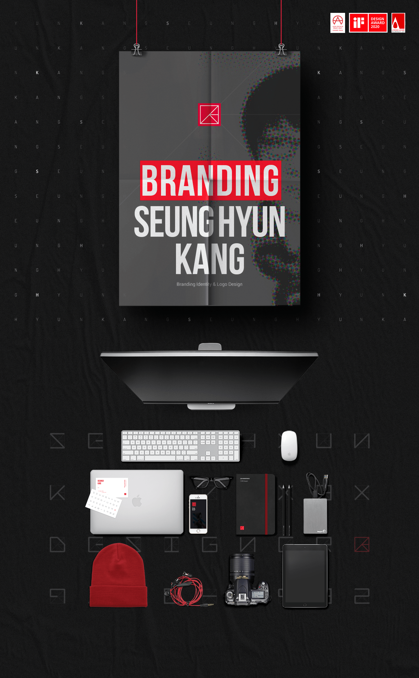
저의 작품을 온라인으로 광고하고 싶었기 때문에 상징성있는 로고가 필요했습니다. 그래서 가능한 쉬운 형태로 디자인하여 글꼴과 명함을 시작으로 다양하게 구성하게 되었습니다.
전체 디자인 키워드는 '나눔' 입니다.
'나눔' 은 디자이너가 가져야 할 방향성인 '일방적이지 않고 함께 소통하는, 생각을 나누고 이야기를 나누고 디자인에 담다.' 의 의미를 가지고 있습니다.
로고가 의미하는 바는 네모난 상자안에 '공유+강(라스트네임)+디자인' 입니다. 이 상자를 자세히 보면 '디자인 아이디어의 공유'를 표현하기 위한 언어들로 구성되어 있습니다. 그리고 '강' 을 나타내는 알파벳인 'K' 는 저의 이름을 상징하고 있습니다. 이러한 언어들은 디자이너의 생각, 아이디어, 표현들이 같은 공간에서 다자간을 위한 의사소통을 하는 것을 의미합니다.
마지막으로 디자인에 대한 저의 열정을 강조하기 위해 과감한 레드 컬러를 사용하였습니다.
누가 만들었는지, 목적이 무엇이든지 창조된 브랜드라면 개발하고 발전해야 한다고 생각합니다. 그리고 어떻게 진화는지 연구하는 것이 중요합니다. 잃지 말아야 할 방향성은 지속적이고 꾸준한 발전입니다.
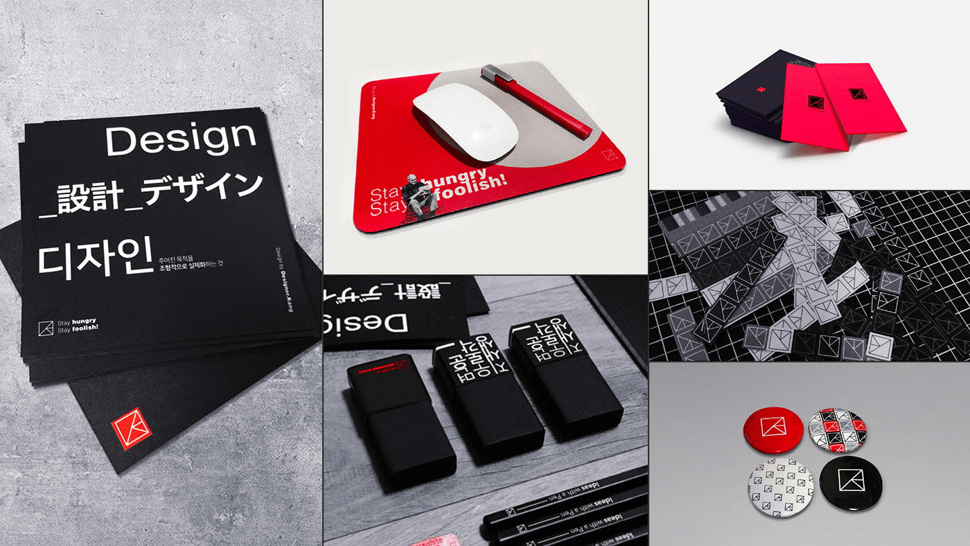
그래서 현재 브랜드와 관련된 몇 가지 제품을 만들거나 사용하고 있습니다.
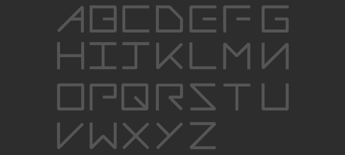
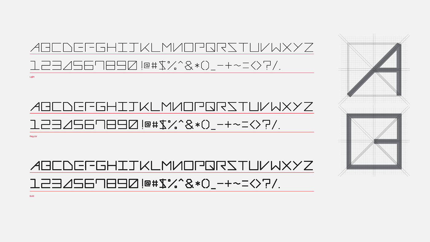
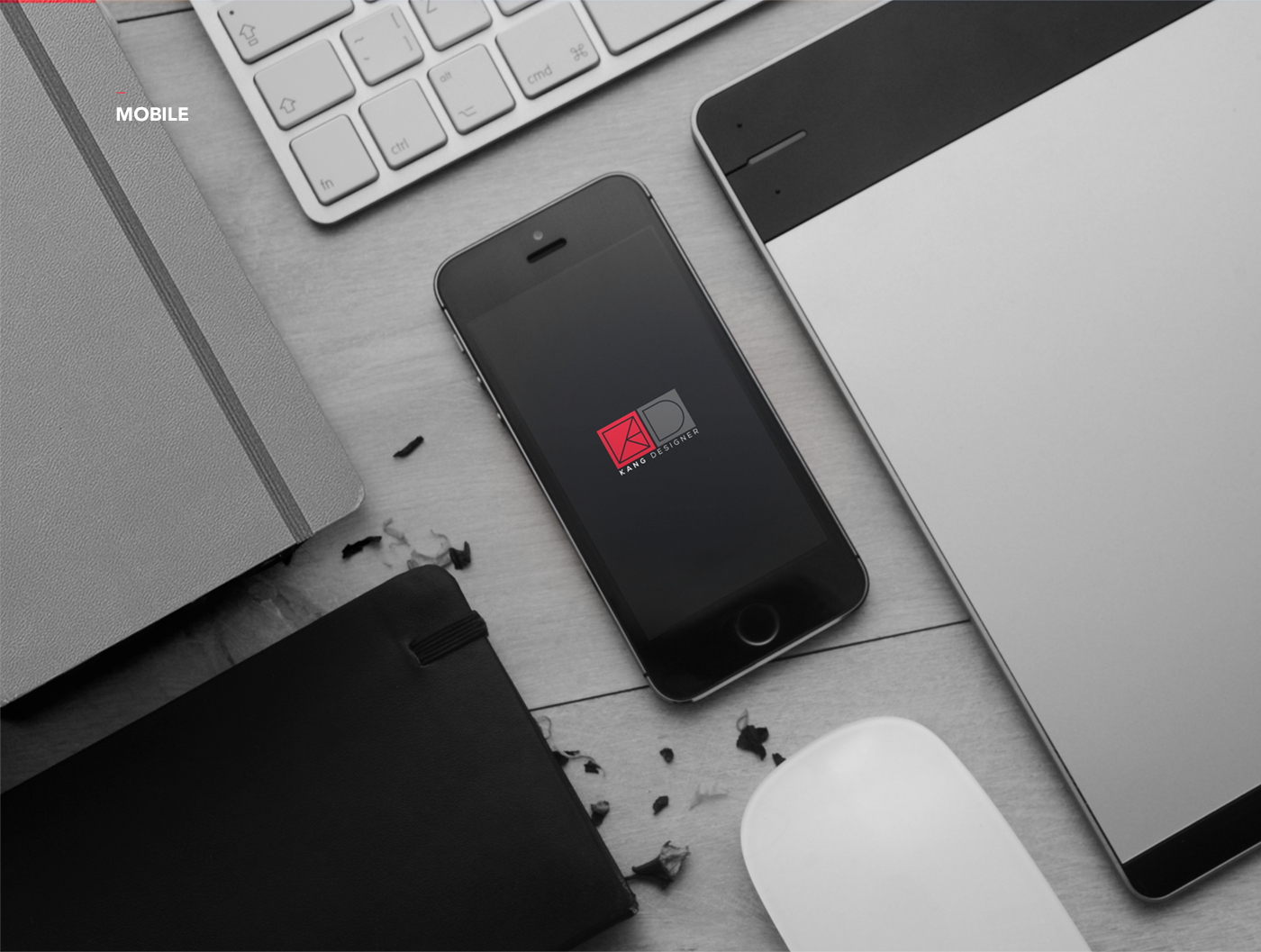
폰트 디자인 폰트는 다양한 환경에 적용될수 있습니다
특히 제목과 같이 강한 요소에 활용하면 효과적인 디자인입니다.
시계디자인에도 활용 되었는데 워치마스터와 함께 일하고있다 이것은 구글스토어와 삼성스토어에서도 확인할 수 있습니다.
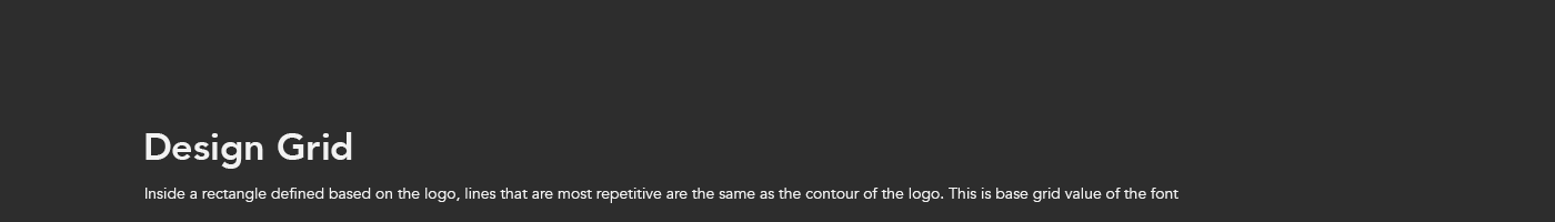
폰트 그리드는 로고를 기반으로 정의된 사각형 내에서 가장 반복적으로 사용되는 라인이 로고의 형태를 와 같다 이것은 글꼴의 기본 그리드 값이고
한글로 “딪”을 입력하면 자동으로 로고가 만들어 집니다.
EN
I believe that any designer needs his or her unique brand.
Using symbolic logos with a coherent theme would make a designer more memorable, especially during this day and age, where people can share everything online.
The reason I designed a logo (brand) a few years ago was simple.
A few years ago, I needed a symbolic logo as I wanted my works to be out there online. Hence, I composed a set of simple designs as simple as possible and started to integrate them, starting from fonts and business cards.
The overall theme for my logo design is ‘sharing.’
‘Sharing’ means the direction and character any designer should embody – ‘not unilateral, communicating and sharing thoughts and stories which comprise a part of designs.’
The logo shows ‘sharing, Kang(Last Name) and Design’ in a rectangular box. If you scrutinize the box, interior of the box is comprised of different words to express ‘sharing design ideas. ‘K,’ an alphabet from ‘Kang’ symbolizes my name. These words mean multilateral communication using designers’ thoughts, ideas, and expressions. As a finishing touch, I used a bold reddish colour to emphasize my passion for design.
I believe that a brand must develop and evolve, regardless of who created it or why it was created. A designer should continuously study how his or her brand can be improved. If there is one direction that cannot be forfeited, it would be a continuous and constant evolution.
Therefore, I am developing and marketing a few product lines related to my brand.
-
-
2020 London International Creative Competition
- SHORTLIST -
-
-
-