


KONFLIKT is a music organization actually based in Belgium.
It was founded by three professionals artists and dj in 2015. The aim of konflikt is to provide high quality underground music: both with the guests artists and the venue performance. Konflikt also focus to provide different style of music during a party or event: there is always a "peaceful conflict".
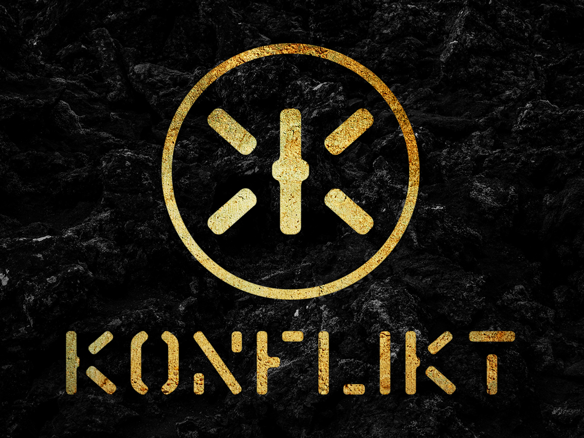
This essence was the starting point to build the identity of konflikt. The monogram is based of a mirrored k. It represents the tension/conflict and in some logo variations it is within a circle: this symbol is more a direct reference to the music world. The typeface used for the logo is a stencil based one in order to refer to the underground side of the organization. Finally the colors used are primary black and white: two famous color to be opposed but needed to create all the grey area between them… The third/secondary color is gold. Gold is obviously used to refer to the high quality of the organization as mentioned above.
Graphic design & art direction: Laurent Doucet
Year: 2015
Logo


Branding


Thanks for watching.


