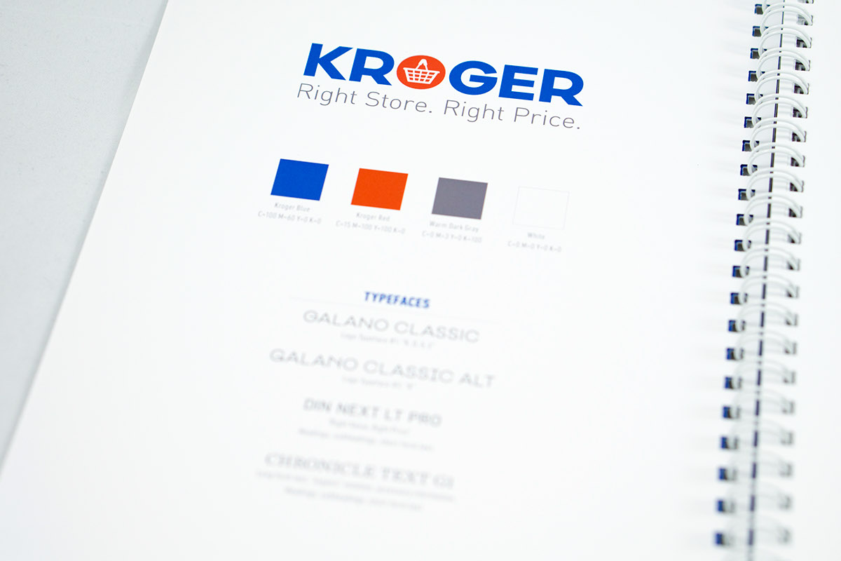
Current Logo
Project Overview
Class project to rebrand one large company from (mostly) top to bottom.
Current Identity Impressions
-Kroger’s current mark from 2001 is too trendy/outdated, it hearkens back to the late 90’s/early 2000’s trend of glossy, button-like logos.
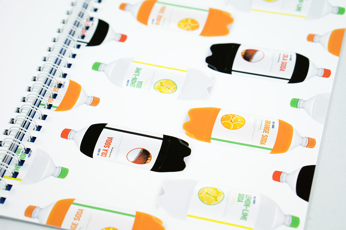
-The packaging of Kroger products assert no strong personality or qualities. The neutral, lukewarm design reads as “cheaper” when compared to competitors, when the quality is indeed there.
-The recent store redesigns (i.e. Marietta location) convey a stronger brand than the 2D design/web design.
-The packaging of Kroger products assert no strong personality or qualities. The neutral, lukewarm design reads as “cheaper” when compared to competitors, when the quality is indeed there.
-The recent store redesigns (i.e. Marietta location) convey a stronger brand than the 2D design/web design.
History
The Kroger Company is the United States’ largest supermarket chain, founded by Barney Kroger in 1883 in Cincinnati, Ohio. Operating through 2,424 stores directly or through subsidiaries, Kroger falls under dozens of different banners and store configurations, including supermarkets, superstores, department stores, convenience stores, and mall jewelry stores.
Goals
Create a more consistent, distinct design language
Updating the brand and revitalizing the dated image of Kroger is paramount, as the current design is certainly memorable, but not because of its aesthetics or conveyed emotions. A cohesive company proves beneficial for all. Embracing the refreshed Kroger brand, applying it consistently and maintaining brand values will ensure an image of increased professionalism and distinction amongst the competition.
Dissolve sub-brands into a strong, monolithic brand identity
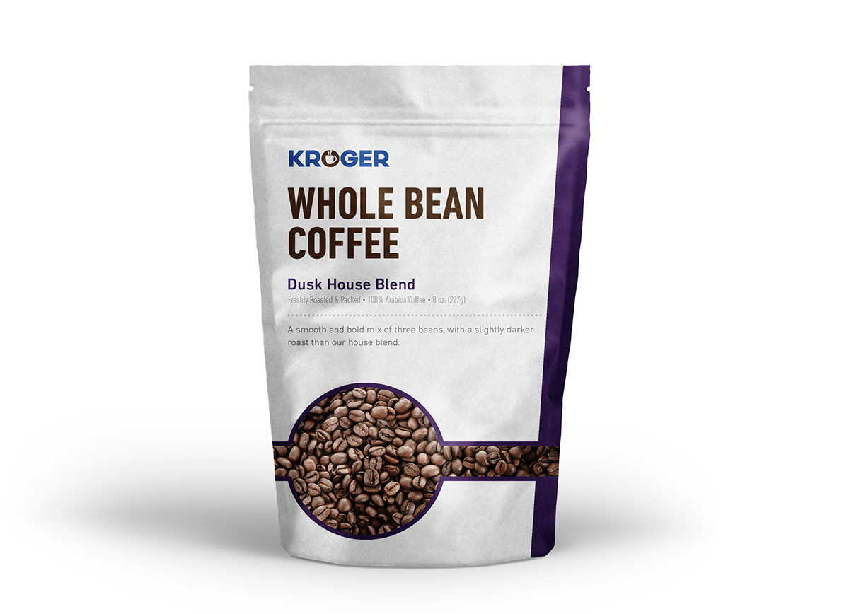
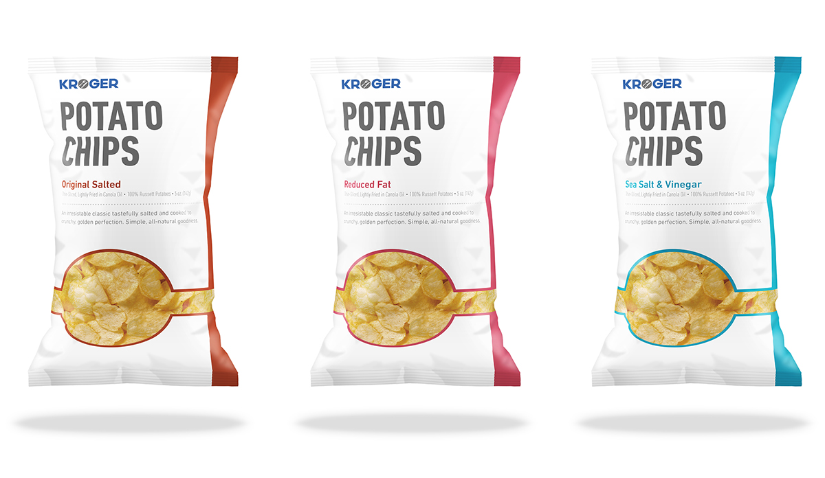
In the commitment of reaffirming Kroger as a quality brand, presenting the Kroger name on every product says “we’re proud of who we are, and our products are great.”
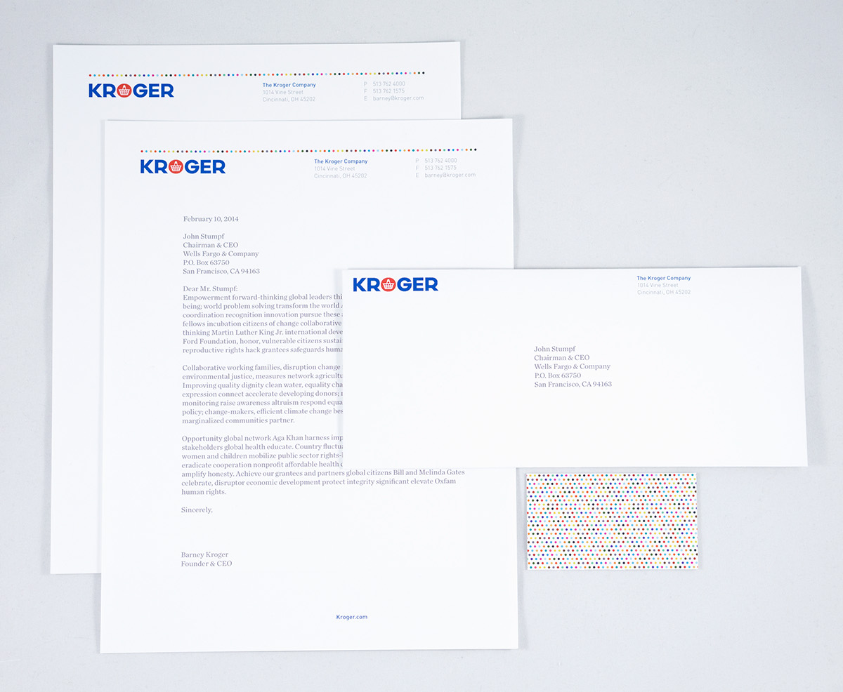
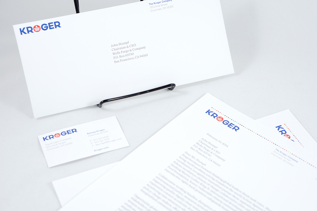
Identity
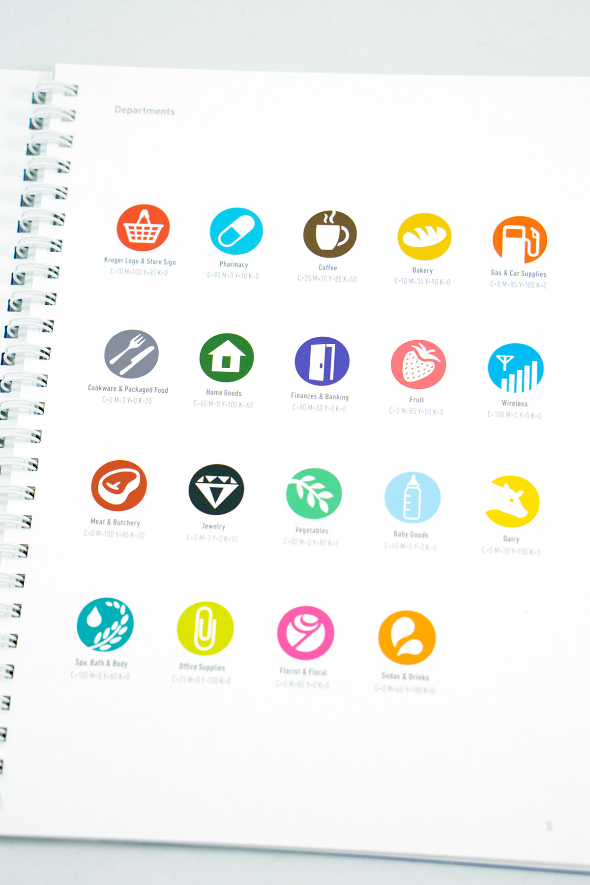
My logo was built around the need for expressing professionalism, variety and modernism with an air of approachability. Heavy iconography allows for the Kroger brand to be reinforced in every department beautifully and consistently.
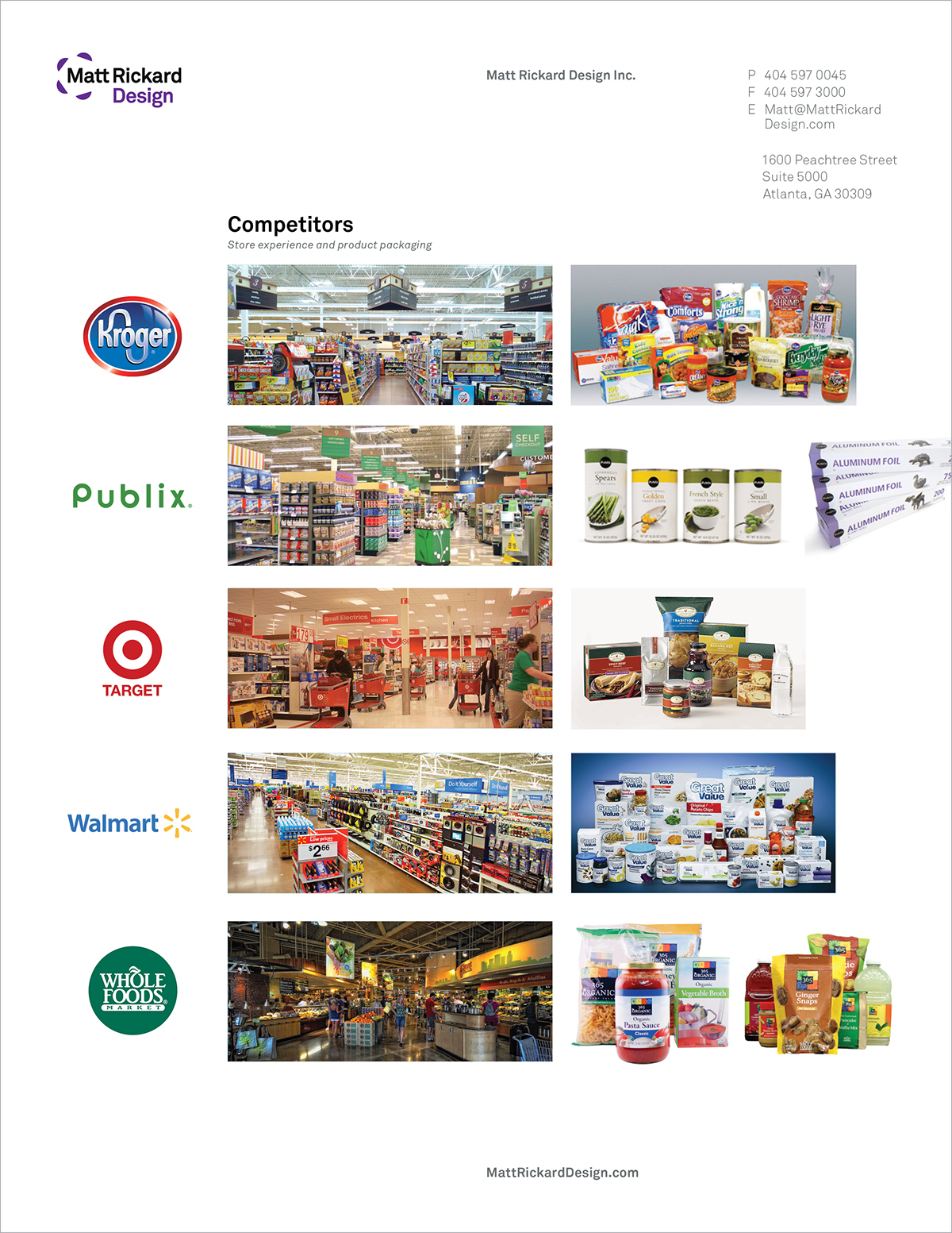
Competitor Analysis
I needed to analyze what people were and weren't doing well to be able to ensure my design was as effective as it could be within the context of other competing brands.


Logo Redesign & Implementation


Store signage would have pure iconography above every department, increasing store scannability without the clutter of type danglers. The type/aisle descriptors would still remain at the end of every aisle, just not hanging from the ceiling.


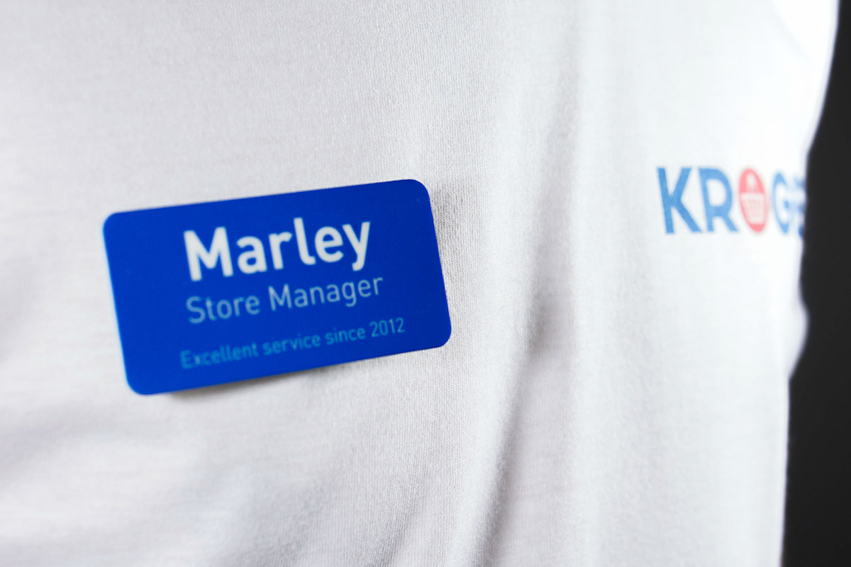
Garments and Promotional Items
Aprons were vinyled, nametags and phone cases were sublimated, shirts were direct-to-garment printed on white and screen-printed on blue. Bags were direct-to-garment printed also. Props to Nick Fenton for being my lovely model!


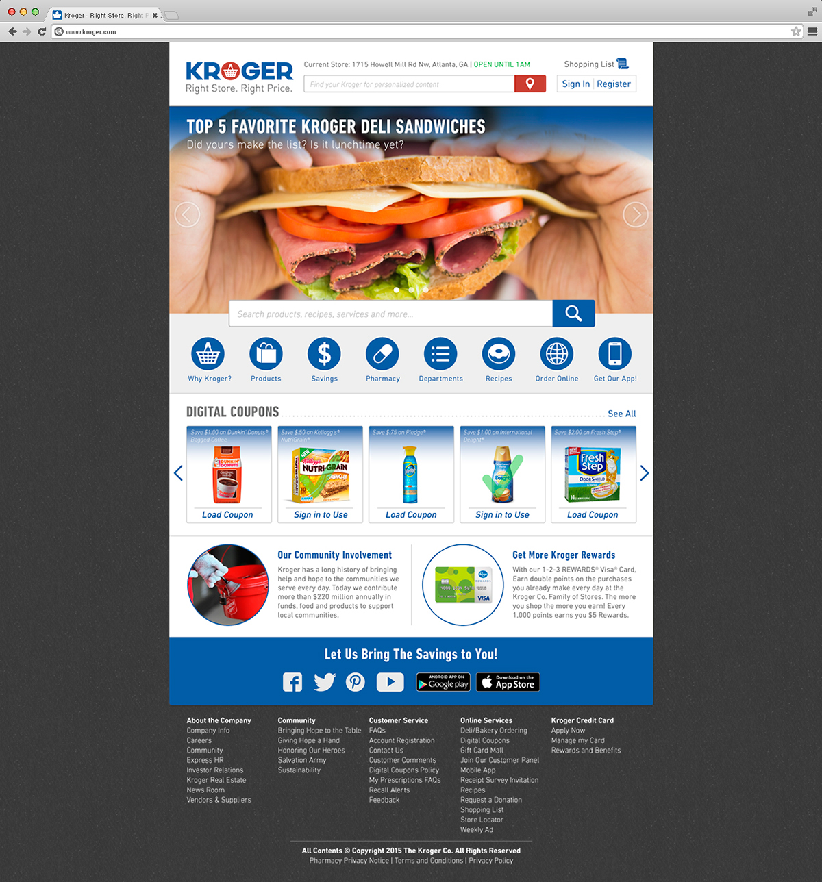
Website Landing Page
I reimagined the website with increased focus on what counts, which was difficult as Kroger has
so many different departments and options.
so many different departments and options.

Identity Proposal Book


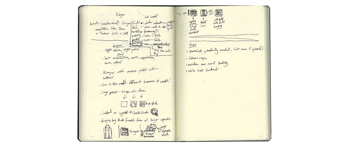
Progress Work