

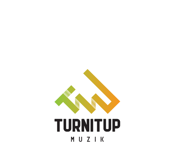
TURNITUP MUZIK LOGO DESIGN
I was approached by a newly founded record label to design their logo. We went through several stages to develop the final logo. Which was inspired by various aspects of music and sound. The label will soon start releasing their first songs.
Our first idea was to go with a strong typographic logo but after a while we decided it would be better to go for clean typography with a distinct logomark which can both be used together but also individually.
INITIAL TYPOGRAPHY SKETCHES

SKETCHING THE SYMBOL (BOTTOM RIGHT IS THE APPROVED SKETCH)
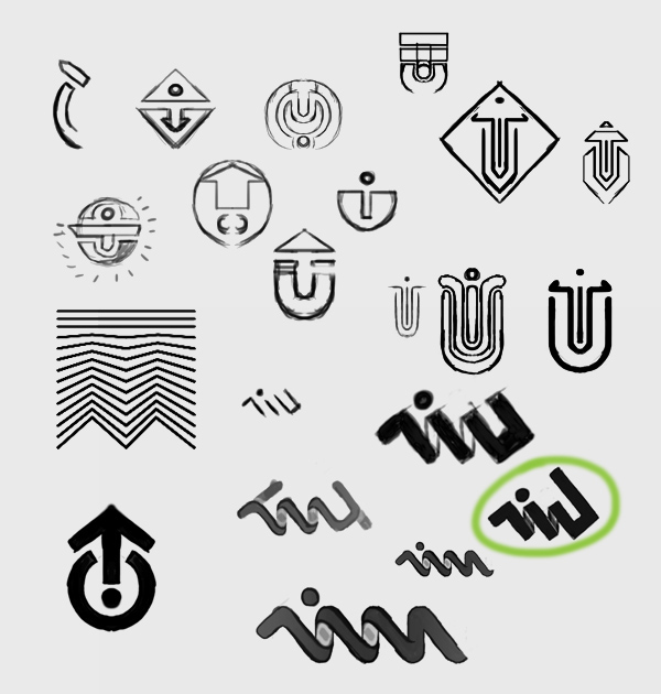
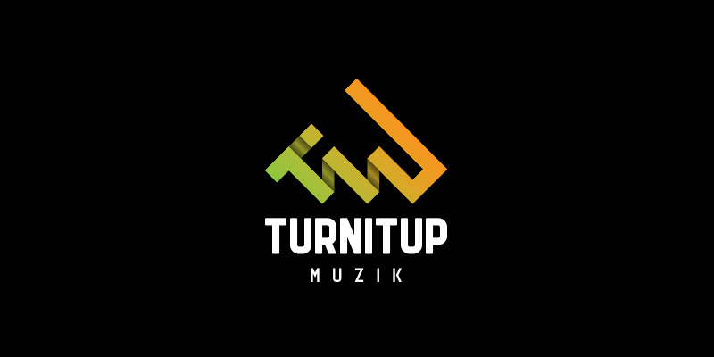
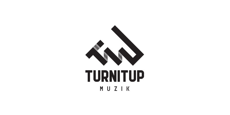
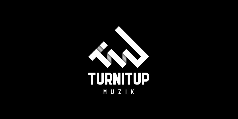
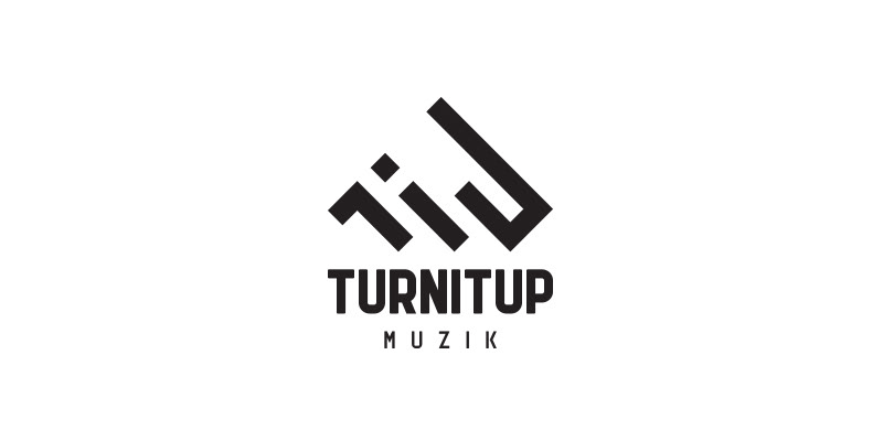
SYMBOL VARIATIONS ON BLACK AND WHITE


SYMBOL INSPIRATION
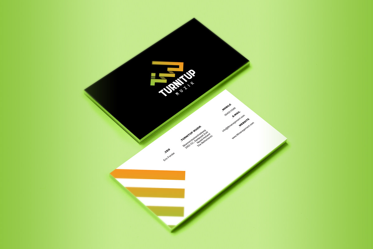
The symbol is build out of 3 aspects which are all closely related to the brand. The initials are part of the logo so that people will know what it stands for even when the typography isn't used. The second part of the logo are volume bars being turned up. The third part was added to give it upwards movement. Combining all of these gave us a unique result.

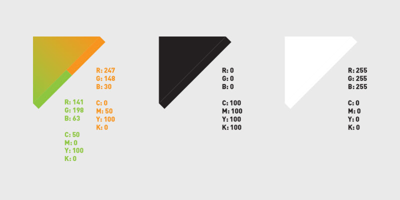
CHOSEN BRAND COLORS
Green to orange/red are colors often associated with music volume, we wanted people to have this association right away and therefor we decided to use these simple colors. Aside from that we kept it very simple with black and white because the logo will mostly be used on cover artworks which we don't want to distract from.
Green to orange/red are colors often associated with music volume, we wanted people to have this association right away and therefor we decided to use these simple colors. Aside from that we kept it very simple with black and white because the logo will mostly be used on cover artworks which we don't want to distract from.
SYMBOL GRID

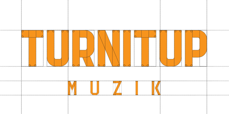
TYPOGRAPHY GRID
FINAL LOGO + VARIATIONS
All build from the same grid we've made it possible to create several variations depending on the application the logo will be used for. Some applications might call for the colored logo while others might need a very simple logo.
All build from the same grid we've made it possible to create several variations depending on the application the logo will be used for. Some applications might call for the colored logo while others might need a very simple logo.


APPLICATION


Expect some cool releases on this label soon!
Stay tuned, thank you for viewing!


