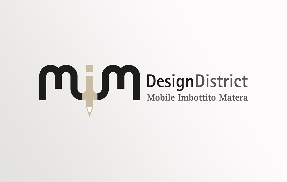
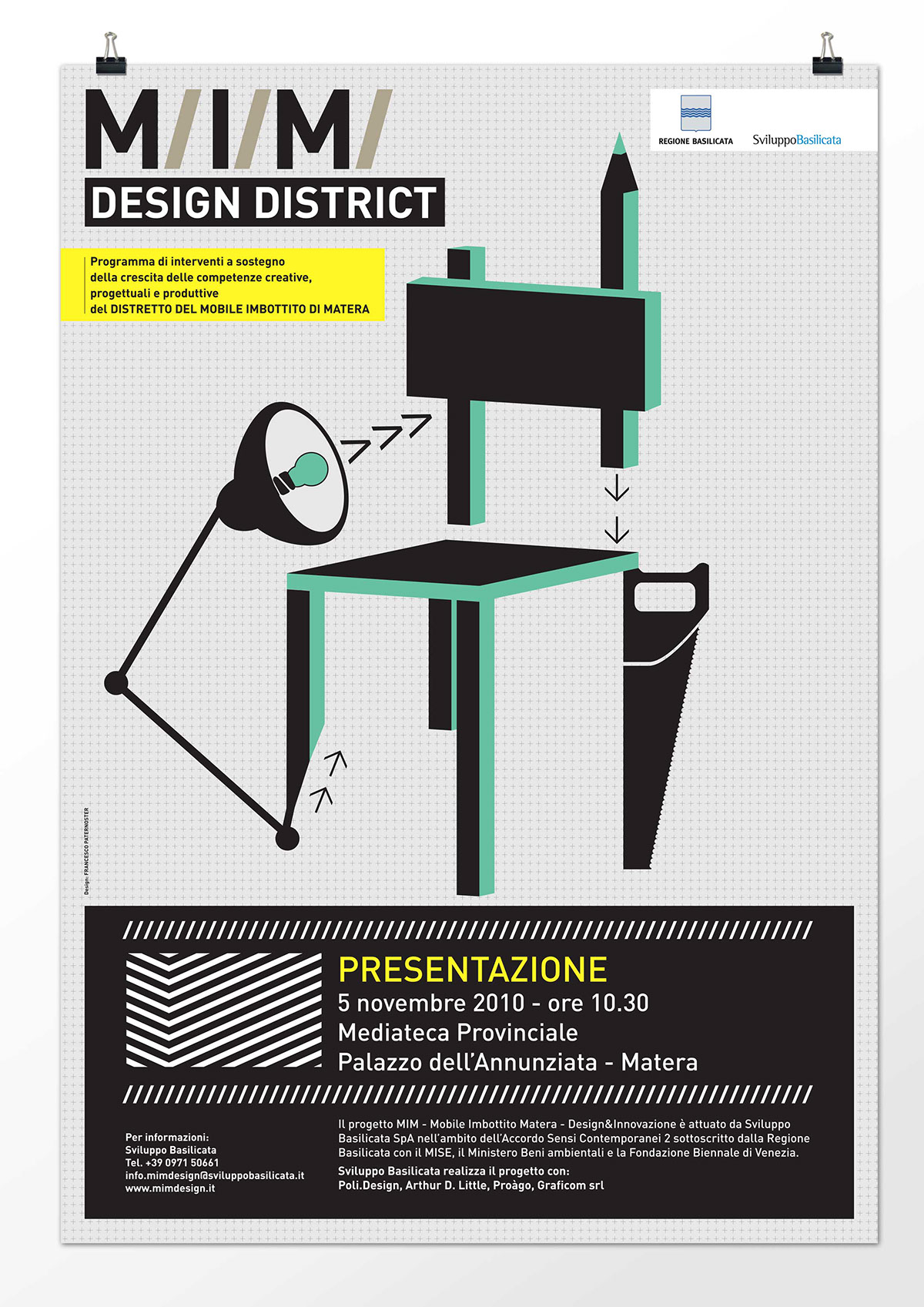
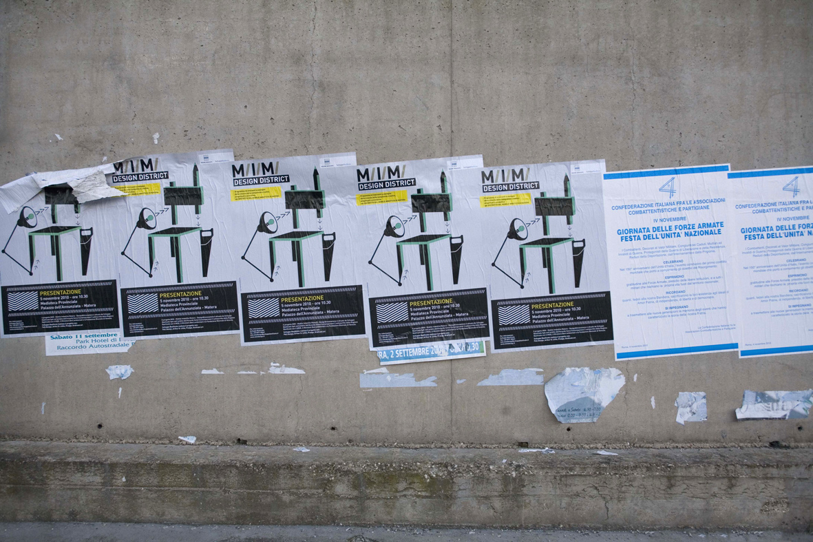
MIM DESIGN DISTRICT
Corporate identity, Type Design, Editorial, Illustration, Web.
Corporate identity, Type Design, Editorial, Illustration, Web.
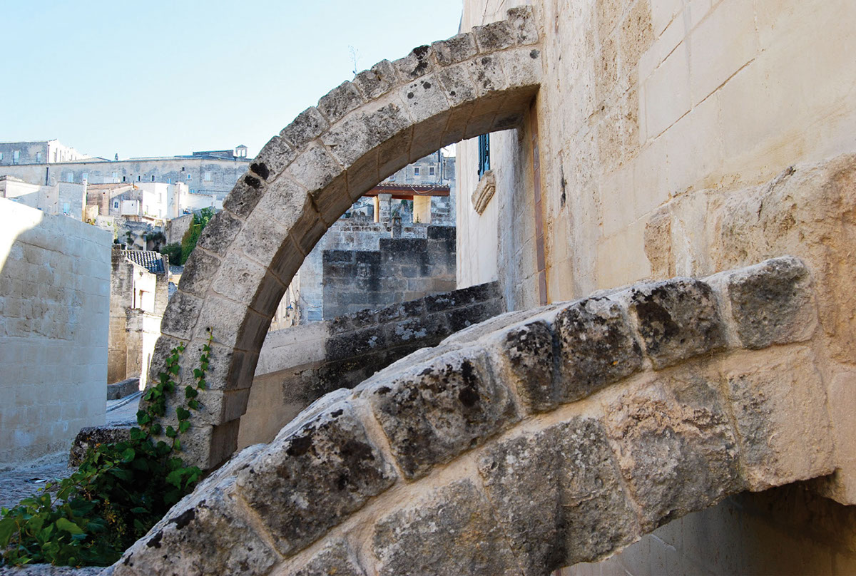
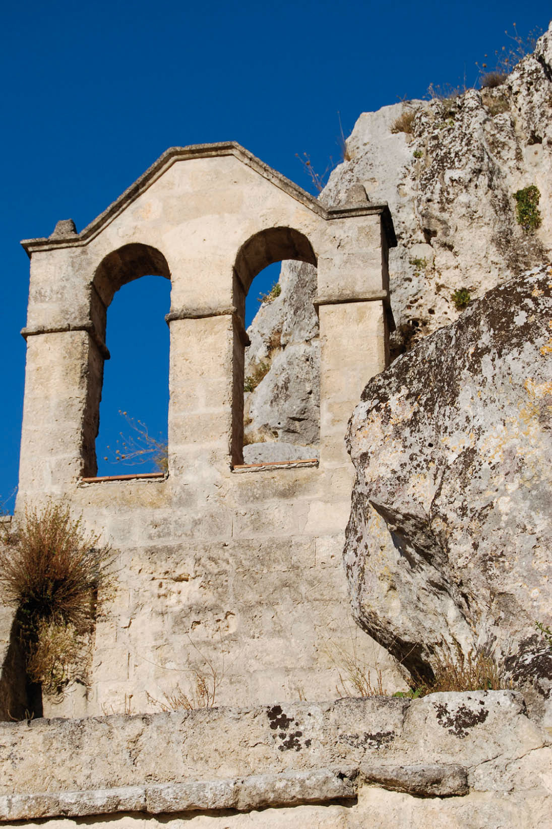
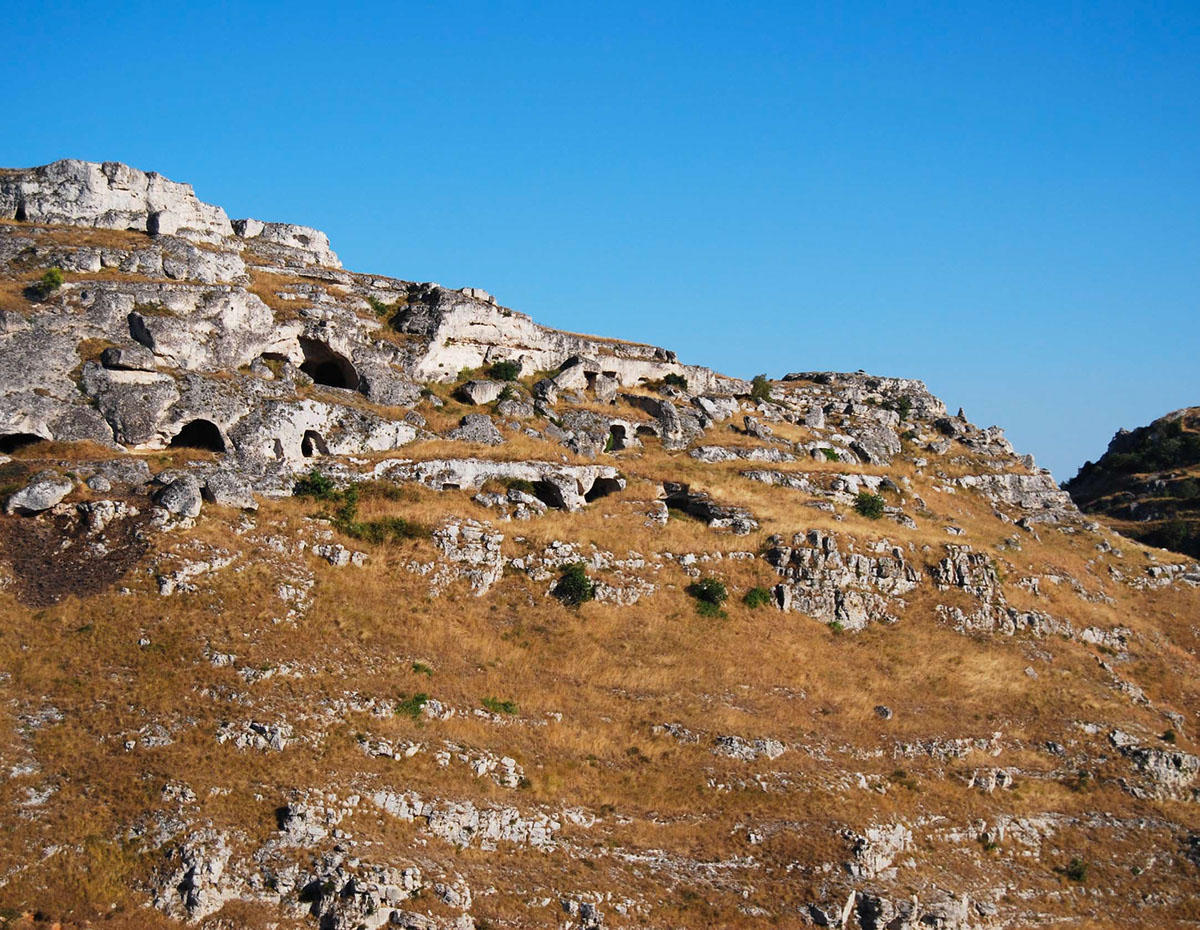
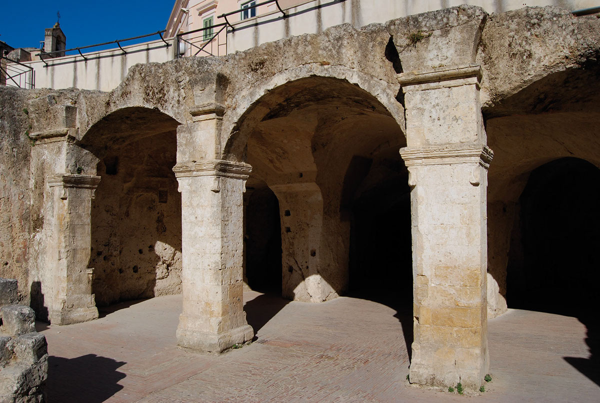
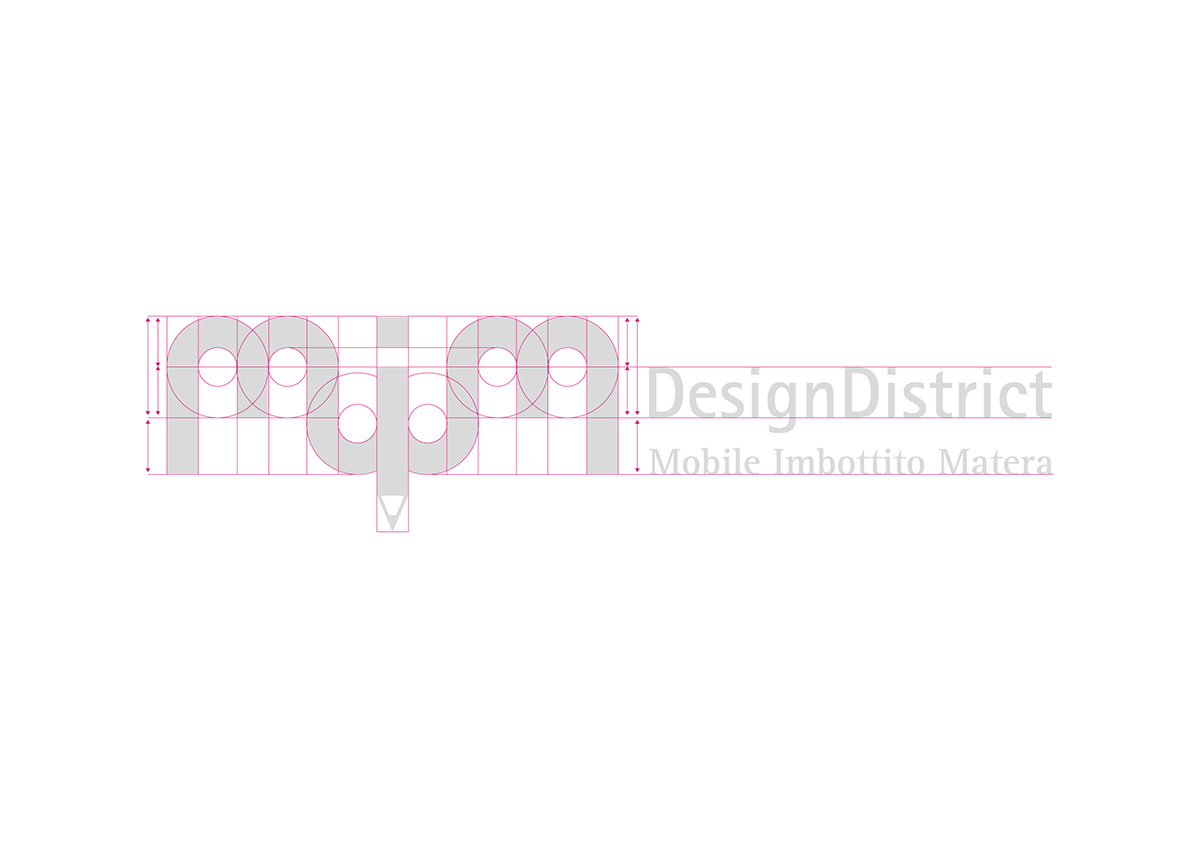
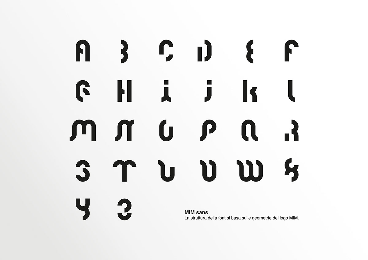
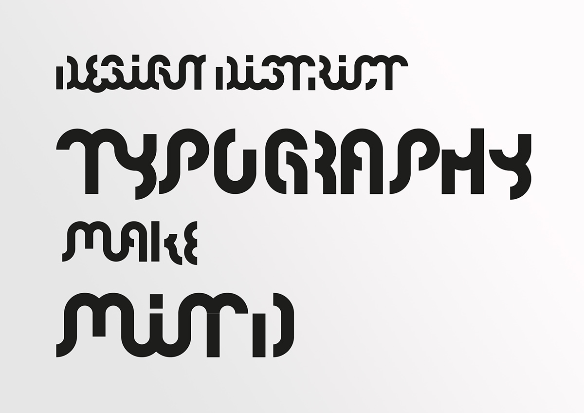
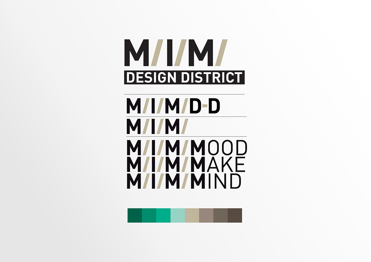
The logo design was inspired by the archaic forms of the old city of Matera.
M/I/M/ is a design container: it is a multidisciplinary network where project and skills meet, a reservoir of ideas, suggestions and practices for renewal.
M/I/M/ is not a school, but it is an open and localized laboratory for testing, for the building of a design culture as growth and innovation engine and tool for development of productive excellence and local craftsmen.
M/I/M/ is a developing concept: it is a booming and elastic system, which is changeable to be attractor of energy and new ideas' visions and new design concepts.
M/I/M/ is a local resource with a global vision: it is a tool for renewal, through sharing moments and localized projects, aiming to create an enzymatic system of mutual influence.
PARTNERS: Politecnico di Milano, Arthur D. Little, Proago, Graficom
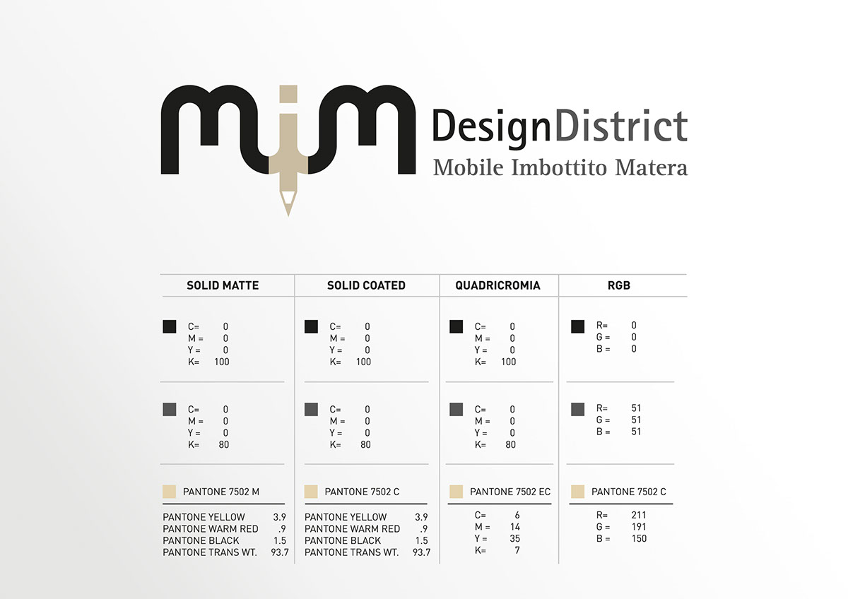
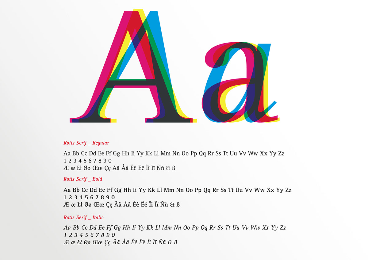
Font choosed for the Corporate Identity

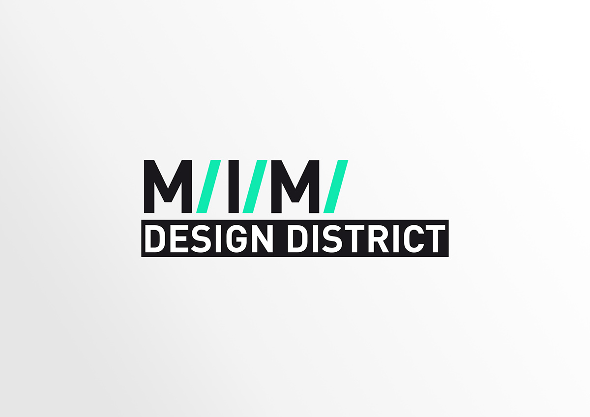
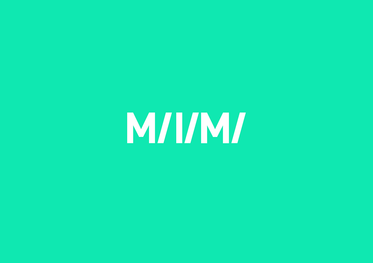
OFFICIAL VERISION of the logo


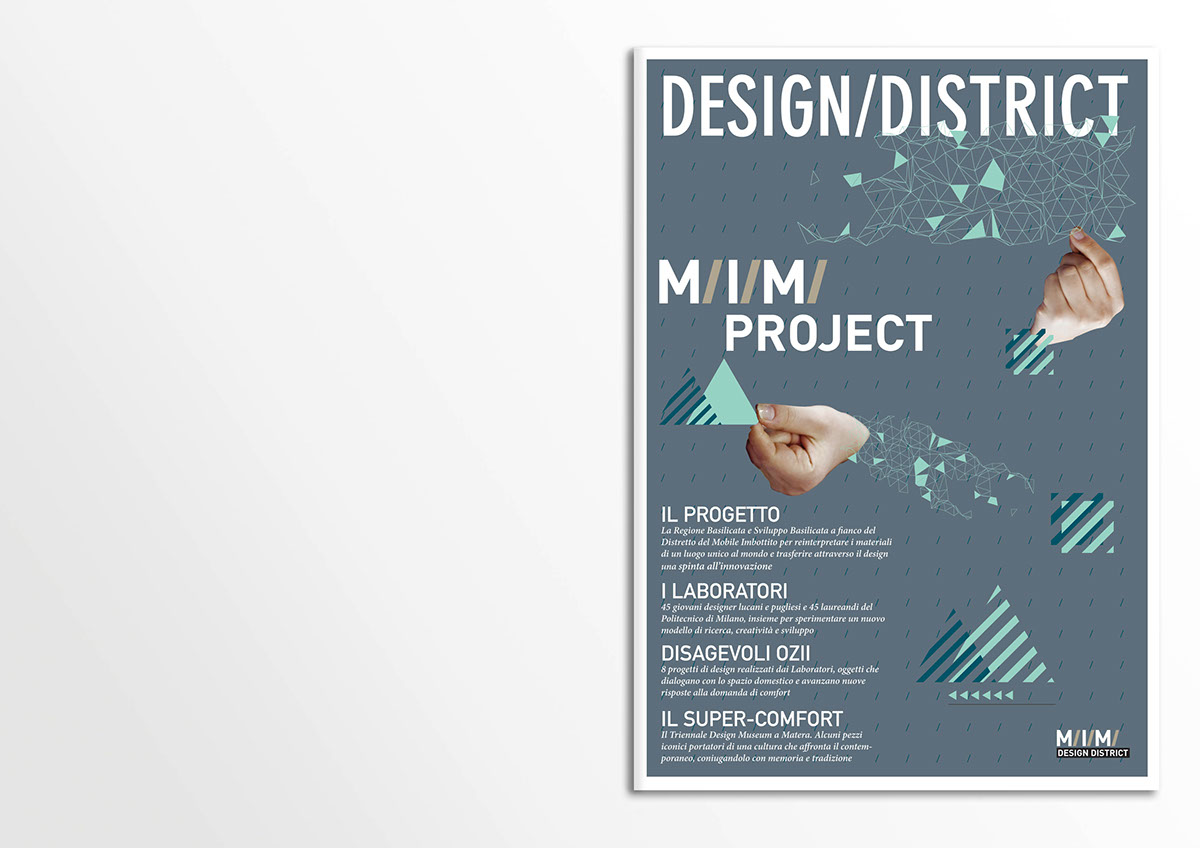
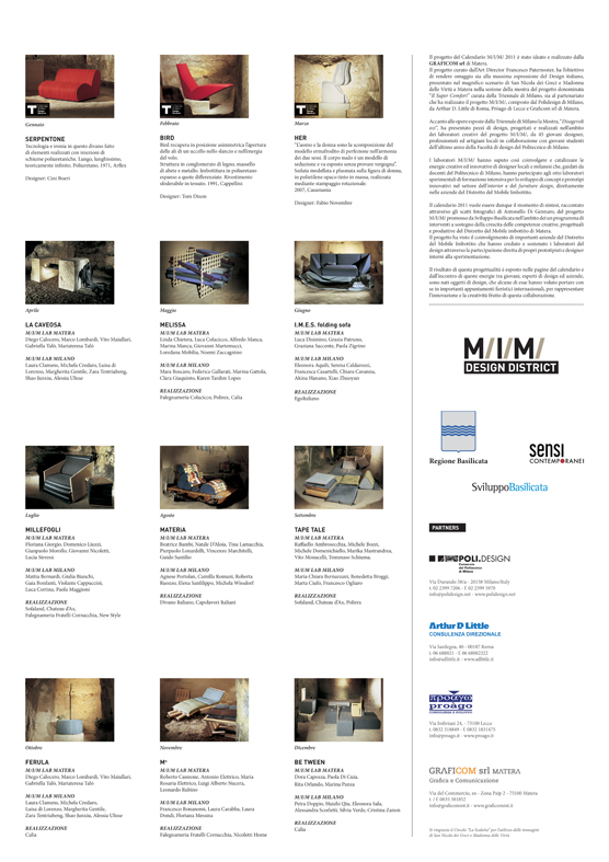
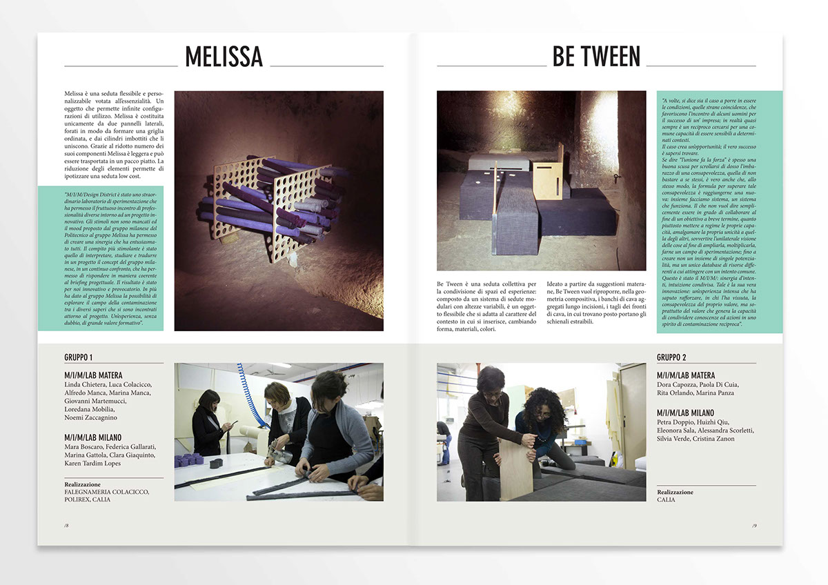
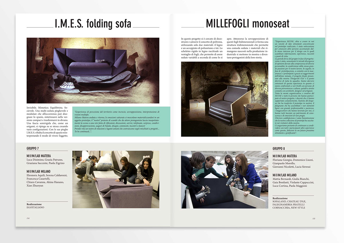
Magazine published to collect and show to the public all the activities made during the workshops.
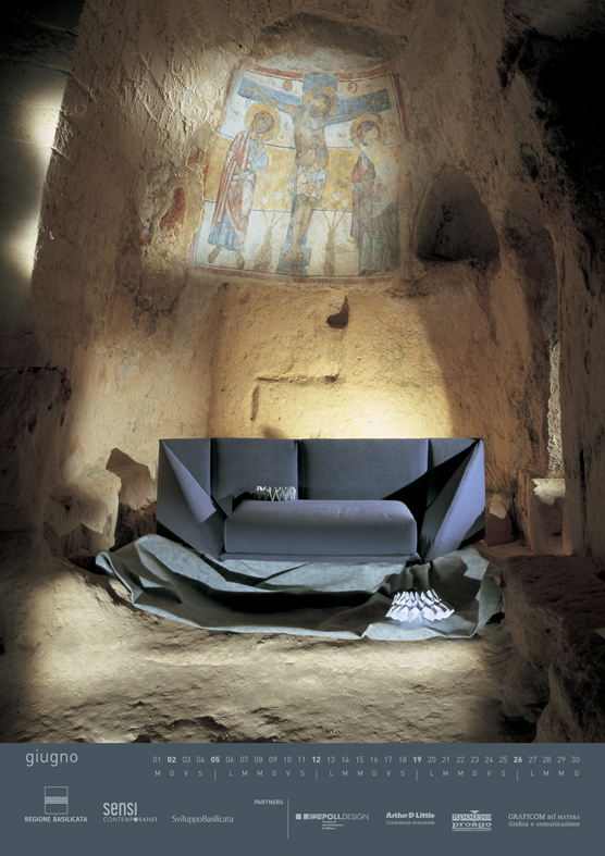
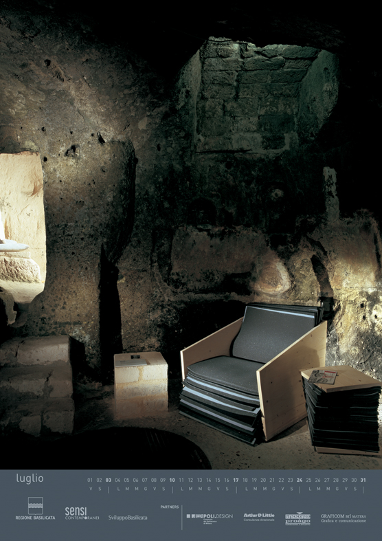
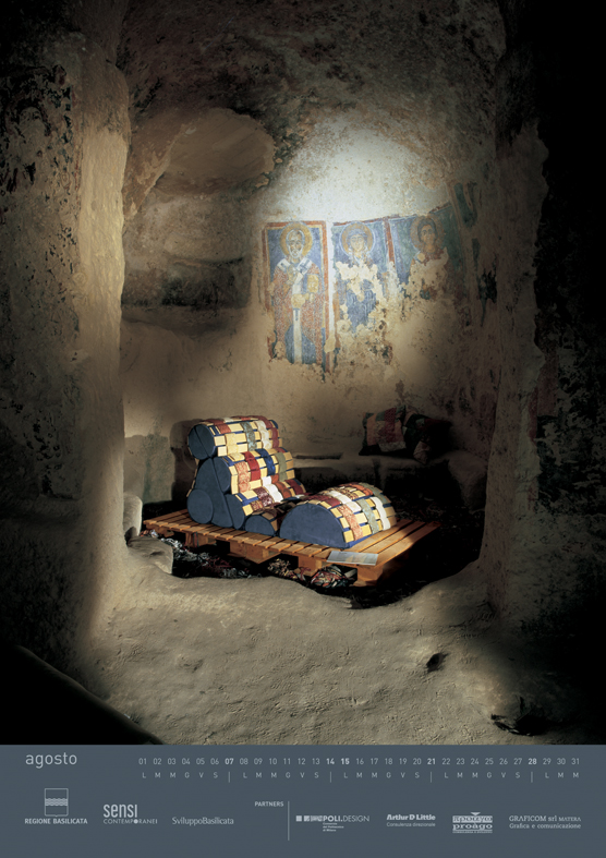
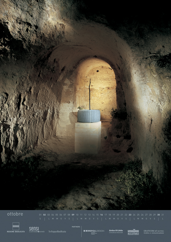
Every project of the MIMERS and also a selection of the most famous design forniture made by Cini Boeri, Tom Dixon and Fabio Novembre are published in this calender.
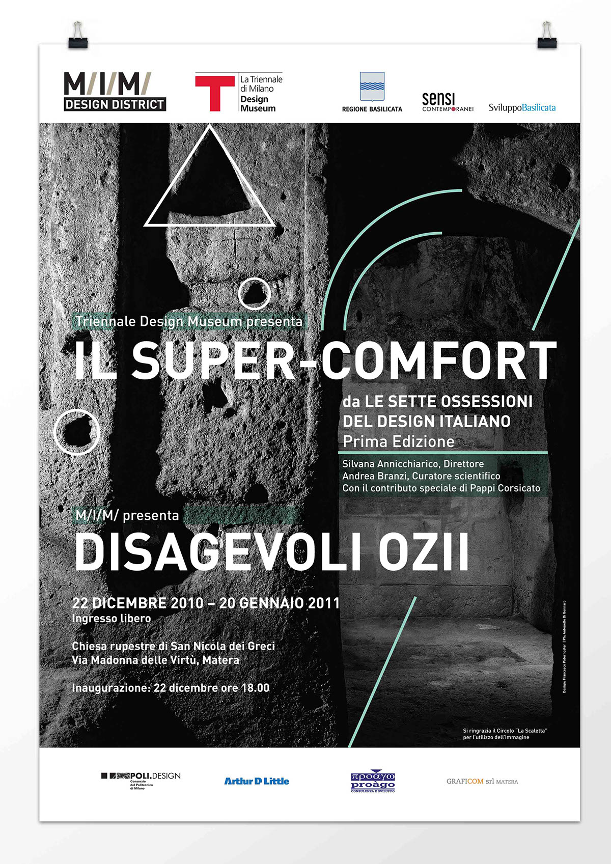
Graphic Design: Francesco Paternoster
Photo: Antonello Di Gennaro
Graphic Design: Francesco Paternoster
Photo: Antonello Di Gennaro