


ABOUT THE PROJECT
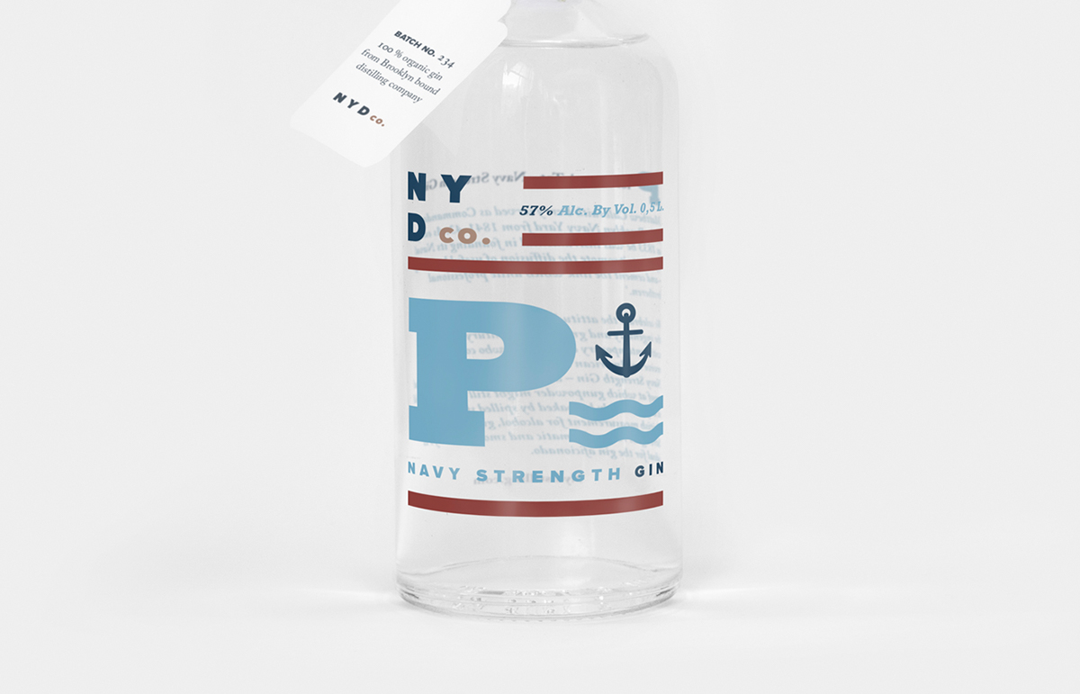
NYDC is a Brooklyn bound distilling company. They have three different kinds of gin and one whisky in their spirits portfolio. All their spirits are produced at their place in Green Point, Brooklyn. Connected to the distillery is the bar called the The Shanty, from where they offer tours around the distillery, every weekend for free.
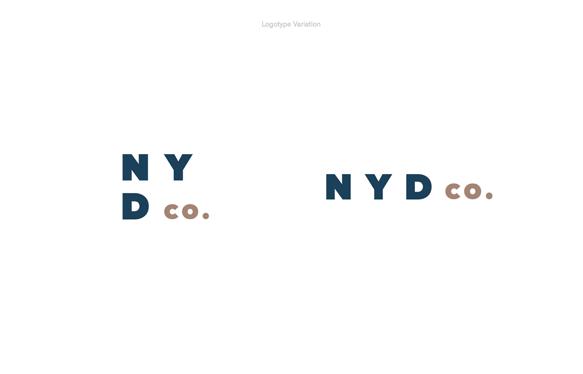
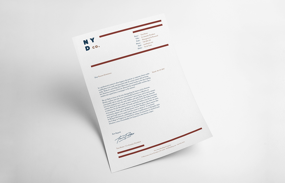
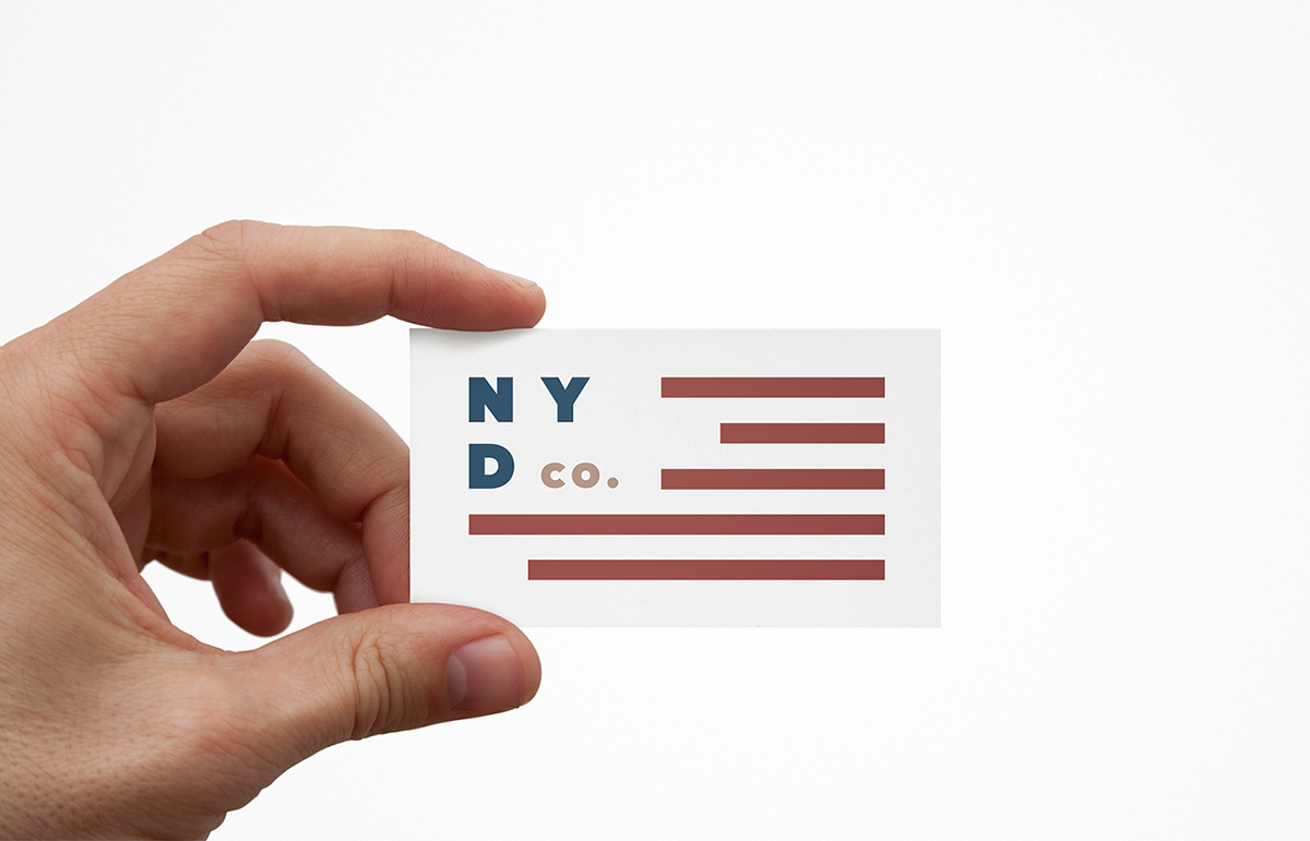
My approach to the project was to streamline their identity and bind it together with The Shanty. I chose a very clean, simple and graphic approach. The look is very scandinavian, the content and the labels are striped down to the essentials. I chose to redesign the Gin called: Perry Tot’s - Navy Strength Gin.
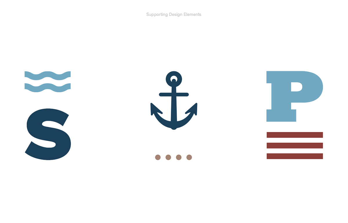
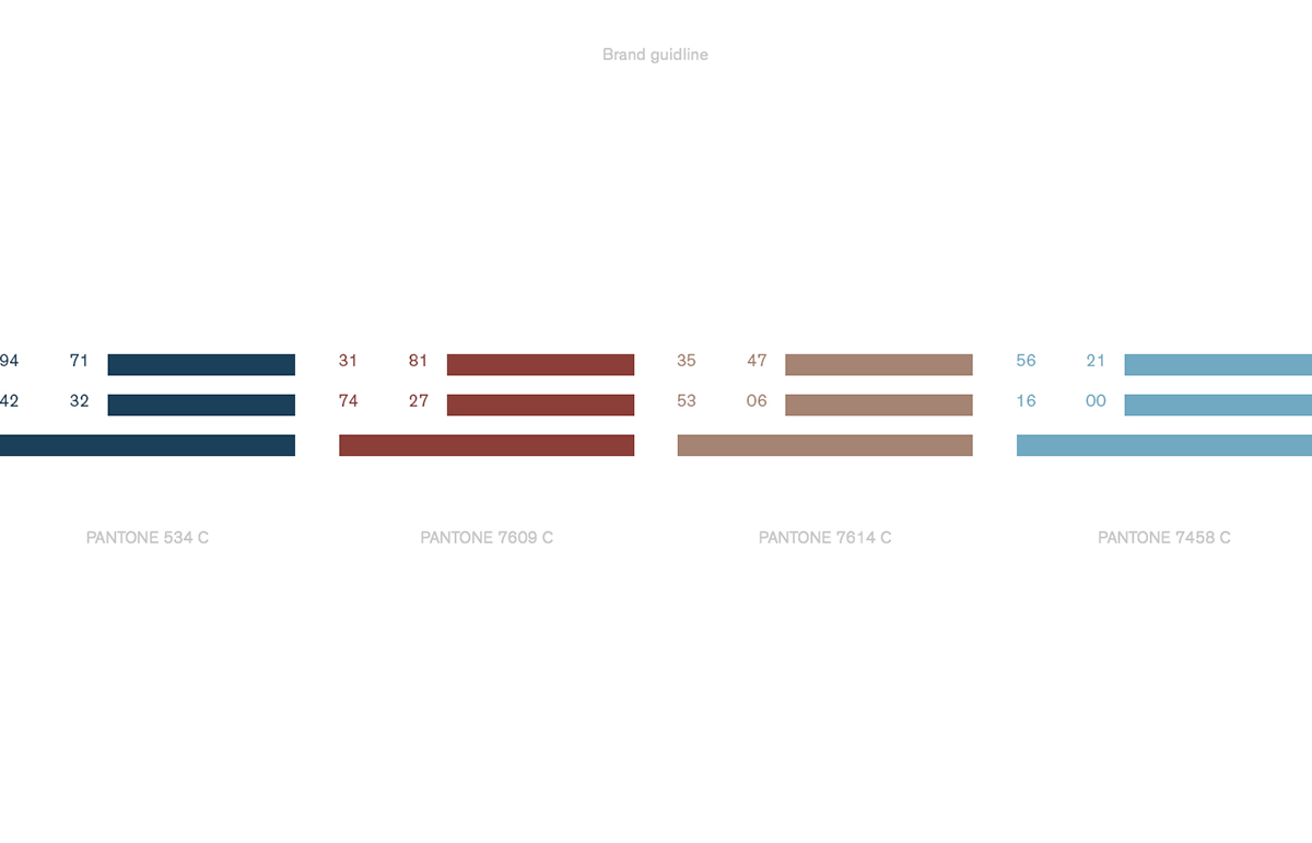
The logo and the colours are inspired by: the East river, the Manhattan skyline which is best seen from the Brooklyn side, the Brownstone houses, Brooklyn-bridge and obviously the Stars and Stripes, to give it that American felling.
The project was the first of two exams in order to graduate as graphic designer from The School of Visual Commuication in Haderslev, Denmark.
CREDITS
A special thanks to Morten Sølvstrøm for helping out with the pictures.


