


The logo we designed for our first aid kit, it consists of a cross and a drop of blood.

We wanted a minimalistc and discreet exterior while still conveying the message that this is a first aid kit.
So we opted for "traditional" colors associated with medical aid and the well known cross, however we choose to give it a sharp and dangerous look.
The idea was to combine harm and aid in the presentation.
So we opted for "traditional" colors associated with medical aid and the well known cross, however we choose to give it a sharp and dangerous look.
The idea was to combine harm and aid in the presentation.
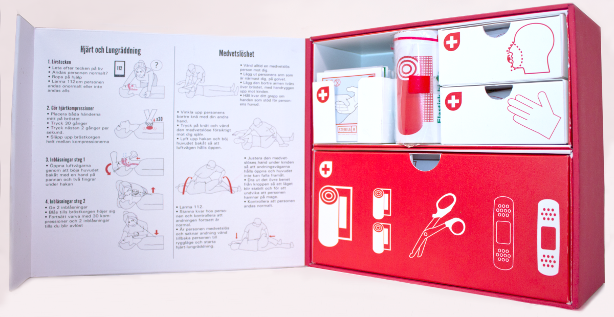
The insideof the lid contains CPR instructions and how to handle an unconscious individual.
To the right, our modular design consisting of two containers for different purposes.
To the right, our modular design consisting of two containers for different purposes.

The box fully opened, showcasing all components.

All components except for basic bandaids.

Front and back of the modular and refillable containers.

Closer look at some of our instructional illustrations for the gauze bandages.

Instructions for CPR and handling unconscious individuals.

Inside of our graphical manual.

A pattern consisting of our logo for the backside of our graphical manual.

Our poster for the first aid packaging design vernisage.


